- SAP Dashboards Tutorial
- SAP Dashboards - Home
- SAP Dashboards - Introduction
- SAP Dashboards - Version
- SAP Dashboards - WorkSpace
- SAP Dashboards - Font Options
- Components Browser
- SAP Dashboards - Object Browser
- SAP Dashboards - Quick Views
- Docking/Undocking
- Working With Components
- SAP Dashboards - Properties Panel
- Binding Components
- Setting Component Properties
- Configure Component Properties
- Component Colors
- Setting Component Text
- Chart Components
- Container Components
- Selector Components
- Single Value Components
- SAP Dashboards - Map Components
- SAP Dashboards - Text Components
- Web Connectivity Components
- Universe Connectivity
- Deleting Components & Alerts
- Models & Templates
- SAP Dashboards - Themes
- SAP Dashboards - Color Schemes
- Previewing Models
- Working With Data Sources
- SAP Dashboards - Data Connections
- Export Format Options
- Dynamic Dashboard
- SAP Dashboards Useful Resources
- SAP Dashboards - Quick Guide
- SAP Dashboards - Useful Resources
- SAP Dashboards - Discussion
SAP Dashboards - Dynamic Dashboard
In this chapter, we will discuss how to create a Dashboard on top of the SQL Server using Embedded Spreadsheets.
Dynamic Dashboard using SQL Server
Open the Dashboard Designer and select an untitled dashboard.
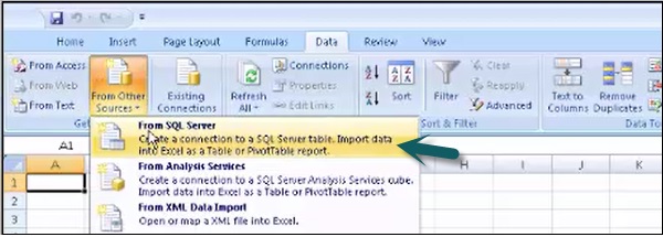
Go to the Data tab in the Spreadsheet → From Other sources → From SQL server.
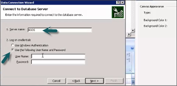
Enter the SQL Server name and credentials to connect to the SQL server database as shown in the following screenshot.
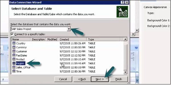
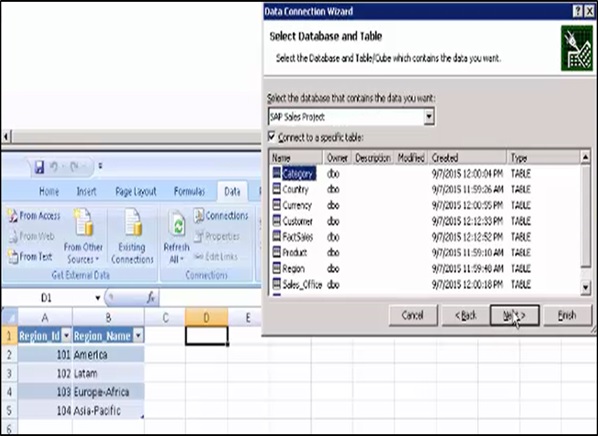
In the next window, select the database and table you want to use in the model.
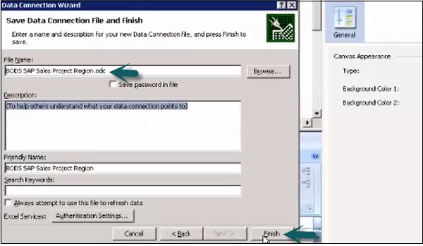
Enter the name of your data connection file and click Finish.
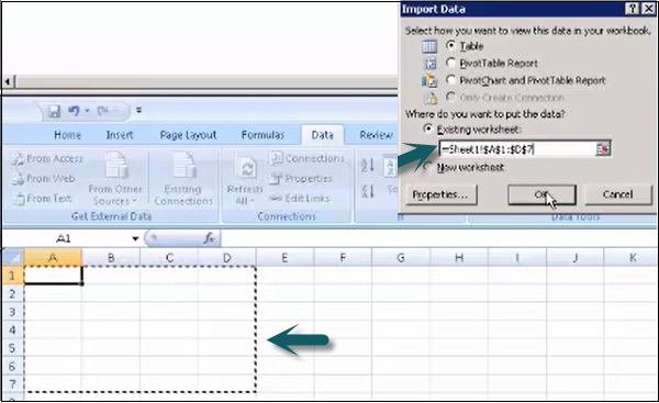
Select the area in the embedded spreadsheet and click ok. Enter the credentials again if it prompts.
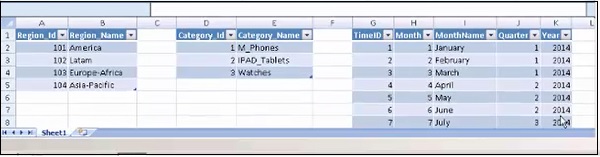
In a similar way, select all the tables from the database to the embedded spreadsheet.
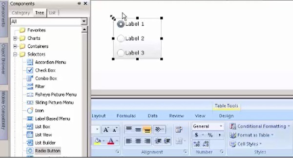
How to Add a Selector Component?
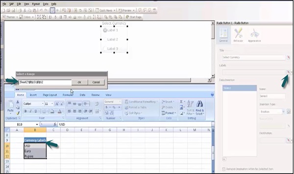
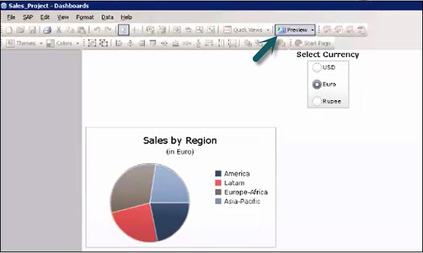
Here we can add the selector component − A radio button to implement Currency conversion in the data model.
Enter the title of the Radio button and go to the Cell selector to select cells from the spreadsheet.
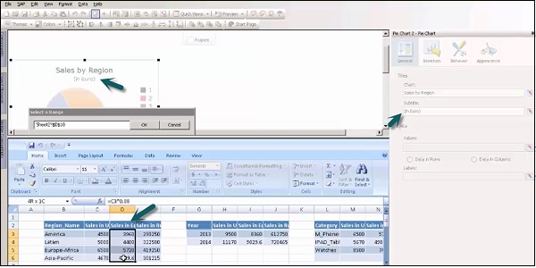
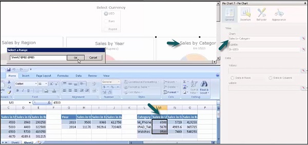
From components, select a Pie chart. Enter the title and sub title of the chart. Go to cell selector from the Values tab and select cells from the spreadsheets.
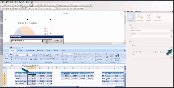
Go to General → Labels → Cell Selector to add labels to this component. Select cells from the spreadsheet to add labels as shown in the following screenshot.
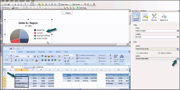
In a similar way, add more pie charts to add Currency in Euros and Rupees to show the sales. Add titles and subtitles to the chart to show the same and go to a cell selector.
How to Enable Dynamic Visibility?
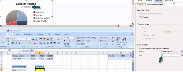
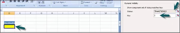
To enable dynamic visibility for each chart, go to Behavior → Dynamic Visibility and Status. Go to that cell in the Chart which stores value for dynamic visibility.
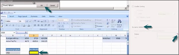
Enter the key value of each pie chart as per the Radio button selector component.
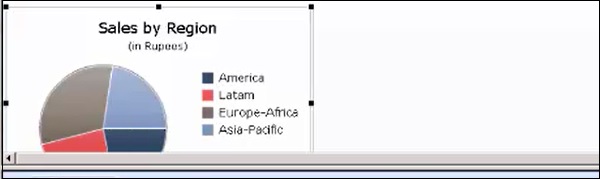
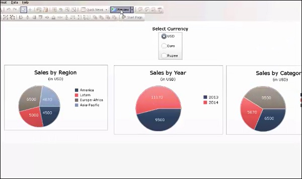
Save the model using the option at the top and go to the Preview option to see the preview as shown in the following screenshot.
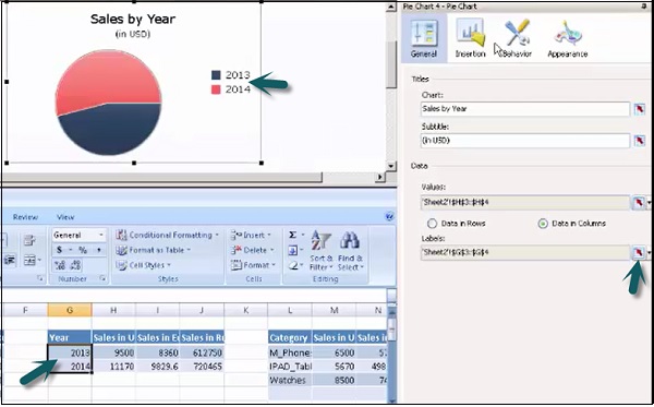
To add more components to show sales by year, select a Pie chart and title it as Sales by year and subtitle as USD. Go to cell selector to pass value from embedded spreadsheet.
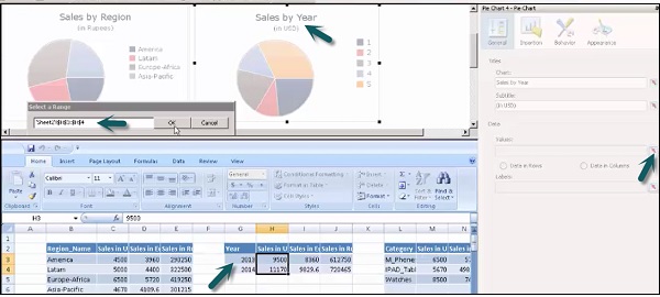
To add years as labels, go to labels and select the Years column from the embedded spreadsheet.
Set the dynamic visibility of the chart as mentioned in the previous topics. Value of the key is stored in the cell under Destination.
In a similar way, add pie charts for Sales by Year (In Euros) and Sales by Year (In Rupees). Save the Sales Project. To apply any type of formatting, you can view all the charts from the object browser, go to Appearance → Text.
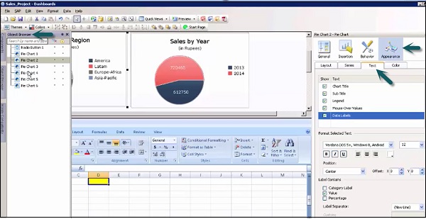
Similarly, you can add more charts with the title − Sales by Category, as shown in the following screenshot.
Add labels by going to the cell selector. Set the dynamic visibility for the components and multiple charts.

Save the project again and go to Preview option at the top.
This is how you can create models in SAP Business Objects Dashboard Designer and use embedded spreadsheets to get data from external data sources and do binding data with different components in the Canvas and use the dynamic visibility feature.
To Continue Learning Please Login