- jQuery Mobile Tutorial
- jQuery Mobile - Home
- jQuery Mobile - Overview
- jQuery Mobile - Setup
- jQuery Mobile - Pages
- jQuery Mobile - Icons
- jQuery Mobile - Transitions
- jQuery Mobile - Layouts
- jQuery Mobile - Widgets
- jQuery Mobile - Events
- jQuery Mobile - Forms
- jQuery Mobile - Themes
- jQuery Mobile - CSS Classes
- jQuery Mobile - Data Attributes
- jQuery Mobile Useful Resources
- jQuery Mobile - Interview Questions
- jQuery Mobile - Quick Guide
- jQuery Mobile - Useful Resources
- jQuery Mobile - Discussion
jQuery Mobile - Setup
In this chapter, we will discuss how to install and set up jQuery Mobile.
Download jQuery Mobile
When you open the link jquerymobile.com/, you will see there are two options to download jQuery mobile library.
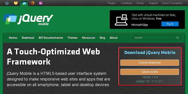
Custom Download − Click this button to download a customized version of library.
Latest Stable − Click this button to get the stable and latest version of jQuery mobile library.
Custom Download with Download Builder
Using Download Builder, you can create a custom build including only the portions of the library that you need. When you download this new customized version of jQuery Mobile, you will see the following screen.
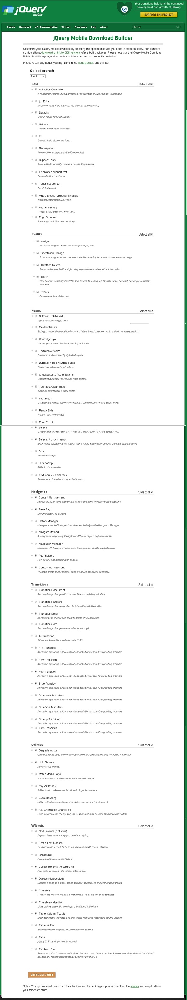
You can select the libraries according to your need and click the Build My Download button.
Stable download
Click the Stable button, which leads directly to a ZIP file containing the CSS and JQuery files, for the latest version of jQuery mobile library. Extract the ZIP file contents to a jQuery mobile directory.
This version contains all files including all dependencies, a large collection of demos, and even the library's unit test suite. This version is helpful to getting started.
Download jQuery Library from CDNs
A CDN (Content Delivery Network) is a network of servers designed to serve files to the users. If you use a CDN link in your webpage, it moves the responsibility of hosting files from your own servers to a series of external ones. This also offers an advantage that if a visitor to your webpage has already downloaded a copy of jQuery mobile from the same CDN, it won't have to be re-downloaded. You can include the following CDN files into the HTML document.
//The jQuery Mobile CSS theme file (optional, if you are overriding the default theme)
<link rel = "stylesheet" href = "https://code.jquery.com/mobile/1.4.5/jquery.mobile-1.4.5.min.css">

//The jQuery core JavaScript file
<script src = "https://code.jquery.com/jquery-1.11.3.min.js"></script>

//The jQuery Mobile core JavaScript file
<script src = "https://code.jquery.com/mobile/1.4.5/jquery.mobile-1.4.5.min.js"></script>
We are using the CDN versions of the library throughout this tutorial. We use AMPPS (AMPPS is a WAMP, MAMP and LAMP stack of Apache, MySQL, MongoDB, PHP, Perl & Python) server to execute all our examples.
Example
Following is a simple example of jQuery Mobile.
<!DOCTYPE html>
<html>
   <head>
      <meta name = "viewport" content = "width = device-width, initial-scale = 1">
      <link rel = "stylesheet" href = "https://code.jquery.com/mobile/1.4.5/jquery.mobile-1.4.5.min.css">
      <script src = "https://code.jquery.com/jquery-1.11.3.min.js"></script>
      <script src = "https://code.jquery.com/mobile/1.4.5/jquery.mobile-1.4.5.min.js"></script>
   </head>


   <body>
      <div data-role = "page" id = "pageone">
         <div data-role = "header">
            <h1>Header Text</h1>
         </div>

         <div data-role = "main" class = "ui-content">
            <h2>Welcome to TutorialsPoint</h2>
         </div>

         <div data-role = "footer">
            <h1>Footer Text</h1>
         </div>
      </div>
   </body>
</html>
Details of the above code are −
This code is specified inside the head element.
<meta name = "viewport" content = "width = device-width, initial-scale = 1">
The viewport is used to specify (by the browser) to display the page zoom level and dimension.
content = "width = device-width" is used to set the pixel width of the page or screen device.
initial-scale = 1 sets the initial zoom level, when the page is loaded for the first time.
Include the following CDNs
<link rel = "stylesheet" href = "https://code.jquery.com/mobile/1.4.5/jquery.mobile-1.4.5.min.css">
<script src = "https://code.jquery.com/jquery-1.11.3.min.js"></script>
<script src = "https://code.jquery.com/mobile/1.4.5/jquery.mobile-1.4.5.min.js"></script>
Content inside the <body> tag is a page displayed in the browser.
<div data-role = "page">
   ...
</div>
data-role = "header" creates the header at the top of the page.
data-role = "main" is used to define the content of the page.
data-role = "footer" creates the footer at the bottom of the page.
class = "ui-content" includes padding and margin inside the page content.
Output
Let's carry out the following steps to see how the above code works −
Save the above html code as simple_example.html file in your server root folder.
Open this HTML file as http://localhost/simple_example.html and the following output will be displayed.