- jQuery Mobile Tutorial
- jQuery Mobile - Home
- jQuery Mobile - Overview
- jQuery Mobile - Setup
- jQuery Mobile - Pages
- jQuery Mobile - Icons
- jQuery Mobile - Transitions
- jQuery Mobile - Layouts
- jQuery Mobile - Widgets
- jQuery Mobile - Events
- jQuery Mobile - Forms
- jQuery Mobile - Themes
- jQuery Mobile - CSS Classes
- jQuery Mobile - Data Attributes
- jQuery Mobile Useful Resources
- jQuery Mobile - Interview Questions
- jQuery Mobile - Quick Guide
- jQuery Mobile - Useful Resources
- jQuery Mobile - Discussion
jQuery Mobile - Quick Guide
jQuery Mobile - Overview
JQuery Mobile is a user interface framework, which is built on jQuery Core and used for developing responsive websites or applications that are accessible on mobile, tablet, and desktop devices. It uses the features of both jQuery and jQuery UI to provide API features for mobile web applications.
It was developed by the jQuery project team in the year 2010 and written in JavaScript.
Why Use jQuery Mobile?
It creates web applications that it will work the same way on the mobile, tablet, and desktop devices.
It is compatible with other frameworks such as PhoneGap, Whitelight, etc.
It provides a set of touch-friendly form inputs and UI widgets.
The progressive enhancement brings a unique functionality to all mobile, tablet, and desktop platforms and adds efficient page loads and wider device support.
Features of jQuery Mobile
It is built on jQuery Core and "write less, do more" UI framework.
It is an open source framework, and cross-platform as well as cross-browser compatible.
It is written in JavaScript and uses features of both jQuery and jQuery UI for building mobile-friendly sites.
It integrates HTML5, CCS3, jQuery and jQuery UI into one framework for creating pages with minimal scripting.
It includes Ajax navigation system that uses animated page transitions.
Advantages of jQuery Mobile
It is easy to learn and develop applications if you have knowledge of HTML5, CSS3 features.
It is cross-platform and cross-browser compatible so you don't have to worry about writing different code for each device resolution.
You can create the custom theme using ThemeRoller without writing the line of code. It supports all HTML5 browsers.
It uses HTML5 along with JavaScript for easy development of web applications.
It is built in a way that allows the same code to automatically scale from the mobile screen to desktop screen.
Disadvantages of jQuery Mobile
There are limited options for CSS themes, so sites can look similar which are built by these themes.
Applications which are developed using jQuery Mobile are slower on mobiles.
It becomes more time consuming when you combine jQuery mobile with other mobile frameworks.
Difficult to provide complete customized visual design.
All the features in a device cannot be accessed by JavaScript in a browser.
jQuery Mobile - Setup
In this chapter, we will discuss how to install and set up jQuery Mobile.
Download jQuery Mobile
When you open the link jquerymobile.com/, you will see there are two options to download jQuery mobile library.
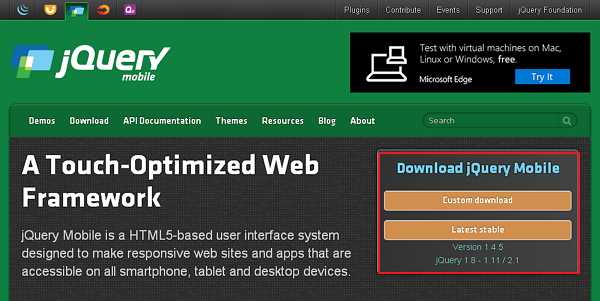
Custom Download − Click this button to download a customized version of library.
Latest Stable − Click this button to get the stable and latest version of jQuery mobile library.
Custom Download with Download Builder
Using Download Builder, you can create a custom build including only the portions of the library that you need. When you download this new customized version of jQuery Mobile, you will see the following screen.
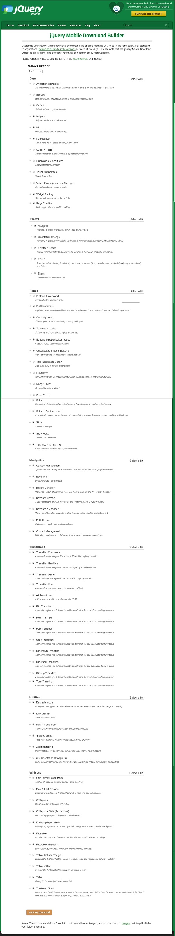
You can select the libraries according to your need and click the Build My Download button.
Stable download
Click the Stable button, which leads directly to a ZIP file containing the CSS and JQuery files, for the latest version of jQuery mobile library. Extract the ZIP file contents to a jQuery mobile directory.
This version contains all files including all dependencies, a large collection of demos, and even the library's unit test suite. This version is helpful to getting started.
Download jQuery Library from CDNs
A CDN (Content Delivery Network) is a network of servers designed to serve files to the users. If you use a CDN link in your webpage, it moves the responsibility of hosting files from your own servers to a series of external ones. This also offers an advantage that if a visitor to your webpage has already downloaded a copy of jQuery mobile from the same CDN, it won't have to be re-downloaded. You can include the following CDN files into the HTML document.
//The jQuery Mobile CSS theme file (optional, if you are overriding the default theme)
<link rel = "stylesheet" href = "https://code.jquery.com/mobile/1.4.5/jquery.mobile-1.4.5.min.css">

//The jQuery core JavaScript file
<script src = "https://code.jquery.com/jquery-1.11.3.min.js"></script>

//The jQuery Mobile core JavaScript file
<script src = "https://code.jquery.com/mobile/1.4.5/jquery.mobile-1.4.5.min.js"></script>
We are using the CDN versions of the library throughout this tutorial. We use AMPPS (AMPPS is a WAMP, MAMP and LAMP stack of Apache, MySQL, MongoDB, PHP, Perl & Python) server to execute all our examples.
Example
Following is a simple example of jQuery Mobile.
<!DOCTYPE html>
<html>
   <head>
      <meta name = "viewport" content = "width = device-width, initial-scale = 1">
      <link rel = "stylesheet" href = "https://code.jquery.com/mobile/1.4.5/jquery.mobile-1.4.5.min.css">
      <script src = "https://code.jquery.com/jquery-1.11.3.min.js"></script>
      <script src = "https://code.jquery.com/mobile/1.4.5/jquery.mobile-1.4.5.min.js"></script>
   </head>


   <body>
      <div data-role = "page" id = "pageone">
         <div data-role = "header">
            <h1>Header Text</h1>
         </div>

         <div data-role = "main" class = "ui-content">
            <h2>Welcome to TutorialsPoint</h2>
         </div>

         <div data-role = "footer">
            <h1>Footer Text</h1>
         </div>
      </div>
   </body>
</html>
Details of the above code are −
This code is specified inside the head element.
<meta name = "viewport" content = "width = device-width, initial-scale = 1">
The viewport is used to specify (by the browser) to display the page zoom level and dimension.
content = "width = device-width" is used to set the pixel width of the page or screen device.
initial-scale = 1 sets the initial zoom level, when the page is loaded for the first time.
Include the following CDNs
<link rel = "stylesheet" href = "https://code.jquery.com/mobile/1.4.5/jquery.mobile-1.4.5.min.css">
<script src = "https://code.jquery.com/jquery-1.11.3.min.js"></script>
<script src = "https://code.jquery.com/mobile/1.4.5/jquery.mobile-1.4.5.min.js"></script>
Content inside the <body> tag is a page displayed in the browser.
<div data-role = "page">
   ...
</div>
data-role = "header" creates the header at the top of the page.
data-role = "main" is used to define the content of the page.
data-role = "footer" creates the footer at the bottom of the page.
class = "ui-content" includes padding and margin inside the page content.
Output
Let's carry out the following steps to see how the above code works −
Save the above html code as simple_example.html file in your server root folder.
Open this HTML file as http://localhost/simple_example.html and the following output will be displayed.
jQuery Mobile - Pages
The user can interact with jQuery Mobile pages, which groups the content into logical views and page views. Page view can be animated using page transitions. Multiple pages can be created using HTML document and therefore, there is no need of requesting the content from the server.
Following table demonstrates the types of pages in detail.
| Sr.No. | Type & Description |
|---|---|
| 1 | Single Page
A single page is created in HTML document using a standard way of writing a template. |
| 2 | Multi-Page Template
Multiple pages can be included in the single HTML document, which loads together by adding multiple divs with data-role = "page". |
| 3 | Dialogs Page
Modal dialogs open content in an interactive overlay above the page. |
Conventions, not requirements
The data-role attribute elements such as the header, footer, page, and content are used to provide the basic format and structure of a page.
For single page documents, the page wrapper was required for auto-initialization is set as optional.
The structural element can be excluded for a webpage with custom layout.
To manage pages, the page wrapper is injected by the framework when it is not included by the markup.
Prefetching pages
Including the attribute data-prefetch, we can prefetch pages into the DOM in the single page templates. For more information click here.
DOM Cache
When the browser memory gets full in DOM, then it slow downs the mobile browser or might crash due to loading of multiple pages. There is a simple method to keep the DOM tidy −
When a page is loaded via ajax, then it indicates to remove the page from DOM when you redirect to another page.
The previous page which you have visited can be retrived from the cache when you revisit it.
Instead of removing the pages, you can tell jQuery mobile to keep it in DOM by using the following line −
$.mobile.page.prototype.options.domCache = true;
Set the domCache option as true on the page plugin to keep all the pages in the DOM, which was visited previously.
pageContainerElement.page({ domCache: true });
jQuery Mobile - Icons
jQuery Mobile provides a set of built-in icons, which can be used with buttons, listview buttons which will make the buttons more attractive.
Following table lists down some of the icons used in the jQuery Mobile framework.
| Sr.No. | Icon Area & Description |
|---|---|
| 1 | Icon Set
It sets the icon in the button. |
| 2 | Positioning Icons
It specifies the position of the icon in the button. |
| 3 | Icon-only
It displays only an icon in the button. |
| 4 | Icon shadow
It adds an icon shadow in your button. |
| 5 | Removing Circle
It removes the grey circle around the icon. |
| 6 | Black or White Icons
It changes the color of icons to black or white. |
| 7 | Combining alt and nodisc
It combines the alt and nodisc classes to the icon. |
jQuery Mobile - Transitions
It allows to change property values which occurs over specified duration and alters behavior of an element from one state to another state by applying different styles for each state.
Following table lists down some of the page transitions used in the jQuery Mobile framework −
| Sr.No. | Transition & Description | For Pages | For Dialogs |
|---|---|---|---|
| 1 | fade You can make elements fade in and out of visibility. |
Fade Page | Fade Dialog |
| 2 | flip Flip the elements from back to front to the next page. |
Flip Page | Flip Dialog |
| 3 | pop You can create a popup window. |
Pop Page | Pop Dialog |
| 4 | flow Display the next page by keeping current page away. |
Flow Page | Flow Dialog |
| 5 | slide You can slide the page from right to left. |
Slide Page | Slide Dialog |
| 6 | slidefade Slides the page from right to left and fades in the next page. |
Slidefade Page | Slidefade Dialog |
| 7 | slideup Slides the page from bottom to up. |
Slideup Page | Slideup Dialog |
| 8 | slidedown Slides the page from top to bottom. |
Slidedown Page | Slidedown Dialog |
| 9 | turn You can turn to the next page. |
Turn Page | Turn Dialog |
| 10 | none You cannot use any transition effect by using this attribute. |
None Page | None Dialog |
Setting Transition and Global Configuration
By default, pages will have fade transition in the framework. You can use custom transitions by adding the data-transition attribute to the link. You can use different default transition effects for the page using defaultPageTransition option globally. For dialogs, you can make use of defaultDialogTransition option.
Fallback Transition
All transitions support 3D transformations except the fade transition. The devices which do not support 3D transformation, they will have to make use of fade transition. Some browsers do not support 3D transformations for each transition type, so you can use the fade as default transition fallback.
Max Scroll for Transitions
The transitions are set to none when you are scrolling from or to a page and the scroll position will be three times the height of the device screen. Sometimes, you may get slow in responding or the browser may crash when you click any navigation element; so to avoid this we are using the scroll position for transition by using getMaxScrollForTransition function.
Max Width for Transitions
You can disable the transition when the window width is higher than the pixel width. You can configure the max width for transitions using the $.mobile.maxTransitionWidth global option, which is set to false by default. It takes values such as pixel width or false value, and the transition will be set to none if it is not a false value when the window is higher than the specified value.
Same Page Transition
You can add the transitions to the current page using the allowSamePageTransition option of page container widget's change() method.
Creating Custom Transitions
You can create the custom transitions in the page using the $.mobile.transitionHandlers option that expands the selection of transitions on the website or application.
jQuery Mobile - Layouts
Grid systems are used to create page layouts through a series of rows and columns that house your content.
Below table demonstrates the types of grids in detail.
| Sr.No. | Type & Description |
|---|---|
| 1 | Grid
jQuery mobile grid system creates page layouts through a series of rows and columns. |
| 2 | Buttons in grids
Collection of button in grid format in jQuery mobile. |
| 3 | Custom responsive grid
The basic grid style can be easily extended to the custom responsive layout using media queries in CSS. |
jQuery Mobile - Widgets
A widget is a small gadget or control of your jQuery mobile application. Widgets can be very handy as they allow you to put your favorite applications on your home screen in order to quickly access them.
Following table demonstrates the types of Widgets in detail.
| Sr.No. | Type & Description |
|---|---|
| 1 | Buttons
It specifies clickable button that includes content like text or images. |
| 2 | Checkbox
Checkboxes are used when more than one option is required to be selected. |
| 3 | Radiobox
Radio buttons are used when out of many options, just one option is required to be selected. |
| 4 | Datepicker
It is focused on the input to open an interactive calendar in a small overlay. |
| 5 | Collapsible
Collapsible allows you to expand or collapse the content whenever clicked on it. It is very helpful for mobile device, which presents a brief content. |
| 6 | Controlgroup
Controlgroups provide a set of buttons to specify a single block that looks like a navigation component. |
| 7 | Filterable
By using the data-filter = "true" attribute, you can filter the children of any element. |
| 8 | Flipswitch
Flip Switch allows you to turn off/on or true/false the switch by clicking on it for boolean style input. |
| 9 | Listview
The purpose of listview component is to render complex and customized content in lists. |
| 10 | Loader
The jQuery Mobile provides different ways of loading states to an element. |
| 11 | Navbar
The navbar widget is a set of buttons which links you to other web pages or sections. |
| 12 | Panels
Panels are used to display the DOM components in the box. |
| 13 | Popups
Popup is a user interface that appears within a small window to display text, images, and other content. |
| 14 | Rangeslider
Rangeslider widget provides you with a pair of handles allowing you to select a numeric value range. |
| 15 | Selectmenu
A select menu provides various options in the form of dropdown list, from where a user can select one or more options. |
| 16 | Slider
Slider allows you to choose a value by sliding the handle of the slider. |
| 17 | Table
jQuery Mobile uses the table to represent the data in terms of rows and columns, i.e. displays the data in a tabular format. |
| 18 | Tabs
The tabs widget is jQuery ui tabs widget's extension, which accepts all the methods and options. |
| 19 | Textinput
The <input> tag is used to declare an input element, a control that allows the user to input data. |
| 20 | Toolbar
The jQuery mobile toolbar widget allows you to create headers and footers. |
jQuery Mobile - Events
jQuery Mobile allows to create dynamic web pages. By using events, you can set up event-driven process on the elements, which are triggered by the user's interaction such as mouse click, mouse hover on an element, key press on the keyboard, etc.
Following table lists some of the events for the mobile devices, which are supported by jQuery Mobile.
| Sr.No. | Event & Description |
|---|---|
| 1 | jQuery Mobile Events
It responds to user interaction when the user clicks on a certain page or hovers the mouse over an element, etc. |
| 2 | jQuery Touch Events
It provides touch events when the user touches the screen. |
| 3 | jQuery Scroll Events
It fires the scroll events when the user scrolls up and down. |
| 4 | jQuery Orientation Event
It triggers the orientation event when the user rotates the device vertically or horizontally. |
| 5 | jQuery Page Events
It provides the page events when the user hides, creates, loads, or unloads the pages. |
jQuery Mobile - Forms
Creation of forms is easy and very flexible, which are built with a combination of standardized form elements and buttons.
Following table demonstrates the types of form in detail.
| Sr.No. | Type & Description |
|---|---|
| 1 | Form Basic
jQuery Mobile provides powerful, easy, and versatile layout system for Forms, which combines form styles, input button, and slider support. |
| 2 | Form Inputs
The <input> tag is a control that allows the user to input data. |
| 3 | Form Select
In form of option, a dropdown list is provided for select menu. |
| 4 | Form Sliders
Slider allows you to choose a value by sliding the handle of the slider. |
| 5 | Refreshing and auto initialization of form elements
Refresh method is used to update the new state of form control by itself and updates the form control with JavaScript. |
jQuery Mobile - Themes
It sets different types of theme on the buttons, navbars, blocks, links and so on. You can set the theme using data-theme attribute.
Following table describes the use of the theme functionality in different areas which is supported by jQuery Mobile.
| Sr.No. | Functionality & Description |
|---|---|
| 1 | Themes
It provides two different types of themes such as theme "a" and theme "b" to customize the look of the application. |
| 2 | Theming Header and Footer in Dialogs
Sets the theme for header and footer in the dialog box. |
| 3 | Theming Buttons, Icons and Popups
Specifies the theme for buttons, icons and popups. |
| 4 | Theming Buttons in Header and Footer
Displays the theme for buttons in the header and footer. |
| 5 | Theming Navigation Bars
Applies the theme for navigation bars in header or footer. |
| 6 | Theming Panels
You can apply the theme for panel. |
| 7 | Theming Collapsible Button and Split Buttons
Displays the theme for collapsible and split buttons. |
| 8 | Theming Lists and Collapsible Lists
Displays the theme for lists and collapsible lists. |
| 9 | Collapsible Forms
You can apply the theme for forms. |
jQuery Mobile - CSS Classes
jQuery CSS Classes
You can use different types of CSS classes to style the elements as described in the below sections.
Global Classes
The following classes can be used as global classes on jQuery Mobile widgets −
| Sr.No. | Class & Description |
|---|---|
| 1 | ui-corner-all It displays the elements with rounded corners. |
| 2 | ui-shadow It displays the shadow for the elements. |
| 3 | ui-overlay-shadow It displays the overlay shadow for the elements. |
| 4 | ui-mini It displays the smaller elements. |
Button Classes
The following table lists button classes that are used with anchor or button elements −
| Sr.No. | Class & Description |
|---|---|
| 1 | ui-btn It specifies that the element will be styled as button. |
| 2 | ui-btn-inline It shows the button as inline element which saves the space as needed for the label. |
| 3 | ui-btn-icon-top It places the icon above the text. |
| 4 | ui-btn-icon-right It places the icon right of the text. |
| 5 | ui-btn-icon-bottom It places the icon below the text. |
| 6 | ui-btn-icon-left It places the icon left of the text. |
| 7 | ui-btn-icon-notext It shows the only icon. |
| 8 | ui-btn-a|b It displays the color of the button ("a" will be the default background color i.e. gray and "b" will change the background color to black). |
Icon Classes
The following table lists icon classes that are used with anchor or button elements −
| Sr.No. | Class & Description |
|---|---|
| 1 | ui-icon-action It shows the action icon. |
| 2 | ui-icon-alert It display the exclamation mark inside a triangle. |
| 3 | ui-icon-arrow-d-l It specifies down with left arrow. |
| 4 | ui-icon-arrow-d-r It specifies down with right arrow. |
| 5 | ui-icon-arrow-u-l It specifies up with left arrow. |
| 6 | ui-icon-arrow-u-r It specifies up with right arrow. |
| 7 | ui-icon-arrow-l It specifies the left arrow. |
| 8 | ui-icon-arrow-r It specifies the right arrow. |
| 9 | ui-icon-arrow-u It specifies the up arrow. |
| 10 | ui-icon-arrow-d It specifies the down arrow. |
| 11 | ui-icon-bars It shows the 3 horizontal bars one above the other. |
| 12 | ui-icon-bullets It shows the 3 horizontal bullets one above the other. |
| 13 | ui-icon-carat-d It displays the carat to down. |
| 14 | ui-icon-carat-l It displays the carat to left. |
| 15 | ui-icon-carat-r It displays the carat to right. |
| 16 | ui-icon-carat-u It displays the carat to up. |
| 17 | ui-icon-check It shows the checkmark icon. |
| 18 | ui-icon-comment It specifies the comment or message. |
| 19 | ui-icon-forbidden It displays the forbidden icon. |
| 20 | ui-icon-forward It specifies the forward icon. |
| 21 | ui-icon-navigation It specifies the navigation icon. |
| 22 | ui-icon-recycle It displays the recycle icon. |
| 23 | ui-icon-refresh It shows the refresh icon. |
| 24 | ui-icon-tag It indicates the tag icon. |
| 25 | ui-icon-video It indicates the video or camera icon. |
Theme Classes
It provides two different types of themes such as theme "a" and theme "b" to customize the look of the application. You can create your own theme classes by appending swatch letter (a-z). Following table lists theme classes which are specified from letter a to z.
| Sr.No. | Class & Description |
|---|---|
| 1 | ui-bar-(a-z) It displays the color for bar including headers, footers, and other bars in the page. |
| 2 | ui-body-(a-z) It displays the color for content block including listview, popups, sliders, panels, loaders, etc. |
| 3 | ui-btn-(a-z) It displays the color for button. |
| 4 | ui-group-theme-(a-z) It displays the color for controlgroups, listviews, and collapsible sets. |
| 5 | ui-overlay-(a-z) It displays the background color for popup, dialog, and page containers. |
| 6 | ui-page-theme-(a-z) It displays the color for pages. |
Grid Classes
Following table lists grid classes that are used with equal width, no border, background, margin or padding.
| Sr.No. | Grid Class | Columns | Column Widths | Corresponds To |
|---|---|---|---|---|
| 1 | ui-grid-solo | 1 | 100% | ui-block-a |
| 2 | ui-grid-a | 2 | 50%/50% | ui-block-a|b |
| 3 | ui-grid-b | 3 | 33%/33%/33% | ui-block-a|b|c |
| 4 | ui-grid-c | 4 | 25%/25%/25%/25% | ui-block-a|b|c|d |
| 5 | ui-grid-d | 5 | 20%/20%/20%/20%/20% | ui-block-a|b|c|d|e |
jQuery Mobile - Data Attributes
Button
It specifies a clickable button that includes content like text or images using the class ui-btn. It is deprecated in version 1.4. Use the ui-btn attribute instead of using data-role = "button" attribute.
Following table lists the button elements used with data attribute.
| Sr.No. | Data-attribute & Description | Value |
|---|---|---|
| 1 | data-corners It defines whether the button should contain rounded corners or not. |
true | false |
| 2 | data-icon It defines the icon of the button. |
Default is no icon |
| 3 | data-iconpos It defines the position of the icon. |
left | right | top | bottom |
| 4 | data-iconshadow It defines whether the icon of the button should contain shadow or not. |
true | false |
| 5 | data-inline It defines whether the button should be inline or not. |
true | false |
| 6 | data-mini It defines whether the button should display in smaller size or regular size. |
true | false |
| 7 | data-shadow It defines whether the button should contain shadow or not. |
true | false |
| 8 | data-theme It displays the theme color for the button. |
letter (a-z) |
Checkbox
Following table lists the checkbox elements used with type = "checkbox".
| Sr.No. | Data-attribute & Description | Value |
|---|---|---|
| 1 | data-mini It defines whether the checkbox should display in smaller size or regular size. |
true | false |
| 2 | data-role It stops styling of checkboxes as buttons. |
none |
| 3 | data-theme It displays the theme color for the checkbox. |
letter (a-z) |
Collapsible
Following table lists collapsible elements used with data-role = "collapsible" attribute.
| Sr.No. | Data-attribute & Description | Value |
|---|---|---|
| 1 | data-collapsed It indicates whether the content should be closed or expanded. |
true | false |
| 2 | data-collapsed-cue-text It displays feedback for users with screen reader software. |
Default is collapsing content |
| 3 | data-collapsed-icon It defines the icon of collapsible button. |
Default icon is "plus" |
| 4 | data-content-theme It displays the theme color for the collapsible content. |
letter (a-z) |
| 5 | data-expanded-cue-text It displays feedback for users with screen reader software. |
Default is expanding content |
| 6 | data-expanded-icon It displays the collapsible button when you expand the content. |
Default icon is "minus" |
| 7 | data-iconpos It defines the position of the icon. |
left | right | top | bottom |
| 8 | data-inset It defines whether the collapsible button should display with rounded corners and margin or not. |
true | false |
| 9 | data-mini It defines whether the collapsible buttons should display in smaller size or regular size. |
true | false |
| 10 | data-theme It displays the theme color for the collapsible button. |
letter (a-z) |
Collapsible Set
Following table lists the collapsible set elements used with the data-role = "collapsibleset" attribute.
| Sr.No. | Data-attribute & Description | Value |
|---|---|---|
| 1 | data-collapsed-icon It defines the icon of collapsible button. |
Default icon is "plus" |
| 2 | data-content-theme It displays the theme color for the collapsible content. |
letter (a-z) |
| 3 | data-expanded-icon It displays the collapsible button when you expand the content. |
Default icon is "minus" |
| 4 | data-iconpos It defines the position of the icon. |
left | right | top | bottom |
| 5 | data-inset It defines whether the collapsible button should display with rounded corners and margin or not. |
true | false |
| 6 | data-mini It defines whether the collapsible buttons should display in smaller size or regular size. |
true | false |
| 7 | data-theme It displays the theme color for the collapsible button. |
letter (a-z) |
Controlgroup
Following table lists Controlgroup elements used with data-role = "controlgroup" attribute −
| Sr.No. | Data-attribute & Description | Value |
|---|---|---|
| 1 | data-exclude-invisible It defines whether to exclude invisible children in the assignment of rounded corners. |
true | false |
| 2 | data-mini It defines whether the group should display in smaller size or regular size. |
true | false |
| 3 | data-theme It displays the theme color for the controlgroup. |
letter (a-z) |
| 4 | data-type It indicates whether the group should display in horizontal or vertical format. |
horizontal | vertical |
Dialog
Following table lists dialog elements used with data-dialog="true" attribute.
| Sr.No. | Data-attribute & Description | Value |
|---|---|---|
| 1 | data-close-btn It defines the position of the close button. |
left | right | none |
| 2 | data-close-btn-text It defines the text for the close button. |
text |
| 3 | data-corners It defines whether dialog should display with rounded corners or not. |
true | false |
| 4 | data-dom-cache It indicates whether DOM cache must clear or not for individual pages. |
true | false |
| 5 | data-overlay-theme It defines the overlay color of the dialog page. |
letter (a-z) |
| 6 | data-theme It defines the theme color of the dialog page. |
letter (a-z) |
| 7 | data-title It defines the title of the dialog page. |
text |
Enhancement
Following table lists enhancement elements used with data-enhance="false" or data-ajax = "false" attribute.
| Sr.No. | Data-attribute & Description | Value |
|---|---|---|
| 1 | data-enhance You can style the page by setting this attribute to "true". You cannot style the page if it is set to "false". |
true | false |
| 2 | data-ajax It indicates whether pages must load from Ajax or not. |
true | false |
| Sr.No. | Data-attribute & Description | Value |
|---|---|---|
| 1 | data-disable-page-zoom It defines whether the user is able to scale/zoom the page or not. |
true | false |
| 2 | data-fullscreen It defines toolbars must be positioned at the top and/or bottom. |
true | false |
| 3 | data-tap-toggle It indicates whether the user can toggle toolbar-visibility on taps or not. |
true | false |
| 4 | data-transition It shows a transition effect when you tap or click the element. |
slide | fade | none |
| 5 | data-update-page-padding It updates the padding of page by using resize, transition and update layout events. |
true | false |
| 6 | data-visible-on-page-show It defines toolbar-visibility when the parent page is shown. |
true | false |
| Sr.No. | Data-attribute & Description | Value |
|---|---|---|
| 1 | data-mini It defines whether the switch should display in smaller size or regular size. |
true | false |
| 2 | data-on-text It defines the "on" text on the flip switch. |
Default is "on" |
| 3 | data-off-text It defines the "off" text on the flip switch. |
Default is "off" |
| Sr.No. | Data-attribute & Description | Value |
|---|---|---|
| 1 | data-id It defines the unique ID. |
text |
| 2 | data-position It defines whether the footer should be positioned at the bottom or inline with page content. |
inline | fixed |
| 3 | data-fullscreen It defines whether the footer should be positioned at the bottom and over the page content or not. |
true | false |
| 4 | data-theme It defines the theme color of the footer. |
letter (a-z) |
| Sr.No. | Data-attribute & Description | Value |
|---|---|---|
| 1 | data-id It defines the unique ID. |
text |
| 2 | data-position It defines whether the header should be positioned at the bottom or inline with the page content. |
inline | fixed |
| 3 | data-fullscreen It defines whether the header should be positioned at the bottom and over the page content or not. |
true | false |
| 4 | data-theme It defines the theme color of the header. |
letter (a-z) |
| Sr.No. | Data-attribute & Description | Value |
|---|---|---|
| 1 | data-clear-btn It defines whether the input element should contain clear button or not. |
true | false |
| 2 | data-clear-btn-text It defines the text for the clear button. |
text |
| 3 | data-mini It defines whether input should display in smaller size or regular size. |
true | false |
| 4 | data-role It stops styling input or text areas as buttons. |
none |
| 5 | data-theme It defines the theme color of the input element. |
letter (a-z) |
| Sr.No. | Data-attribute & Description | Value |
|---|---|---|
| 1 | data-ajax It indicates whether the pages must be loaded through Ajax or not. |
true | false |
| 2 | data-direction It is used for reverse transition. |
reverse |
| 3 | data-dom-cache It indicates whether jQuery DOM cache must be clear or not for pages. |
true | false |
| 4 | data-prefetch It is used to prefetch the pages into DOM. |
true | false |
| 5 | data-rel It specifies the behavior of the link. |
back | dialog | external | popup |
| 6 | data-transition It defines the transition from one page to another. |
fade | flip | flow | pop | slide | slidedown | slidefade | slideup | turn | none |
| 7 | data-position-to It defines the position of the popup boxes. |
origin | jQuery selector | window |
| Sr.No. | Data-attribute & Description | Value |
|---|---|---|
| 1 | data-autodividers It divides the list automatically. |
true | false |
| 2 | data-count-theme It defines the theme color of the count element. |
letter (a-z) |
| 3 | data-divider-theme It defines the theme color for list divider. |
letter (a-z) |
| 4 | data-filter It is used to filter the list values in the search box. |
true | false |
| 5 | data-filter-placeholder It defines some text inside the search box. |
text |
| 6 | data-filter-theme It defines the theme color for search filter. |
letter (a-z) |
| 7 | data-icon It provides the icon for the list. |
Default is no icon |
| 8 | data-inset It defines whether list should display with rounded corners and margin or not. |
true | false |
| 9 | data-split-icon It defines the icon for split button. |
The default icon is "arrow-r" |
| 10 | data-split-theme It defines the theme color for split button. |
letter (a-z) |
| 11 | data-theme It defines the theme color for the list. |
letter (a-z) |
List Item
Following table shows list item elements used with data-role = "listview" attribute.
| Sr.No. | Data-attribute & Description | Value |
|---|---|---|
| 1 | data-filtertext It is used to filter the list values using the text in the search box. |
text |
| 2 | data-icon It provides the icon for the list item. |
Default is no icon |
| 3 | data-role It defines the divider for list items. |
list-divider |
| 4 | data-theme It defines the theme color for the list item. |
letter (a-z) |
Navbar
Following table lists the navbar elements used with data-role = "navbar" attribute.
| Sr.No. | Data-attribute & Description | Value |
|---|---|---|
| 1 | data-icon It provides the icon for the list item. |
Default is no icon |
| 2 | data-iconpos It defines the position for the icon. |
left | right | top | bottom | notext |
Page
Following table lists the page elements used with data-role = "page" attribute.
| Sr.No. | Data-attribute & Description | Value |
|---|---|---|
| 1 | data-dom-cache It indicates whether DOM cache must clear or not for individual pages. |
true | false |
| 2 | data-overlay-theme It defines the overlay color of the dialog pages. |
letter (a-z) |
| 3 | data-theme It defines theme color for the page. |
letter (a-z) |
| 4 | data-title It provides the title for the page. |
Default is no icon |
| 5 | data-url It is used to updating the URL. |
url |
Popup
Following table lists the popup elements used with data-role = "popup" attribute.
| Sr.No. | Data-attribute & Description | Value |
|---|---|---|
| 1 | data-corners It defines whether the popup should display with rounded corners and margin or not. |
true | false |
| 2 | data-dismissible It defines the whether popup should be close by clicking outside or not. |
true | false |
| 3 | data-history It defines the whether popup should display the history of item when opened. |
true | false |
| 4 | data-overlay-theme It defines the overlay color of the popup box. |
letter (a-z) |
| 5 | data-shadow It displays the shadow for the popup box. |
true | false |
| 6 | data-theme It defines theme color for the popup box. |
letter (a-z) |
| 7 | data-tolerance It defines the edges of the window. |
30, 15, 30, 15 |
Radio Button
Following table lists the radio button elements used with type = "radio" attribute.
| Sr.No. | Data-attribute & Description | Value |
|---|---|---|
| 1 | data-mini It defines whether the button should display in smaller size or regular size. |
true | false |
| 2 | data-role It stops the styling of radio buttons as enhanced buttons. |
none |
| 3 | data-theme It defines the theme color for the radio button. |
letter (a-z) |
Select
Following table lists the select elements used with jQuery Mobile.
| Sr.No. | Data-attribute & Description | Value |
|---|---|---|
| 1 | data-icon It provides the icon for the select element. |
Default is "arrow-d" |
| 2 | data-iconpos It defines the position of the icon. |
left | right | top | bottom |
| 3 | data-inline It defines whether the button should be inline or not. |
true | false |
| 4 | data-mini It defines whether select should display in smaller size or regular size. |
true | false |
| 5 | data-native-menu It use custom menu when it has been set to false. |
true | false |
| 6 | data-overlay-theme It defines the overlay color for the custom select menu. |
letter (a-z) |
| 7 | data-placeholder It is used to set an option element of non-native select. |
true | false |
| 8 | data-role It stops the styling of select elements as buttons. |
none |
| 9 | data-theme It displays the theme color for the select elements. |
letter (a-z) |
Slider
Following table lists the slider elements used with type = "range" attribute.
| Sr.No. | Data-attribute & Description | Value |
|---|---|---|
| 1 | data-highlight It highlights the slider. |
true | false |
| 2 | data-mini It defines whether the slider should display in smaller size or regular size. |
true | false |
| 3 | data-role It stops the styling of slider controls as buttons. |
none |
| 4 | data-theme It displays the theme color for the slider control. |
letter (a-z) |
| 5 | data-track-theme It displays the theme color for the slider track. |
letter (a-z) |