- D3.js Tutorial
- D3.js - Home
- D3.js - Introduction
- D3.js - Installation
- D3.js - Concepts
- D3.js - Selections
- D3.js - Data Join
- D3.js - Introduction to SVG
- D3.js - SVG Transformation
- D3.js - Transition
- D3.js - Animation
- D3.js - Drawing Charts
- D3.js - Graphs
- D3.js - Geographies
- D3.js - Array API
- D3.js - Collections API
- D3.js - Selection API
- D3.js - Paths API
- D3.js - Scales API
- D3.js - Axis API
- D3.js - Shapes API
- D3.js - Colors API
- D3.js - Transitions API
- D3.js - Dragging API
- D3.js - Zooming API
- D3.js - Requests API
- Delimiter-Separated Values API
- D3.js - Timer API
- D3.js - Working Example
- D3.js Useful Resources
- D3.js - Quick Guide
- D3.js - Useful Resources
- D3.js - Discussion
D3.js - Graphs
A Graph is a 2-dimensional flat space represented as a rectangle. Graphs have a coordinate space where x = 0 and y = 0 coordinates fall on the bottom left. According to mathematical Cartesian coordinate space, graphs have the X coordinate growing from left to right and the Y coordinate growing from bottom to top.
When we talk about drawing a circle with x = 30 and y = 30 coordinates, we go 30 units from the bottom left to the right and then we go 30 units up.
SVG Coordinate Space
SVG Coordinate Space works in the same way that a mathematical graph coordinate space works, except for two important features −
- SVG Coordinate space has x = 0 and y = 0 coordinates fall on the top left.
- SVG Coordinate space has the Y coordinate growing from top to bottom.
SVG Coordinate Space Graph
When we talk about drawing a circle with x = 30 and y = 30 coordinates in the SVG Coordinate Space, we go 30 units from the top left to the right and then we go down 30 units up. It is defined as follows.
var svgContainer = d3
   .select("body")
   .append("svg")
   .attr("width", 200)
   .attr("height", 200);
Consider, SVG element as a graph 200 units wide and 200 units tall. We now know that the X and Y zero coordinates are at the top left. We also now know that as the Y coordinate grows, it will move from the top to the bottom of our graph. You can style the SVG elements as shown below.
var svgContainer = d3
   .select("body").append("svg")
   .attr("width", 200)
   .attr("height", 200)
   .style("border", "1px solid black");
Graph Example
Let us consider an example of the Line graph.
Line Graph − A line graph is used to visualize the value of something over time. It compares two variables. Each variable is plotted along an axis. A line graph has a vertical axis and a horizontal axis.
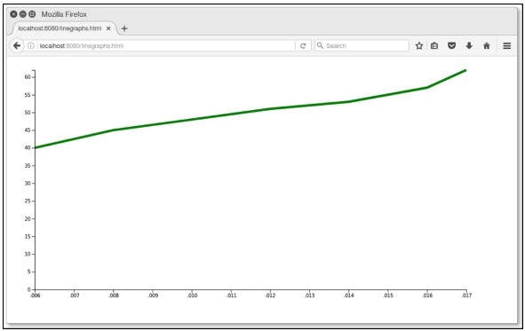
In this example graph, we can take csv file records as Indian States Population Growth form year 2006 to 2017. Let us first create a data.csv to show the population records.
Create a new csv file in your D3 folder −
year,population
2006,40
2008,45
2010,48
2012,51
2014,53
2016,57
2017,62
Now, save the file and perform the following steps to draw a line graph in D3. Let us go through each step in detail.
Step 1 − Adding styles − Let us add a style to the line class using the code given below.
.line {
   fill: none;
   stroke: green;
   stroke-width: 5px;
}
Step 2 − Define variables − The SVG attributes are defined below.
var margin = {top: 20, right: 20, bottom: 30, left: 50},
   width = 960 - margin.left - margin.right,
   height = 500 - margin.top - margin.bottom;
Here, the first line defines the four margins, which surround the block where the graph is positioned.
Step 3 − Define line − Draw a new line using the d3.line() function, which is shown below.
var valueline = d3.line()
   .x(function(d) { return x(d.year); })
   .y(function(d) { return y(d.population); });
Here, Year represents the data in the X-axis records and the population refers to the data in the Y-axis.
Step 4 − Append SVG attributes − Append SVG attributes and group elements using the code below.
var svg = d3.select("body").append("svg")
   .attr("width", width + margin.left + margin.right)
   .attr("height", height + margin.top + margin.bottom)
   .append("g").attr("transform",
      "translate(" + margin.left + "," + margin.top + ")");
Here, we have appended the group elements and applied the transformation.
Step 5 − Read data − Now, we can read data from our dataset data.csv.
d3.csv("data.csv", function(error, data) {
   if (error) throw error;
}
Here, the data.csv is not present, it throws an error.
Step 6 − Format data − Now, format the data using the code below.
data.forEach(function(d) {
   d.year = d.year;
   d.population = +d.population;
});
This above code ensures that all the values that are pulled out of the csv file are set and formatted correctly. Each row consists of two values − one value for ‘year’ and another value for ‘population’. The function is pulling out values of ‘year’ and ‘population’ one row at a time.
Step 7 − Set scale range − After data formatted, you can set the scale range for X and Y.
x.domain(d3.extent(data, function(d) { return d.year; }));
y.domain([0, d3.max(data, function(d) { return d.population; })]);
Step 8 − Append path − Append path and data as shown below.
svg.append("path").data([data])
   .attr("class", "line").attr("d", valueline);
Step 9 − Add X-axis − Now, you can add X-axis using the code below.
svg.append("g")
   .attr("transform", "translate(0," + height + ")")
   .call(d3.axisBottom(x));
Step 10 − Add Y-axis − We can add Y-axis to the group as shown below.
svg.append("g")
   .call(d3.axisLeft(y));
Step 11 − Working Example − The complete code is given in the following code block. Create a simple webpage linegraphs.html and add the following changes to it.
graph.html
<!DOCTYPE html>
<html>
   <head>
      <script type = "text/javascript" src = "https://d3js.org/d3.v4.min.js"></script>
      <style>
         .line {
            fill: none;
            stroke: green;
            stroke-width: 5px;
         }
      </style>
   </head>

   <body>
      <script>
         // set the dimensions and margins of the graph
         var margin = {top: 20, right: 20, bottom: 30, left: 50},
         width = 960 - margin.left - margin.right,
         height = 500 - margin.top - margin.bottom;

         // set the ranges
         var x = d3.scaleTime().range([0, width]);
         var y = d3.scaleLinear().range([height, 0]);

         // define the line
         var valueline = d3.line()
            .x(function(d) { return x(d.year); })
            .y(function(d) { return y(d.population); });

         // append the svg obgect to the body of the page
         // appends a 'group' element to 'svg'
         // moves the 'group' element to the top left margin
         var svg = d3.select("body").append("svg")
            .attr("width", width + margin.left + margin.right)
            .attr("height", height + margin.top + margin.bottom)
            .append("g").attr("transform",
               "translate(" + margin.left + "," + margin.top + ")");

         // Get the data
         d3.csv("data.csv", function(error, data) {
            if (error) throw error;
            // format the data
            data.forEach(function(d) {
               d.year = d.year;
               d.population = +d.population;
            });

            // Scale the range of the data
            x.domain(d3.extent(data, function(d) { return d.year; }));
            y.domain([0, d3.max(data, function(d) { return d.population; })]);

            // Add the valueline path.
            svg.append("path")
               .data([data])
               .attr("class", "line")
               .attr("d", valueline);

            // Add the X Axis
            svg.append("g")
               .attr("transform", "translate(0," + height + ")")
               .call(d3.axisBottom(x));

            // Add the Y Axis
            svg.append("g")
               .call(d3.axisLeft(y));
         });
      </script>
   </body>
</html>
Now request the browser and we will see the following result.