- iOS Development - Home
- iOS Development - Xcode IDE
- iOS Development - First Application
- Making the App Interactive
- iOS Development - Swift Playground
- Making Applications with Swift
- iOS Development - Advanced iOS
- iOS Development - Integrating Maps
- iOS Development - Auto Layouts
- iOS Development - Animations
- Accessing Web Services
- Concurrency Control
- Interview Questions
iOS Development with Swift 2 - Auto Layouts
When we make iOS applications and we add UI Elements in that application, they might seem perfect on one device. Nevertheless, now we should try the same application on some other device. We will certainly see drastic changes in the UI and some elements might not appear as well.
Auto layout is the technique that we will use to resolve this issue. In this chapter, we will understand how to make Auto Layout, Apply Constraints and Stack View to make your application look perfect and best on every Device.
We will start by making a new single view application.
Adding Elements
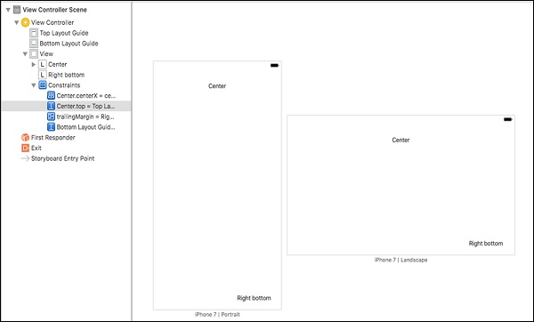
Add a label in the top center of the view and one in the bottom right of the view as shown below −
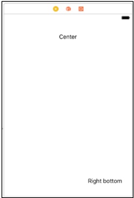
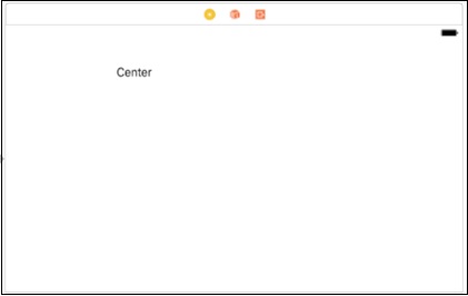
Now, try to change the orientation and we will see that the right bottom does not appear, while the Center is not in the center.
(Tip − You do not need to run the simulator to see layouts, just click on View as − iPhone x, in the bottom of the screen as shown in the following screenshot.)
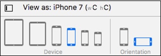
Select the iPhone version and the orientation. We will see that the UI elements are not arranged properly. Therefore, when we change our orientation, device, or both, the right bottom label will disappear and the center will not be in the center.
This happens because we have not specified the fixed position for elements. To solve this, we will use Constraints.
Applying Constraints to UI Elements
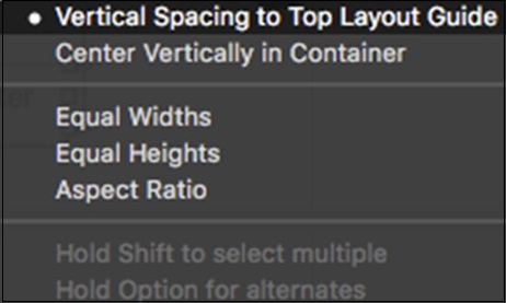
Click on the Center Label, press control and drag anywhere inside the view, release. Now you must be seeing −
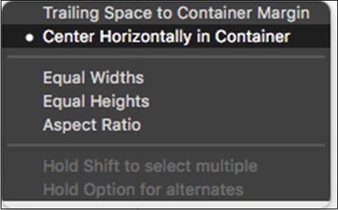
Select Center Horizontally in Container. Again, repeat the above step and choose, Vertical Spacing to Top Layout Guide.
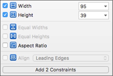
Now, click on Add new constraint button and select height and width, and click Add 2 Constraints.
Click on the Right bottom label, control drag from label to anywhere inside the view, and choose Trailing space to container Margin. Similarly choose, Vertical spacing to Bottom layout Guide.
(Tip − To select multiple options at once, press shift and choose the options. Ensure that you do not release shift until you have selected everything.)
After applying all the constraints, the view should look as follows −
Stack View
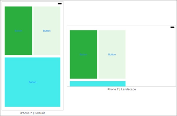
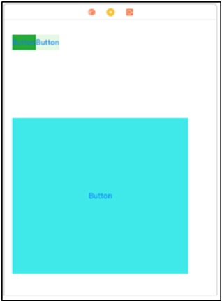
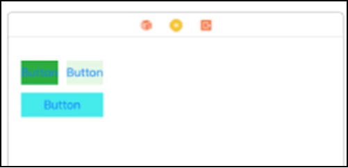
Stack view works by arranging elements in stacks. After arranging, we define the constraints only once, and all the elements are arranged accordingly. To start with stack view, create the following view, which will not look better in other devices. However, we will make it suitable for other devices in this section.
Now, select the top two buttons select one button, press command and then select the second one. To embed them in a stack view, go to editor → embed In → stack view.
OR
At the bottom right-hand corner, there is an option  Select this option and this will embed the views into the stack view.
Horizontal Stack View
The Horizontal Stack View would look as shown in the following screenshot.
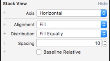
While this stack view is selected, go to attribute inspector. Change Distribution to Fill Equally and Spacing to 10.
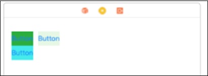
Now, select this stack view and the bottom button and again embed into the stack view. This time the stack view axis will be vertical, while in the previous stack view, it was horizontal.
Vertical Stack Views
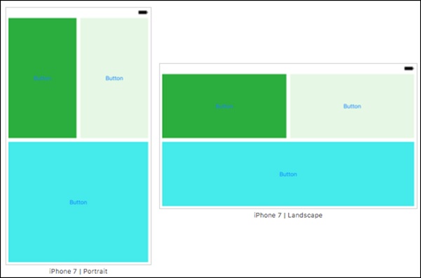
Now your view will look like −
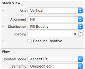
While this stack view is selected, go to its attribute inspector and make sure it matches the screenshot below.
Now, your view should look as follows −
The last step is to make constraints for this stack view.
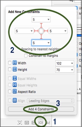
Select the stack view → Click on add new constraint button.

This will open a new window in which we have to follow the steps shown in the next screenshot.
Adding Constraints to Stack View
The following screenshot will describe how to add constraints to a stack view.
That is all we will do with auto layouts. In the next chapter, we will discuss about Animations.
That is all we will do with auto layouts. In the next chapter, we will discuss about Animations.
