
Article Categories
- All Categories
-
 Data Structure
-
 Networking
-
 RDBMS
RDBMS
-
 Operating System
-
 Java
Java
-
 MS Excel
-
 iOS
iOS
-
 HTML
HTML
-
 CSS
CSS
-
 Android
-
 Python
-
 C Programming
-
 C++
C++
-
 C#
C#
-
 MongoDB
-
 MySQL
MySQL
-
 Javascript
-
 PHP
PHP
-
 Economics & Finance
Selected Reading
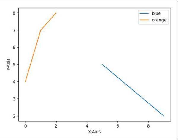
Show Matplotlib plots (and other GUI) in Ubuntu
Use the plot method of matplotlib and set the legend with different sets of colors.
Steps
Set the X-axis label using plt.xlabel() method.
Set the Y-axis label using plt.ylabel() method.
Plot the lines using plt.plot() method with [9, 5], [2, 5] and [4, 7, 8] array.
Initialize two variables; location = 0 for the best location and border_drawn_flag = True (True, if border to be drawn for legend. False, if border is not drawn).
Use plt.legend() method for the legend and set the location and border_drawn_flag accordingly to get the perfect legend in the diagram.
Show the figure using plt.show() method.
Example
import matplotlib.pyplot as plt

plt.ylabel("Y-axis ")
plt.xlabel("X-axis ")

plt.plot([9, 5], [2, 5], [4, 7, 8])

location = 0 # For the best location
legend_drawn_flag = True
plt.legend(["blue", "orange"], loc=0, frameon=legend_drawn_flag)

plt.show()
Output

Updated on: 2021-03-17T08:28:38+05:30
2K+ Views

Advertisements