- Home
- Background and Introduction
- Concepts
- Web Design and Parallax Scroll
- CSS Techniques
- JavaScript Techniques
- jQuery Techniques
- Bootstrap Techniques
- Conclusion
Background and Introduction
If you are browsing any modern day website on computers or mobile phones, you might have experienced that when you scroll down/up the website, it appears like the whole screen is moving in the direction of scroll. If this is the effect in the background, the information in the foreground too changes as you scroll. This effect can be briefly described as Parallax Scrolling.
Scrolling
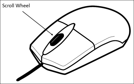
Let us understand what it means by scrolling. When you are viewing a web page, the action for browsing the web page in any direction (up, down, left and right), is known as Scrolling.
Usually, if you are a desktop computer user, this action is done by using the scroll wheel on the mouse.
History
Let us look at the word Scroll. In olden days, to send a message to other people who are located at a great distance, handwritten scrolls were used. These scrolls looked like as shown below −

Imagine the action of the person who is holding the scroll. To read the content in full, the person would have to scroll and roll it further. The use of these scrolls was also for maintaining a record text or decisions. As the time went by, the use of scroll increased as it was prepared from different writing materials such as papyrus, parchment and paper.
As the computers evolved, processing and storing very large documents, tables and images became possible. Sometimes the data was so much so that the screen size was just not sufficient to present the data to the user. When the data to be displayed was larger than the size of window or display area, the data would remain hidden. This necessitated for an approach of expanding the screen area.
Some options to achieve expansion of screen are listed below −
- To increase the screen size
- To reduce the data size
- To use scrolling
This scrolling mechanism is more important for people working with graphics design and photo editing.
Parallax Scrolling Origin
Let us look into the history of parallax scrolling. First, we will understand what the word parallax means. The word parallax comes from Greek word (parallaxis), which means alternation.
If we are viewing an object from an angle, the object will appear in a specific manner. But if youre moving the same object from different positions, there will be an apparent movement of objects. This phenomenon is referred to as Parallax.
Parallax Scrolling in Web Design - Concepts
Now that we have understood the origin and background of Parallax, let us understand the history and the concept of Parallax scrolling in web design.
Definition
According to Wikipedia Parallax scrolling is a technique in computer graphics where background images move past the camera more slowly than foreground images, creating an illusion of depth in a 2D scene and adding to the sense of immersion in the virtual experience.
Parallax scrolling was employed in the early days of animation. Many of the animation studios (like Disney) used multiplane cameras to achieve the parallax effect.
As the computer graphics technologies evolved along with the cutting edge frameworks like JavaScript, web designers and developers can now build sites with a rich experience. Although parallax scrolling started with a couple of layers, it was taken to the next level with scroll bars in computers. The technique remained the same, but due to its application for Scrolling, a unique experience was created.
Examples
The parallax scrolling is extensively used in modern web sites. As parallax scrolling can be implemented for mobiles as well as desktop sites in one go, the popularity of such sites has skyrocketed in the recent years.
Some examples of websites that employ parallax scrolling are given below −
Bear Grylls

As the animation proceeds, you will be able to see how the website content is going interactive. As you scroll ahead, more and more information will reveal.
Make Your Money Matter

To introduce the reader to the benefits of a credit union, this site takes you through a storyline. As you scroll ahead, information is revealed in a unique way.
InfoQuest Infographic
The journey of an employee to find critical information at his workplace is depicted using the scrolling experience.
GitHub 404
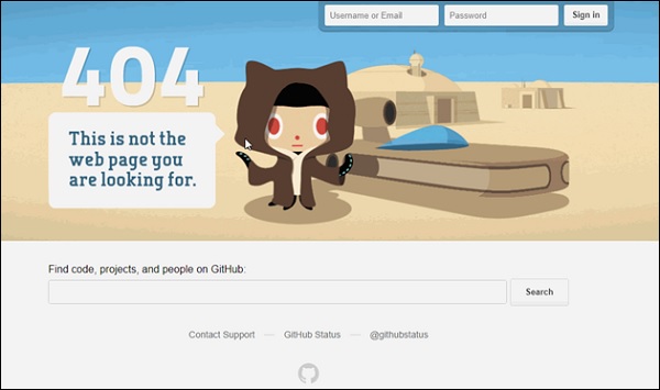
This is a bit different from the usual parallax experience, the object at the top of screen moves as you hover the mouse pointer over it.
Applications of Parallax Scrolling
By now, it should be clear from the definition and the background that parallax scrolling is useful in wide variety of digital media. Some of the applications are parallax scrolling are below −
Game Design
Parallax scrolling is widely used in game design. The character needs to move relative to the background and with the players control using mouse and keyboard, the whole experience needs to change. Game design is very primitive yet trendy way of using parallax scrolling.
Websites
To make the user gripped to the website, some dynamic and different experience is important. As you might have noticed from the examples of websites discussed above, parallax scrolling adds to the content because of its representation in an interactive manner.
Web Design and Parallax Scroll
This chapter talks about concepts of web design and advantages of using parallax scroll in web design.
Web Design Background
Since the beginning of 20th century, paper media has got into a cut-throat competition due to digital media. The digital media includes what we see on internet and hence the allied magazines that come along.
The newsletters that you get as a part of weekly/monthly subscriptions are also included in the digital media. Primarily, digital media heavily depends on mobile and desktop devices. It makes a difference when you can see content on your mobile (handheld) as well as desktop devices. The way content is displayed on either of devices, a specific style of designing the content is at play.
This style of designing is referred as Web Designing. From a designing or coding standpoint, when a web page designer sets out to build a webpage, he/she takes the mobile devices in consideration as well.
According to Wikipedia, Web designencompasses many different skills and disciplines in the production and maintenance of websites. One of such skills is designing an impactful experience for users. Web design caters for this experience and provides an organized way for arranging the page contents and provides different styling to them.
Web design includes − interface design, graphic design and using certain standards to write the code. This work can be performed by a single person or by a team of people.
There are many tools available in market to make this work easy, however, it is up to ones creative skills to create the appearance of web page.
Modern Day Web Design
With the technology evolution, there is an explosion of knowledge. Internet has become a thing and it has skyrocketed the quality of our lives. At any given point, more and more information is being processed by an average internet user. This information can be in the form of a website on a desktop computer or from a handheld device; tablet or a mobile phone.
Though so much information tries to attract the users attention, it is obvious that as a person designing a web experience, there are only 3 seconds allocated to pass the message across.
How does one deal with this? It is more than important to pass the message, because it is at the source for any web design. You want to build a website that communicates, at the same time it has to attract and make the user stick to the content. It is a difficult task indeed.
Considering the vast scope of work for any given web content, more and more people are getting into the world of Web Design. A creative web designer is the talk of the town thanks to his/her amazing talent of creating a good user experience. The web designer may currently take up a job at a marketing/advertising company or start on his/her own to dive into the web designing.
Aesthetic appeal is the key for a given content on web. This means a web designer must be aware of the principles and foundation of design, color, spacing, etc. More and more users get to see great quality web content every day. It is obvious that one will compare the current webpage or website with the one that was visited few hours or few minutes back. The ordering of the content, coupled with good graphics and colors has made many standalone banners/pages a popular thing on the internet.
Example
Let us take the case of a simple graphic. There are many graphics on the internet, called memes. They are simple Graphics Interchange Format (GIF) images with some text embedded inside the graphics. These memes are making rounds of internet based on a recent event in some part of the world. If we look at this example, the only appeal they have is graphic and some relevant or irrelevant text.
Still, it has gained so much of popularity which makes one think about amazing possibilities on the Internet.
Thus, for a web design to be effective, both the creativity and method to communicate the message play important roles.
It is important point to note that a successful web page is combination of Web Design and Web Development. As per current market trend, along with web designer, a web developer is a must have in the team. A web designer will always look for inspiration and use his/her creativity to create graphics and relevant color schemes. Whereas a web developer will use his/her coding skills to bring the graphics and color schemes live on the website.
A web designer should have a knowledge of writing the code as well, to make the intended graphic or color scheme usable for a web developer. A simple code in a simple application like Notepad can help a web designer to take the driving seat in the web development.
Using Parallax Scrolling
Parallax Scrolling falls into the work boundary of both web designer and web developer. A web designer might create the effect of Parallax Scrolling using the tools such as InVision, UXPin to convey the web developer the intended behavior on scroll. Further, a web developer will take it on his/her skills to create the parallax scrolling effect. This can be done by different JavaScript, CSS and jQuery techniques. A detailed description of each of these methods is provided in next chapters.
As per the definition specified in the previous section, parallax scrolling is a technique when the background content is moved at a different speed than the foreground content when scrolling.
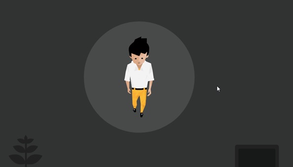
A simple CSS technique to create parallax scrolling effect is shown on this website The Urban Walks.

As you can see in the screenshot above, the mobile phone at the center of the screen will change the content after you scroll twice. Also, observe on the first scroll, the background with the mobile phone will change.
This transition is giving you a feeling that the phone is constant in its place and the background is getting changed as you scroll down. This effect is called parallax scrolling effect. You know that you are scrolling it down as there is an indicator of the screens towards the very right of the screen in the form of some dots.

The first use of parallax scrolling was in the old computer games. Where a fixed background image would move at a slower speed as the character moved faster than the background. Some examples of these games Disneys Aladdin and Disneys Lion King. These games were launched back in 1993 and 1994 respectively.
While it is true that it started with the games, but currently, many web designers are emphasizing on the effect to have their audience love their site. The advantages of parallax scrolling are extended from website to mobile sites.
These websites, once designed with parallax scrolling for the desktop versions, are added with code that supports mobile screens as well.
Advantages of Parallax Scrolling in Web and Mobile
In this section, we will discuss the advantages of using parallax scrolling from various perspectives as discussed below −
From Audience Perspective
There is a fun element associated with the parallax scrolling. As you have seen in the above example, conveying the information of thousand words has become easier as the user scrolls from different screens.
If we consider a first time user, there is a curiosity associated with each scroll. Hence, it not only enriches the experience of the website but also increases the probability of the user spending more time in the first visit to the website itself.
The proportion of user engagement dramatically increases as the user is intrigued in the scrolling.
The user does not have to get into the thought of process of figuring out the information, as it is available in a more obvious manner.
In some cases, you can put a story about the product/service you are offering by animating other items on the screen, such as the logo or the menu icon.
From Technical Perspective
Once you implement parallax scrolling for a desktop version, very easily the same framework can be used for the mobile website or screens.
As the code snippet is simple and reusable, if you are a marketing agency or website service provider company, this becomes effortless when gathering new clients.
Knowledge of parallax scrolling comes with more expertise in frontend frameworks such as CSS, JavaScript, etc.
CSS Techniques
For a web developer, when it comes to creating a parallax scrolling effect, various techniques are available. One of such techniques is using Cascaded Styling Sheets(CSS).
CSS explains how the HTML elements are displayed on the screen. One can create a CSS file and it can be used for the complete website. It is simpler to add CSS file than adding styles to each HTML element and manage them in different parts of the web page.
Note − Some of the methods discussed below in this chapter are specific to desktop computers and not for mobile devices. It will be mentioned in the steps when a particular technique is not suitable for mobile devices.
Considering CSS offloads into all the extra drawing into the document object model (DOM), there is a greater utilization of hardware acceleration and a smooth effect without burdening the CPU.
Absolute Position Method
This method is frequently used to create a parallax effect, as this is relatively light in weight compared to other options available. The position of the background image is kept fixed as relative to other content on the screen. In the example discussed below, you will see how to do it using the magic of CSS.
In this section, we will go through two methods for Absolute Position Method −
- Single Background
- Multiple Background
Single Background Method
In this method, we will create two files in the same folder. Observe the steps given below for the same purpose −
Step 1
We have to create two files in the same folder: first file with HTML markup and the second with CSS code.
Step 2
Now, let us define our HTML markup. Observe the code given below −
<html>
   <head>
      <link rel = "stylesheet" href = "styles.css">
   </head>
   <body>
      <div class = "BgContainer">
         <div class = "Parallax">
            <h1> Welcome! </h1>
         </div>
         <div class = "FgContainer">
            <div class = "MainContent">
               <p>
                  Here we will go ahead with some content which will really vary
                  according to the content on your site. I am just typing out this
                  content as it is sometimes good to engage user than the usual lorem
                  ipsum text!
                  <br/>
                  <br/>

                  Lorem ipsum dolor sit amet, consectetur adipiscing elit, sed do
                  eiusmod tempor incididunt ut labore et dolore magna aliqua. Ut enim
                  ad minim veniam, quis nostrud exercitation ullamco laboris nisi ut
                  aliquip ex ea commodo consequat. Duis aute irure dolor in
                  reprehenderit in voluptate velit esse cillum dolore eu fugiat nulla
                  pariatur. Excepteur sint occaecat cupidatat non proident, sunt in
                  culpa qui officia deserunt mollit anim id est laborum.
                  <br/>
                  <br/>

                  Lorem ipsum dolor sit amet, consectetur adipiscing elit, sed do
                  eiusmod tempor incididunt ut labore et dolore magna aliqua. Ut enim
                  ad minim veniam, quis nostrud exercitation ullamco laboris nisi ut
                  aliquip ex ea commodo consequat. Duis aute irure dolor in
                  reprehenderit in voluptate velit esse cillum dolore eu fugiat nulla
                  pariatur. Excepteur sint occaecat cupidatat non proident, sunt in
                  culpa qui officia deserunt mollit anim id est laborum.
               </p>
            </div>
         </div>
      </div>
   </body>

</html>
Step 3
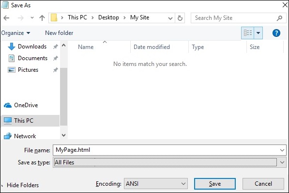
Open notepad. Copy and paste the above code snippet.
When you are saving the file, under Save as type, select All Files. Enter a name to your file as required, but it needs to be followed by an extension − .html as shown in the screenshot below.
Step 4
Once the file is saved, create another file in notepad and paste the code given below −
html, body {
   font-size: 18px;
   line-height: 28px;
}

h1 {
   letter-spacing: -15px;
   color: white;
   text-align: center;
   font-size: 200px;
   font-weight: 800;
   line-height: 200px;
}

BgContainer {
   perspective: 1px;
   transform-style: preserve-3d;
   height: 100vh;
   overflow-x: hidden;
   overflow-y: scroll;
}

FgContainer {
   position: relative;
   display: block;
   background-color: white;
   z-index: 1;
}

MainContent {
   max-width: 750px;
   margin: 0 auto;
   padding: 75px 0;
}

p {
   margin: 75px 0;
}

.Parallax {
   display: flex;
   flex: 1 0 auto;
   position: relative;
   z-index: -1;
   height: 100vh;
   justify-content: center;
   align-items: center;
   transform: translateZ(-1px) scale(2);
   background: url(https://cdn.pixabay.com/photo/2017/02/07/09/02/background-2045380_640.jpg);
   background-color: rgb(250,228, 216);
}
As you have seen in the last step, when you are saving the file, under Save as type, select All Files. Enter a name to your file as required and add an extension .css to it.
Analysis of Code
Let us understand which part of the code is responsible for the parallax effect. Most important work for parallax is done by using perspective and transform rules. Refer to line 15 in the above code snippet. The perspective is created for our BgContainer first. This initiates a platform for transform rule.
In the Parallax container starting on line 40, transform rule on line 48 pushes the BgContainer div into background using translate(-1px).
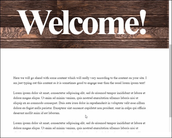
You can modify the values for translate and scale parameters to modify the depth of the parallax.
When you open the html file, the parallax effect will be visible as shown below −
Note − For the rest of the tutorial, it will be assumed that the reader is able to create the HTML and CSS files as per the folder structure provided in above method.
Multiple Background Method
In this method, we will have different images coming across as the user scrolls down the page. There is an image with pencils, which is used in different color combinations to illustrate this effect.
Observe the following code for HTML page as shown below −
<html>
   <head>
      <link rel = "stylesheet" href = "styles.css">
   </head>

   <body>
      <h1>Multiple Background Example</h1>
      <div class = "parallax">
         <div class = "bg__First">First</div>
         <div class = "bg__Second">Second</div>
         <div class = "bg__Third">Third</div>
         <div class = "bg__Fourth">Fourth</div>
      </div>
   </body>

</html>
Similar to the previous example, we will use styles.css stored on the same location as this HTML file. We have three different div named as First, Second, Third and Fourth.
The CSS code for the parallax scrolling is given below −
body, html {
   height : 100%;
   font-family : sans-serif;
}

.parallax [class*="bg__"] {
   position : relative;
   height : 50vh;
   text-indent : -9999px;
   background-attachment : fixed;
   background-position   : top center;
   background-size       : cover;
}
.parallax [class*="bg__"]:nth-child( 2n) {
   box-shadow : inset 0 0 1em #111;
}
.parallax .bg__First, .bg__Fourth {
   height : 100vh;
}
.parallax .bg__First {
   background-image : url("parallax0.png");
}
.parallax .bg__Second {
   background-image : url("parallax1.png");
}
.parallax .bg__Third {
   background-image : url("parallax2.png");
}
.parallax .bg__Fourth {
   background-image : url("parallax1.png");
}
Here, we create the parallax effect from line 7, important property here is background-attachment:fixed.
Using this property, the first image with coloured pencils will remain at the top always. As you scroll down, different images as described from line 28 will start showing up.
As a result, you will be able to see parallax effect as shown in gif below. The following image is the screenshot of the example that we considered for multiple background.

Pure CSS Parallax
Let us combine the knowledge from previous two methods and create an advanced Pure CSS Parallax effect.
The difference will be the way we arrange the image element and the z-transform property. The explanation of the property will be provided after the CSS code.
Create the HTML file with the following code using the usual method from Notepad.
<html>
   <head>
      <link rel = "stylesheet" href = "styles.css">
   </head>

   <body>
      <div class = "wrapParallax">
         <div class = "parallax_one">
            <img src = "https://cdn.pixabay.com/photo/2018/06/16/15/36/water-lily-3478924_640.jpg" alt = "">
         </div>
         <div class = "parallax_two">
            <h1>Pure CSS Parllax Advanced Level</h1>
         </div>
         <div class = "parallax_three">
            <img src = "https://cdn.pixabay.com/photo/2016/11/29/04/19/beach-1867285_640.jpg" alt = "">
         </div>
      </div>
   </body>

</html>
For the CSS file, the code is given below −
body, html {
   padding: 0;
   margin: 0;
}

h1 {
   color: blue;
   text-align: center;
   padding: 20px;
   text-shadow: 0px 0px 10px #fffff;
}

img {
   width:100vw;
   height:100vh;
}

.wrapParallax {
   perspective: 100px;
   height: 100vh;
   overflow-x: hidden;
   overflow-y: auto;
}

.parallax {
   position: absolute;
   top: 0;
   bottom: 0;
   right: 0;
   left: 0;
}

.parallax_one {
   transform: translateZ(-100px) scale(2)
}

.parallax_two {
   z-index: 10;
   transform: translateZ(-200px) scale(3)
}

.parallax_three {
   margin-top: 100vh;
}
Analysis of Code
We have fixed the position of first layer in line 26 by using position:absolute property. The positions are also hard-coded to 0.
In parallax_two, which is the layer with heading, we have applied z-index: 10 to provide a floating effect to the heading. The layer parallax_three is moved to the bottom by providing a margin-top property.
Thus, we can raise the level of complexity in our Parallax effect.
Observe the effect as shown in below figure.

JavaScript Techniques
To create Parallax effect, the most popular method is using JavaScript. From this chapter onwards we will discuss the concepts of JavaScript and some of the libraries used to achieve Parallax scrolling.
Utilizing pure JavaScript makes sense to keep the website performance optimal. There are many other advantages of using libraries from an aspect of performance. However, to understand the code organization better, we will start with pure JavaScript parallax implementation. Fun fact, sometimes pure JavaScript is also called vanilla JavaScript.
Parallax Scrolling using Pure JavaScript
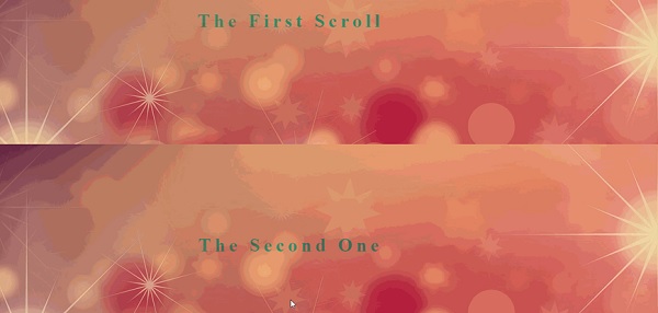
First, create main HTML file with code shown below. The HTML page will just consist of four heading text.
<html>
   <head>
      <link rel = "stylesheet" href = "styles.css">
      <script src = "myscripts.js"></script>
   </head>

   <body>
      <section class = "parallax">
         <h1>The First Scroll</h1>
      </section>

      <section class = "parallax">
         <h1>The Second One</h1>
      </section>

      <section class = "parallax">
         <h1>GoingOn !!</h1>
      </section>

      <section class = "parallax">
         <h1>And we've reached the bottom!!</h1>
      </section>
   </body>

</html>
Observe that in line number 4, for this example, we are using myscripts.js file which will be stored in the same folder as the HTML file and CSS file.
Now, let us prepare our CSS file as shown below.
header {
   height: 4em;
   background: #845;
}

.parallax {
   background-repeat: no-repeat;
   background-size: cover;
}

.parallax h1 {
   text-align: center;
   margin: 0;
   font-size: 2.5em;
   letter-spacing: .2em;
   color: red;
   padding: 10rem 0;
   mix-blend-mode: exclusion;
}

.parallax:nth-of-type(1) {
   background: url(https://pixabay.com/get/ea35b10621f0083ed1534705fb0938c9bd22ffd41cb2114296f0c679a4/background-3009949_1920.jpg);
}

.parallax:nth-of-type(1) h1 {
   padding: 15rem 0;
}

.parallax:nth-of-type(2) {
   background: url(https://pixabay.com/get/ea35b10621f0083ed1534705fb0938c9bd22ffd41cb2114296f0c679a4/background-3009949_1920.jpg);
}

.parallax:nth-of-type(2) h1 {
   padding: 12rem 0;
}

.parallax:nth-of-type(3) {
   background: url(https://pixabay.com/get/ea35b10621f0083ed1534705fb0938c9bd22ffd41cb2114296f0c679a4/background-3009949_1920.jpg);
}

.parallax:nth-of-type(4) {
   background: url(https://pixabay.com/get/ea35b10621f0083ed1534705fb0938c9bd22ffd41cb2114296f0c679a4/background-3009949_1920.jpg);
}
Now comes the JavaScript part, create a file in notepad and save it as myscripts.js.
function $$(selector, context) {
   context = context || document;
   var elements = context.querySelectorAll(selector);
   return Array.prototype.slice.call(elements);
}
window.addEventListener("scroll", function() {
   var scrolledHeight= window.pageYOffset;

   $$(".parallax").forEach(function(el,index,array) {
      var limit = el.offsetTop+ el.offsetHeight;

      if(scrolledHeight > el.offsetTop && scrolledHeight &l;= limit) {
         el.style.backgroundPositionY=  (scrolledHeight - el.offsetTop) /1.5+ "px";
      } else {
         el.style.backgroundPositionY=  "0";
      }
   });
});
Analysis of Code
Let us analyze the JavaScript code.
Code from line number 1 to 4 represents the helper function.
In line 6, we select our parallax element and add scroll event to the window. To determine how much area is scrolled, we are using scrolledHeight property. As the screen scrolls down, backgroundPositionY is updated for the parallax element.
To slow down the parallax effect, we divided by 1.5, this number can be changed to any number you want.
Now, you will be able to see the page scrolling down as provided in below screenshot.
Using ScrollMagic JavaScript Library
As discussed in the previous section, while we can use pure JavaScript to create parallax effect, there are some powerful JavaScript libraries which will enhance the user experience. ScrollMagic is one such library for creating parallax scroll interactions.
Let us discuss more about this with the help of an example as given below −
Note − In this example, to keep it simple, we will have the CSS stored in HTML file. Also, the JavaScript code will be present in the same document. In a nutshell, we will create only one HTML file and it will have ScrollMagic libraries referenced along with the required CSS.
<html>
   <head>
      <script src = "https://cdnjs.cloudflare.com/ajax/libs/gsap/2.0.1/TweenMax.min.js"></script>
      <script src = "http://cdnjs.cloudflare.com/ajax/libs/ScrollMagic/2.0.5/ScrollMagic.js"></script>
      <script src = "http://cdnjs.cloudflare.com/ajax/libs/ScrollMagic/2.0.5/plugins/animation.gsap.js"></script>
      <script src = "http://cdnjs.cloudflare.com/ajax/libs/ScrollMagic/2.0.5/plugins/debug.addIndicators.js"></script>
   </head>

   <body>
      <style type = "text/css">
         .parallaxParent {
            height: 100vh;
            overflow: hidden;
         }
         .parallaxParent > * {
            height: 200%;
            position: relative;
            top: -100%;
         }
      </style>
      <div class = "spacing0"></div>

      <div id = "parallax1" class = "parallaxParent">
         <div style = "background-image: url(https://cdn.pixabay.com/photo/2015/05/16/19/13/stones-770264_640.jpg);"></div>
      </div>

      <div class = "spacing1">
         <div style = "background-color:cyan">
         <p>These are bricks</p>
         </div>
      </div>

      <div class = "spacing0"></div>
      <div id="parallax2" class = "parallaxParent">
         <div style = "background-image: url(https://cdn.pixabay.com/photo/2015/05/16/19/13/stones-770264_640.jpg);"></div>
      </div>

      <div class = "spacing1">
         <div style = "background-color:yellow">
            <p>Some More Bricks</p>
         </div>
      </div>

      <div class = "spacing0"></div>
      <div id = "parallax3" class = "parallaxParent">
         <div style = "background-image: url(https://cdn.pixabay.com/photo/2015/05/16/19/13/stones-770264_640.jpg);"></div>
      </div>
      <div class = "spacing2"></div>

      <script>
         // init controller
         var controller = new ScrollMagic.Controller({
            globalSceneOptions: {triggerHook: "onEnter", duration: "200%"}});

         // build scenes
         new ScrollMagic.Scene({triggerElement: "#parallax1"})
            .setTween("#parallax1 > div", {y: "80%", ease: Linear.easeNone})
            .addIndicators()
            .addTo(controller);

         new ScrollMagic.Scene({triggerElement: "#parallax2"})
            .setTween("#parallax2 > div", {y: "80%", ease: Linear.easeNone})
            .addIndicators()
            .addTo(controller);

         new ScrollMagic.Scene({triggerElement: "#parallax3"})
            .setTween("#parallax3 > div", {y: "80%", ease: Linear.easeNone})
            .addIndicators()
            .addTo(controller);
      </script>
   </body>

</html>
As shown in the above code, we have required JavaScript libraries references from line 3 to 6. The CSS code is specified from line 9 to 19.
Content Delivery Network
Script references from line 3 to 6 point to ScrollMagic Content Delivery Network (CDN) URLs. Using a CDN makes sense in modern website development, as you get to load the required libraries without slowing down your website.
If there are customizations required in the libraries, one would have to host the libraries on their respective server to utilize these effects. If you are using basic functionalities from a library, it is efficient to use the CDN URL.
The HTML code above shows an image separated by 2 divisions. First division appears with a heading These are bricks and second division appears with Some More Bricks.
Notice that in the CSS code from line 9 to 19, we are only specifying the position and style for the respective parallax div.
The work of creating this soft parallax scene is done by ScrollMagic library. If you refer to script code from line 43 to 62, ScrollMagic controller is invoked and a scene is created.
The scenes guide the DOM to create parallax effect when 80% of the screen is occupied. JavaScript is used to understand the scroll trigger. As a result, what you get is a floating experience on this page.
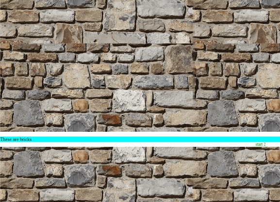
Note − Considering above image as a GIF image, you will not get to observe the smooth effect of the text divisions.
Trigger Animations
The possibilities of creating varied user experience are endless with ScrollMagic Library. Observe the code snippets given below to trigger animations on scroll.
Note that for this you need two files *minus; one HTML file and one CSS file.
Create HTML file with the code shown below −
<html>
   <head>
      <link rel = "stylesheet" href = "style.css">

      <script src = "https://cdnjs.cloudflare.com/ajax/libs/gsap/2.0.1/TweenMax.min.js"></script>
      <script src = "http://cdnjs.cloudflare.com/ajax/libs/ScrollMagic/2.0.5/ScrollMagic.js"></script>
      <script src = "http://cdnjs.cloudflare.com/ajax/libs/ScrollMagic/2.0.5/plugins/animation.gsap.js"></script>
      <script src = "http://cdnjs.cloudflare.com/ajax/libs/ScrollMagic/2.0.5/plugins/debug.addIndicators.js"></script>
   </head>

   <body>
      <div class = "spacing0"></div>
      <div id = "parallax1" class = "parallaxParent">
         <div style = "background-image: url(https://cdn.pixabay.com/photo/2015/05/16/19/13/stones-770264_640.jpg);"></div>
      </div>

      <div style = "height:450px;"></div>
      <div id = "square" class = "square">This is it!</div>
      <div style = "height:450px;"></div>

      <script>
         var controller = new ScrollMagic.Controller();
         var scene = new ScrollMagic.Scene({triggerElement: "#parallax1"})
            .setTween("#parallax1 > div", {y: "40%", ease: Linear.easeNone})
            .addTo(controller);

         var scene = new ScrollMagic.Scene({triggerElement: '.square'})
            .setClassToggle('.square', 'show')
            .addTo(controller);
      </script>
   </body>

</html>
Now, create a CSS file with the following code in it.
.square {
   background: aqua;
   margin: 0 auto;
   display: block;
   padding: 40px 0;
   text-align: center;
   color: #000;
   font-size: 40px;
   font-weight: bold;
   opacity: 0;
   transition: .3s;
   width: 0%;
}
.square.show{
   opacity: 1;
   width: 100%;
}
.parallaxParent {
   height: 100vh;
   overflow: hidden;
}
.parallaxParent > * {
   height: 200%;
   position: relative;
   top: -100%;
}
Analysis of Code
Referring to HTML code, the ScrollMagic code starts from line 17 and continues till line 25. In this section, we are creating two ScrollMagic scenes. First scene is for the brick image and the other is for the banner animation.
As specified in setTween function on line 20, when the scroll action happens at 40% of screen size, the next scene starts which shows up the banner This is it!
The opacity of the div with id - square is controlled in the CSS file on line 10 and line 15.
As a result, you will get to see below animation on the page.

Horizontal Scrolling
We can also apply parallax scrolling and achieve a horizontal scroll. The library ScrollMagic can be used to create a horizontal effect of scrolling. See the code below.
Although the code is straight forward to create horizontal scrolling effect, we will need jquery reference for achieving the horizontal movement of screens. Details of jQuery are provided in next chapter, for now, just follow the code as given below.
We will create three separate files HTML file for the main code, CSS file for styles and JS file for ScrollMagic function calls.
Here is the code for HTML document.
<html>
   <head>
      <link rel = "stylesheet" href = "style.css">
   </head>

   <script src = 'http://cdnjs.cloudflare.com/ajax/libs/jquery/2.1.3/jquery.min.js'></script>
   <script src = 'http://cdnjs.cloudflare.com/ajax/libs/gsap/1.18.0/TweenMax.min.js'></script>
   <script src = 'https://cdnjs.cloudflare.com/ajax/libs/ScrollMagic/2.0.2/ScrollMagic.min.js'></script>
   <script src = 'https://cdnjs.cloudflare.com/ajax/libs/ScrollMagic/2.0.2/plugins/animation.gsap.js'></script>
   <script src = 'https://cdnjs.cloudflare.com/ajax/libs/ScrollMagic/2.0.2/plugins/debug.addIndicators.min.js'></script>
   <script src = "animation.js"></script>

   <body>
      <div class = "wrapper" id = "js-wrapper">
         <div class = "sections" id = "js-slideContainer">
            <section class = "section">
               <span class = "section__title" id = "title1">Scroll Once</span>
               <span id = "trigger--title1"></span>
            </section>

            <section class = "section">
               <span class = "section__title" id = "title2">Do It Again</span>
               <span id = "trigger--title2"></span>
            </section>

            <section class = "section">
            <span class = "section__title" id = "title3">Thank You!</span>
            <span id = "trigger--title3"></span>
         </div>
      </div>
   </body>

</html>
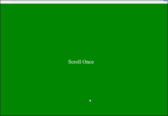
Observe that we have three sections, which will appear after scrolling. The three sections are denoted by ids title1, title2 and title3 on lines 15,19 and 23 respectively.
The code for CSS document is given below −
body {
   font-family: serif;
}

body, html {
   height: 100%;
}

.wrapper {
   width: 100%;
   height: 100%;
   overflow: hidden;
}

.section {
   height: 100%;
   width: calc( 100% / 5 );
   float: left;
   position: relative;
}

.section:nth-child(1) {
   background: green;
}

.section:nth-child(2) {
   background: orange;
}

.section:nth-child(3) {
   background: red;
}

.sections {
   width: 500%;
   height: 100%;
}

.section__title {
   position: absolute;
   top: 50%;
   left: 50%;
   font-size: 30px;
   color: #fff;
}
Analysis of Code
The background colors for the three screens (or sections) are provided on lines 10, 22 and 25.
We are calculating the relative width of each screen in the code beginning on line 13.
The JavaScript code for the ScrollMagic is given below −
$(function () {
   var controller = new ScrollMagic.Controller();
   var horizontalSlide = new TimelineMax()
      .to("#js-slideContainer", 1,   {x: "-20%"})
      .to("#js-slideContainer", 1,   {x: "-40%"})

   new ScrollMagic.Scene({
      triggerElement: "#js-wrapper",
      triggerHook: "onLeave",
      duration: "400%"
   })
   .setPin("#js-wrapper")
   .setTween(horizontalSlide)
   .addTo(controller);
});
Notice the triggerHook property on line 8. This property is responsible for providing the scroll effect as the user reaches the completion of scroll event. The function TimelineMax is responsible for providing the horizontal scroll effect to our screens.
Once created the respective files, you will be able to see the horizontal scroll animation as shown below.
jQuery Techniques
In the previous chapters, we have understood how using JavaScript libraries adds good effects to websites. JavaScript, when coupled with jQuery, provides phenomenal flexibility and ease to add parallax scrolling to your websites.
In this chapter, we are going to look at three jQuery plugins to add the parallax scrolling effect. Just like how we referenced in the previous chapter for JavaScript, we are going to use jQuery references in our HTML code to create powerful jQuery parallax scrolling.
An important point to note about jQuery plugins is that often the plugins are not updated, hence you would want to do some research before you start using any plugin for parallax scrolling.
Simple Parallax Scrolling using Parallax.js
Using Parallax.js jQuery plugin, we can create parallax scrolling effect without much hassles. Considering jQuery plugin requires a high-end inclusion of libraries such as bootstrap. Note that in this chapter will have HTML5 tags in the code.
Let us look at the HTML file shown below −
<!DOCTYPE html>
<html lang = "en">
<head>
<title>Parallax.js | Simple Parallax Scrolling Effect with jQuery</title>
<meta charset = "utf-8">
<meta http-equiv = "X-UA-Compatible" content = "IE = edge">
<meta name = "viewport" content = "width = device-width, initial-scale = 1">
<link href = "css/bootstrap.min.css" rel = "stylesheet">
<link href = "css/style.css" rel = "stylesheet">
<script src = "https://code.jquery.com/jquery-1.12.4.min.js"></script>
<script src = "https://cdn.jsdelivr.net/parallax.js/1.4.2/parallax.min.js"></script>
</head>
<body>
<section>
<div class = "container">
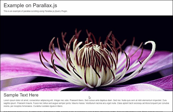
<h1>Example on Parallax.js</h1>
<p data-pg-collapsed>
This is an example of parallax scrolling using Parallax.js jQuery Plugin.
</p>
<br/>
</div>
</section>
<div class = "parallax-container" data-parallax = "scroll"
data-position = "top" data-bleed = "10"
data-image-src = "https://pixabay.com/get/ea31b90a2af5093ed1534705fb0938c9bd22ffd41cb2114595f9c67dae/clematis-3485218_1920.jpg"
data-natural-width = "1600" data-natural-height = "800" >
</div>
<section>
<div class = "container">
<h2 id = "sampleLorem">Sample Text Here</h2>
<p>
Lorem ipsum dolor sit amet, consectetur adipiscing elit. Integer nec
odio. Praesent libero. Sed cursus ante dapibus diam. Sed nisi. Nulla
quis sem at nibh elementum imperdiet. Duis sagittis ipsum. Praesent
mauris. Fusce nec tellus sed augue semper porta. Mauris massa.
Vestibulum lacinia arcu eget nulla. Class aptent taciti sociosqu ad
litora torquent per conubia nostra, per inceptos himenaeos. Curabitur sodales ligula in libero.
<br/>
<br/>
Sed dignissim lacinia nunc. Curabitur tortor. Pellentesque nibh. Aenean
quam. In scelerisque sem at dolor. Maecenas mattis. Sed convallis
tristique sem. Proin ut ligula vel nunc egestas porttitor. Morbi lectus
risus, iaculis vel, suscipit quis, luctus non, massa. Fusce ac turpis
quis ligula lacinia aliquet. Mauris ipsum.
<br/>
<br/>
Nulla metus metus, ullamcorper vel, tincidunt sed, euismod in, nibh.
Quisque volutpat condimentum velit. Class aptent taciti sociosqu ad
litora torquent per conubia nostra, per inceptos himenaeos. Nam nec
ante. Sed lacinia, urna non tincidunt mattis, tortor neque adipiscing
diam, a cursus ipsum ante quis turpis. Nulla facilisi. Ut fringilla.
Suspendisse potenti. Nunc feugiat mi a tellus consequat imperdiet.
Vestibulum sapien. Proin quam. Etiam ultrices. Suspendisse in justo eu
magna luctus suscipit.
<br/>
<br/>
Sed lectus. Integer euismod lacus luctus magna. Quisque cursus, metus
vitae pharetra auctor, sem massa mattis sem, at interdum magna augue
eget diam. Vestibulum ante ipsum primis in faucibus orci luctus et
ultrices posuere cubilia Curae; Morbi lacinia molestie dui. Praesent
blandit dolor. Sed non quam. In vel mi sit amet augue congue elementum.
Morbi in ipsum sit amet pede facilisis laoreet. Donec lacus nunc,
viverra nec, blandit vel, egestas et, augue. Vestibulum tincidunt
malesuada tellus. Ut ultrices ultrices enim. Curabitur sit amet mauris.
Morbi in dui quis est pulvinar ullamcorper.
<br/>
<br/>
Nulla facilisi. Integer lacinia sollicitudin massa. Cras metus. Sed
aliquet risus a tortor. Integer id quam. Morbi mi. Quisque nisl felis,
venenatis tristique, dignissim in, ultrices sit amet, augue. Proin
sodales libero eget ante. Nulla quam. Aenean laoreet. Vestibulum nisi
lectus, commodo ac, facilisis ac, ultricies eu, pede. Ut orci risus,
accumsan porttitor, cursus quis, aliquet eget, justo. Sed pretium
blandit orci.
<br/>
<br/>
Ut eu diam at pede suscipit sodales. Aenean lectus elit, fermentum non,
convallis id, sagittis at, neque. Nullam mauris orci, aliquet et,
iaculis et, viverra vitae, ligula. Nulla ut felis in purus aliquam
imperdiet. Maecenas aliquet mollis lectus. Vivamus consectetuer risus
et tortor. Lorem ipsum dolor sit amet, consectetur adipiscing elit.
Integer nec odio. Praesent libero. Sed cursus ante dapibus diam. Sed
nisi. Nulla quis sem at nibh elementum imperdiet.
<br/>
<br/>
</p>
</div>
</section>
<div class = "parallax-container" data-parallax = "scroll"
data-bleed = "10" data-speed = "0.2"
data-image-src = "https://pixabay.com/get/ea31b90620f0063ed1534705fb0938c9bd22ffd41cb2114594f0c37cae/chamomile-3489847_1920.jpg"
data-natural-width = "1600" data-natural-height = "801"
data-pg-name = "PARALLAX IMAGE 002">
</div>
</body>
</html>
Analysis of Code
The above code snippets show the code for a page with two images and a sample text between them.
As you can see, the code starts with <!DOCTYPE html>, this is typical way of letting the browsers know that the code is HTML5 based.
The <meta> tags from line 4 to 6 shows the code which is for machine interpretation. You will not be able to see the impact of this code. Important thing to note here is with meta tag, web developers get an enhanced control over the data being displayed.
Also, on line 8 and 9, we have included the CSS stylesheets along with Bootstrap. For a specific font face and typography, Bootstrap is the widely used library.
Lines 10 and 11 take care of the jQuery and Parallax.js libraries. It is important to include Parallax.js for having the control over parallax effect of images. You will be able to find data-parallax property with div on line 21, which is sufficient enough to call parallax.js library for the required parallax effect.
Parallax effect can be seen in code on lines 21 and line 40. Important properties which make this effect happen with parallax.js are data-parallax, data-image-src, data-natural-width, data-natural-height.
With the CSS file, we have only one property to provide. It is as shown below −
.parallax-container {
   height: 500px;
   width: 100%;
}
In the HTML code above, we have created a specific structure for CSS files. We will have a folder called css, which will have CSS files bootstrap.min.css and style.css.
Once everything is through with documents, you will be able to see the parallax effect as shown below −
Using Parallaxator jQuery Plugin
Parallaxator plugin provides best of jQuery parallax scrolling effects and is easy to use. You can download the Parallaxator plugin, its CSS and JS files from this link − Parallaxator GitHub.
Once the CSS and JS files are downloaded, you can use the code shown below to create the HTML code.
<!DOCTYPE html>
<html>
<head>
<title>Parallaxator Plugin</title>
<meta http-equiv = "Content-Type" content = "text/html; charset = utf-8">
<link rel = "stylesheet" href = "fm.parallaxator.jquery.css">
<link rel = "stylesheet" href = "style.css">
<script src = "https://code.jquery.com/jquery-1.12.4.min.js"></script>
<script src = "fm.parallaxator.jquery.js"></script>
</head>
<body>
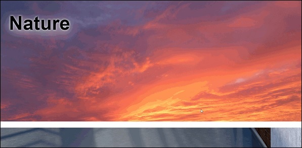
<div class = "section1 parallaxator">
<img class = "parallax_child" src = "img/landscape.jpg" width = "100%">
<h1 class = "mega_text parallax_child">Nature</h1>
</div>
<div class = "section2 parallaxator">
<img class = "parallax_child" src = "img/architecture.jpg" width = "100%">
<h1 class = "mega_text parallax_child">
Architecture<br>
</h1>
</div>
<div class = "section3 parallaxator">
<img class = "parallax_child" src = "img/architecture1.jpg" width = "100%">
<h1 class = "mega_text parallax_child" data-parallaxator-reverse = "true" data-parallaxator-velocity = "0.35">
Architecture again!
</h1>
</div>
</body>
</html>
Analysis of Code
The parallax effect is provided by parallax_child class which is provided with each img tag. The parallax_child is hooked up with CSS and JS files which are provided below.
For the parallaxator plugin to work, we have included fm.parallaxator.jquery.css and fm.parallaxator.jquery.js. These files are required to be available in the same directory as the HTML file.
The code for CSS is as shown below −
body {
   font-family: sans-serif;
   margin: 0;
   padding: 0;
}

.section1,.section2, .section3 {
   border-bottom: 32px solid #fff;
   padding-top: 40%;
}

.section1 {
   background-color: #fdb;
}

.section2 {
   background-color: #bdf;
}

.section3 {
   background-color: #fbd;
}

.mega_text {
   font-weight: bold;
   font-size: 100px;
   margin: 0;
   text-shadow: 0 10px 100px #fff, 0 0 15px #fff;
   padding: 64px;
   display: block;
}
As a result of the above code, you will be able to see the parallax effect.
Stellar.js jQuery Plugin for Parallax Scrolling
Stellar.js is another addition to the list of parallax jQuery plugins. Though it is no longer maintained, developer who have used its stable build, are able to use parallax scrolling effect with ease. It is compatible with latest versions of jQuery and easy to implement.
You will need to download the latest jquery.stellar.js from the official website for Stellar.js plugin. Once downloaded, create this plugin file in the same folder as your HTML and CSS file.
Let us have a look at HTML code.
<!doctype html>
<html>
<head>
<title>Stellar.js Demo</title>
<link href = "style.css" rel = "stylesheet">
<script src = "https://code.jquery.com/jquery-1.12.4.min.js"></script>
<script src = "jquery.stellar.js"></script>
<script>
$(function(){
$.stellar({
horizontalScrolling: false,
verticalOffset: 40
});
});
</script>
</head>
<body>
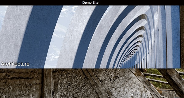
<h1>Demo Site</h1>
<div class = "image architecture" data-stellar-background-ratio = "0.5">
<span>Architecture</span>
</div>
<div class = "image abstract" data-stellar-background-ratio = "0.5">
<span>Abstract</span>
</div>
<div class = "image landscape" data-stellar-background-ratio = "0.5">
<span>Landscape</span>
</div>
<div class = "image window" data-stellar-background-ratio = "0.5">
<span>Window</span>
</div>
</body>
</html>
Analysis of Code
For Stellar.js to work, we have included the jquery.stellar.js library right after the jQuery plugin is referenced on line 6.
Function for Stellar parallax is called in the script tag from line 8 to line 15. With the property data-stellar-background-ratio, we are setting an offset for the images being displayed. This is done on lines 19,20,21 and 22.
The CSS code is given below −
body {
   font-family: helvetica, arial;
   padding-top: 40px;
}

h1 {
   background-color: black;
   color: white;
   height: 40px;
   font-size: 24px;
   font-weight: normal;
   left: 0;
   line-height: 40px;
   position: fixed;
   text-align: center;
   top: 0;
   width: 100%;
   z-index: 1;
}

h1 a {
   border-bottom: 1px solid white;
   color: white;
   display: inline-block;
   line-height: 30px;
   text-decoration: none;
}

.image {
   background-attachment: fixed;
   background-position: 50% 0;
   background-repeat: no-repeat;
   height: 450px;
   position: relative;
}

.image span {
   bottom: 0;
   color: white;
   display: block;
   left: 50%;
   margin-left: -640px;
   font-size: 38px;
   padding: 10px;
   position: absolute;
   text-shadow: 0 2px 0 black, 0 0 10px black;
   width: 1280px;
}

.architecture {
   background-image: url(img/architecture.jpg);
}

.abstract {
   background-image: url(img/ruin.jpg);
}

.landscape {
   background-image: url(img/landscape.jpg);
}

.window {
   background-image: url(img/window.jpg);
}
Once both the files are created and stellar.js plugin file is included in the same folder, you should be able to see the effect as shown in the screenshot given below −
Bootstrap Technique
Bootstrap is a popular framework with many ready-to-use components to choose from. Bootstrap can optimize the code for implementing parallax scrolling.
In this chapter, let us discuss with an example how we are going to use Jumbotron component to implement parallax scrolling.
Full Width Parallax Page with Bootstrap4 Jumbotron
Imagine a website where the user is shown with a big call-to-action box with some content regarding a discount or sale. Usually, Jumbotron finds its application in such places. It is a big box useful to attract attention of the user.
As we are using only one component of Bootstrap, we will not create a separate CSS file for this example. Let us dive right into the HTML code.
<!DOCTYPE html>
<html lang = "en">
   <head>
      <meta charset = "utf-8">
      <meta name = "viewport" content = "width = device-width, initial-scale = 1, shrink-to-fit = no">
      <link rel = "stylesheet" href = "https://maxcdn.bootstrapcdn.com/bootstrap/4.0.0/css/bootstrap.min.css"
         integrity = "sha384-Gn5384xqQ1aoWXA+058RXPxPg6fy4IWvTNh0E263XmFcJlSAwiGgFAW/dAiS6JXm"
         crossorigin = "anonymous">

      <style>
         .jumbotron{
            margin:15px 30px 0px 30px;
            border-radius:10px;
            background:
            linear-gradient(
               rgba(0, 0, 250, 0.25),
               rgba(125, 250, 250, 0.45)),
               url(img/ruin.jpg);

            background-repeat: no-repeat;
            background-attachment: fixed;
            color:white !important;
            height:440px;
         }
         .page-scroll {
            height:5000px;
         }
         .lead {
            font-family:raleway;
            font-weight:100;
            margin-top:-10px;
         }
      </style>
   </head>

   <body>
      <div class = "jumbotron jumbotron-fluid">
         <div class = "container">
            <h1 class = "display-2">Jumbotron Example</h1>
            <p class = "lead">Example text for parallax using jumbotron</p>
         </div>
      </div>
      <div class = "page-scroll"> </div>
   </body>

</html>
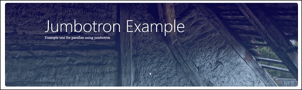
Analysis of Code
The line 6 references Bootstrap 4 library. We are specifying the margin and border radius for jumbotron from line 8 to 11.
As we can see on line 33, we are creating a div with jumbotron class to show the big box where we will have our specific image loaded. Please note that there is no direct URL for the image this time, we are going to use a downloaded image. You can download any high resolution image for your example and specify it in line 16.
The output that you can see when you execute the above given code is shown below −
Parallax Scrolling in Web Design - Conclusion
In this tutorial, we have studied different libraries for creating parallax scrolling. We have covered all aspects from basic level where we used CSS to advanced level wherewe used Bootstrap for front end development. We suggest you to apply your creative skills to come up with a web page which is hard to ignore. Remember that for parallax scrolling, there are enormous examples online to provide you an inspiration.
Utilization of Parallax Scrolling
As we have already discussed in the introductory chapters, you can use parallax scrolling to achieve an extraordinary user experience. Here are some ideas for website, where you can include parallax scrolling.
Timeline Website
These type of website usually have a story to tell about a product or company or anything else. You can create a parallax effect to put forth the story to the visitor and keep them engaged with different animations.
For a timeline website, it will be worthwhile to create a background and show the text content in the foreground. You can team up with a graphic designer to create graphics which go hand in hand with the background.
Mobile App Website
Nowadays, mobile app is a must have for any product/service offering. There are many startups looking for creating mobile app website which provide an explanation of what the mobile app can and cannot do.
Apple App Store, known for their strict app creation guidelines, demands the mobile app to have a support website. This website will always need to be attractive and user friendly.
Using Parallax Scrolling, you can use a mobile image and show different types of functionalities as the user scrolls down the page. One such example is already discussed in Chapter 4 of this tutorial.
Mouse Over Effect
You can use the power of parallax scrolling and mouse over to create next level of animation. With mouse over, you can control the direction of scrolling and create a parallax effect.
In this way, there are many possibilities when it comes to creating a great experience. All you need is an idea and right set of tools and libraries.
Future of Web UI
With the power of technology and creative elements like parallax scrolling, there is a never-before competition to create amazing user experiences. This is not just limited to websites but it has also got extended to mobile sites as well.
While Web UI is currently at its peak, having a web page compatible with a mobile device is the need of time. As we have seen in the examples for Bootstrap and jQuery, the websites cannot live a long life if they are not supported on handheld devices.
Along with the existing libraries, future of user experience eagerly looks forward to Artificial Intelligence and Virtual Reality as well. There are some webpages which are viewable using a VR gear. In such a situation, keeping in touch with the latest plugins and also looking for creating new one really makes sense.
Apply the knowledge you gained in this tutorial for creating best of the user experience, wish you much luck and success to your web development journey!
