- Home
- Background and Introduction
- Concepts
- Web Design and Parallax Scroll
- CSS Techniques
- JavaScript Techniques
- jQuery Techniques
- Bootstrap Techniques
- Conclusion
CSS Techniques
For a web developer, when it comes to creating a parallax scrolling effect, various techniques are available. One of such techniques is using Cascaded Styling Sheets(CSS).
CSS explains how the HTML elements are displayed on the screen. One can create a CSS file and it can be used for the complete website. It is simpler to add CSS file than adding styles to each HTML element and manage them in different parts of the web page.
Note − Some of the methods discussed below in this chapter are specific to desktop computers and not for mobile devices. It will be mentioned in the steps when a particular technique is not suitable for mobile devices.
Considering CSS offloads into all the extra drawing into the document object model (DOM), there is a greater utilization of hardware acceleration and a smooth effect without burdening the CPU.
Absolute Position Method
This method is frequently used to create a parallax effect, as this is relatively light in weight compared to other options available. The position of the background image is kept fixed as relative to other content on the screen. In the example discussed below, you will see how to do it using the magic of CSS.
In this section, we will go through two methods for Absolute Position Method −
- Single Background
- Multiple Background
Single Background Method
In this method, we will create two files in the same folder. Observe the steps given below for the same purpose −
Step 1
We have to create two files in the same folder: first file with HTML markup and the second with CSS code.
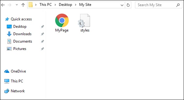
Step 2
Now, let us define our HTML markup. Observe the code given below −
<html>
   <head>
      <link rel = "stylesheet" href = "styles.css">
   </head>
   <body>
      <div class = "BgContainer">
         <div class = "Parallax">
            <h1> Welcome! </h1>
         </div>
         <div class = "FgContainer">
            <div class = "MainContent">
               <p>
                  Here we will go ahead with some content which will really vary
                  according to the content on your site. I am just typing out this
                  content as it is sometimes good to engage user than the usual lorem
                  ipsum text!
                  <br/>
                  <br/>

                  Lorem ipsum dolor sit amet, consectetur adipiscing elit, sed do
                  eiusmod tempor incididunt ut labore et dolore magna aliqua. Ut enim
                  ad minim veniam, quis nostrud exercitation ullamco laboris nisi ut
                  aliquip ex ea commodo consequat. Duis aute irure dolor in
                  reprehenderit in voluptate velit esse cillum dolore eu fugiat nulla
                  pariatur. Excepteur sint occaecat cupidatat non proident, sunt in
                  culpa qui officia deserunt mollit anim id est laborum.
                  <br/>
                  <br/>

                  Lorem ipsum dolor sit amet, consectetur adipiscing elit, sed do
                  eiusmod tempor incididunt ut labore et dolore magna aliqua. Ut enim
                  ad minim veniam, quis nostrud exercitation ullamco laboris nisi ut
                  aliquip ex ea commodo consequat. Duis aute irure dolor in
                  reprehenderit in voluptate velit esse cillum dolore eu fugiat nulla
                  pariatur. Excepteur sint occaecat cupidatat non proident, sunt in
                  culpa qui officia deserunt mollit anim id est laborum.
               </p>
            </div>
         </div>
      </div>
   </body>

</html>
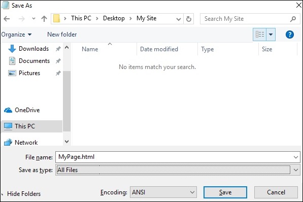
Step 3
Open notepad. Copy and paste the above code snippet.
When you are saving the file, under Save as type, select All Files. Enter a name to your file as required, but it needs to be followed by an extension − .html as shown in the screenshot below.
Step 4
Once the file is saved, create another file in notepad and paste the code given below −
html, body {
   font-size: 18px;
   line-height: 28px;
}

h1 {
   letter-spacing: -15px;
   color: white;
   text-align: center;
   font-size: 200px;
   font-weight: 800;
   line-height: 200px;
}

BgContainer {
   perspective: 1px;
   transform-style: preserve-3d;
   height: 100vh;
   overflow-x: hidden;
   overflow-y: scroll;
}

FgContainer {
   position: relative;
   display: block;
   background-color: white;
   z-index: 1;
}

MainContent {
   max-width: 750px;
   margin: 0 auto;
   padding: 75px 0;
}

p {
   margin: 75px 0;
}

.Parallax {
   display: flex;
   flex: 1 0 auto;
   position: relative;
   z-index: -1;
   height: 100vh;
   justify-content: center;
   align-items: center;
   transform: translateZ(-1px) scale(2);
   background: url(https://cdn.pixabay.com/photo/2017/02/07/09/02/background-2045380_640.jpg);
   background-color: rgb(250,228, 216);
}
As you have seen in the last step, when you are saving the file, under Save as type, select All Files. Enter a name to your file as required and add an extension .css to it.
Analysis of Code
Let us understand which part of the code is responsible for the parallax effect. Most important work for parallax is done by using perspective and transform rules. Refer to line 15 in the above code snippet. The perspective is created for our BgContainer first. This initiates a platform for transform rule.
In the Parallax container starting on line 40, transform rule on line 48 pushes the BgContainer div into background using translate(-1px).
You can modify the values for translate and scale parameters to modify the depth of the parallax.
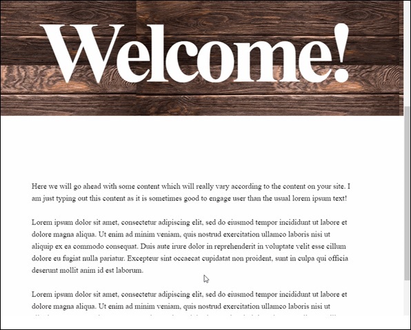
When you open the html file, the parallax effect will be visible as shown below −
Note − For the rest of the tutorial, it will be assumed that the reader is able to create the HTML and CSS files as per the folder structure provided in above method.
Multiple Background Method
In this method, we will have different images coming across as the user scrolls down the page. There is an image with pencils, which is used in different color combinations to illustrate this effect.
Observe the following code for HTML page as shown below −
<html>
   <head>
      <link rel = "stylesheet" href = "styles.css">
   </head>

   <body>
      <h1>Multiple Background Example</h1>
      <div class = "parallax">
         <div class = "bg__First">First</div>
         <div class = "bg__Second">Second</div>
         <div class = "bg__Third">Third</div>
         <div class = "bg__Fourth">Fourth</div>
      </div>
   </body>

</html>
Similar to the previous example, we will use styles.css stored on the same location as this HTML file. We have three different div named as First, Second, Third and Fourth.
The CSS code for the parallax scrolling is given below −
body, html {
   height : 100%;
   font-family : sans-serif;
}

.parallax [class*="bg__"] {
   position : relative;
   height : 50vh;
   text-indent : -9999px;
   background-attachment : fixed;
   background-position   : top center;
   background-size       : cover;
}
.parallax [class*="bg__"]:nth-child( 2n) {
   box-shadow : inset 0 0 1em #111;
}
.parallax .bg__First, .bg__Fourth {
   height : 100vh;
}
.parallax .bg__First {
   background-image : url("parallax0.png");
}
.parallax .bg__Second {
   background-image : url("parallax1.png");
}
.parallax .bg__Third {
   background-image : url("parallax2.png");
}
.parallax .bg__Fourth {
   background-image : url("parallax1.png");
}
Here, we create the parallax effect from line 7, important property here is background-attachment:fixed.
Using this property, the first image with coloured pencils will remain at the top always. As you scroll down, different images as described from line 28 will start showing up.
As a result, you will be able to see parallax effect as shown in gif below. The following image is the screenshot of the example that we considered for multiple background.

Pure CSS Parallax
Let us combine the knowledge from previous two methods and create an advanced Pure CSS Parallax effect.
The difference will be the way we arrange the image element and the z-transform property. The explanation of the property will be provided after the CSS code.
Create the HTML file with the following code using the usual method from Notepad.
<html>
   <head>
      <link rel = "stylesheet" href = "styles.css">
   </head>

   <body>
      <div class = "wrapParallax">
         <div class = "parallax_one">
            <img src = "https://cdn.pixabay.com/photo/2018/06/16/15/36/water-lily-3478924_640.jpg" alt = "">
         </div>
         <div class = "parallax_two">
            <h1>Pure CSS Parllax Advanced Level</h1>
         </div>
         <div class = "parallax_three">
            <img src = "https://cdn.pixabay.com/photo/2016/11/29/04/19/beach-1867285_640.jpg" alt = "">
         </div>
      </div>
   </body>

</html>
For the CSS file, the code is given below −
body, html {
   padding: 0;
   margin: 0;
}

h1 {
   color: blue;
   text-align: center;
   padding: 20px;
   text-shadow: 0px 0px 10px #fffff;
}

img {
   width:100vw;
   height:100vh;
}

.wrapParallax {
   perspective: 100px;
   height: 100vh;
   overflow-x: hidden;
   overflow-y: auto;
}

.parallax {
   position: absolute;
   top: 0;
   bottom: 0;
   right: 0;
   left: 0;
}

.parallax_one {
   transform: translateZ(-100px) scale(2)
}

.parallax_two {
   z-index: 10;
   transform: translateZ(-200px) scale(3)
}

.parallax_three {
   margin-top: 100vh;
}
Analysis of Code
We have fixed the position of first layer in line 26 by using position:absolute property. The positions are also hard-coded to 0.
In parallax_two, which is the layer with heading, we have applied z-index: 10 to provide a floating effect to the heading. The layer parallax_three is moved to the bottom by providing a margin-top property.
Thus, we can raise the level of complexity in our Parallax effect.
Observe the effect as shown in below figure.