
 Data Structure
 Networking
 RDBMS
RDBMS Operating System
 Java
Java MS Excel
 iOS
iOS HTML
HTML CSS
CSS Android
 Python
 C Programming
 C++
C++ C#
C# MongoDB
 MySQL
MySQL Javascript
 PHP
PHP
- Selected Reading
- UPSC IAS Exams Notes
- Developer's Best Practices
- Questions and Answers
- Effective Resume Writing
- HR Interview Questions
- Computer Glossary
- Who is Who
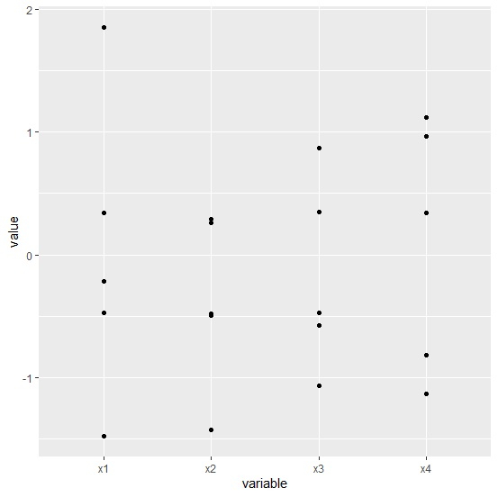
How to create scatterplot using data frame columns in R?
To create scatterplot using data frame columns, we need to convert the data frame columns into a variable and the value for each column will be read in a new column against each column name. This can be done with the help of melt function in reshape2 package.
After that we can use ggplot function to create the scatterplot with new data frame as shown in the below example.
Example
Following snippet creates a sample data frame −
x1<-rnorm(5)
x2<-rnorm(5)
x3<-rnorm(5)
x4<-rnorm(5)
df<-data.frame(x1,x2,x3,x4)
df
The following dataframe is created −
      x1         x2         x3           x4
1  -0.2125113 -1.4267446 -0.5756297  1.1171186
2  -1.4783953 -0.4924259 -1.0638708  0.3386777
3   0.3445651  0.2900645  0.3504212  0.9621898
4  -0.4691720 -0.4806233 -0.4731242 -1.1291709
5   1.8550476  0.2577891  0.8672877 -0.8178571
To load reshape2 package and melting df, add the following code to the above snippet −
library(reshape2)
new_df<-melt(df)
No id variables; using all as measure variables
new_df
Output
If you execute all the above given snippets as a single program, it generates the following output −
variable value
1  x1  -0.2125113
2  x1  -1.4783953
3  x1   0.3445651
4  x1  -0.4691720
5  x1   1.8550476
6  x2  -1.4267446
7  x2  -0.4924259
8  x2   0.2900645
9  x2  -0.4806233
10 x2   0.2577891
11 x3  -0.5756297
12 x3  -1.0638708
13 x3   0.3504212
14 x3  -0.4731242
15 x3   0.8672877
16 x4   1.1171186
17 x4   0.3386777
18 x4   0.9621898
19 x4  -1.1291709
20 x4  -0.8178571
To load ggplot2 package and create point chart for data in new_df, add the following code to the above snippet −
library(ggplot2)
ggplot(new_df,aes(variable,value))+geom_point()
Output
If you execute all the above given snippets as a single program, it generates the following output −

3K+ Views
