
Article Categories
- All Categories
-
 Data Structure
-
 Networking
-
 RDBMS
RDBMS
-
 Operating System
-
 Java
Java
-
 MS Excel
-
 iOS
iOS
-
 HTML
HTML
-
 CSS
CSS
-
 Android
-
 Python
-
 C Programming
-
 C++
C++
-
 C#
C#
-
 MongoDB
-
 MySQL
MySQL
-
 Javascript
-
 PHP
PHP
-
 Economics & Finance
Selected Reading
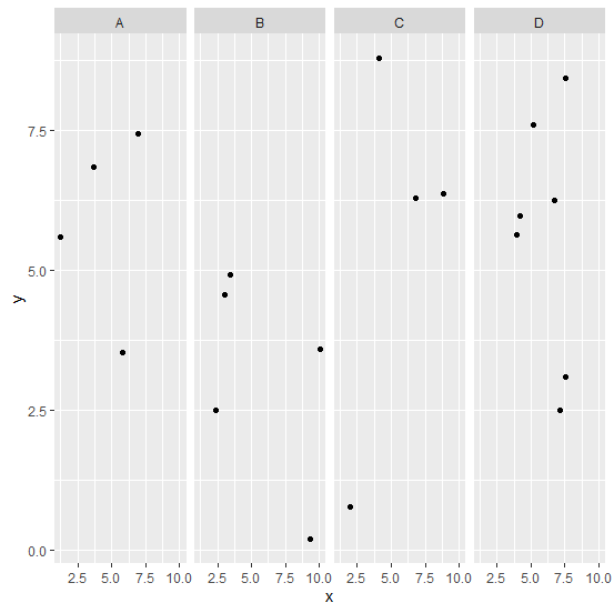
How to create scatterplot for factor levels in an R data frame?
To create a scatterplot for factor levels, we can use facet_grid function of ggplot2 package. For example, suppose we have a factor column in a data frame df defined as F and numerical columns defined as x and y then the scatterplot for the factor levels can be created as −
ggplot(df,aes(x,y))+geom_point()+facet_grid(~Factor)
Example
library(ggplot2)
ggplot(df,aes(x,y))+geom_point()+facet_grid(~Factor)
Output

Updated on: 2026-03-11T23:22:53+05:30
683 Views

Advertisements