
Article Categories
- All Categories
-
 Data Structure
-
 Networking
-
 RDBMS
RDBMS
-
 Operating System
-
 Java
Java
-
 MS Excel
-
 iOS
iOS
-
 HTML
HTML
-
 CSS
CSS
-
 Android
-
 Python
-
 C Programming
-
 C++
C++
-
 C#
C#
-
 MongoDB
-
 MySQL
MySQL
-
 Javascript
-
 PHP
PHP
-
 Economics & Finance
Selected Reading
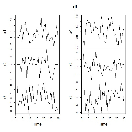
How to create line chart for all columns of a data frame a in R?
To check the trend of all columns of a data frame, we need to create line charts for all of those columns. These line charts help us to understand how data points fall or rise for the columns. Once we know the trend, we can try to find the out the reasons behind them and take appropriate actions. We can plot line charts for each of the column by using plot.ts function that plots data as a time series.
Example
Consider the below data frame.
> set.seed(1)
> x1<-rpois(30,5)
> x2<-rpois(30,2)
> x3<-runif(30,2,10)
> x4<-runif(30,2,5)
> x5<-rnorm(30,2)
> x6<-rbinom(30,10,0.6)
> df<-data.frame(x1,x2,x3,x4,x5,x6)
> head(df,20)
x1 x2 x3 x4 x5 x6
1 4 2 9.303007 2.718888 4.4016178 7
2 4 2 4.348827 2.176803 1.9607600 7
3 5 2 5.672526 3.926865 2.6897394 4
4 8 1 4.659157 4.628808 2.0280022 6
5 3 3 7.206964 4.336744 1.2567268 4
6 8 2 4.064134 4.391926 2.1887923 7
7 9 3 5.828362 3.365823 0.1950414 5
8 6 0 8.130485 3.230252 3.4655549 5
9 6 3 2.673975 4.432611 2.1532533 4
10 2 2 9.002571 3.814800 4.1726117 6
11 3 3 4.712584 3.964172 2.4755095 5
12 3 2 8.715523 3.059592 1.2900536 6
13 6 3 4.773468 2.810780 2.6107264 8
14 4 2 4.670199 4.978052 1.0659024 4
15 7 2 5.810810 3.900480 0.7463666 7
16 5 3 9.137587 2.639624 2.2914462 6
17 6 0 8.914716 2.388117 1.5567081 8
18 11 2 5.119916 3.434354 2.0011054 4
19 4 3 8.218566 4.772223 2.0743413 7
20 7 3 9.684944 3.796283 1.4104791 5
Plotting all the columns as a time series −
> plot.ts(df)
Output

Updated on: 2020-08-11T12:33:23+05:30
311 Views

Advertisements