
Article Categories
- All Categories
-
 Data Structure
-
 Networking
-
 RDBMS
RDBMS
-
 Operating System
-
 Java
Java
-
 MS Excel
-
 iOS
iOS
-
 HTML
HTML
-
 CSS
CSS
-
 Android
-
 Python
-
 C Programming
-
 C++
C++
-
 C#
C#
-
 MongoDB
-
 MySQL
MySQL
-
 Javascript
-
 PHP
PHP
-
 Economics & Finance
How to Create a Circular Determinate ProgressBar in Android?
A Circular Determinate progress bar in Android could be a visual component that demonstrates the progress of an errand in a circular mould. Not at all like a vague ProgressBar, which ceaselessly invigorates without appearing particularly advanced, a determinate ProgressBar shows a characterised advance esteem. It regularly consists of a circular shape with an advance marker that fills the circle relative to the task's completion. The Circular Determinate ProgressBar gives clients visual input on the progress of a particular assignment, such as downloading a record or uploading information. By setting the advance value programmatically, engineers can overhaul the ProgressBar to reflect the real advance of the continuous errand, giving clients a clear sign of the task's completion status in an outwardly engaging way.
Methods Used
Manual implementation
Manual Implementation
Manual implementation refers to the method of making a circular, determinate ProgressBar in Android by customising its behaviour and appearance through code instead of depending exclusively on predefined components or libraries. It includes characterising and controlling the advance of the ProgressBar programmatically, permitting designers to have fine-grained control over its usefulness. By physically executing a circularly determined ProgressBar, engineers can customise its estimate, colours, activities, and advanced upgrades to their particular requirements. This approach offers adaptability and empowers engineers to form interesting and custom-fit advanced pointers that consistently coordinate with their Android applications.
Algorithm
Make a format record (XML) that incorporates a ProgressBar component in a determinate fashion. Set the vital qualities such as estimate, colour, and visibility.
In your Java lesson, get a reference to the ProgressBar by utilising findViewById() and relegating it to a variable.
Set the most extreme value for the progress bar using setMax(). This esteem speaks to the most extreme advance that can be achieved.
Determine the current advance value based on your application's rationale or errand advance. This esteem ought to be between and the most extreme esteem set in step 3.
Set the current advance value using setProgress().
Optionally, you'll be able to customise the appearance of the ProgressBar by utilising strategies like setIndeterminateDrawable(), setProgressDrawable(), or setProgressTintList().
Update the advance estimate at whatever point is required by rehashing steps 4 and 5.
Example
Create a drawable resource file
XML Program
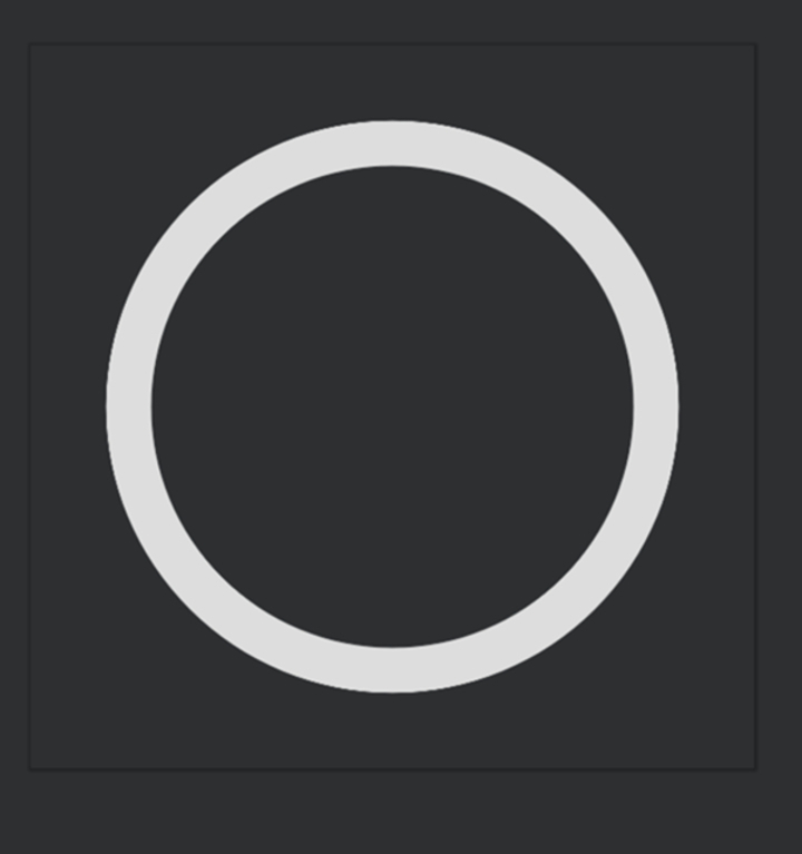
<?xml version="1.0" encoding="utf-8"?>
<layer-list xmlns:android="http://schemas.android.com/apk/res/android">
   <!-- Adding the first item: A ring shape -->
	<item>
		<!-- Create a ring shape using the "ring" attribute.
		To make the ring appear with color code "#DDD", set android:useLevel="false". -->
		<shape
			android:shape="ring"
			android:thicknessRatio="16"
			android:useLevel="false">
			<solid android:color="#DDD" />
		</shape>
	</item>
	<!-- Adding the second item: A rotating ring -->
	<item>
		<!-- Rotate the ring from 270 degrees to 270 degrees -->
		<rotate
			android:fromDegrees="270"
			android:toDegrees="270">
			<!-- Use android:useLevel="true" in the shape tag to enable rotation.
			Add a gradient to set the startColor and endColor of the ring. -->
			<shape
				android:shape="ring"
				android:thicknessRatio="16"
				android:useLevel="true">
				<gradient
					android:endColor="@color/teal_700"
					android:startColor="@color/black"
					android:type="sweep" />
			</shape>
		</rotate>
	</item>
</layer-list>
Output
XML Program for Theme
<resources xmlns:tools="http://schemas.android.com/tools">
   <!-- Base application theme. -->
	<style name="Theme.ProgressBar" parent="Theme.MaterialComponents.DayNight.DarkActionBar">
		<!-- Primary brand color. -->
		<item name="colorPrimary">@color/green</item>
		<item name="colorPrimaryVariant">@color/green</item>
		<item name="colorOnPrimary">@color/white</item>
		<!-- Secondary brand color. -->
		<item name="colorSecondary">@color/teal_200</item>
		<item name="colorSecondaryVariant">@color/teal_700</item>
		<item name="colorOnSecondary">@color/black</item>
		<!-- Status bar color. -->
		<item name="android:statusBarColor" tools:targetApi="l">?attr/colorPrimaryVariant</item>
		<!-- Customize your theme here. -->
	</style>


	<!-- Style for Circular Determinate ProgressBar -->
	<style name="CircularDeterminateProgressBar">
		<item name="android:indeterminateOnly">false</item>
		<item name="android:progressDrawable">@drawable/circle</item>
	</style>

</resources>
Main XML Program
<?xml version="1.0" encoding="utf-8"?>
<androidx.constraintlayout.widget.ConstraintLayout
   xmlns:android="http://schemas.android.com/apk/res/android"
   xmlns:app="http://schemas.android.com/apk/res-auto"
   xmlns:tools="http://schemas.android.com/tools"
   android:layout_width="match_parent"
   android:layout_height="match_parent"
   tools:context=".MainActivity">

   <!-- Add ProgressBar. The main attributes used here are:
      - style="@style/CircularDeterminateProgressBar" that
      references the style created in the theme.xml file above.
      - android:progressDrawable="@drawable/circle" that
      references the drawable created in the circle.xml file above.
   -->
   <ProgressBar
      android:id="@+id/progress_bar"
      style="@style/CircularDeterminateProgressBar"
      android:layout_width="200dp"
      android:layout_height="200dp"
      android:indeterminateOnly="false"
      android:progress="60"
      android:progressDrawable="@drawable/circle"
      android:rotation="-90"
      app:layout_constraintBottom_toBottomOf="parent"
      app:layout_constraintLeft_toLeftOf="parent"
      app:layout_constraintRight_toRightOf="parent"
      app:layout_constraintTop_toTopOf="parent"
      tools:progress="60" />

   <!-- TextView to display the progress percentage -->
   <TextView
      android:id="@+id/text_view_progress"
      android:layout_width="wrap_content"
      android:layout_height="wrap_content"
      android:textAppearance="@style/TextAppearance.AppCompat.Large"
      app:layout_constraintBottom_toBottomOf="@+id/progress_bar"
      app:layout_constraintEnd_toEndOf="@+id/progress_bar"
      app:layout_constraintStart_toStartOf="@+id/progress_bar"
      app:layout_constraintTop_toTopOf="@+id/progress_bar"
      tools:text="60%" />

   <!-- Decrement button that will decrease the progress by 10% -->
   <Button
      android:id="@+id/button_decr"
      android:layout_width="wrap_content"
      android:layout_height="wrap_content"
      android:text="- 10%"
      app:layout_constraintStart_toStartOf="@+id/progress_bar"
      app:layout_constraintTop_toBottomOf="@+id/progress_bar" />

   <!-- Increment button that will increase the progress by 10% -->
   <Button
      android:id="@+id/button_incr"
      android:layout_width="wrap_content"
      android:layout_height="wrap_content"
      android:text="+ 10%"
      app:layout_constraintEnd_toEndOf="@+id/progress_bar"
      app:layout_constraintTop_toBottomOf="@+id/progress_bar" />

</androidx.constraintlayout.widget.ConstraintLayout>
Main XML Program
<?xml version="1.0" encoding="utf-8"?>
<androidx.constraintlayout.widget.ConstraintLayout
   xmlns:android="http://schemas.android.com/apk/res/android"
   xmlns:app="http://schemas.android.com/apk/res-auto"
   xmlns:tools="http://schemas.android.com/tools"
   android:layout_width="match_parent"
   android:layout_height="match_parent"
   tools:context=".MainActivity">

   <ProgressBar
      android:id="@+id/progress_bar"
      style="@style/CircularDeterminateProgressBar"
      android:layout_width="250dp"
      android:layout_height="250dp"
      android:progress="60"
      android:rotation="-90"
      app:layout_constraintBottom_toBottomOf="parent"
      app:layout_constraintLeft_toLeftOf="parent"
      app:layout_constraintRight_toRightOf="parent"
      app:layout_constraintTop_toTopOf="parent"
      tools:progress="60" />

   <TextView
      android:id="@+id/text_view_progress"
      android:layout_width="wrap_content"
      android:layout_height="wrap_content"
      android:textAppearance="@style/TextAppearance.AppCompat.Large"
      app:layout_constraintBottom_toBottomOf="@+id/progress_bar"
      app:layout_constraintEnd_toEndOf="@+id/progress_bar"
      app:layout_constraintStart_toStartOf="@+id/progress_bar"
      app:layout_constraintTop_toTopOf="@+id/progress_bar"
      tools:text="60%" />

   <Button
      android:id="@+id/button_decr"
      android:layout_width="100dp"
      android:layout_height="wrap_content"
      android:text="- 10%"
      app:layout_constraintStart_toStartOf="@+id/progress_bar"
      app:layout_constraintTop_toBottomOf="@+id/progress_bar"
      android:onClick="decrementProgress" />

   <Button
      android:id="@+id/button_incr"
      android:layout_width="100dp"
      android:layout_height="wrap_content"
      android:text="+ 10%"
      app:layout_constraintEnd_toEndOf="@+id/progress_bar"
      app:layout_constraintTop_toBottomOf="@+id/progress_bar"
      android:onClick="incrementProgress" />

</androidx.constraintlayout.widget.ConstraintLayout>
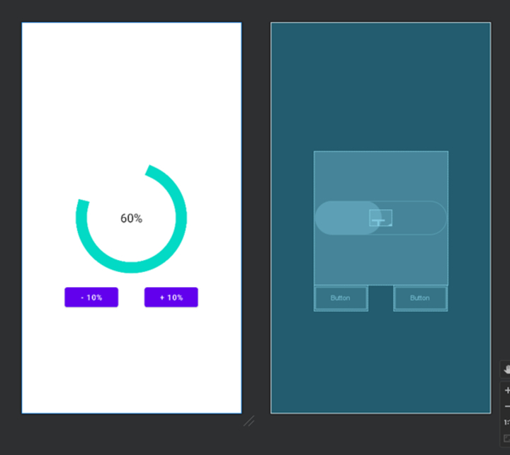
Output
import android.os.Bundle;
import android.view.View;
import android.widget.Button;
import android.widget.ProgressBar;
import android.widget.TextView;

import androidx.appcompat.app.AppCompatActivity;

public class MainActivity extends AppCompatActivity {
   private ProgressBar progressBar;
   private TextView textViewProgress;
   private Button buttonDecr;
   private Button buttonIncr;

   private int progress;

   @Override
   protected void onCreate(Bundle savedInstanceState) {
      super.onCreate(savedInstanceState);
      setContentView(R.layout.activity_main);

      progressBar = findViewById(R.id.progress_bar);
      textViewProgress = findViewById(R.id.text_view_progress);
      buttonDecr = findViewById(R.id.button_decr);
      buttonIncr = findViewById(R.id.button_incr);

      progress = 60;

      buttonDecr.setOnClickListener(new View.OnClickListener() {
         @Override
         public void onClick(View v) {
            decrementProgress();
         }
      });

      buttonIncr.setOnClickListener(new View.OnClickListener() {
         @Override
         public void onClick(View v) {
            incrementProgress();
         }
      });
   }

   private void decrementProgress() {
      if (progress > 0) {
         progress -= 10;
         progressBar.setProgress(progress);
         textViewProgress.setText(progress + "%");
      }
   }

   private void incrementProgress() {
      if (progress < 100) {
         progress += 10;
         progressBar.setProgress(progress);
         textViewProgress.setText(progress + "%");
      }
   }
}
Output
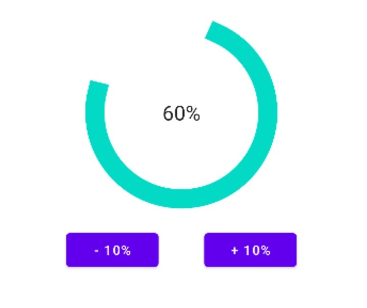
Conclusion
This article gives a direct tutorial on making a Circular Determinate progress bar in Android. It clarifies that a Circular Determinate progress bar may be a visual component that speaks to the progress of an assignment in a circular frame. Not at all like an uncertain ProgressBar, the determinate adaptation shows a characterised advance esteem. The article traces the steps for physically actualizing this ProgressBar, counting making XML-format records and customising its behaviour through Java code. It also gives test XML and Java code snippets for reference. In general, the article points out how to assist designers in making outwardly engaging and intelligently advanced markers in Android applications.

1K+ Views
