
Article Categories
- All Categories
-
 Data Structure
-
 Networking
-
 RDBMS
RDBMS
-
 Operating System
-
 Java
Java
-
 MS Excel
-
 iOS
iOS
-
 HTML
HTML
-
 CSS
CSS
-
 Android
-
 Python
-
 C Programming
-
 C++
C++
-
 C#
C#
-
 MongoDB
-
 MySQL
MySQL
-
 Javascript
-
 PHP
PHP
-
 Economics & Finance
How to Capture a pick event and use it to activate or deactivate Line Plots in Matplotlib
After enabling the pick event property of artists in Matplotlib, the task is to use the pick event to enable and disable the line plots for a given axis in a set of plots.
In order to pick a specific line plot, we use Legend.
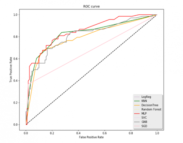
We will use a Binary classification plot to create the ROC Curve. ROC curve or Receiver Operating Characteristics curve is used for diagnostics, weather prediction and other applications. It contains True Negative Rate (TPR) and False Positive Rate (FPR). Using ROC, we will create multiple plots of the curve.
Let us Import the libraries first. Here ‘nbAgg’ is used to enable the interactive figures.
import matplotlib.pyplot as plt
plt.switch_backend('nbAgg')
import pandas as pd
Now read the ‘fpr(false positive Rate)’ and ‘tpr(True Negative Rate)’ from the data or Excel file. For demonstration, it will look like,
fpr_logreg = pd.read_excel('ROC_Curves.xlsx', 'fpr_logreg')
tpr_logreg = pd.read_excel('ROC_Curves.xlsx', 'tpr_logreg')
fpr_KNN = pd.read_excel('ROC_Curves.xlsx', 'fpr_KNN')
tpr_KNN = pd.read_excel('ROC_Curves.xlsx', 'tpr_KNN')
fpr_MLP = pd.read_excel('ROC_Curves.xlsx', 'fpr_MLP')
tpr_MLP = pd.read_excel('ROC_Curves.xlsx', 'tpr_MLP')
fpr_SGD = pd.read_excel('ROC_Curves.xlsx', 'fpr_SGD')
tpr_SGD = pd.read_excel('ROC_Curves.xlsx', 'tpr_SGD')
fpr_GNB = pd.read_excel('ROC_Curves.xlsx', 'fpr_GNB')
tpr_GNB = pd.read_excel('ROC_Curves.xlsx', 'tpr_GNB')
fpr_svc = pd.read_excel('ROC_Curves.xlsx', 'fpr_svc')
tpr_svc = pd.read_excel('ROC_Curves.xlsx', 'tpr_svc')
fpr_RF = pd.read_excel('ROC_Curves.xlsx', 'fpr_RF')
tpr_RF = pd.read_excel('ROC_Curves.xlsx', 'tpr_RF')
fpr_DT = pd.read_excel('ROC_Curves.xlsx', 'fpr_DT')
tpr_DT = pd.read_excel('ROC_Curves.xlsx', 'tpr_DT')
Now define and create the figure with the empty grid,
fig = plt.figure(figsize=(10,8))
Plot the line Graph for the given data,
plt.plot([0, 1], [0, 1], 'k--')
l1, = plt.plot(fpr_logreg, tpr_logreg, label='LogReg',color='purple')
l2, = plt.plot(fpr_KNN, tpr_KNN, label='KNN',color='green')
l3, = plt.plot(fpr_DT, tpr_DT, label='DecisionTree', color='orange')
l4, = plt.plot(fpr_RF, tpr_RF, label='Random Forest',color='yellow')
l5, = plt.plot(fpr_MLP, tpr_MLP, label='MLP',color='red')
l6, = plt.plot(fpr_svc, tpr_svc, label='SVC',color='violet')
l7, = plt.plot(fpr_GNB, tpr_GNB, label='GNB',color='grey')
l8, = plt.plot(fpr_SGD, tpr_SGD, label='SGD', color='pink')
Setting the labels, legends, and Title of the plot,
plt.xlabel('False Positive Rate')
plt.ylabel('True Positive Rate')
plt.title('ROC curve')
lgd = plt.legend(loc='lower right', fancybox=True, shadow=True)
Now map the legend with its labels,
pltlines = [l1, l2, l3, l4, l5, l6, l7, l8]
leg_ln_map = dict()
for leg_line, plot_line in zip(lgd.get_lines(), pltlines):
leg_line.set_picker(10)
leg_ln_map[leg_line] = plot_line
Define the callback function to respond Pick Events,
Example
def on_pick(event):
# on the pick event, find the plot line corresponding to the legend line, and toggle the visibility
   leg_line = event.artist
   plot_line = leg_ln_map[leg_line]
   vis = not plot_line.get_visible()
   plot_line.set_visible(vis)
# Change the alpha on the line in the legend so we can see what lines have been toggled
   if vis:
      leg_line.set_alpha(1.0)
   else:
      leg_line.set_alpha(0.2)
      fig.canvas.draw()
Now connect the event with the callback function,
fig.canvas.mpl_connect('pick_event', onpick)
Show the Output of the plot created,
plt.show()
Output

610 Views
