- Foundation - Home
- Foundation - Overview
- Foundation - Installation
- Foundation - Starter Projects
- Foundation - Kitchen Sink
- Foundation - Global Styles
- Foundation - Sass
- Foundation - JavaScript
- Foundation - JavaScript Utilities
- Foundation - Media Queries
- Foundation - The Grid
- Foundation - Flex Grid
- Foundation - Forms
- Foundation - Visibility Classes
- Foundation - Base Typography
- Foundation - Typography Helpers
- Foundation - Basic Controls
- Foundation - Navigation
- Foundation - Containers
- Foundation - Media
- Foundation - Plugins
- Foundation SASS
- Foundation - Sass Functions
- Foundation - Sass Mixins
- Foundation Libraries
- Foundation - Motion UI
- Foundation Useful Resources
- Foundation - Quick Guide
- Foundation - Useful Resources
- Foundation - Discussion
Foundation - Quick Guide
Foundation - Overview
What is Foundation?
Foundation is one of the advanced front-end frameworks for designing beautiful responsive websites. It works on all types of devices and provides you with HTML, CSS and JavaScript plugins.
Foundation began as an internal style guide, built by ZURB in 2008. ZURB is a product design company in Campbell, California. It released Foundation 2.0 as open source in October 2011. The latest version of Foundation is 6.1.1, released in December 2015.
Why Use Foundation?
It provides faster development by using Sass compiler, which works much faster than default compiler.
It enriches your website with pricing tables, switches, joyride, range sliders, lightbox and many more.
It comes with development package like Grunt and Libsass for faster coding and control.
Foundation for sites provides you with HTML, CSS and JS to quickly build websites.
Email framework provides you with responsive HTML emails, which can be read on any device.
Foundation for Apps allows you to build fully responsive web apps.
Features
It has powerful grid system and some useful UI components and cool JavaScript plugins.
It provides responsive design, which serves all types of devices.
It is optimized for mobile devices and truly supports mobile first approach.
It provides HTML templates, which are customizable and extensible.
Advantages
It is easy to learn, once you have the basic understanding of HTML and CSS.
You can use Foundation freely as it is an open source.
It provides you a bunch of templates, which helps you in start developing the website right away.
Foundation supports preprocessors like SASS and Compass, which makes development faster.
Disadvantages
Because of the popularity of the Twitter Bootstrap, the community support for Twitter Bootstrap is better than Foundation.
It may take some time for beginners to learn and take advantage of the preprocessor support.
Lack of wider support like QA sites and forums for fixing issues.
Foundation has less themes compared to others.
Foundation - Installation
In this chapter, we will discuss about how to install and use Foundation on website.
Download the Foundation
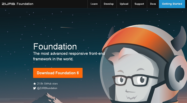
When you open the link foundation.zurb.com, you will see a screen as shown below −
Click the Download Foundation 6 button, you will be redirected to another page.
Here you can see four buttons −
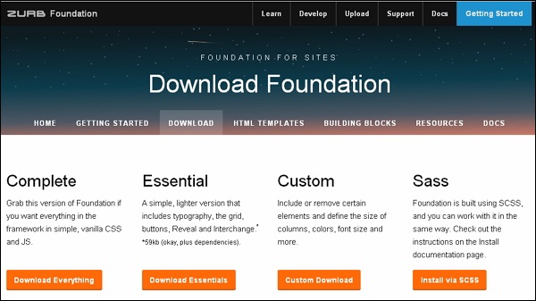
Download Everything − You can download this version of Foundation, if you wish to have everything in the framework i.e. vanilla CSS and JS.
Download Essentials − It will download the simple version which includes the grid, buttons, typography etc.
Custom Download − This will download the custom library for Foundation, it includes elements and define size of columns, font size, color etc.
Install via SCSS − This will redirect you to the documentation page to install Foundation for sites.
You can click the Download Everything button to get everything in the framework i.e. CSS and JS. As the files consist all things in the framework so every time you don't need to include separate files for individual functionality. At the time of writing this tutorial, the latest version (Foundation 6) was downloaded.
File Structure
Once Foundation is downloaded, extract the ZIP file, and you will see the following file/directory structure −
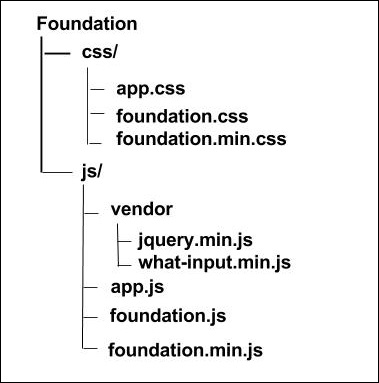
As you can see, there are compiled CSS and JS (foundation.*), as well as compiled and minified CSS and JS (foundation.min.*).
We are using the CDN versions of the library throughout this tutorial.
HTML Template
A basic HTML template using Foundation is as shown below −
<!DOCTYPE html>
<html>
   <head>
      <title>Foundation Template</title>
      <meta name = "viewport" content = "width = device-width, initial-scale = 1">

      <link rel="stylesheet" href="https://cdn.jsdelivr.net/npm/foundation-sites@6.5.1/dist/css/foundation.min.css" integrity="sha256-1mcRjtAxlSjp6XJBgrBeeCORfBp/ppyX4tsvpQVCcpA= sha384-b5S5X654rX3Wo6z5/hnQ4GBmKuIJKMPwrJXn52ypjztlnDK2w9+9hSMBz/asy9Gw sha512-M1VveR2JGzpgWHb0elGqPTltHK3xbvu3Brgjfg4cg5ZNtyyApxw/45yHYsZ/rCVbfoO5MSZxB241wWq642jLtA==" crossorigin="anonymous">

      <!-- Compressed JavaScript -->
      <script src="https://cdnjs.cloudflare.com/ajax/libs/foundation/6.0.1/js/vendor/jquery.min.js"></script>
      <script src="https://cdn.jsdelivr.net/npm/foundation-sites@6.5.1/dist/js/foundation.min.js" integrity="sha256-WUKHnLrIrx8dew//IpSEmPN/NT3DGAEmIePQYIEJLLs= sha384-53StQWuVbn6figscdDC3xV00aYCPEz3srBdV/QGSXw3f19og3Tq2wTRe0vJqRTEO sha512-X9O+2f1ty1rzBJOC8AXBnuNUdyJg0m8xMKmbt9I3Vu/UOWmSg5zG+dtnje4wAZrKtkopz/PEDClHZ1LXx5IeOw==" crossorigin="anonymous"></script>

   </head>

   <body>
      <h1>Hello, world!</h1>
   </body>
</html>
The following sections describe the above code in detail.
HTML5 doctype
Foundation consists of certain HTML elements and CSS properties that require the use of the HTML5 doctype. Therefore, the following code for HTML5 doctype should be included at the beginning of all your projects using Foundation.
<!DOCTYPE html>
<html>
   ....
</html>
Mobile First
It helps to be responsive to mobile devices. You need to include the viewport meta tag to the <head> element, to ensure proper rendering and touch zooming on mobile devices.
<meta name = "viewport" content = "width = device-width, initial-scale = 1">
width property controls the width of the device. Setting it to device-width will make sure that it is rendered across various devices (mobiles, desktops, tablets...) properly.
initial-scale = 1.0 ensures that when loaded, your web page will be rendered at a 1:1 scale, and no zooming will be applied out of the box.
Initialization of components
The jQuery script is required in Foundation for components like modals and dropdown.
<script src = "https://cdnjs.cloudflare.com/ajax/libs/foundation/6.0.1/js/foundation.min.js">
</script>
<script src = "https://cdnjs.cloudflare.com/ajax/libs/foundation/6.0.1/js/vendor/jquery.min.js">
</script>
Output
Let us carry out the following steps to see how the above given code works −
Save the above given html code firstexample.html file.
Open this HTML file in a browser, an output is displayed as shown below.
Foundation - Starter Projects
You can start with your project development with some available templates which can be installed through Yeti Launch or Foundation CLI. You can start with the new project by using these templates by using Gulp build system for the processing of the Sass, JavaScript, copying files etc.
Basic Template
The basic template is something like SASS template, which includes the flat directory structure and compiles only SASS files and it is good to have this simple template while using only SASS. You can use the basic template by using Yeti Launch or using Foundation CLI using the following command −
$ foundation new --framework sites --template basic
To set up this, first run the npm install, bower install and use the npm start command to run it. You can also download the template files from the Github.
ZURB Template
It is a combination of CSS/SCSS, JavaScript, Handlebars template, markup structure, image compression and uses SASS processing. You can use the ZURB template by using Yeti Launch or using Foundation CLI using the below command −
$ foundation new --framework sites --template zurb
To run this template, follow the same steps specified in the basic template. You can also download the template files from the Github.
Asset Copying
You can copy the content in the src/assets folder using Gulp in which assets will be your project folder. Important thing here is, the SASS files, JavaScript files and images will not come under this asset copying process, as they will be having their own process to copy the content.
Page Compilation
You can create HTML pages under three folders namely pages, layouts and partials which resides inside the src/ directory. You can use the Panini flat file compiler that creates layouts for pages by using templates, pages, HTML partials. This process can be done by using Handlebars templating language.
SASS Compilation
You can compile the SASS to CSS using Libsass and the main SASS file will be stored under src/assets/scss/app.scss and also newly created SASS partials will be stored under this folder itself. The output of CSS will be like normal CSS, which is in the nested style. You can compress the CSS with clean-css and removes the unused CSS from the stylesheet using UnCSS.
JavaScript Compilation
The JavaScript files will be stored under src/assets/js folder along with Foundation and all dependencies are tied together into app.js file. The files will be tied together as specified in the below order −
- Dependencies of Foundation.
- Files will be stored under src/assets/js folder.
- The files are bundled into one file called app.js.
Image Compression
By default, all images will be stored under assets/img folder under dist folder. You can compress the images while building for production using gulp-imagemin which supports JPEG, PNG, SVG and GIF files.
BrowserSync
You can create a BrowserSync server which is synchronized browser testing available at http://localhost:8000 and able to see the compiled templates using this URL. While your server is running, the page refreshes automatically when you save the file and you could see the changes made to the page in real time as you work.
Foundation - Kitchen Sink
Description
It includes the Foundation elements to work with the web applications smoothly. The following table lists some of the Foundation components −
| Sr.No. | Component & Description |
|---|---|
| 1 |
Accordion
Accordions contain vertical tabs which are used on websites to expand and collapse large amount of data. |
| 2 |
Accordion Menu
It displays the collapsible menu with accordion effects. |
| 3 |
Badge
Badges are similar to labels, which are used to highlight the information such as important notes and messages. |
| 4 |
Breadcrumbs
It specifies the current location for a site within navigational hierarchy. |
| 5 |
Buttons
Foundation supports standard buttons with different styles. |
| 6 |
Callout
Callout is an element, which can be used to place the content inside. |
| 7 |
Close Button
It is used to dismiss the alert box. |
| 8 |
Drilldown Menu
Drilldown menu changes the nested lists into vertical drilldown menu. |
| 9 |
Dropdown Menu
Dropdown menu is used for displaying links in a list format. |
| 10 |
Dropdown Pane
Dropdown pane displays the content when you click the button. |
| 11 |
Flex Video
It is used to create video objects in the web pages. |
| 12 |
Float Classes
It is used to add utility classes to HTML elements. |
| 13 |
Forms
It is used to create form layout to collect user input. |
| 14 |
Label
Labels are inline styles, which define a label for an input element. |
| 15 |
Media Object
It is used to add media objects such as images, video, blog comments etc. Which can be placed left or right of the content block. |
| 16 |
Menu
It provides access to different modes in the website. |
| 17 |
Pagination
It is a type of navigation that divides the content into a series of related pages. |
| 18 |
Slider
It specifies the range of values by dragging a handle. |
| 19 |
Switch
It is used to switch between on and off state. |
| 20 |
Table
It represents the data in rows and columns format. |
| 21 |
Tabs
It is a navigation based tab that displays the content into different panes without leaving the page. |
| 22 |
Thumbnail
It styles the images in thumbnail shape. |
| 23 |
Title Bar
It is used to display the current screen used by the user with other menu items. |
| 24 |
Tooltip
It is small pop-up box that describes the information when you hover the mouse on the link. |
| 25 |
Top Bar
It is used to create navigation header in the website. |
| 26 | Orbit
It is an easy and powerful slider that swipes the elements using the orbit class. |
Foundation - Global Styles
In this chapter, we will study about Global Styles. The global CSS of Foundation framework includes useful resets that makes sure styling is consistent across browsers.
Font Sizing
The font size of the browser style sheet is set to 100% by default. The default font size is set to 16 pixels. Depending on font size, grid size is calculated. To have distinct base font size and unaffected grid breakpoints, set $rem-base to $global-font-size value, which must be in pixels.
Colors
Interactive elements like links and buttons use default shade of blue which comes from SASS variable $primary-color. Components can also have colors such as: secondary, alert, success and warning. For more information check here.
SASS Reference
Variables
The following table lists the SASS variables, which are used to customize the default styles of components in your project _settings.scss.
| Sr.No. | Name & Description | Type | Default Value |
|---|---|---|---|
| 1 |
$global-width It represents the site's global width. Used to determine the grid's row width. |
Number | rem-calc(1200) |
| 2 |
$global-font-size It represents the font size applied to <html> and <body>. It is set 100% by default and the user's browser settings value will be inherited. |
Number | 100% |
| 3 |
$global-lineheight It represents all types of default line height. $global-lineheight is 24px while $global-font-size set to 16px. |
Number | 1.5 |
| 4 |
$primary-color It gives color to the interactive components such as links and buttons. |
Color | #2199e8 |
| 5 |
$secondary-color It is used with components, which support .secondary class. |
Color | #777 |
| 6 |
$success-color It represents the positive status or action when used with .success class. |
Color | #3adb76 |
| 7 |
$warning-color It represents a caution status or action when used with .warning class. |
Color | #ffae00 |
| 8 |
$alert-color It represents a negative status or action when used with .alert class. |
Color | #ec5840 |
| 9 |
$light-gray It is used for light gray UI items. |
Color | #e6e6e6 |
| 10 |
$medium-gray It is used for medium gray UI items. |
Color | #cacaca |
| 11 |
$dark-gray It is used for dark gray UI items. |
Color | #8a8a8a |
| 12 |
$black It is used for black UI items. |
Color | #0a0a0a |
| 13 |
$white It is used for white UI items. |
Color | #fefefe |
| 14 |
$body-background It represents the background color of the body. |
Color | $white |
| 15 |
$body-font-color It represents the text color of the body. |
Color | $black |
| 16 |
$body-font-family It represents the list of fonts of the body. |
List | 'Helvetica Neue', Helvetica, Roboto, Arial, sans-serif |
| 17 |
$body-antialiased Antialiased type is enabled by setting this attribute to true using the CSS properties -webkit-font-smoothing and -moz-osx-font-smoothing. |
Boolean | true |
| 18 |
$global-margin It represents the global margin value on components. |
Number | 1rem |
| 19 |
$global-padding It represents global padding value on components. |
Number | 1rem |
| 20 |
$global-margin It represents global margin value used between components. |
Number | 1rem |
| 21 |
$global-weight-normal It represents global font weight for normal type. |
Keyword or Number | normal |
| 22 |
$global-weight-bold It represents global font weight for bold type. |
Keyword or Number | bold |
| 23 |
$global-radius It represents the global value of all elements which has a border radius. |
Number | 0 |
| 24 |
$global-text-direction It sets the text direction of the CSS to ltr or rtl |
ltr |
Foundation - Sass
SASS helps to make the code more flexible and customizable in Foundation.
Compatibility
To install SASS based version for foundation, Ruby should be installed on Windows. Foundation can be compiled with Ruby SASS and libsass. We recommend node-sass 3.4.2+ version to compile SASS.
Autoprefixer Required
Autoprefixer handles SASS files. gulp-autoprefixer is used to build the process. The following autoprefixer setting is used to get proper browser support.
autoprefixer ({
   browsers: ['last 2 versions', 'ie >= 9', 'and_chr >= 2.3']
});
Loading the Framework
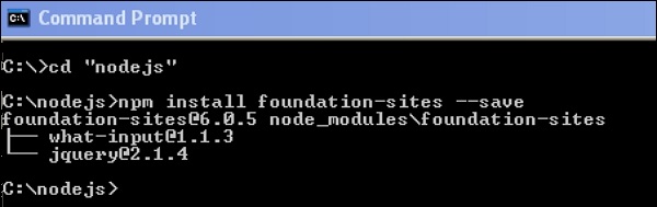
We can install the framework files using NPM. Using command line interface (CLI), we can compile the Sass files. Following is the command to load the framework −
npm install foundation-sites --save
After running the above command line code, you will get the following lines −
Compiling Manually
Framework files can be added as an import path depending upon on your build process, but the path will be the same packages_folder/foundation-sites/scss. The @import statement is included at the top of the foundation-sites.scss file. The next line in the given code is explained in the Adjusting CSS Output section.
@import 'foundation';
@include foundation-everything;
Using Compiled CSS
You can include the pre-compiled CSS files. There are two types of CSS files, i.e. minified and unminified. Minified version is used for production and the unminified version is used to directly edit the framework CSS.
<link rel = "stylesheet" href = "node_modules/foundation-sites/dist/foundation-sites.css">
<link rel = "stylesheet" href = "node_modules/foundation-sites/dist/foundation-sites.min.css">
Adjusting CSS Output
For various components, Foundation output consist of many classes. It is used to control the CSS output of the framework. Add the following single line of code to include all the components at once.
@include foundation-everything;
The following is the list of the components imported when you write the above code in your scss file. The components which are not necessary can be commented. You can view the below given code lines in the Your_folder_name/node_modules/foundation-sites/scss/foundation.scss file.
@import 'foundation';

@import 'grid/grid';
@import 'typography/typography';
@import 'forms/forms';
@import 'components/visibility';
@import 'components/float';
@import 'components/button';
@import 'components/button-group';
@import 'components/accordion-menu';
@import 'components/accordion';
@import 'components/badge';
@import 'components/breadcrumbs';
@import 'components/callout';
@import 'components/close-button';
@import 'components/drilldown';
...
...
...
//so on....
The Settings File
A settings file is included in the entire foundation project i.e. _settings.scss. If you are using Yeti Launch or the CLI to create a Foundation for Sites project, you can find the settings file under src/assets/scss/.
We have installed Foundation using npm, hence you can find the settings file included under your_folder_name/node_modules/foundation-sites/scss/settings/_settings.scss. You can move this into your own Sass files to work with.
You can write your own CSS, if you are not able to customize with variables. Following is a set of variables, which change the default styling of buttons.
$button-padding: 0.85em 1em;
$button-margin: 0 $global-margin $global-margin 0;
$button-fill: solid;
$button-background: $primary-color;
$button-background-hover: scale-color($button-background, $lightness: -15%);
$button-color: #fff;
$button-color-alt: #000;
$button-radius: $global-radius;

$button-sizes: (
   tiny: 0.6rem,
   small: 0.75rem,
   default: 0.9rem,
   large: 1.25rem,
);
$button-opacity-disabled: 0.25;
Foundation - JavaScript
In this chapter, we will study about JavaScript. It is easy to set up JavaScript in Foundation; only thing you require is jQuery.
JavaScript Installing
You can use ZIP download, package manager, or CDN to get Foundation JavaScript file. In your code you can provide links to jQuery and Foundation as <script> tags, placed before the closing <body> and check that Foundation is loaded after jQuery. For more information click here.
File Structure
When you install Foundation through command line, Foundation plugins downloads as individual files such as foundation.tabs.js, foundation.dropdownMenu.js, foundation.slider.js and so on. All these files are combined into foundation.js, which provides all the plugins at one time. If you wish to use some plugin, first foundation.core.js should be loaded.
For instance −
<script src = "js/jquery.min.js"></script>
<script src = "js/foundation.core.js"></script>
<script src = "js/foundation.tabs.js"></script>
Certain plugins may require particular utility libraries, which come with Foundation installation. You can study in detail about specific plugin requirements in the next chapter JavaScript Utilities.
Loading individual files creates network overhead, specifically for mobile users. For faster page loading, use of grunt or gulp is recommended.
Initializing
The foundation() function is used to initialize all the Foundation plugin at one time.
For instance −
(document).foundation();
Using Plugins
Using data attributes, plugins are connected to HTML elements as they match the plugins name. A single HTML element can have only one plugin at a time, although the majority of the plugins can be nested within other ones. For instance, tooltip link is created by adding data-tooltip. For more information click here.
Configuring Plugins
Plugins can be customized by using its configuration settings. For instance, you can set the speed of the accordion slides up and down. The plugin settings can be globally changed using the plugin's DEFAULTS property. For more information click here.
Adding Plugins after Page Load
When new HTML is added to the DOM, any of the plugins on those elements will not be initialized by default. You can check for new plugins by re-calling the .foundation() function.
For instance −
$.ajax('assets/partials/kitten-carousel.html', function(data) {
   $('#kitten-carousel'</span>).html(data).foundation();
});
Programmatic Use
In JavaScript, plugins can be created programmatically and each plugin is global Foundation object's class, with a constructor which takes two parameters such as an element and an object.
var $accordion = new Foundation.Accordion($('#accordion'), {
   slideSpeed: 600, multiExpand: true
});
Majority of the plugins are provided with public API, which lets you manipulate it via JavaScript. You can look through the documentations of plugin to study the available functions and methods can be invoked easily.
For instance −
$('.tooltip').foundation('destroy');
// this will destroy all Tooltips on the page.

$('#reveal').foundation('open');
// this will open a Reveal modal with id `reveal`.

$('[data-tabs]').eq(0).foundation('selectTab', $('#example'));
// this will change the first Tabs on the page to whatever panel you choose.
You are allowed to choose any jQuery selector and if the selector holds multiple plugins, then they all will have identical chosen method called.
Arguments can be passed just like passing arguments to JavaScript.
Methods that are prefixed with underscore(_) are considered as a portion of internal API, meaning, that without warning they can break, change or even disappear.
Events
Whenever a specific function finishes, DOM triggers an event. For instance, whenever tabs are changed, it can be listened and create a return response to it. Each plugin can trigger list of events, which will be documented in plugin's documentation. In Foundation 6, callback plugins are removed and must be taken as event listeners.
For instance −
$('[data-tabs]').on('change.zf.tabs', function() {
   console.log('Tabs are changed!');
});
Foundation - JavaScript Utilities
Foundation includes JavaScript utilities that are used to add common functionalities. It is very helpful and easy to use. This JavaScript utilities library can be found in the folder Your_folder_name/node_modules/foundation-sites/js
Box
Foundation.Box library consists of a couple of methods.
The js/foundation.util.box.js is the script filename, which can be included while writing the code.
Either jQuery objects or plain JavaScript elements can be pass to both methods.
var dims = Foundation.Box.GetDimensions(element);
The returned object specifies the dimension of the element as −
{
   height: 54,
   width: 521,
   offset: {
      left: 198,
      top: 1047
   },

   parentDims: {
      height: ...    //The same format is share for parentDims and windowDims as the element dimensions.
   },

   windowDims: {
      height: ...
   }
}
Function ImNotTouchingYou is included.
Based on the passed element, a Boolean value is returned, which is either a conflict with edge of the window or optional or a parent element.
The two options specified in the line given below i.e. leftAndRightOnly, topAndBottomOnly is used to identify the collision on only one axis.
var clear = Foundation.Box.ImNotTouchingYou (
   element [, parent, leftAndRightOnly, topAndBottomOnly]);
Keyboard
There are many methods in Foundation.Keyboard, which helps to make the keyboard event interaction easy.
The js/foundation.util.keyboard.js is the script filename, which can be included while writing the code.
The object Foundation.Keyboard.keys consist key/value pairs, which keys are used in the framework more frequently.
Whenever the key is pressed then Foundation.Keyboard.parseKey is called to get a string. This helps to manage your own keyboard inputs.
The following code is used to find all focusable elements within the given $element. Therefore, there is no need of writing any function and selector by you.
var focusable = Foundation.Keyboard.findFocusable($('#content'));
The handleKey function is a main function of this library.
This method is used to handle the keyboard event; it can be called whenever any plugin is registered with the utility.
Foundation.Keyboard.register('pluginName', {
   'TAB': 'next'
});

...//in event callback
Foundation.Keyboard.handleKey(event, 'pluginName', {
   next: function(){
      //do stuff
   }
});
The Foundation.Keyboard.register function can be called when you want to use your own key bindings.
MediaQuery
MediaQuery library is a backbone of all responsive CSS technique.
The js/foundation.util.mediaQuery.js is the script filename, which can be included while writing the code.
The Foundation.MediaQuery.atLeast('large') is used to check if the screen is at least as wide as a breakpoint.
The Foundation.MediaQuery.get('medium') gets the media query of a breakpoint.
The Foundation.MediaQuery.queries are an array of media queries, Foundation uses for breakpoints.
The Foundation.MediaQuery.current is a string of the current breakpoint size.
Foundation.MediaQuery.get('medium');
Foundation.MediaQuery.atLeast('large');
Foundation.MediaQuery.queries;
Foundation.MediaQuery.current;
The following code broadcasts the media query change on the window.
$(window).on('changed.zf.mediaquery', function(event, newSize, oldSize){});
Motion & Move
Foundation.Motion javascript is similar to Motion UI library, which is included in the Foundation 6. It is used to create custom CSS transitions and animations.
The js/foundation.util.motion.js is the script filename, which can be included while writing the code.
Foundation.Move is used to make CSS3 backed animation simple and elegant.
requestAnimationFrame(); method tells the browser to perform an animation; it requests that your animation function be called before the browser performs the next repaint.
Foundation.Move(durationInMS, $element, function() {
   //animation logic
});
When the animation is completed, finished.zf.animate is fired.
Timer & Images Loaded
Orbit uses both, the function timer and the image loaded. The js/foundation.util.timerAndImageLoader.js is the script filename, which can be included while writing the code.
var timer = new Foundation.Timer($element, {duration: ms, infinite: bool}, callback);
The image-loaded method runs a callback function in your jQuery collection when images are completely loaded.
Foundation.onImagesLoaded($images, callback);
Touch
The methods are used for adding pseudo drag events and swipe to elements.
The js/foundation.util.touch.js is the script filename, which can be included while writing the code.
The addTouch method is used to bind elements to touch events in the Slider plugin for mobile devices.
The spotSwipe method binds the elements to swipe events in the Orbit plugin for mobile devices.
$('selector').addTouch().on('mousemove', handleDrag);

$('selector').spotSwipe().on('swipeleft', handleLeftSwipe);
Triggers
It triggers the specified event for the selected elements.
The js/foundation.util.triggers.js is the script filename, which can be included while writing the code.
The triggers are utilized in many Foundation plugin.
$('selector').on('open.zf.trigger', handleOpen);
$('selector').on('close.zf.trigger', handleClose);
$('selector').on('toggle.zf.trigger', handleToggle);
The following two methods are used in this library i.e. resize and scroll.
The resize() method triggers the resize event when a resize event occurs.
The scroll() method triggers the scroll event when a scroll event occurs.
$('#someId').on('scrollme.zf.trigger', handleScroll);
$('#someId').on('resizeme.zf.trigger', handleResize);
Miscellaneous
Foundation contains few features in the core library, which are used in many places.
The js/foundation.core.js is the script filename, which can be included while writing the code.
Foundation.GetYoDigits([number, namespace]) returns a random base-36 uid with namespacing. It returns the string length of 6 characters long by default.
Foundation.getFnName(fn) returns a JavaScript function name.
Foundation.transitionend occurs when CSS transition is completed.
Foundation - Media Queries
Media queries are CSS3 module that include media features such as width, height, color and displays the content as per the specified screen resolution.
Foundation uses the following media queries to create breakdown ranges −
Small − Used for any screen.
Medium − It is used for screens of 640 pixels and wider.
Large − It is used for screens of 1024 pixels and wider.
You can change the screen size by using the breakpoint classes. For instance, you can use .small-6 class for small sized screens and .medium-4 class for medium sized screens as shown in the following code snippet −
<div class = "row">
   <div class = "small-6 medium-4 columns"></div>
   <div class = "small-6 medium-8 columns"></div>
</div>
Changing the Breakpoints
You can change the breakpoints, if your application uses SASS version of Foundation. You can place the breakpoints name under the $breakpoints variable in the settings file as shown below −
$breakpoints: (
   small: 0px,
   medium: 640px,
   large: 1024px,
   xlarge: 1200px,
   xxlarge: 1440px,
);
You can change the breakpoints classes in the settings file by modifying the $breakpoint-classes variable. If you want to use .large class in the CSS, then add it to the end of the list as shown below −
$breakpoints-classes: (small medium large);
Suppose, you want to use .xlarge class in the CSS, and then add this class to the end of the list as shown below −
$breakpoints-classes: (small medium large xlarge);
SASS
The Breakpoint Mixin
You can write the media queries by using breakpoint() mixin along with @include.
Use the down or only keywords along with the breakpoint value to change the behavior of the media query as shown in the following code format −
.class_name {
   // code for medium screens and smaller
   @include breakpoint(medium down) { }

   // code for medium screens only
   @include breakpoint(medium only) { }
}
You can use three media queries portrait, landscape and retina for device orientation or pixel density and they are not width based media queries.
Breakpoint Function
You can use the functionality of breakpoint() mixin by using the internal function.
The breakpoint() functionality can be used directly to write own media queries −
@media screen and #{breakpoint(medium)} {
   // code for medium screens and up styles
}
JavaScript
Working with Media Queries
The Foundation JavaScript provides the MediaQuery.current function to access current breakpoint name on the Foundation.MediaQuery object as specified below −
Foundation.MediaQuery.current
The MediaQuery.current function displays small, medium, large as current breakpoint names.
You can get the media query of breakpoint using the MediaQuery.get function as shown below −
Foundation.MediaQuery.get('small')
Sass Reference
Variables
The following table lists the SASS variables, which can be used to customize the default styles of the component −
| Sr.No. | Name & Description | Type | Default Value |
|---|---|---|---|
| 1 |
$breakpoints It is a breakpoint name which can be used to write the media queries by using breakpoint() mixin. |
Map |
small: 0px medium: 640px large: 1024px xlarge: 1200px xxlarge: 1440px |
| 2 |
$breakpoint-classes You can change the CSS class output by modifying the $breakpoint-classes variable. |
List | small medium large |
Mixins
Mixins creates a group of styles to build your CSS class structure for the Foundation components.
BREAKPOINT
It uses breakpoint() mixin to create media queries and includes the following activities −
If string is passed, then mixin searches the string in the $breakpoints map and creates the media query.
If you are using pixel value, then convert it to em value using $rem-base.
If rem value is passed, then it changes its unit to em.
If you are using em value, then it can be used as it is.
The following table specifies the parameter used by the breakpoint −
| Sr.No. | Name & Description | Type | Default Value |
|---|---|---|---|
| 1 |
$value It is processes the values by using breakpoint name, px, rem or em values. |
keyword or number | None |
Functions
BREAKPOINT
It uses breakpoint() mixin to create media queries with matching input value.
The following table specifies the possible input value used by the breakpoint −
| Sr.No. | Name & Description | Type | Default Value |
|---|---|---|---|
| 1 |
$val It processes the values by using breakpoint name, px, rem or em values. |
keyword or number | small |
JavaScript Reference
Functions
There are two types of functions −
.atLeast − It checks the screen. It must be wide at least as a breakpoint.
.get − It is used to get the media query of the breakpoint.
The following table specifies the parameter used by above functions −
| Sr.No. | Name & Description | Type |
|---|---|---|
| 1 |
size It checks and gets the name of the breakpoint for the specified functions respectively. |
String |
Foundation - The Grid
Description
Foundation grid system scales up to 12 columns through the page. Grid systems are used to create page layouts through a series of rows and columns that house your content.
Grid Options
The following table tells briefly about how the Foundation grid system works in multiple devices.
| Small devices Phones(<640px) | Medium devices Tablets(>=640px) | Large devices Laptops & Desktops(>=1200px) | |
|---|---|---|---|
| Grid behavior | Horizontal at all times | Collapsed to start, horizontal above breakpoints | Collapsed to start, horizontal above breakpoints |
| Class prefix | .small-* | .medium-* | .large-* |
| Number of columns | 12 | 12 | 12 |
| Nestable | Yes | Yes | Yes |
| Offsets | Yes | Yes | Yes |
| Column ordering | Yes | Yes | Yes |
Basic Structure of a Foundation Grid
The following is the basic structure of a Foundation grid −
<div class = "row">
   <div class = "small-*"></div>
   <div class = "medium-*"></div>
   <div class = "large-*"></div>
</div>

<div class = "row">
   ...
</div>
First, create a row class to create horizontal groups of columns.
Content should be placed within the columns, and only columns may be the immediate children of rows.
Grid columns are created by specifying the number of twelve available columns you wish to span. For example, for four equal columns we would use .large-3
The following are the three classes used in the Foundation grid system −
| Sr.No. | Basic Grid classes & Description |
|---|---|
| 1 | Large
The large-* classes is used for the large devices. |
| 2 | Medium
The medium-* class is used for the medium devices. |
| 3 | Small
small-* class is used for the small devices. |
Advanced Grid
The following are the advanced grid formats used in Foundation.
| Sr.No. | Advanced Grids & Description |
|---|---|
| 1 | Combined Column/Row
The column and row classes are used on the same element to get the full width column to use as a container. |
| 2 | Nesting
We can nest the grid columns inside another columns. |
| 3 | Offsets
Using large-offset-* or small-offset-* class, you can move the columns to the right. |
| 4 | Incomplete Rows
Foundation floats the last element automatically to the right when the rows do not include columns up to 12. |
| 5 | Collapse/Uncollapse Rows
Using the media query size, the collapse and uncollapse classes are included to the row element to show the paddings. |
| 6 | Centered Columns
By including the class small-centered in the column, you can make the column at the center. |
| 7 | Source Ordering
Source ordering class is used to shift the columns between the breakpoint. |
| 8 | Block Grids
Block-grid is used to split the content. |
Building Semantically
Using the set of SASS mixins, a grid CSS is generated which is used to build your own semantic grid. For more information click here
SASS Reference
The following are the SASS reference for grid used in Foundation.
| Sr.No. | Basic Grids & Description |
|---|---|
| 1 | Variables
Using the sass variables we can modify the default styles of this component. |
| 2 | Mixins
The final CSS output is build using the mixin. |
Foundation - Flex Grid
The grid depends on the flex display property. It consists of a number of features that are available with the flexbox, like automatic stacking, source ordering, vertical alignment and horizontal alignment.
Browser Support
The flex grid is supported in Chrome, Firefox, Internet Explorer 10+, Safari 6+, Android 4+ and iOS 7+.
The following table describes the features of Flex Grid along with the description.
| Sr.No. | Features & Description |
|---|---|
| 1 | Importing
It includes the export mixin for the flex grid to use the default CSS. |
| 2 | Basics
The Flex grid structure is similar to that of float grid. |
| 3 | Advanced Sizing
If the sizing class is not included in the column, then it expands itself and fills the remaining space in the column. |
| 4 | Responsive Adjustments
If the explicit size of column in flex grid is not given, then it will auto-size the columns |
| 5 | Column Alignment
The flex grid columns can be aligned horizontal or vertical axis in the parent row. |
| 6 | Source Ordering
Source ordering helps to rearrange the column in different size of screens. |
| 7 | Sass Reference
SASS (Syntactically Awesome Stylesheet) is a CSS pre-processor which helps to reduce repetition with CSS and saves time. |
Foundation - Forms
In this chapter, we will study about Forms. Foundation provides powerful, easy and versatile layout system for Forms, which combines form styles and grid support.
The following table lists the form elements used in Foundation.
| Sr.No. | Form element & Description |
|---|---|
| 1 | Form Basics
Creation of forms is easy and very flexible, which are built with a combination of standardized form elements and powerful grid system. |
| 2 | Help Text
It is used to notify the user about the purpose of the element and is usually placed below a field. |
| 3 | Label Positioning
You can position your labels left or right of your inputs. |
| 4 | Inline Labels and Buttons
Extra text or controls can be attached to the left/right of an input field. |
| 5 | Custom Controls
Custom controls like date pickers, switches or sliders require some attention to access it. |
| 6 | SASS Reference
You can change the styles of the components by using SASS Reference. |
Foundation - Visibility Classes
Description
Foundation uses visibility classes to show or hide elements based upon device orientation (portrait and landscape) or screen size (small, medium, large or xlarge screen).
It allows a user to use elements based on the browsing environment.
The following table lists the visibility classes of Foundation, which control the elements based on their browsing environment −
| Sr.No. | Visibility Class & Description |
|---|---|
| 1 | Show by Screen Size
It shows the elements based on the device by using .show class. |
| 2 | Hide by Screen Size
It hides the elements based on the device by using .hide class. |
Foundation supports some classes where you can hide the content by using the .hide and .invisible classes and displays nothing on the page.
Orientation Detection
The devices can determine different orientations by using landscape and portrait functionality. The hand held devices such as mobile phones specifies the different orientations when you rotate them. For desktop, the orientation will be landscape always.
Accessibility
The following table lists the accessibility techniques for screen readers which hides the content while making it readable by screen readers −
| Sr.No. | Accessibility Class & Description |
|---|---|
| 1 | Show for Screen Readers
It uses show-for-sr class to hide the content while preventing screen readers from reading it. |
| 2 | Hide for Screen Readers
It uses aria-hidden attribute which makes text visible but could not be read by a screen reader. |
| 3 | Creating Skip Links
Screen reader will create a skip link to get the navigation to your site's content. |
Sass Reference
Foundation uses the following mixins to display CSS output, which allows building own class structure for your components −
| Sr.No. | Mixin & Description | Parameter | Type |
|---|---|---|---|
| 1 |
show-for By default, it hides an element and displays it above certain screen size. |
$size | Keyword |
| 2 |
show-for-only By default, it hides an element and displays it within breakpoint. |
$size | Keyword |
| 3 |
hide-for By default, it shows an element and hides it above a certain screen size. |
$size | Keyword |
| 4 |
hide-for-only By default, it shows an element and hides it above a certain screen size. |
$size | Keyword |
The default value of all these mixins will be set to none.
Foundation - Base Typography
Description
Typography in Foundation defines headings, paragraphs, lists and other inline elements which create attractive and simple default styles for elements.
The following table lists the different types of typography used in Foundation −
| Sr.No. | Typography & Description |
|---|---|
| 1 | Paragraphs
Paragraph is a group of sentences defined with different font size, highlighted words, line height etc. |
| 2 | Header
It defines HTML headings from h1 to h6. |
| 3 | Links
It creates a hyperlink that opens another document when you click on the text or an image. |
| 4 | Dividers
It is used to give a break between the sections by using <hr> tag. |
| 5 | Ordered and Unordered Lists
Foundation supports ordered lists, unordered lists to list the things. |
| 6 | Definition Lists
Definition Lists are used to display name value pairs. |
| 7 | Blockquotes
It represents block of text, which defines much bigger than normal. |
| 8 | Abbreviations and Code
Abbreviation defines a shortened term of word or phrase and code represents a piece of code. |
| 9 | Keystrokes
It is used to perform a specific function. |
| 10 | Accessibility
Foundation provides some guidelines to access the content of the page. |
Sass Reference
You can change the styles of the components by using the following SASS variables as listed in the table.
| Sr.No. | Name & Description | Type | Default Value |
|---|---|---|---|
| 1 |
$header-font-family Specifies the font family for header elements. |
String or List | $body-font-family |
| 2 |
$header-font-weight Specifies font weight of headers. |
String | $global-weight-normal |
| 3 |
$header-font-style Provides font style of headers. |
String | normal |
| 4 |
$font-family-monospace Font stack used for elements that use monospaced type, such as code samples. |
String or List | Consolas, 'Liberation Mono', Courier, monospace |
| 5 | $header-sizes Defines screen sizes of headings and each key is a breakpoint, and each value is a map of heading sizes. |
Map |
small: ( 'h1': 24 'h2': 20 'h3': 19 'h4': 18 'h5': 17 'h6': 16 ) medium: ( 'h1': 48 'h2': 40 'h3': 31 'h4': 25 'h5': 20 'h6': 16 ) |
| 6 |
$header-color Provides color of the headers. |
Color | inherit |
| 7 |
$header-lineheight Defines line height of headers. |
Number | 1.4 |
| 8 |
$header-margin-bottom Provides bottom margin of headers. |
Number | 0.5rem |
| 9 |
$header-text-rendering Defines method for text rendering. |
String | optimizeLegibility |
| 10 |
$small-font-size Specifies font size for <small> elements. |
Number | 80% |
| 11 |
$paragraph-margin-bottom Specifies bottom margin of paragraphs. |
Number | 1rem |
| 12 |
$paragraph-text-rendering Methods for text rendering paragraph. |
String | optimizeLegibility |
| 13 |
$code-color Provides text color to code samples. |
Color | $black |
| 14 |
$code-font-family Provides font family to the code samples. |
String or List | $font-family-monospace |
| 15 |
$code-border Specifies the border around the code. |
List | 1px solid $medium-gray |
| 16 |
$code-padding Specifies the padding around the text. |
Number or List | rem-calc(2 5 1) |
| 17 |
$anchor-color Default color for links. |
Color | $primary-color |
| 18 |
$anchor-color-hover Specifies the default color for links on hover. |
Color | scale-color($anchor-color, $lightness: -14%) |
| 19 |
$anchor-text-decoration Default text decoration for links. |
String | none |
| 20 |
$anchor-text-decoration-hover Default text decoration for links on hover. |
String | none |
| 21 |
$hr-width Defines maximum width of a divider. |
Number | $global-width |
| 22 |
$hr-border Specifies default border for a divider. |
List | 1px solid $medium-gray |
| 23 |
$hr-margin Default margin for a divider. |
Number or List | rem-calc(20) auto |
| 24 |
$list-lineheight It defines line height for items in a list. |
Number | $paragraph-lineheight |
| 25 |
$list-style-type Provides bullet type for unordered lists. |
String | disc |
| 26 |
$list-style-position It defines positioning for bullets on unordered lists. |
String | outside |
| 27 |
$list-side-margin Defines left side (or right) margin. |
Number | 1.25rem |
| 28 |
$defnlist-term-weight Provides font weight for <dt> elements. |
String | $global-weight-bold |
| 29 |
$defnlist-term-margin-bottom Provides spacing between <dt> and <dd> elements. |
Number | 0.3rem |
| 30 |
$blockquote-color It applies text color of <blockquote> elements. |
Color | $dark-gray |
| 31 |
$blockquote-padding Provides padding inside a <blockquote> elements. |
Number or List | rem-calc(9 20 0 19) |
| 32 |
$blockquote-border It gives side border for the <blockquote> elements. |
List | 1px solid $medium-gray |
| 33 |
$cite-font-size Defines font size for the <cite> elements. |
Number | rem-calc(13) |
| 34 |
$cite-color Provides text color for |
Color | $dark-gray |
| 35 |
$keystroke-font Defines font family for the <kbd> elements. |
String or List | $font-family-monospace |
| 36 |
$keystroke-color Defines text color for the <kbd> elements. |
Color | $black |
| 37 |
$keystroke-background Provides background color for the <kbd> elements. |
Color | $light-gray |
| 38 |
$keystroke-padding Specifies padding for the <kbd> elements. |
Number or List | rem-calc(2 4 0) |
| 39 |
$keystroke-radius Displays the border radius for the <kbd> elements. |
Number or List | $global-radius |
| 40 |
$abbr-underline Provides the bottom border style for the <abbr> elements. |
List | 1px dotted $black |
Foundation - Typography Helpers
In this chapter, we will study about Typography Helpers. Typography helpers are used to format your text in semantically relevant ways. Helper classes in Foundation let you to scaffold some typographic styles quicker.
The following table lists the Typography Helpers, which are used in Foundation.
| Sr.No. | Typography helper & Description |
|---|---|
| 1 | Text Alignment
It helps in changing the element's text alignment like left, right, center and justify. |
| 2 | Subheader
Subheaders can be added to any header element by using the .subheader class. |
| 3 | Lead Paragraph
It is considerably larger block of text compared to the normal text, which can be used for advertisement or other descriptive text. |
| 4 | Un-bulleted List
By default, the <ul> is a bulleted list in Foundation. To remove the bullets, you can use .no-bullet class. |
| 5 | Statistics
Whenever you are dealing with dashboard, you need to highlight some important numbers. You can achieve this by using .stat class. |
Sass Reference
Variables
The following table lists the SASS variables in the project's settings file that makes the component's default styles to get customized.
| Sr.No. | Name & Description | Type | Default Value |
|---|---|---|---|
| 1 |
$lead-font-size Font size for lead paragraphs by default. |
Number | $global-font-size * 1.25 |
| 2 |
$lead-lineheight Line height for lead paragraph by default. |
String | 1.6 |
| 3 |
$subheader-lineheight Subheader's default line height. |
Number | 1.4 |
| 4 |
$subheader-color Subheader's default font color. |
Color | $dark-gray |
| 5 |
$subheader-font-weight Subheader's default font weight. |
String | $global-weight-normal |
| 6 |
$subheader-margin-top Subheader's default top margin. |
Number | 0.2rem |
| 7 |
$subheader-margin-bottom Subheader's default bottom margin. |
Number | 0.5rem |
| 8 |
$stat-font-size Static number's default font size |
Number | 2.5rem |
Foundation - Basic Controls
In this chapter, we will study about basic controls. Foundation provides basic controls such as buttons, sliders and switches.
The following table lists the basic controls used in Foundation.
| Sr.No. | Basic control & Description |
|---|---|
| 1 | Button
Foundation supports many button styles that can be customized according to your needs. |
| 2 | Button Group
They are containers for corresponding action elements. It works fine when group of actions is displayed in a bar. |
| 3 | Close Button
Close button is used when you want something to go away by clicking on it. |
| 4 | Slider
Sliders are very useful for setting certain values inside a range. |
| 5 | Switch
It allows you to turn off or turn on the switch by clicking on it. |
Foundation - Navigation
Description
Foundation provides a few different options for styling navigation elements. Many simple navigation patterns are bundled; it can be integrated in the form for robust responsive navigation solution.
The following table describes the different types of navigation along with the description.
| Sr.No. | Type & Description |
|---|---|
| 1 | Navigation Overview
Navigation contains links to the other section and consists of many navigation patterns. |
| 2 | Menu
Menu is used to build many navigation components. |
| 3 | Dropdown Menu
The dropdown menu plugin is used to create submenus below the main menu. |
| 4 | Drilldown Menu
The drilldown menu plugin is used to create submenus in main menu in the slider format. |
| 5 | Accordion Menu
It displays the collapsible menu with accordion effects and provides support for auto collapse using the Accordion Menu plugin. |
| 6 | Top Bar
Top bar helps to display the complex navigation bar easily on different size of the screen. |
| 7 | Responsive Navigation
Responsive menu plugin allocates the menu in different sizes of the screen. |
| 8 | Magellan
Magellan creates a navigation, which is in a fixed position; it automatically tracks the navigation list on a page, based on scroll position. |
| 9 | Pagination
Pagination, an unordered list is handled by Bootstrap like a lot of other interface elements. |
| 10 | Breadcrumbs
A breadcrumb specifies the current location for a site within navigational hierarchy. |
Foundation - Containers
Foundation containers are used to make full width of the browsers at all times for the site and wrap the site contents.
The following table lists the down some of the containers used in Foundation −
| Sr.No. | Container & Description |
|---|---|
| 1 | Accordion
Accordions contain vertical tabs which are used on websites to expand and collapse large amount of data. |
| 2 | Callout
It places the content inside the component. |
| 3 | Dropdown-panes
It displays the content when you click the button. |
| 4 | Media Object
It adds media objects such as images, videos, blogs comments, etc. along with some content. |
| 5 | Off-canvas
It sets off the navigation menu from the visible area and displays the main content. |
| 6 | Reveal-Modal
Foundation allows creating modal dialogs or pop-up windows using reveal class. |
| 7 | Tables
Foundation provides layouts for displaying data in tabular format. |
| 8 | Tabs
It is a navigation based tab that displays the content into different panes without leaving the page. |
Foundation - Media
In this chapter, we will study about media in Foundation. The Foundation consists of several media types like Flex Video, Label, orbit, progress bar and tooltip. The following table lists all the media types.
| Sr.No. | Media Type & Description |
|---|---|
| 1 | Flex Video
It is used to embed videos in a flex video container to keep the right aspect ratio despite the screen size. |
| 2 | Label
It can be used for inline styling which can be put into body to invoke specific section or to attach metadata. |
| 3 | Orbit
It is a powerful and responsive slider, allowing a user to swipe on touch-screen devices. |
| 4 | Progress Bar
It is used to display your progress and can be added to your layouts. |
| 5 | Tooltips
It is used to display extra information for a term or action on a page. |
Foundation - Plugins
Description
Plugin is a software that provides additional functionality which was not originally completed by Foundation core functionality. Foundation Plugins can be uploaded to expand the functionality of the site. Plugins are used to make your work easier.
The following table describes the different types of Plugins along with the description.
| Sr.No. | Type & Description |
|---|---|
| 1 | Abide
Abide is used in the HTML5 form validation library with native API using the required attributes and patterns. |
| 2 | Equalizer
Equalizer is a way to create multiple content with equal heights on your page. |
| 3 | Interchange
It is used to load the responsive content according to the user's device. |
| 4 | Toggler
Toggle is used to switch from one setting to another. |
| 5 | Sticky
Sticky plugin is used to create a constant content or image in the website. |
Foundation - Sass Functions
Foundation provides a set of SASS utility functions, which can be used with util, color, selector, unit, value and many more.
You can import all utility files at a time by using the following line of code −
@import 'util/util';
You can also import individual utility files as shown below −
@import 'util/color';
@import 'util/selector';
@import 'util/unit';
@import 'util/value';
Sass Reference
You can change the styles of the components by using the following SASS functions.
foreground
It provides the foreground color to the elements based on the background color. It uses the following format for assigning different types of parameters −
foreground($color, $yes, $no, $threshold)
The above parameters are specified in the following table −
| Sr.No. | Parameter & Description | Type | Default Value |
|---|---|---|---|
| 1 |
$color It checks the lightness of the color. |
Color | None |
| 2 |
$yes If the color is light, then it returns $yes color. |
Color | $black |
| 3 |
$no If the color is dark, then it returns $no color. |
Color | $white |
| 4 |
$threshold It represents the threshold of the lightness. |
Percentage | 60% |
smart-scale
It provides appropriate color for the elements according to its lightness. It uses the following format for specifying the appropriate color −
smart-scale($color, $scale, $threshold)
The above given parameters are specified in the following table −
| Sr.No. | Parameter & Description | Type | Default Value |
|---|---|---|---|
| 1 |
$color It is used to scale the color. |
Color | None |
| 2 |
$scale It specifies the percentage to scale up or down. |
Percentage | 5% |
| 3 |
$threshold It represents the threshold of the lightness. |
Percentage | 40% |
text-inputs
It creates a selector while using the text input type. It uses the following format for specifying the input types −
text-inputs($types)
It uses the parameter as specified in the following table −
| Sr.No. | Parameter & Description | Type | Default Value |
|---|---|---|---|
| 1 |
$types It provides a number of text input types for generating a selector. |
Color | - |
strip-unit
It removes the unit from the value and returns only the number. It uses the following format for removing the unit from value −
strip-unit($num)
It uses the parameter as specified in the following table −
| Sr.No. | Parameter & Description | Type | Default Value |
|---|---|---|---|
| 1 |
$num It specifies the number when you remove the unit from the value. |
Color | None |
rem-calc
It changes the pixel value to match the rem values. It uses the following format for converting pixel values to rem values −
rem-calc($values, $base)
It uses the following parameters as specified in the table −
| Sr.No. | Parameter & Description | Type | Default Value |
|---|---|---|---|
| 1 |
$values It converts the pixel values to rem values and separate them using spaces. If you are converting comma separated list, then wrap list in parentheses. |
Number or List | None |
| 2 |
$base It provides the base value while converting pixel to rem value. If there is null value for the base, then function uses the $base-font-size variable as the base. |
Number | null |
has-value
It specifies the value if it is not false. The false values include null, none, 0 or an empty list. It uses the following format for specifying the value −
has-value($val)
It uses the parameter as specified in the following table −
| Sr.No. | Parameter & Description | Type | Default Value |
|---|---|---|---|
| 1 |
$val It checks the specified value. |
Mixed | None |
get-side
It specifies the side of a value and defines the top/right/bottom/left values on padding, margin etc. It uses the following format for specifying the side of a value −
has-value($val)
It uses the following parameters as specified in the table −
| Sr.No. | Parameter & Description | Type | Default Value |
|---|---|---|---|
| 1 |
$val It specifies the side of a value. |
List or Number | None |
| 2 |
$side It determines on which side the (top/right/bottom/left) value should return. |
Keyword | None |
get-border-value
It determines the border value of an element. It uses the following format for specifying the border value −
get-border-value($val, $elem)
It uses the following parameters as specified in the table −
| Sr.No. | Parameter & Description | Type | Default Value |
|---|---|---|---|
| 1 |
$val It finds a specific value of the border. |
List | None |
| 2 |
$elem It is used to extract the border component. |
Keyword | None |
Foundation - Sass Mixins
Importing
It imports the contents of the SASS mixins which are placed under the scss/util/_mixins.scss file. You can import the SASS mixins by using the following line of code −
@import 'util/mixins';
Sass Reference
You can change the styles of the components by using the SASS functions.
Mixins
You can use the following mixins to build the CSS class structure for your components.
CSS-TRIANGLE
It is used for creating dropdown arrows, dropdown pips and many more. It uses <i>&::before</i> or <i>&::after</i> selector for attaching a triangle to an existing element. It uses the following format −
@include css-triangle($triangle-size, $triangle-color, $triangle-direction);
It uses following parameters as specified in the table −
| Sr.No. | Parameter & Description | Type | Default Value |
|---|---|---|---|
| 1 |
$triangle-size It defines the width of the triangle. |
Number | None |
| 2 |
$triangle-color It defines the color of the triangle. |
Color | None |
| 3 |
$triangle-direction It defines the direction of the triangle such as up, right, down or left. |
Keyword | None |
HAMBURGER
It is used for creating menu icon with width, height, number of bars and colors. It uses the following format −
@include hamburger($color, $color-hover, $width, $height, $weight, $bars);
It uses following parameters as specified in the table −
| Sr.No. | Parameter & Description | Type | Default Value |
|---|---|---|---|
| 1 |
$color It defines the color for the icon. |
Color | None |
| 2 |
$color-hover It defines the color when you hover on the icon. |
Color | None |
| 3 |
$width It defines the width of the icon. |
Number | None |
| 4 |
$height It defines the height of the icon. |
Number | None |
| 5 |
$weight It defines the weight of individual bars in the icon. |
Number | None |
| 6 |
$bars It defines the number of bars in the icon. |
Number | None |
BACKGROUND-TRIANGLE
It is used for specifying the background image to an element. It uses the following format −
@include background-triangle($color);
It uses the parameter as specified in the table −
| Sr.No. | Parameter & Description | Type | Default Value |
|---|---|---|---|
| 1 |
$color It defines the color for the triangle. |
Color | $black |
CLEARFIX
This mixin automatically clears the children elements, so that there is no need of additional markup. It uses the following format −
@include clearfix;
AUTO-WIDTH
It automatically sizes the elements based on the number of elements present in the container. It uses the following format −
@include auto-width($max, $elem);
It uses the following parameters as specified in the table −
| Sr.No. | Parameter & Description | Type | Default Value |
|---|---|---|---|
| 1 |
$max It identifies the maximum number of items in the container. |
Number | None |
| 2 |
$elem It uses a tag for sibling selectors. |
Keyword | li |
DISABLE-MOUSE-OUTLINE
It is used to disable the outline around the element when it identifies the mouse input action. It uses the following format −
@include disable-mouse-outline;
ELEMENT-INVISIBLE
It is used to hide the elements and can be available to keyboards and other devices. It uses the following format −
@include element-invisible;
ELEMENT-INVISIBLE-OFF
It is used to remove the invisible elements and reverses the CSS output by using the element-invisible() mixin. It uses the following format −
@include element-invisible-off;
VERTICAL-CENTER
It is used to place the elements vertically-centered inside the non-static parent element by using the following format −
@include vertical-center;
HORIZONTAL-CENTER
It is used to place the elements horizontally-centered inside the non-static parent element by using the following format −
@include horizontal-center;
ABSOLUTE-CENTER
It is used to place the elements absolutely-centered inside the non-static parent element by using the following format −
@include absolute-center;
Foundation - Motion UI
Foundation provides Motion UI library for creating UI transitions and animations and is used by Foundation components such as Toggler, Reveal and Orbit.
Installing Motion UI
You can install Motion UI library in your project by using npm or bower as shown in the following line of code −
$ npm install motion-ui --save-dev
bower install motion-ui --save-dev
You can add a path for Motion UI library in the Compass by using config.rb as shown in the following line of code −
add_import_path 'node_modules/motion-ui/src'
You can include the path in the gulp-sass using the following lines of code −
gulp.src('./src/scss/app.scss')
   .pipe(sass( {
      includePaths: ['node_modules/motion-ui/src']
   }));
Import the Motion UI library in the SASS file using the following code −
@import 'motion-ui'
Built-in Transitions
Foundation provides transition effects by using transition classes which are created by Motion UI library. Let us create one simple example using transition effects.
Custom Transitions
You can set the custom transition classes using Motion UI library. For instance, we will set custom classes for mui-hinge() transition, which rotates the element −
@include mui-hinge(
   $state: in,
   $from: right,
   $turn-origin: from-back,
   $duration: 0.5s,
   $timing: easeInOut
);
Animation
You can use Motion UI transition effects for creating CSS animations. Click this link to check how animation works on the modal using data-animation class.
