- Flutter - Home
- Flutter - Introduction
- Flutter - Installation
- Creating Simple Application in Android Studio
- Flutter - Architecture Application
- Introduction to Dart Programming
- Flutter - Introduction to Widgets
- Flutter - Introduction to Layouts
- Flutter - Introduction to Gestures
- Flutter - State Management
- Flutter - Animation
- Flutter - Writing Android Specific Code
- Flutter - Writing IOS Specific Code
- Flutter - Introduction to Package
- Flutter - Accessing REST API
- Flutter - Database Concepts
- Flutter - Internationalization
- Flutter - Testing
- Flutter - Deployment
- Flutter - Development Tools
- Flutter - Writting Advanced Applications
- Flutter - Conclusion
- Flutter Useful Resources
- Flutter - Quick Guide
- Flutter - Useful Resources
- Flutter - Discussion
Flutter - Introduction to Layouts
Since the core concept of Flutter is Everything is widget, Flutter incorporates a user interface layout functionality into the widgets itself. Flutter provides quite a lot of specially designed widgets like Container, Center, Align, etc., only for the purpose of laying out the user interface. Widgets build by composing other widgets normally use layout widgets. Let use learn the Flutter layout concept in this chapter.
Type of Layout Widgets
Layout widgets can be grouped into two distinct category based on its child −
- Widget supporting a single child
- Widget supporting multiple child
Let us learn both type of widgets and its functionality in the upcoming sections.
Single Child Widgets
In this category, widgets will have only one widget as its child and every widget will have a special layout functionality.
For example, Center widget just centers it child widget with respect to its parent widget and Container widget provides complete flexibility to place it child at any given place inside it using different option like padding, decoration, etc.,
Single child widgets are great options to create high quality widget having single functionality such as button, label, etc.,
The code to create a simple button using Container widget is as follows −
class MyButton extends StatelessWidget {
MyButton({Key key}) : super(key: key);
@override
Widget build(BuildContext context) {
return Container(
decoration: const BoxDecoration(
border: Border(
top: BorderSide(width: 1.0, color: Color(0xFFFFFFFFFF)),
left: BorderSide(width: 1.0, color: Color(0xFFFFFFFFFF)),
right: BorderSide(width: 1.0, color: Color(0xFFFF000000)),
bottom: BorderSide(width: 1.0, color: Color(0xFFFF000000)),
),
),
child: Container(
padding: const
EdgeInsets.symmetric(horizontal: 20.0, vertical: 2.0),
decoration: const BoxDecoration(
border: Border(
top: BorderSide(width: 1.0, color: Color(0xFFFFDFDFDF)),
left: BorderSide(width: 1.0, color: Color(0xFFFFDFDFDF)),
right: BorderSide(width: 1.0, color: Color(0xFFFF7F7F7F)),
bottom: BorderSide(width: 1.0, color: Color(0xFFFF7F7F7F)),
),
color: Colors.grey,
),
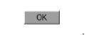
child: const Text(
'OK',textAlign: TextAlign.center, style: TextStyle(color: Colors.black)
),
),
);
}
}
Here, we have used two widgets a Container widget and a Text widget. The result of the widget is as a custom button as shown below −
Let us check some of the most important single child layout widgets provided by Flutter −
Padding − Used to arrange its child widget by the given padding. Here, padding can be provided by EdgeInsets class.
Align − Align its child widget within itself using the value of alignment property. The value for alignment property can be provided by FractionalOffset class. The FractionalOffset class specifies the offsets in terms of a distance from the top left.
Some of the possible values of offsets are as follows −
FractionalOffset(1.0, 0.0) represents the top right.
FractionalOffset(0.0, 1.0) represents the bottom left.
A sample code about offsets is shown below −
Center(
   child: Container(
      height: 100.0,
      width: 100.0,
      color: Colors.yellow, child: Align(
         alignment: FractionalOffset(0.2, 0.6),
         child: Container( height: 40.0, width:
            40.0, color: Colors.red,
         ),
      ),
   ),
)
FittedBox − It scales the child widget and then positions it according to the specified fit.
AspectRatio − It attempts to size the child widget to the specified aspect ratio
ConstrainedBox
Baseline
FractinallySizedBox
IntrinsicHeight
IntrinsicWidth
LiimitedBox
OffStage
OverflowBox
SizedBox
SizedOverflowBox
Transform
CustomSingleChildLayout
Our hello world application is using material based layout widgets to design the home page. Let us modify our hello world application to build the home page using basic layout widgets as specified below −
Container − Generic, single child, box based container widget with alignment, padding, border and margin along with rich styling features.
Center − Simple, Single child container widget, which centers its child widget.
The modified code of the MyHomePage and MyApp widget is as below −
class MyApp extends StatelessWidget {
   @override
   Widget build(BuildContext context) {
      return MyHomePage(title: "Hello World demo app");
   }
}
class MyHomePage extends StatelessWidget {
   MyHomePage({Key key, this.title}) : super(key: key);
   final String title;
   @override
   Widget build(BuildContext context) {
      return Container(
         decoration: BoxDecoration(color: Colors.white,),
         padding: EdgeInsets.all(25), child: Center(
            child:Text(
               'Hello World', style: TextStyle(
                  color: Colors.black, letterSpacing: 0.5, fontSize: 20,
               ),
               textDirection: TextDirection.ltr,
            ),
         )
      );
   }
}
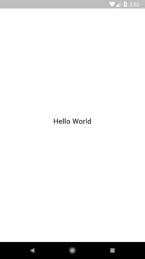
Here,
Container widget is the top level or root widget. Container is configured using decoration and padding property to layout its content.
BoxDecoration has many properties like color, border, etc., to decorate the Container widget and here, color is used to set the color of the container.
padding of the Container widget is set by using dgeInsets class, which provides the option to specify the padding value.
Center is the child widget of the Container widget. Again, Text is the child of the Center widget. Text is used to show message and Center is used to center the text message with respect to the parent widget, Container.
The final result of the code given above is a layout sample as shown below −
Multiple Child Widgets
In this category, a given widget will have more than one child widgets and the layout of each widget is unique.
For example, Row widget allows the laying out of its children in horizontal direction, whereas Column widget allows laying out of its children in vertical direction. By composing Row and Column, widget with any level of complexity can be built.
Let us learn some of the frequently used widgets in this section.
Row − Allows to arrange its children in a horizontal manner.
Column − Allows to arrange its children in a vertical manner.
ListView − Allows to arrange its children as list.
GridView − Allows to arrange its children as gallery.
Expanded − Used to make the children of Row and Column widget to occupy the maximum possible area.
Table − Table based widget.
Flow − Flow based widget.
Stack − Stack based widget.
Advanced Layout Application
In this section, let us learn how to create a complex user interface of product listing with custom design using both single and multiple child layout widgets.
For this purpose, follow the sequence given below −
Create a new Flutter application in Android studio, product_layout_app.
Replace the main.dart code with folowing code −
import 'package:flutter/material.dart';
void main() => runApp(MyApp());

class MyApp extends StatelessWidget {
   // This widget is the root of your application.
   @override
   Widget build(BuildContext context) {
      return MaterialApp(
         title: 'Flutter Demo', theme: ThemeData(
         primarySwatch: Colors.blue,),
         home: MyHomePage(title: 'Product layout demo home page'),
      );
   }
}
class MyHomePage extends StatelessWidget {
   MyHomePage({Key key, this.title}) : super(key: key);
   final String title;

   @override
   Widget build(BuildContext context) {
      return Scaffold(
         appBar: AppBar(title: Text(this.title),),
         body: Center(child: Text( 'Hello World', )),
      );
   }
}
Here,
We have created MyHomePage widget by extending StatelessWidget instead of default StatefulWidget and then removed the relevant code.
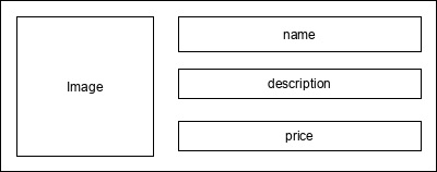
Now, create a new widget, ProductBox according to the specified design as shown below −
The code for the ProductBox is as follows.
class ProductBox extends StatelessWidget {
   ProductBox({Key key, this.name, this.description, this.price, this.image})
      : super(key: key);
   final String name;
   final String description;
   final int price;
   final String image;

   Widget build(BuildContext context) {
      return Container(
         padding: EdgeInsets.all(2), height: 120,  child: Card(
            child: Row(
               mainAxisAlignment: MainAxisAlignment.spaceEvenly, children: <Widget>[
                  Image.asset("assets/appimages/" +image), Expanded(
                     child: Container(
                        padding: EdgeInsets.all(5), child: Column(
                           mainAxisAlignment: MainAxisAlignment.spaceEvenly,
                              children: <Widget>[

                              Text(this.name, style: TextStyle(fontWeight:
                                 FontWeight.bold)), Text(this.description),
                              Text("Price: " + this.price.toString()),
                           ],
                        )
                     )
                  )
               ]
            )
         )
      );
   }
}
Please observe the following in the code −
ProductBox has used four arguments as specified below −
name - Product name
description - Product description
price - Price of the product
image - Image of the product
ProductBox uses seven build-in widgets as specified below −
- Container
- Expanded
- Row
- Column
- Card
- Text
- Image
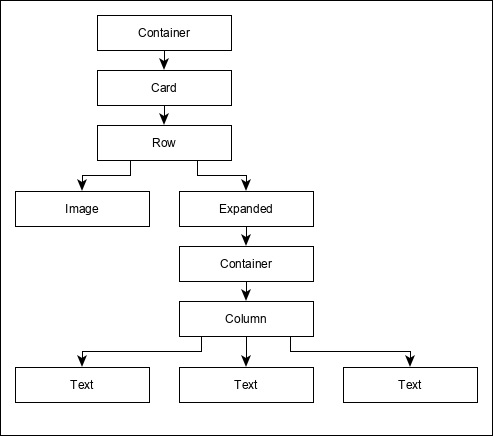
ProductBox is designed using the above mentioned widget. The arrangement or hierarchy of the widget is specified in the diagram shown below −
Now, place some dummy image (see below) for product information in the assets folder of the application and configure the assets folder in the pubspec.yaml file as shown below −
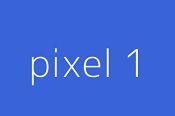
assets:
   - assets/appimages/floppy.png
   - assets/appimages/iphone.png
   - assets/appimages/laptop.png
   - assets/appimages/pendrive.png
   - assets/appimages/pixel.png
   - assets/appimages/tablet.png
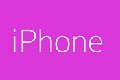
iPhone.png
Pixel.png
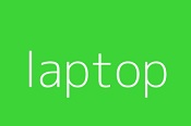
Laptop.png
Tablet.png
Pendrive.png
Floppy.png
Finally, Use the ProductBox widget in the MyHomePage widget as specified below −
class MyHomePage extends StatelessWidget {
   MyHomePage({Key key, this.title}) : super(key: key);
   final String title;

   @override
   Widget build(BuildContext context) {
      return Scaffold(
         appBar: AppBar(title:Text("Product Listing")),
         body: ListView(
            shrinkWrap: true, padding: const EdgeInsets.fromLTRB(2.0, 10.0, 2.0, 10.0),
            children: <Widget> [
               ProductBox(
                  name: "iPhone",
                  description: "iPhone is the stylist phone ever",
                  price: 1000,
                  image: "iphone.png"
               ),
               ProductBox(
                  name: "Pixel",
                  description: "Pixel is the most featureful phone ever",
                  price: 800,
                  image: "pixel.png"
               ),
               ProductBox(
                  name: "Laptop",
                  description: "Laptop is most productive development tool",
                  price: 2000,
                  image: "laptop.png"
               ),
               ProductBox(
                  name: "Tablet",
                  description: "Tablet is the most useful device ever for meeting",
                  price: 1500,
                  image: "tablet.png"
               ),
               ProductBox(
                  name: "Pendrive",
                  description: "Pendrive is useful storage medium",
                  price: 100,
                  image: "pendrive.png"
               ),
               ProductBox(
                  name: "Floppy Drive",
                  description: "Floppy drive is useful rescue storage medium",
                  price: 20,
                  image: "floppy.png"
               ),
            ],
         )
      );
   }
}
Here,we have used ProductBox as children of ListView widget.
The complete code (main.dart) of the product layout application (product_layout_app) is as follows −
import 'package:flutter/material.dart';
void main() => runApp(MyApp());

class MyApp extends StatelessWidget {
   // This widget is the root of your application.
   @override
   Widget build(BuildContext context) {
      return MaterialApp(
         title: 'Flutter Demo', theme: ThemeData(
            primarySwatch: Colors.blue,
         ),
         home: MyHomePage(title: 'Product layout demo home page'),
      );
   }
}
class MyHomePage extends StatelessWidget {
   MyHomePage({Key key, this.title}) : super(key: key);
   final String title;

   @override
   Widget build(BuildContext context) {
      return Scaffold(
         appBar: AppBar(title: Text("Product Listing")),
         body: ListView(
            shrinkWrap: true,
            padding: const EdgeInsets.fromLTRB(2.0, 10.0, 2.0, 10.0),
            children: <Widget>[
               ProductBox(
                  name: "iPhone",
                  description: "iPhone is the stylist phone ever",
                  price: 1000,
                  image: "iphone.png"
               ),
               ProductBox(
                  name: "Pixel",
                  description: "Pixel is the most featureful phone ever",
                  price: 800,
                  image: "pixel.png"
               ),
               ProductBox(
                  name: "Laptop",
                  description: "Laptop is most productive development tool",
                  price: 2000,
                  image: "laptop.png"
               ),
               ProductBox(
                  name: "Tablet",
                  description: "Tablet is the most useful device ever for meeting",
                  price: 1500,
                  image: "tablet.png"
               ),
               ProductBox(
                  name: "Pendrive",
                  description: "Pendrive is useful storage medium",
                  price: 100,
                  image: "pendrive.png"
               ),
               ProductBox(
                  name: "Floppy Drive",
                  description: "Floppy drive is useful rescue storage medium",
                  price: 20,
                  image: "floppy.png"
               ),
            ],
         )
      );
   }
}
class ProductBox extends StatelessWidget {
   ProductBox({Key key, this.name, this.description, this.price, this.image}) :
      super(key: key);
   final String name;
   final String description;
   final int price;
   final String image;

   Widget build(BuildContext context) {
      return Container(
         padding: EdgeInsets.all(2),
         height: 120,
         child: Card(
            child: Row(
               mainAxisAlignment: MainAxisAlignment.spaceEvenly,
               children: <Widget>[
                  Image.asset("assets/appimages/" + image),
                  Expanded(
                     child: Container(
                        padding: EdgeInsets.all(5),
                        child: Column(
                           mainAxisAlignment: MainAxisAlignment.spaceEvenly,
                           children: <Widget>[
                              Text(
                                 this.name, style: TextStyle(
                                    fontWeight: FontWeight.bold
                                 )
                              ),
                              Text(this.description), Text(
                                 "Price: " + this.price.toString()
                              ),
                           ],
                        )
                     )
                  )
               ]
            )
         )
      );
   }
}
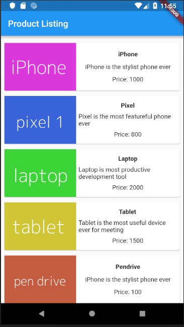
The final output of the application is as follows −