
Article Categories
- All Categories
-
 Data Structure
-
 Networking
-
 RDBMS
RDBMS
-
 Operating System
-
 Java
Java
-
 MS Excel
-
 iOS
iOS
-
 HTML
HTML
-
 CSS
CSS
-
 Android
-
 Python
-
 C Programming
-
 C++
C++
-
 C#
C#
-
 MongoDB
-
 MySQL
MySQL
-
 Javascript
-
 PHP
PHP
-
 Economics & Finance
Create a simple clustered chart to show the Gender Distribution in the employee dataset
Introduction
Visualization is an effective technique where the users can showcase their data in the presentation form. Numerous built-in visuals are available in Power BI tools like Simple clustered charts, Line charts, Heat maps, Funnels, Gauge charts, Pie charts, and so on. Through these visuals, the segregation of data based on accuracy enables quicker identification of useful information while eliminating time-consuming manual corrections. We will examine the clustered chart in this article to observe how the gender distribution in the employee dataset is displayed.
Creation of a simple clustered chart to show gender distribution in the dataset
Step 1
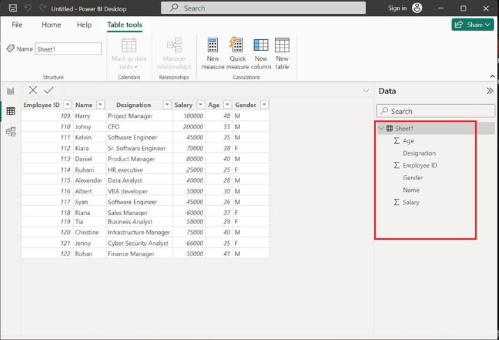
Open the Power BI desktop and load the Sheet1 table consisting of the six columns named Age, Designation, Employee ID, Gender, Name and Salary. The complete structure and entries of the Sheet1 table are shown below
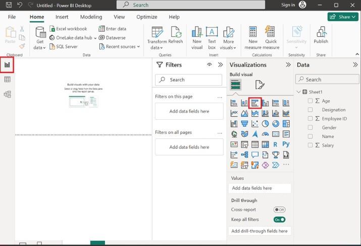
Step 2
Navigate to the Report Editor, and click on the Clustered bar chart as depicted below
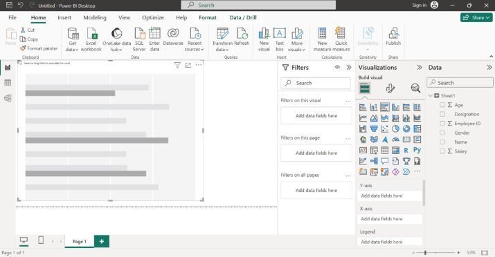
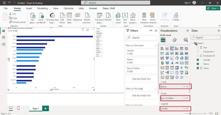
Step 3
Select the Name column to the Y axis, drag the Salary column, drop it to the X axis, and add the Gender column to the Legend section as shown in the below image. The gender distribution is done by their salary. Therefore, the female employees are populated in the light blue color, and Male employees are showcased in dark blue color.
Step 4
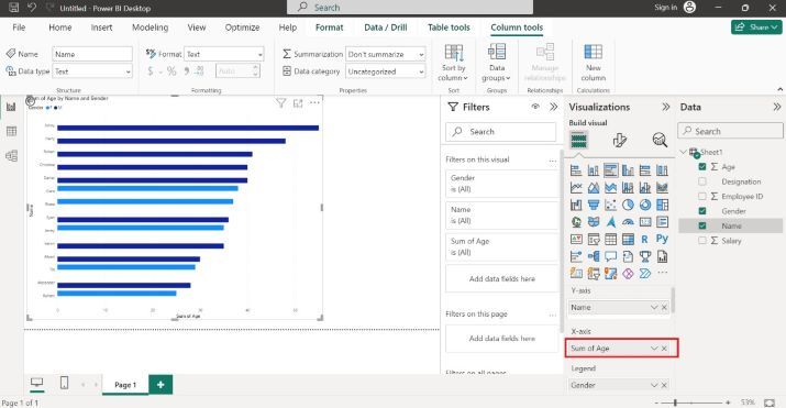
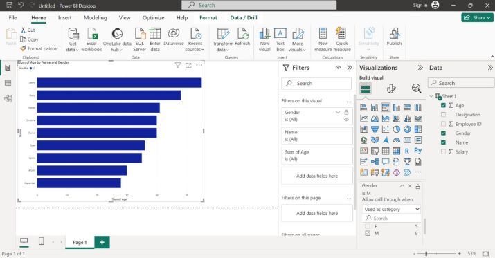
Let?s change the X-axis column. Drag the Age column and drop it into the X-axis section. The clustered chart depicts the sum of age by name and gender as shown below
Step 5
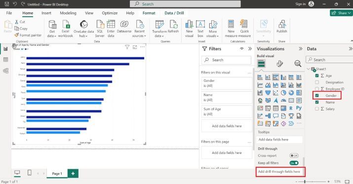
You can also count the number of Female and Male employees by drill-down option. Drag the Gender column and drop into the "Drill through" section as highlighted below image
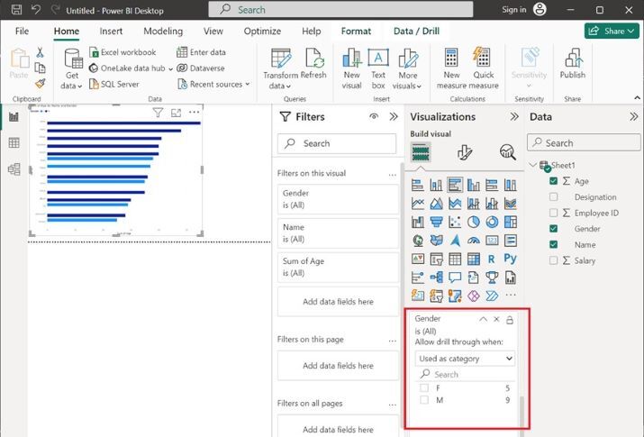
In the above image, we may easily count the number of female employees which is 5 and the number of male employees is equal to 9.
Step 6
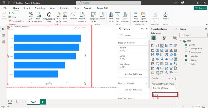
You can click on the F checkbox to populate only Female employees
Step 7
Similarly, you may click on the "M" checkbox to count the number of Male employees through this visual.
Conclusion
The user must follow the above instructions to generate the simple clustered chart. It is an effective yet simple and precious technique; beginners may take advantage of this technique. Make sure that the employee table comprises the Gender, Name, and Salary columns. Other columns in the employee table are optional.

684 Views
