- AWS Quicksight - Home
- AWS Quicksight - Overview
- AWS Quicksight - Landing Page
- AWS Quicksight - Using Data Sources
- AWS Quicksight - Data Source Limit
- AWS Quicksight - Editing Datasets
- AWS Quicksight - Creating New Analysis
- AWS Quicksight - Adding Visuals
- Using Filters to a Visual
- AWS Quicksight - Insights
- AWS Quicksight - Creating Story
- AWS Quicksight - Using Parameters
- AWS Quicksight - Sharing Analysis
- AWS Quicksight - Dashboards
- AWS Quicksight - Managing Quicksight
- AWS Quicksight - Edition Type
- AWS Quicksight - Managing IAM Policies
- AWS Quicksight - Embedding Dashboard
- AWS Quicksight - AWS SDKs
- Developer Responsibilities
- AWS Quicksight Useful Resources
- AWS Quicksight - Quick Guide
- AWS Quicksight - Useful Resources
- AWS Quicksight - Discussion
AWS Quicksight - Creating New Analysis
An analysis is a combination of one or more visuals. A visual is the representation of data in graphical, chart or tabular format. There are number of formats available to create any visual. This includes the pie charts, horizontal bar chart, vertical bar chart and pivot table.
Once the input data set has been modified as per business requirement, double click on the dataset and click on visualize to start creating new analysis. It will show you the below screen or the workspace.
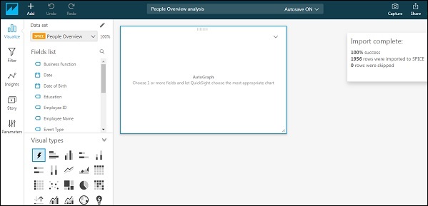
Once you select a field, Quicksight automatically chooses the type of visual depending upon the field. If you want to change the visual type, you can select one of the visual types.
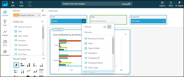
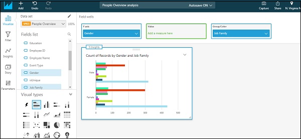
For example, we start by selecting the Horizontal bar under visual types. First, drag any one field inside the visual in the centre. At the top, you will see Fields wells containing fields used in visual and the corresponding axis. You can click on the down arrow at the last just under user name.

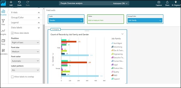
This will give you an expanded view. I have selected Gender on Y axis and Job family under Group/colour. You can modify the fields from dropdown. Under value, you can add any numeric field and use aggregate function on that field. By default, the visual will show count of rows.
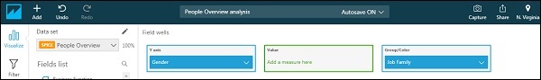
The visual will appear as follows −
There are options to change the heading/title of the visual and number of other formatting options. Click the dropdown on the right most. The options will expand. Choose format visual. You will be able to see various options in left tab under Format visual.
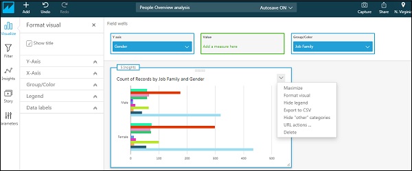
X-Axis/Y-Axis − This gives the option if you want to see the label or field name on the respective axis. It also allows you to rename these labels.
Group/Color − This provides the option to change the default colors in the visual.
Legend − This provides the options to change title and position of title in the visual. You can also rename the title by just clicking over it.
Data labels − This provides the option to show exact values of each bar and the position where the values needs to be displayed.
The below screen shows the visual with everything turned on −