
Article Categories
- All Categories
-
 Data Structure
-
 Networking
-
 RDBMS
RDBMS
-
 Operating System
-
 Java
Java
-
 MS Excel
-
 iOS
iOS
-
 HTML
HTML
-
 CSS
CSS
-
 Android
-
 Python
-
 C Programming
-
 C++
C++
-
 C#
C#
-
 MongoDB
-
 MySQL
MySQL
-
 Javascript
-
 PHP
PHP
-
 Economics & Finance
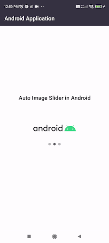
Auto Image Slider in Android with Example
What is an Auto Image Slider in Android?
In this tutorial, we are going to learn on How to implement an Auto Image Slider in our android application using Kotlin as a programming language.
Auto Image Slider is a UI widget which contains multiple images sliding automatically from left to right or in opposite directions. This type of feature is seen in many ecommerce applications which are used to display different types of banners to the customers using auto image slider widget.
Implementation of Auto Image Slider
We will be creating a simple application in which we will be simply displaying an auto image slider within our application which will contain 3 images in it. We will be loading these images from the internet using image URL and displaying those images within our auto image slider. We will be following a step by step guide to implement a circular fillable loader in an android application.
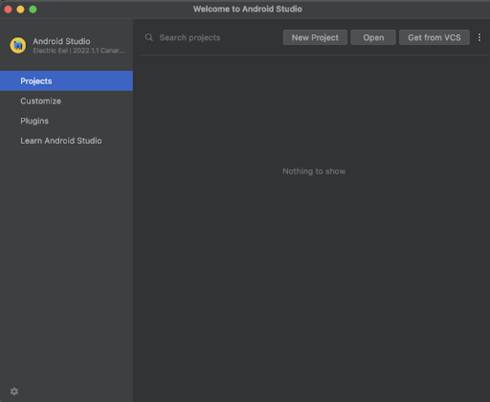
Step 1 : Creating a new project in Android Studio
Navigate to Android studio as shown in below screen. In the below screen click on New Project to create a new Android Studio Project.
After clicking on New Project you will get to see the below screen.
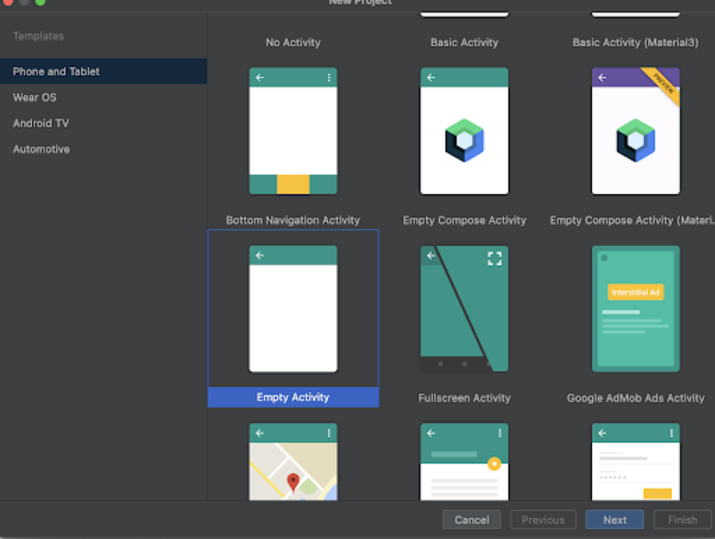
Inside this screen we have to simply select Empty Activity and click on Next. After clicking on next you will get to see the screen below.
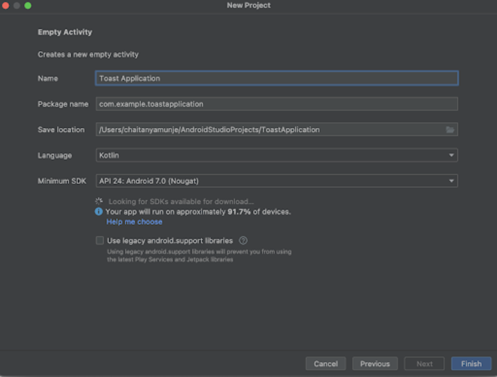
Inside this screen we have to simply specify the project name. Then the package name will be generated automatically.
Note ? Make sure to select the Language as Kotlin.
After specifying all the details click on Finish to create a new Android studio project.
Once our project has been created we will get to see 2 files which are open i.e activity_main.xml and MainActivity.kt file.
Step 2 : Adding dependency in build.gradle file to use this library
Navigate to Gradle Scripts>build.gradle file and add the below dependency in dependencies section.
implementation 'com.github.smarteist:autoimageslider:1.3.9'
implementation "com.github.bumptech.glide:glide:4.11.0"
In the dependencies section we will be adding 2 dependencies as shown above. The first dependency is used to create an auto image slider within our application and the second dependency is of Glide which is used to load images from the Internet using image URL.
After adding the above dependency you will get to see the Sync Now option in the top right corner of your IDE. Simply click on it to sync your project and install this dependency within your project.
Step 3 : Working with activity_main.xml
Navigate to activity_main.xml. If this file is not visible. To open this file. In the left pane navigate to app>res>layout>activity_main.xml to open this file. After opening this file. Add the below code to it. Comments are added in the code to get to know in detail.
<div class="code-mirror  language-kotlin" contenteditable="plaintext-only" spellcheck="false" style="outline: none; overflow-wrap: break-word; overflow-y: auto; white-space: pre-wrap;"><span class="token operator"><</span><span class="token operator">?</span>xml version<span class="token operator">=</span><span class="token string">"1.0"</span> encoding<span class="token operator">=</span><span class="token string">"utf-8"</span><span class="token operator">?</span><span class="token operator">></span>
<span class="token operator"><</span>RelativeLayout xmlns<span class="token operator">:</span>android<span class="token operator">=</span><span class="token string">"http://schemas.android.com/apk/res/android"</span>
   xmlns<span class="token operator">:</span>app<span class="token operator">=</span><span class="token string">"http://schemas.android.com/apk/res-auto"</span>
   xmlns<span class="token operator">:</span>tools<span class="token operator">=</span><span class="token string">"http://schemas.android.com/tools"</span>
   android<span class="token operator">:</span>layout_width<span class="token operator">=</span><span class="token string">"match_parent"</span>
   android<span class="token operator">:</span>layout_height<span class="token operator">=</span><span class="token string">"match_parent"</span>
   tools<span class="token operator">:</span>context<span class="token operator">=</span><span class="token string">".MainActivity"</span><span class="token operator">></span>

   <span class="token operator"><</span><span class="token operator">!</span><span class="token operator">--</span> creating text view <span class="token keyword">for</span> displaying heading<span class="token operator">--</span><span class="token operator">></span>
   <span class="token operator"><</span>TextView
      android<span class="token operator">:</span>id<span class="token operator">=</span><span class="token string">"@+id/idTVHeading"</span>
      android<span class="token operator">:</span>layout_width<span class="token operator">=</span><span class="token string">"match_parent"</span>
      android<span class="token operator">:</span>layout_height<span class="token operator">=</span><span class="token string">"wrap_content"</span>
      android<span class="token operator">:</span>layout_above<span class="token operator">=</span><span class="token string">"@id/slider"</span>
      android<span class="token operator">:</span>layout_margin<span class="token operator">=</span><span class="token string">"20dp"</span>
      android<span class="token operator">:</span>gravity<span class="token operator">=</span><span class="token string">"center"</span>
      android<span class="token operator">:</span>text<span class="token operator">=</span><span class="token string">"Auto Image Slider in Android"</span>
      android<span class="token operator">:</span>textAlignment<span class="token operator">=</span><span class="token string">"center"</span>
      android<span class="token operator">:</span>textAllCaps<span class="token operator">=</span><span class="token string">"false"</span>
      android<span class="token operator">:</span>textColor<span class="token operator">=</span><span class="token string">"#FF000000"</span>
      android<span class="token operator">:</span>textSize<span class="token operator">=</span><span class="token string">"20sp"</span>
      android<span class="token operator">:</span>textStyle<span class="token operator">=</span><span class="token string">"bold"</span> <span class="token operator">/</span><span class="token operator">></span>

   <span class="token operator"><</span><span class="token operator">!</span><span class="token operator">--</span>Creating auto image slider on below line<span class="token operator">--</span><span class="token operator">></span>
   <span class="token operator"><</span>com<span class="token punctuation">.</span>smarteist<span class="token punctuation">.</span>autoimageslider<span class="token punctuation">.</span>SliderView
      android<span class="token operator">:</span>id<span class="token operator">=</span><span class="token string">"@+id/slider"</span>
      android<span class="token operator">:</span>layout_width<span class="token operator">=</span><span class="token string">"match_parent"</span>
      android<span class="token operator">:</span>layout_height<span class="token operator">=</span><span class="token string">"150dp"</span>
      android<span class="token operator">:</span>layout_centerInParent<span class="token operator">=</span><span class="token string">"true"</span>
      app<span class="token operator">:</span>sliderAnimationDuration<span class="token operator">=</span><span class="token string">"600"</span>
      app<span class="token operator">:</span>sliderAutoCycleDirection<span class="token operator">=</span><span class="token string">"back_and_forth"</span>
      app<span class="token operator">:</span>sliderIndicatorAnimationDuration<span class="token operator">=</span><span class="token string">"600"</span>
      app<span class="token operator">:</span>sliderIndicatorEnabled<span class="token operator">=</span><span class="token string">"true"</span>
      app<span class="token operator">:</span>sliderIndicatorGravity<span class="token operator">=</span><span class="token string">"center_horizontal|bottom"</span>
      app<span class="token operator">:</span>sliderIndicatorMargin<span class="token operator">=</span><span class="token string">"15dp"</span>
      app<span class="token operator">:</span>sliderIndicatorOrientation<span class="token operator">=</span><span class="token string">"horizontal"</span>
      app<span class="token operator">:</span>sliderIndicatorPadding<span class="token operator">=</span><span class="token string">"3dp"</span>
      app<span class="token operator">:</span>sliderIndicatorRadius<span class="token operator">=</span><span class="token string">"2dp"</span>
      app<span class="token operator">:</span>sliderIndicatorSelectedColor<span class="token operator">=</span><span class="token string">"#5A5A5A"</span>
      app<span class="token operator">:</span>sliderIndicatorUnselectedColor<span class="token operator">=</span><span class="token string">"#BCB8B8"</span>
      app<span class="token operator">:</span>sliderScrollTimeInSec<span class="token operator">=</span><span class="token string">"1"</span> <span class="token operator">/</span><span class="token operator">></span>

<span class="token operator"><</span><span class="token operator">/</span>RelativeLayout<span class="token operator">></span>
</div>
Explanation ? In the above code the root element is a Relative layout in android. This layout is a view group which is used to align all the elements within it relative to each other. We can relatively align all elements within Relative Layout with the help of ids or positions.
Inside this relative layout the first view which we have created is Text View. It is used to display a simple text message. Inside this text view widget we have specified its width as match_parent so that it will take the complete width of the mobile device and height as wrap content to take the text height.We are specifying id for our text view which is a unique identifier for that widget. We can use this id to perform some operations of this text view such as overriding a new text to it. Then we are adding a layout above param to align this text view layout above of our circular fillable loader with the help of circular fillable loader view id. Then we are adding margin for our text view from all sides. After that we are adding a text as a parameter inside which we will be specifying the value which we have to show inside our Text View. After specifying text we are specifying the text alignment. This will align the text inside the text view widget to the center of the widget. Then we are specifying text color as black, text size as 20sp and lastly specifying the text style as bold.
After adding our text view for heading we are creating our slider view for using auto image slider within our android application. Inside this firstly we are specifying the unique id for it, then we are specifying height and width for our widget. After that we are aligning this widget to the center of the screen by calling centerInParent. Then we are specifying the slider animation duration at 600 milliseconds. Then we are setting the auto cycle direction for the slider view as back and forth. After that we are adding slider indicator animation duration also as 600 milliseconds. Then we are calling the slider indicator enabled to true to display our slider indicator. After that we are setting the slider indicator gravity to the center of the slider view. Adding a margin for the slider indicator from all sides. Then we are adding margin for indicators, orientation for indicators as horizontal, padding for indicators and radius for indicators. After that we are setting selected and unselected color for indicators and lastly adding slider scroll time as 1 second.
At last we are adding a closing tag for our Relative Layout as the text view and button is enclosed in our relative layout.
Step 4 : Creating a new layout file for items of slider view
Now we will be creating a new layout file that we will be using for the individual items of the slider view. For creating that file navigate to app>res>layout>Right click on it>New>Layout resource file and specify the file name as slider_item and click on Create to create a new file. After creating that file add below code to it. Comments are added in the code to get to know in detail.
<div class="code-mirror  language-kotlin" contenteditable="plaintext-only" spellcheck="false" style="outline: none; overflow-wrap: break-word; overflow-y: auto; white-space: pre-wrap;"><span class="token operator"><</span><span class="token operator">?</span>xml version<span class="token operator">=</span><span class="token string">"1.0"</span> encoding<span class="token operator">=</span><span class="token string">"utf-8"</span><span class="token operator">?</span><span class="token operator">></span>
<span class="token operator"><</span>RelativeLayout xmlns<span class="token operator">:</span>android<span class="token operator">=</span><span class="token string">"http://schemas.android.com/apk/res/android"</span>
   android<span class="token operator">:</span>layout_width<span class="token operator">=</span><span class="token string">"match_parent"</span>
   android<span class="token operator">:</span>layout_height<span class="token operator">=</span><span class="token string">"match_parent"</span><span class="token operator">></span>

   <span class="token operator"><</span><span class="token operator">!</span><span class="token operator">--</span>Creating an image view <span class="token keyword">to</span> display <span class="token keyword">in</span> slider view<span class="token operator">--</span><span class="token operator">></span>
   <span class="token operator"><</span>ImageView
      android<span class="token operator">:</span>id<span class="token operator">=</span><span class="token string">"@+id/idIVSliderItem"</span>
      android<span class="token operator">:</span>layout_width<span class="token operator">=</span><span class="token string">"400dp"</span>
      android<span class="token operator">:</span>layout_height<span class="token operator">=</span><span class="token string">"300dp"</span>
      android<span class="token operator">:</span>layout_centerHorizontal<span class="token operator">=</span><span class="token string">"true"</span> <span class="token operator">/</span><span class="token operator">></span>

<span class="token operator"><</span><span class="token operator">/</span>RelativeLayout<span class="token operator">></span>
</div>
Explanation ? In the above code the root element is a Relative layout in android. This layout is a view group which is used to align all the elements within it relative to each other. We can relatively align all elements within Relative Layout with the help of ids or positions.
Inside this relative layout we are creating an image view which is used to display the images in our auto image slider. For this image view we are specifying the unique id which we will be using to set the image for it. Then we are specifying width and height for our image view. After that we are adding layout center horizontal to true to align our image view center horizontal to the screen.
At last we are adding a closing tag for our Relative Layout as the text view and button is enclosed in our relative layout.
Step 5 : Creating an Adapter class for setting the data to items of Slider View
Adapter class is used to set the data to each item of Slider View. Inside this class we will be specifying which layout file we have to display for the items of slider view. Then we will be initializing items of that layout file and setting data to that layout file such as in the current case we will be updating the image.
Now to create the adapter class. Navigate to app>java>your app?s package name>Right click on it>New>Java/Kotlin class and name the file as SliderAdapter and add below code to it. Comments are added in the code to get to know in detail.
<div class="code-mirror  language-kotlin" contenteditable="plaintext-only" spellcheck="false" style="outline: none; overflow-wrap: break-word; overflow-y: auto; white-space: pre-wrap;"><span class="token keyword">package</span> com<span class="token punctuation">.</span>gtappdevelopers<span class="token punctuation">.</span>androidapplication

<span class="token keyword">import</span> android<span class="token punctuation">.</span>view<span class="token punctuation">.</span>LayoutInflater
<span class="token keyword">import</span> android<span class="token punctuation">.</span>view<span class="token punctuation">.</span>View
<span class="token keyword">import</span> android<span class="token punctuation">.</span>view<span class="token punctuation">.</span>ViewGroup
<span class="token keyword">import</span> android<span class="token punctuation">.</span>widget<span class="token punctuation">.</span>ImageView
<span class="token keyword">import</span> com<span class="token punctuation">.</span>bumptech<span class="token punctuation">.</span>glide<span class="token punctuation">.</span>Glide
<span class="token keyword">import</span> com<span class="token punctuation">.</span>smarteist<span class="token punctuation">.</span>autoimageslider<span class="token punctuation">.</span>SliderViewAdapter


<span class="token keyword">class</span> <span class="token function">SliderAdapter</span><span class="token punctuation">(</span><span class="token keyword">private</span> <span class="token keyword">val</span> sliderList<span class="token operator">:</span> List<span class="token operator"><</span>String<span class="token operator">></span><span class="token punctuation">)</span> <span class="token operator">:</span>
   SliderViewAdapter<span class="token operator"><</span>SliderAdapter<span class="token punctuation">.</span>SliderViewHolder<span class="token operator">></span><span class="token punctuation">(</span><span class="token punctuation">)</span> <span class="token punctuation">{</span>

   <span class="token comment">// creating  a class for slider view holder</span>
   <span class="token keyword">class</span> <span class="token function">SliderViewHolder</span><span class="token punctuation">(</span>ItemView<span class="token operator">:</span> View<span class="token punctuation">)</span> <span class="token operator">:</span> SliderViewAdapter<span class="token punctuation">.</span><span class="token function">ViewHolder</span><span class="token punctuation">(</span>ItemView<span class="token punctuation">)</span> <span class="token punctuation">{</span>
      <span class="token comment">// on below line creating and initializing variable for slider image view with unique id.</span>
      <span class="token keyword">val</span> sliderIV<span class="token operator">:</span> ImageView <span class="token operator">=</span> itemView<span class="token punctuation">.</span><span class="token function">findViewById</span><span class="token punctuation">(</span>R<span class="token punctuation">.</span>id<span class="token punctuation">.</span>idIVSliderItem<span class="token punctuation">)</span>
   <span class="token punctuation">}</span>


   <span class="token comment">// below method is use to return the count for the size of slider list</span>
   <span class="token keyword">override</span> <span class="token keyword">fun</span> <span class="token function">getCount</span><span class="token punctuation">(</span><span class="token punctuation">)</span><span class="token operator">:</span> Int <span class="token punctuation">{</span>
      <span class="token keyword">return</span> sliderList<span class="token punctuation">.</span>size
   <span class="token punctuation">}</span>

   <span class="token keyword">override</span> <span class="token keyword">fun</span> <span class="token function">onCreateViewHolder</span><span class="token punctuation">(</span>parent<span class="token operator">:</span> ViewGroup<span class="token operator">?</span><span class="token punctuation">)</span><span class="token operator">:</span> SliderAdapter<span class="token punctuation">.</span><span class="token function">SliderViewHolder</span> <span class="token punctuation">{</span>
      <span class="token comment">// on below line we are creating a variable to inflate the layout file which we have created.</span>
      <span class="token keyword">val</span> itemView<span class="token operator">:</span> View <span class="token operator">=</span>
         LayoutInflater<span class="token punctuation">.</span><span class="token function">from</span><span class="token punctuation">(</span>parent<span class="token operator">!!</span><span class="token punctuation">.</span>context<span class="token punctuation">)</span><span class="token punctuation">.</span><span class="token function">inflate</span><span class="token punctuation">(</span>R<span class="token punctuation">.</span>layout<span class="token punctuation">.</span>slider_item<span class="token punctuation">,</span> <span class="token keyword">null</span><span class="token punctuation">)</span>
      <span class="token comment">// on below line we are passing that view to view holder class.</span>
      <span class="token keyword">return</span> <span class="token function">SliderViewHolder</span><span class="token punctuation">(</span>itemView<span class="token punctuation">)</span>
   <span class="token punctuation">}</span>

   <span class="token keyword">override</span> <span class="token keyword">fun</span> <span class="token function">onBindViewHolder</span><span class="token punctuation">(</span>viewHolder<span class="token operator">:</span> SliderAdapter<span class="token punctuation">.</span>SliderViewHolder<span class="token operator">?</span><span class="token punctuation">,</span> position<span class="token operator">:</span> Int<span class="token punctuation">)</span> <span class="token punctuation">{</span>
      <span class="token comment">// on below line we are loading an image from image url using Glide library and displaying that image in</span>
      <span class="token comment">// our slider image view</span>
      Glide<span class="token punctuation">.</span><span class="token function">with</span><span class="token punctuation">(</span>viewHolder<span class="token operator">!!</span><span class="token punctuation">.</span>itemView<span class="token punctuation">)</span><span class="token punctuation">.</span><span class="token function">load</span><span class="token punctuation">(</span>sliderList<span class="token punctuation">.</span><span class="token function">get</span><span class="token punctuation">(</span>position<span class="token punctuation">)</span><span class="token punctuation">)</span><span class="token punctuation">.</span><span class="token function">fitCenter</span><span class="token punctuation">(</span><span class="token punctuation">)</span>
         <span class="token punctuation">.</span><span class="token function">into</span><span class="token punctuation">(</span>viewHolder<span class="token punctuation">.</span>sliderIV<span class="token punctuation">)</span>
   <span class="token punctuation">}</span>
<span class="token punctuation">}</span>
</div>
Explanation ? In the above code we are creating an adapter class by specifying the class name as SliderAdapter and we are extending the class with SliderViewAdapter to get the properties of that class. Along with that we are passing the list of string as a parameter to our class.
After that we have to create an inner class named as Slider View Holder which will hold items of Slider View. Inside this class we will be creating a variable for image view which we have created in our slider_item.xml file. We will be initializing this variable with the id which we have specified in our slider_item.xml file.
After that we have to override the default methods of SliderViewAdapter class which are generated as below ?
getCount() ? In this method we have to return the size of the list of data which we have to display inside our slider view. For our slider view we are displaying the images from the list so we will be returning the size of the list to return the size of our list to get the item count.
onCreateViewHolder() ? In this method we will be inflating the layout file which we have to display for the items of the slider view. We will be inflating the layout file which we have named as slider_item and passing this item view to our slider view holder to initialize the views within this layout file.
onBindViewHolder() ? In this method we will be setting the data for the image view which we have created in our slider_item.xml file. We will be using the Glide library to load images from the URL within this image view. We are getting this image URL from the array list which we are getting from the variable named as sliderList. We are loading images from that image URL inside our image view of each item of slider view.
Step 6 : Adding internet permissions in AndroidManifest.xml file
As we are loading images from the internet using image URLs we have to add internet permissions within our android application to access the internet to load this images. So we have to add internet permission. For adding internet permissions. Navigate to app>AndroidManifest.xml file and add below permission to it above the application tag.
<uses-permission android:name="android.permission.INTERNET"/>
Step 7 : Working with MainActivity.kt
Navigate to MainActivity.kt. If this file is not visible. To open this file. In the left pane navigate to app>java>your app?s package name>MainActivity.kt to open this file. After opening this file. Add the below code to it. Comments are added in the code to get to know in detail.
<div class="code-mirror  language-kotlin" contenteditable="plaintext-only" spellcheck="false" style="outline: none; overflow-wrap: break-word; overflow-y: auto; white-space: pre-wrap;"><span class="token keyword">package</span> com<span class="token punctuation">.</span>gtappdevelopers<span class="token punctuation">.</span>androidapplication

<span class="token keyword">import</span> android<span class="token punctuation">.</span>os<span class="token punctuation">.</span>Bundle
<span class="token keyword">import</span> androidx<span class="token punctuation">.</span>appcompat<span class="token punctuation">.</span>app<span class="token punctuation">.</span>AppCompatActivity
<span class="token keyword">import</span> com<span class="token punctuation">.</span>smarteist<span class="token punctuation">.</span>autoimageslider<span class="token punctuation">.</span>SliderView
<span class="token keyword">import</span> java<span class="token punctuation">.</span>util<span class="token punctuation">.</span><span class="token operator">*</span>
<span class="token keyword">class</span> MainActivity <span class="token operator">:</span> <span class="token function">AppCompatActivity</span><span class="token punctuation">(</span><span class="token punctuation">)</span> <span class="token punctuation">{</span>
   <span class="token comment">// creating variable for slider view</span>
   <span class="token keyword">lateinit</span> <span class="token keyword">var</span> sliderView<span class="token operator">:</span> SliderView
   <span class="token comment">// on below line creating variables for image urls.</span>
   <span class="token keyword">var</span> url1 <span class="token operator">=</span>
      <span class="token string">"https://developer.android.com/static/codelabs/basic-android-kotlin-compose-first-program/img/3bbebda874e6003b_960.png"</span>
   <span class="token keyword">var</span> url2 <span class="token operator">=</span>
      <span class="token string">"https://lh3.googleusercontent.com/GTmuiIZrppouc6hhdWiocybtRx1Tpbl52eYw4l-nAqHtHd4BpSMEqe-vGv7ZFiaHhG_l4v2m5Fdhapxw9aFLf28ErztHEv5WYIz5fA"</span>
   <span class="token keyword">var</span> url3 <span class="token operator">=</span>
      <span class="token string">"https://www.tutorialspoint.com/images/logo.png"</span>

   <span class="token keyword">override</span> <span class="token keyword">fun</span> <span class="token function">onCreate</span><span class="token punctuation">(</span>savedInstanceState<span class="token operator">:</span> Bundle<span class="token operator">?</span><span class="token punctuation">)</span> <span class="token punctuation">{</span>
      <span class="token keyword">super</span><span class="token punctuation">.</span><span class="token function">onCreate</span><span class="token punctuation">(</span>savedInstanceState<span class="token punctuation">)</span>
      <span class="token function">setContentView</span><span class="token punctuation">(</span>R<span class="token punctuation">.</span>layout<span class="token punctuation">.</span>activity_main<span class="token punctuation">)</span>
      <span class="token comment">// on below line initializing variables for auto image slider.</span>
      sliderView <span class="token operator">=</span> <span class="token function">findViewById</span><span class="token punctuation">(</span>R<span class="token punctuation">.</span>id<span class="token punctuation">.</span>slider<span class="token punctuation">)</span>
      <span class="token comment">// on below line creating variable for array list.</span>
      <span class="token keyword">val</span> sliderDataArrayList<span class="token operator">:</span> ArrayList<span class="token operator"><</span>String<span class="token operator">></span> <span class="token operator">=</span> <span class="token function">ArrayList</span><span class="token punctuation">(</span><span class="token punctuation">)</span>
      <span class="token comment">// on below line adding urls in slider list.</span>
      sliderDataArrayList<span class="token punctuation">.</span><span class="token function">add</span><span class="token punctuation">(</span>url1<span class="token punctuation">)</span>
      sliderDataArrayList<span class="token punctuation">.</span><span class="token function">add</span><span class="token punctuation">(</span>url2<span class="token punctuation">)</span>
      sliderDataArrayList<span class="token punctuation">.</span><span class="token function">add</span><span class="token punctuation">(</span>url3<span class="token punctuation">)</span>
      <span class="token comment">// on below line initializing our adapter class by passing our list to it.</span>
      <span class="token keyword">val</span> adapter <span class="token operator">=</span> <span class="token function">SliderAdapter</span><span class="token punctuation">(</span>sliderDataArrayList<span class="token punctuation">)</span>
      <span class="token comment">// on below line setting auto cycle direction for slider view from left to right.</span>
      sliderView<span class="token punctuation">.</span><span class="token function">setAutoCycleDirection</span><span class="token punctuation">(</span>SliderView<span class="token punctuation">.</span>LAYOUT_DIRECTION_LTR<span class="token punctuation">)</span><span class="token punctuation">;</span>
      <span class="token comment">// on below line setting adapter for slider view.</span>
      sliderView<span class="token punctuation">.</span><span class="token function">setSliderAdapter</span><span class="token punctuation">(</span>adapter<span class="token punctuation">)</span><span class="token punctuation">;</span>
      <span class="token comment">// on below line setting scroll time for slider view</span>
      sliderView<span class="token punctuation">.</span><span class="token function">setScrollTimeInSec</span><span class="token punctuation">(</span><span class="token number">3</span><span class="token punctuation">)</span><span class="token punctuation">;</span>
      <span class="token comment">// on below line setting auto cycle for slider view.</span>
      sliderView<span class="token punctuation">.</span><span class="token function">setAutoCycle</span><span class="token punctuation">(</span><span class="token boolean">true</span><span class="token punctuation">)</span><span class="token punctuation">;</span>
      <span class="token comment">// on below line setting start cycle for slider view.</span>
      sliderView<span class="token punctuation">.</span><span class="token function">startAutoCycle</span><span class="token punctuation">(</span><span class="token punctuation">)</span><span class="token punctuation">;</span>
   <span class="token punctuation">}</span>
<span class="token punctuation">}</span>
</div>
Explanation ? In the above code for the MainActivity.kt file. Firstly we are creating a variable for slider view and then we are creating a variable for image urls named as url1,url2,url3 and initializing these variables with the image URLs which we have to display within our auto image slider.
Now we will get to see the onCreate method. This is the default method of every android application. This method is called when the application view is created. Inside this method we are setting the content view i.e the layout file named activity_main.xml to set the UI from that file.
After specifying the view we are initializing our slider view with its unique id which we have given in the activity_main.xml file.
After initializing the slider view we are creating an array list and initializing it. Then we are adding data to it as url1,url2 and url3 to it. After that we are initializing our adapter class and passing our slider array list to it. After that we are setting the slider view auto cycle direction from left to right so that images within the slider can move from left to right in the slider view. Then we are setting the adapter for our slider view which we have created above named as adapter. Then we are setting scroll time for items of slider view as 3 seconds. Then setting the auto cycle for the slider view as true. Lastly we are starting the slider view cycle.
After adding the above code now we have to simply click on the green icon in the top bar to run our application on a mobile device.
Note : Make sure you are connected to your real device or emulator.
Conclusion
In the above tutorial we learn What is auto image slider and How we can implement auto image slider within our android application to display images within it.

13K+ Views
