- Svelte - Home
- Svelte - Introduction
- Svelte - Installation
- Svelte - Reactivity
- Svelte - Props
- Svelte - Logic
- Svelte - Events
- Svelte - Bindings
- Svelte - Classes
- Svelte - Actions
- Svelte - Transitions
- Svelte - Advance Reactivity
- Svelte - Reusing Content
- Svelte - Motion
- Svelte - Advanced Binding
- Svelte - Advanced Transitions
- Svelte - Context API
- Svelte - Special Elements
- SvelteKit Basics
- SvelteKit - Introduction
- SvelteKit - Headers
- SvelteKit - Cookies
- SvelteKit - Shared Modules
- SvelteKit - Forms
- SvelteKit - API Routes
- SvelteKit - States
- SvelteKit - Errors
- SvelteKit - Redirects
- SvelteKit Advanced
- SvelteKit - Hooks
- SvelteKit - Page Options
- SvelteKit - Link Options
- SvelteKit - Advanced Routing
- SvelteKit - Advanced Loading
- SvelteKit - Environment Variables
- Svelte Resources
- svelte - Useful Resources
- svelte - Discussion
Svelte - Special Elements
Svelte special elements are built-in elements in Svelte that enhance framework capabilities and create user-friendly and dynamic interfaces. This chapter provides some insights into these special elements in Svelte.
Svelte:window
The <svelte:window> element is used to apply event listeners directly to window object. This allows your application react to things that happen anywhere in the browser.
Syntax
To add event listeners to window object you can use <svelte:window> element with event listener in the following way:
<svelte:window on:eventName={handlerFunction} />
Svelte:window Bindings
The <svelte:window> element also allows us to bind local variables to specific properties of the window object. This allows your component to automatically update whenever these properties change.
Syntax
To bind local variables with specific properties you can use the following syntax:
<svelte:window on:eventName={handlerFunction} />
Basic Binding Properties
The following are the properties that can be used to bind with window element in Svelte:
- innerWidth: Width of the window's content area.
- innerHeight: Height of the window's content area.
- outerWidth: Width of the entire browser window.
- outerHeight: Height of the entire browser window.
- scrollX: Horizontal scroll position (read-only).
- scrollY: Vertical scroll position (read-only).
- online: Indicates if the browser is online.
Svelte:document
The <svelte:document> element allows us to apply event listeners directly to the document. This enables your application to respond when users make changes to the document.
Syntax
To attach an event listener to the document, use the following syntax:
<svelte:document on:eventName={handlerFunction} />
Svelte:body
The <svelte:body> element allows us to apply event listeners directly to the body of the document. This enables our application to respond to the specific mouse movements over the body area.
Syntax
To attach event listeners directly to the body, you can use the following syntax:
<svelte:body on:eventName={handlerFunction} />
Svelte:head
The <svelte:head> element allows us to dynamically add elements like <title>, <meta>, and <link> tags to the document's head. This is important for SEO and for managing stylesheets.
Syntax
The <svelte:head> element needs to be at the top of your component and can't be inside other elements or blocks. The basic syntax is:
<svelte:head>
    <title>Your Page Title</title>
    <meta name="description" content="Description for SEO" />
    <link rel="stylesheet" href="styles.css" />
</svelte:head>
Svelte:element
The <svelte:element> element allows us to create different HTML elements without specifying multiple {#if} statements. This is especially helpful when you want to change what shows up based on user input or other conditions.
Syntax
The basic syntax for using <svelte:element> is as follows:
<svelte:element elementName={expression} />
Svelte:boundary
The <svelte:boundary> element is used to catch and handle errors in components. They allow us to manage unexpected issues gracefully.
<svelte:element elementName={expression} />
Syntax
To use <svelte:boundary> in Svelte, you can follow this syntax that wrap the component that might throw an error within the <svelte:boundary> tag.
<svelte:boundary>
    <YourComponent />
</svelte:boundary>
Example
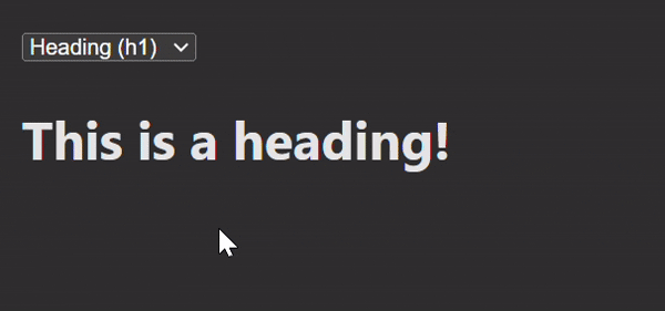
This example demonstrates the use of <svelte:element> element that allows the user to choose between displaying a <h1> or a <p> element based on a selection.
<!--App.svelte-->
<script>
    let selectedElement = 'h1'; // Default element

    function changeElement(event) {
    selectedElement = event.target.value; // Update the selected element based on user input
    }
</script>

<select on:change={changeElement}>
    <option value="h1">Heading (h1)</option>
    <option value="p">Paragraph (p)</option>
</select>

<svelte:element this={selectedElement}>
    {#if selectedElement === 'h1'}
    This is a heading!
    {:else}
    This is a paragraph!
    {/if}
</svelte:element>
Output