- Svelte - Home
- Svelte - Introduction
- Svelte - Installation
- Svelte - Reactivity
- Svelte - Props
- Svelte - Logic
- Svelte - Events
- Svelte - Bindings
- Svelte - Classes
- Svelte - Actions
- Svelte - Transitions
- Svelte - Advance Reactivity
- Svelte - Reusing Content
- Svelte - Motion
- Svelte - Advanced Binding
- Svelte - Advanced Transitions
- Svelte - Context API
- Svelte - Special Elements
- SvelteKit Basics
- SvelteKit - Introduction
- SvelteKit - Headers
- SvelteKit - Cookies
- SvelteKit - Shared Modules
- SvelteKit - Forms
- SvelteKit - API Routes
- SvelteKit - States
- SvelteKit - Errors
- SvelteKit - Redirects
- SvelteKit Advanced
- SvelteKit - Hooks
- SvelteKit - Page Options
- SvelteKit - Link Options
- SvelteKit - Advanced Routing
- SvelteKit - Advanced Loading
- SvelteKit - Environment Variables
- Svelte Resources
- svelte - Useful Resources
- svelte - Discussion
Svelte - Classes
In Svelte, classes are a useful way to control the look and behavior of your components. They let you apply CSS styles based on certain conditions, making your user interface change and respond to what users do or how the state changes.
What are Classes in Svelte?
In JavaScript, a class is a blueprint for creating objects with shared properties and methods. In Svelte, classes can be used to define components, manage state, and encapsulate functionality. By using classes in your Svelte components, you can write clean and reusable code that follows the principles of object-oriented programming.
Class Directives
In Svelte, the class directive is used to add or remove CSS classes from elements based on your application's state. By using this directive, developers can make user interfaces that are interactive and responsive, while also keeping their code organized and easy to work with.
Basic Syntax
The basic syntax for using the class directive is as follows:
<div class:classname={condition}>
  Content goes here
</div>
- classname: The name of the CSS class you want to toggle.
- condition: A boolean expression that decides if the class should be added (true) or not added (false).
Shorthand Class Directive
Svelte allows us to use shorthand for the class directive in such cases where the name of the class is the same as the variable that determines its state. This feature makes it easier to manage and organize your styling in Svelte components and reduces the size of the code.
Shorthand Class Directive Syntax
When the name of the class is the same as the variable that determines its state, you can use a shorthand version that is mentioned below:
<div class:classname>
  Content goes here
</div>
Example
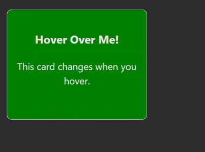
The below is an example of using the class directive in Svelte to create a card component that highlights when hovered over:
<script>
    let isHovered = false; // Variable to track hover state
</script>

<style>
    .card {
        width: 200px;
        height: 150px;
        background-color: green;
        border: 1px solid #ccc;
        border-radius: 8px;
        padding: 16px;
        text-align: center;
        transition: transform 0.3s, box-shadow 0.3s;
    }

    .card.hovered {
        transform: scale(1.05); /* Slightly enlarge the card */
        -webkit-box-shadow: 10px 10px 5px 0px rgba(94,93,94,1);
				-moz-box-shadow: 10px 10px 5px 0px rgba(94,93,94,1);
				box-shadow: 10px 10px 5px 0px rgba(94,93,94,1);
    }
</style>

<div
    class="card {isHovered ? 'hovered' : ''}"
    on:mouseenter={() => isHovered = true}
    on:mouseleave={() => isHovered = false}
>
    <h3>Hover Over Me!</h3>
    <p>This card changes when you hover.</p>
</div>
Output