- Seaborn - Home
- Seaborn - Introduction
- Seaborn - Environment Setup
- Importing Datasets and Libraries
- Seaborn - Figure Aesthetic
- Seaborn- Color Palette
- Seaborn - Histogram
- Seaborn - Kernel Density Estimates
- Seaborn - Visualizing Pairwise Relationship
- Seaborn - Plotting Categorical Data
- Distribution of Observations
- Seaborn - Statistical Estimation
- Seaborn - Plotting Wide Form Data
- Seaborn - Multi Panel Categorical Plots
- Seaborn - Linear Relationships
- Seaborn - Facet Grid
- Seaborn - Pair Grid
- Seaborn Function Reference
- Seaborn - Function Reference
- Relational Plots
- Distribution Plots
- Categorial plots
- Regression plots
- Matrix Plots
- Multi plot grids
- Themeing
- Color Palettes
- Palette widgets
- Utility Functions
- Seaborn Useful Resources
- Seaborn - Quick Guide
- Seaborn - cheatsheet
- Seaborn - Useful Resources
- Seaborn - Discussion
Seaborn - relplot() method
The seaborn.relplot() method of the Seaborn library is used to plot the relation between two variables of a dataset on a graph(x-y axis) with semantic mappings of subset.
For example, there is a dataset with multiple variables such as age, height and gender. Let the x and y variables for the graph be age and height. Using seaborn library we can plot the relation between age and height and also the graph of age-height in relation to the gender.
Syntax
Following is the syntax of seaborn.relplot() method.
seaborn.relplot(*, x=None, y=None, hue=None, size=None, style=None, data=None, row=None, col=None, col_wrap=None, row_order=None, col_order=None, palette=None, hue_order=None, hue_norm=None, sizes=None, size_order=None, size_norm=None, markers=None, dashes=None, style_order=None, legend='auto', kind='scatter', height=5, aspect=1, facet_kws=None, units=None, **kwargs)
Parameters
Some of the parameters of seaborn.relplot() method are as follows −
| S.No | Parameter and Description |
|---|---|
| 1 | x, y
Variables that are represented on the x,y axis. |
| 2 | hue
This will produce elements with different colors. It is a grouping variable. |
| 3 | size
This will produce elements with different sizes. It is also a grouping variable. |
| 4 | style
This will produce elements with different styles. |
| 5 | data This parameter takes the input data structure. That is either a mapping or a sequence. |
| 7 | row, col These determine subsets of data to be plotted in different plots. |
| 8 | kind Corresponds to the kind of plot to be drawn. Can be line or scatter. Scatter plot is the default setting. |
| 9 | palette This parameter is used to set the color tone of the mapping. It can be bright, pastel, dark etc. |
| 10 | height, width
These are scalar quantities that determine the height and width of the plot. |
Working of replot()
Now, we will see a few examples to understand the working of the relplot() method with various parameters. Here (in this article), we will use an inbuilt dataset (of seaborn) named titanic.
Loading the dataset
You can load a dataset in seaborn using the load_dataset() method. So, to load the titanic dataset execute the following snippet −
import seaborn as sns
dts= sns.load_dataset("titanic")
In addition to this, Seaborn have several other in-built datasets, you can see the names of these using the method named get_dataset_names().
set_dns.gataset_names()
You can see the contents of a particular dataset using the method named head().
dts.head()
The below examples show the usage of relplot() to print scatter plots. That is, the kind of plots that are printed are scatter in nature by default.
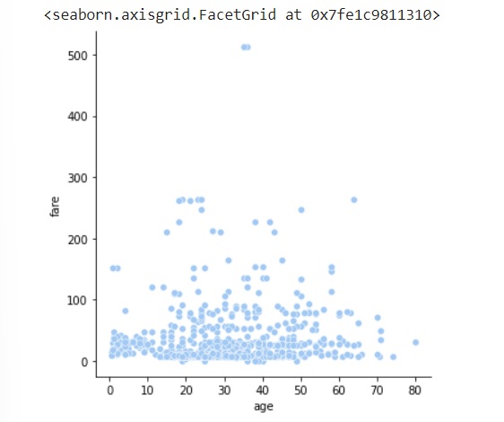
Example 1
Printing a plot using the relplot() method with two parameters x,y.
import seaborn as sns
import matplotlib.pyplot as plt
dts= sns.load_dataset("titanic")
dts.head()
sns.relplot(data=dts, x="age", y="fare")
plt.show()
Output
The plot of relplot() with 2 parameters can be seen below.
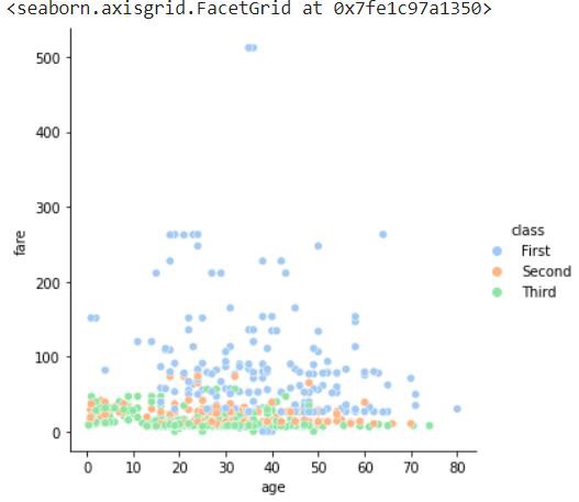
Example 2
Printing a plot using the relplot() method with three parameters; x,y and hue.
import seaborn as sns
import matplotlib.pyplot as plt
dts= sns.load_dataset("titanic")
dts.head()
sns.relplot(data=dts, x="age", y="fare",hue="class")
plt.show()
Output
The plot can be seen below.
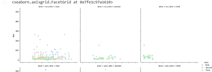
Example 3
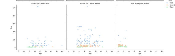
Printing the plot using the relplot() method with five parameters; x, y, hue, col, and row.
import seaborn as sns
import matplotlib.pyplot as plt
dts= sns.load_dataset("titanic")
dts.head()
sns.relplot(data=dts, x="age", y="fare",hue="class",col="who",row="alive")
plt.show()
Output
the output of the above plot can be seen below.
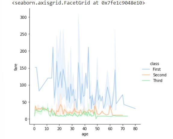
Example 4
This example shows the usage of the kind parameter to print a line plot instead of a scatter plot which is the default plot in relplot() method.
Printing the plot using relplot() method with four parameters; x, y, hue and kind.
import seaborn as sns
import matplotlib.pyplot as plt
dts= sns.load_dataset("titanic")
dts.head()
sns.relplot(data=dts, x="age", y="fare",hue="class",kind="line")
plt.show()
Output
the output of the above line of code can be seen below.