- Seaborn - Home
- Seaborn - Introduction
- Seaborn - Environment Setup
- Importing Datasets and Libraries
- Seaborn - Figure Aesthetic
- Seaborn- Color Palette
- Seaborn - Histogram
- Seaborn - Kernel Density Estimates
- Seaborn - Visualizing Pairwise Relationship
- Seaborn - Plotting Categorical Data
- Distribution of Observations
- Seaborn - Statistical Estimation
- Seaborn - Plotting Wide Form Data
- Seaborn - Multi Panel Categorical Plots
- Seaborn - Linear Relationships
- Seaborn - Facet Grid
- Seaborn - Pair Grid
- Seaborn Function Reference
- Seaborn - Function Reference
- Relational Plots
- Distribution Plots
- Categorial plots
- Regression plots
- Matrix Plots
- Multi plot grids
- Themeing
- Color Palettes
- Palette widgets
- Utility Functions
- Seaborn Useful Resources
- Seaborn - Quick Guide
- Seaborn - cheatsheet
- Seaborn - Useful Resources
- Seaborn - Discussion
Seaborn - Quick Guide
Seaborn - Introduction
In the world of Analytics, the best way to get insights is by visualizing the data. Data can be visualized by representing it as plots which is easy to understand, explore and grasp. Such data helps in drawing the attention of key elements.
To analyse a set of data using Python, we make use of Matplotlib, a widely implemented 2D plotting library. Likewise, Seaborn is a visualization library in Python. It is built on top of Matplotlib.
Seaborn Vs Matplotlib
It is summarized that if Matplotlib tries to make easy things easy and hard things possible, Seaborn tries to make a well-defined set of hard things easy too.
Seaborn helps resolve the two major problems faced by Matplotlib; the problems are −
- Default Matplotlib parameters
- Working with data frames
As Seaborn compliments and extends Matplotlib, the learning curve is quite gradual. If you know Matplotlib, you are already half way through Seaborn.
Important Features of Seaborn
Seaborn is built on top of Pythons core visualization library Matplotlib. It is meant to serve as a complement, and not a replacement. However, Seaborn comes with some very important features. Let us see a few of them here. The features help in −
- Built in themes for styling matplotlib graphics
- Visualizing univariate and bivariate data
- Fitting in and visualizing linear regression models
- Plotting statistical time series data
- Seaborn works well with NumPy and Pandas data structures
- It comes with built in themes for styling Matplotlib graphics
In most cases, you will still use Matplotlib for simple plotting. The knowledge of Matplotlib is recommended to tweak Seaborns default plots.
Seaborn - Environment Setup
In this chapter, we will discuss the environment setup for Seaborn. Let us begin with the installation and understand how to get started as we move ahead.
Installing Seaborn and getting started
In this section, we will understand the steps involved in the installation of Seaborn.
Using Pip Installer
To install the latest release of Seaborn, you can use pip −
pip install seaborn
For Windows, Linux & Mac using Anaconda
Anaconda (from https://www.anaconda.com/ is a free Python distribution for SciPy stack. It is also available for Linux and Mac.
It is also possible to install the released version using conda −
conda install seaborn
To install the development version of Seaborn directly from github
https://github.com/mwaskom/seaborn"
Dependencies
Consider the following dependencies of Seaborn −
- Python 2.7 or 3.4+
- numpy
- scipy
- pandas
- matplotlib
Seaborn - Importing Datasets and Libraries
In this chapter, we will discuss how to import Datasets and Libraries. Let us begin by understanding how to import libraries.
Importing Libraries
Let us start by importing Pandas, which is a great library for managing relational (table-format) datasets. Seaborn comes handy when dealing with DataFrames, which is most widely used data structure for data analysis.
The following command will help you import Pandas −
# Pandas for managing datasets
import pandas as pd
Now, let us import the Matplotlib library, which helps us customize our plots.
# Matplotlib for additional customization
from matplotlib import pyplot as plt
We will import the Seaborn library with the following command −
# Seaborn for plotting and styling
import seaborn as sb
Importing Datasets
We have imported the required libraries. In this section, we will understand how to import the required datasets.
Seaborn comes with a few important datasets in the library. When Seaborn is installed, the datasets download automatically.
You can use any of these datasets for your learning. With the help of the following function you can load the required dataset
load_dataset()
Importing Data as Pandas DataFrame
In this section, we will import a dataset. This dataset loads as Pandas DataFrame by default. If there is any function in the Pandas DataFrame, it works on this DataFrame.
The following line of code will help you import the dataset −
# Seaborn for plotting and styling
import seaborn as sb
df = sb.load_dataset('tips')
print df.head()
The above line of code will generate the following output −
   total_bill  tip   sex    smoker day  time   size
0    16.99    1.01   Female  No    Sun  Dinner  2
1    10.34    1.66   Male    No    Sun  Dinner  3
2    21.01    3.50   Male    No    Sun  Dinner  3
3    23.68    3.31   Male    No    Sun  Dinner  2
4    24.59    3.61   Female  No    Sun  Dinner  4
To view all the available data sets in the Seaborn library, you can use the following command with the get_dataset_names() function as shown below −
import seaborn as sb
print sb.get_dataset_names()
The above line of code will return the list of datasets available as the following output
[u'anscombe', u'attention', u'brain_networks', u'car_crashes', u'dots',
u'exercise', u'flights', u'fmri', u'gammas', u'iris', u'planets', u'tips',
u'titanic']
DataFrames store data in the form of rectangular grids by which the data can be over viewed easily. Each row of the rectangular grid contains values of an instance, and each column of the grid is a vector which holds data for a specific variable. This means that rows of a DataFrame do not need to contain, values of same data type, they can be numeric, character, logical, etc. DataFrames for Python come with the Pandas library, and they are defined as two-dimensional labeled data structures with potentially different types of columns.
For more details on DataFrames, visit our tutorial on pandas.
Seaborn - Figure Aesthetic
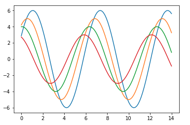
Visualizing data is one step and further making the visualized data more pleasing is another step. Visualization plays a vital role in communicating quantitative insights to an audience to catch their attention.
Aesthetics means a set of principles concerned with the nature and appreciation of beauty, especially in art. Visualization is an art of representing data in effective and easiest possible way.
Matplotlib library highly supports customization, but knowing what settings to tweak to achieve an attractive and anticipated plot is what one should be aware of to make use of it. Unlike Matplotlib, Seaborn comes packed with customized themes and a high-level interface for customizing and controlling the look of Matplotlib figures.
Example
import numpy as np
from matplotlib import pyplot as plt
def sinplot(flip = 1):
   x = np.linspace(0, 14, 100)
   for i in range(1, 5):
      plt.plot(x, np.sin(x + i * .5) * (7 - i) * flip)
sinplot()
plt.show()
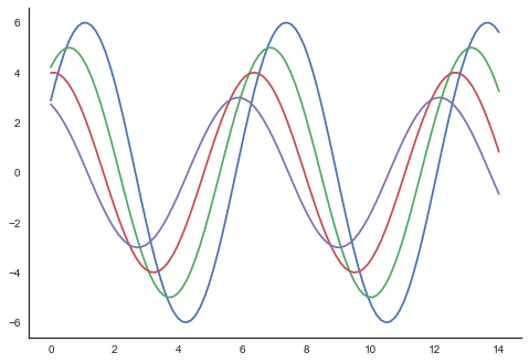
This is how a plot looks with the defaults Matplotlib −
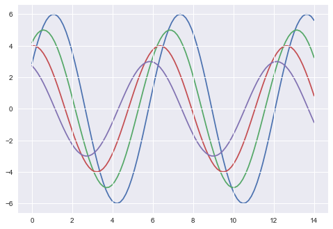
To change the same plot to Seaborn defaults, use the set() function −
Example
import numpy as np
from matplotlib import pyplot as plt
def sinplot(flip = 1):
   x = np.linspace(0, 14, 100)
   for i in range(1, 5):
      plt.plot(x, np.sin(x + i * .5) * (7 - i) * flip)
import seaborn as sb
sb.set()
sinplot()
plt.show()
Output
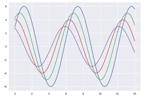
The above two figures show the difference in the default Matplotlib and Seaborn plots. The representation of data is same, but the representation style varies in both.
Basically, Seaborn splits the Matplotlib parameters into two groups−
- Plot styles
- Plot scale
Seaborn Figure Styles
The interface for manipulating the styles is set_style(). Using this function you can set the theme of the plot. As per the latest updated version, below are the five themes available.
- Darkgrid
- Whitegrid
- Dark
- White
- Ticks
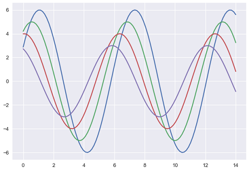
Let us try applying a theme from the above-mentioned list. The default theme of the plot will be darkgrid which we have seen in the previous example.
Example
import numpy as np
from matplotlib import pyplot as plt
def sinplot(flip=1):
   x = np.linspace(0, 14, 100)
   for i in range(1, 5):
      plt.plot(x, np.sin(x + i * .5) * (7 - i) * flip)
import seaborn as sb
sb.set_style("whitegrid")
sinplot()
plt.show()
Output
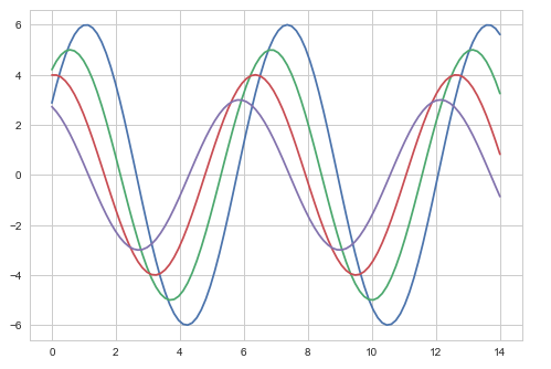
The difference between the above two plots is the background color
Removing Axes Spines
In the white and ticks themes, we can remove the top and right axis spines using the despine() function.
Example
import numpy as np
from matplotlib import pyplot as plt
def sinplot(flip=1):
   x = np.linspace(0, 14, 100)
   for i in range(1, 5):
      plt.plot(x, np.sin(x + i * .5) * (7 - i) * flip)
import seaborn as sb
sb.set_style("white")
sinplot()
sb.despine()
plt.show()
Output
In the regular plots, we use left and bottom axes only. Using the despine() function, we can avoid the unnecessary right and top axes spines, which is not supported in Matplotlib.
Overriding the Elements
If you want to customize the Seaborn styles, you can pass a dictionary of parameters to the set_style() function. Parameters available are viewed using axes_style() function.
Example
import seaborn as sb
print sb.axes_style
Output
{'axes.axisbelow'     : False,
'axes.edgecolor'      : 'white',
'axes.facecolor'      : '#EAEAF2',
'axes.grid'           : True,
'axes.labelcolor'     : '.15',
'axes.linewidth'      : 0.0,
'figure.facecolor'    : 'white',
'font.family'         : [u'sans-serif'],
'font.sans-serif'     : [u'Arial', u'Liberation
                        Sans', u'Bitstream Vera Sans', u'sans-serif'],
'grid.color'          : 'white',
'grid.linestyle'      : u'-',
'image.cmap'          : u'Greys',
'legend.frameon'      : False,
'legend.numpoints'    : 1,
'legend.scatterpoints': 1,
'lines.solid_capstyle': u'round',
'text.color'          : '.15',
'xtick.color'         : '.15',
'xtick.direction'     : u'out',
'xtick.major.size'    : 0.0,
'xtick.minor.size'    : 0.0,
'ytick.color'         : '.15',
'ytick.direction'     : u'out',
'ytick.major.size'    : 0.0,
'ytick.minor.size'    : 0.0}
Altering the values of any of the parameter will alter the plot style.
Example
import numpy as np
from matplotlib import pyplot as plt
def sinplot(flip=1):
   x = np.linspace(0, 14, 100)
   for i in range(1, 5):
      plt.plot(x, np.sin(x + i * .5) * (7 - i) * flip)
import seaborn as sb
sb.set_style("darkgrid", {'axes.axisbelow': False})
sinplot()
sb.despine()
plt.show()
Output
Scaling Plot Elements
We also have control on the plot elements and can control the scale of plot using the set_context() function. We have four preset templates for contexts, based on relative size, the contexts are named as follows
- Paper
- Notebook
- Talk
- Poster
By default, context is set to notebook; and was used in the plots above.
Example
import numpy as np
from matplotlib import pyplot as plt
def sinplot(flip = 1):
   x = np.linspace(0, 14, 100)
   for i in range(1, 5):
      plt.plot(x, np.sin(x + i * .5) * (7 - i) * flip)
import seaborn as sb
sb.set_style("darkgrid", {'axes.axisbelow': False})
sinplot()
sb.despine()
plt.show()
Output
The output size of the actual plot is bigger in size when compared to the above plots.
Note − Due to scaling of images on our web page, you might miss the actual difference in our example plots.
Seaborn - Color Palette
Color plays an important role than any other aspect in the visualizations. When used effectively, color adds more value to the plot. A palette means a flat surface on which a painter arranges and mixes paints.
Building Color Palette
Seaborn provides a function called color_palette(), which can be used to give colors to plots and adding more aesthetic value to it.
Usage
seaborn.color_palette(palette = None, n_colors = None, desat = None)
Parameter
The following table lists down the parameters for building color palette −
| Sr.No. | Palatte & Description |
|---|---|
| 1 | n_colors Number of colors in the palette. If None, the default will depend on how palette is specified. By default the value of n_colors is 6 colors. |
| 2 | desat Proportion to desaturate each color. |
Return
Return refers to the list of RGB tuples. Following are the readily available Seaborn palettes −
- Deep
- Muted
- Bright
- Pastel
- Dark
- Colorblind
Besides these, one can also generate new palette
It is hard to decide which palette should be used for a given data set without knowing the characteristics of data. Being aware of it, we will classify the different ways for using color_palette() types −
- qualitative
- sequential
- diverging
We have another function seaborn.palplot() which deals with color palettes. This function plots the color palette as horizontal array. We will know more regarding seaborn.palplot() in the coming examples.
Qualitative Color Palettes
Qualitative or categorical palettes are best suitable to plot the categorical data.
Example
from matplotlib import pyplot as plt
import seaborn as sb
current_palette = sb.color_palette()
sb.palplot(current_palette)
plt.show()
Output
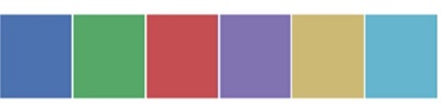
We havent passed any parameters in color_palette(); by default, we are seeing 6 colors. You can see the desired number of colors by passing a value to the n_colors parameter. Here, the palplot() is used to plot the array of colors horizontally.
Sequential Color Palettes
Sequential plots are suitable to express the distribution of data ranging from relative lower values to higher values within a range.
Appending an additional character s to the color passed to the color parameter will plot the Sequential plot.
Example
from matplotlib import pyplot as plt
import seaborn as sb
current_palette = sb.color_palette()
sb.palplot(sb.color_palette("Greens"))
plt.show()

Note −We need to append s to the parameter like Greens in the above example.
Diverging Color Palette
Diverging palettes use two different colors. Each color represents variation in the value ranging from a common point in either direction.
Assume plotting the data ranging from -1 to 1. The values from -1 to 0 takes one color and 0 to +1 takes another color.
By default, the values are centered from zero. You can control it with parameter center by passing a value.
Example
from matplotlib import pyplot as plt
import seaborn as sb
current_palette = sb.color_palette()
sb.palplot(sb.color_palette("BrBG", 7))
plt.show()
Output

Setting the Default Color Palette
The functions color_palette() has a companion called set_palette() The relationship between them is similar to the pairs covered in the aesthetics chapter. The arguments are same for both set_palette() and color_palette(), but the default Matplotlib parameters are changed so that the palette is used for all plots.
Example
import numpy as np
from matplotlib import pyplot as plt
def sinplot(flip = 1):
   x = np.linspace(0, 14, 100)
   for i in range(1, 5):
      plt.plot(x, np.sin(x + i * .5) * (7 - i) * flip)

import seaborn as sb
sb.set_style("white")
sb.set_palette("husl")
sinplot()
plt.show()
Output

Plotting Univariate Distribution
Distribution of data is the foremost thing that we need to understand while analysing the data. Here, we will see how seaborn helps us in understanding the univariate distribution of the data.
Function distplot() provides the most convenient way to take a quick look at univariate distribution. This function will plot a histogram that fits the kernel density estimation of the data.
Usage
seaborn.distplot()
Parameters
The following table lists down the parameters and their description −
| Sr.No. | Parameter & Description |
|---|---|
| 1 | data Series, 1d array or a list |
| 2 | bins Specification of hist bins |
| 3 | hist bool |
| 4 | kde bool |
These are basic and important parameters to look into.
Seaborn - Histogram
Histograms represent the data distribution by forming bins along the range of the data and then drawing bars to show the number of observations that fall in each bin.
Seaborn comes with some datasets and we have used few datasets in our previous chapters. We have learnt how to load the dataset and how to lookup the list of available datasets.
Seaborn comes with some datasets and we have used few datasets in our previous chapters. We have learnt how to load the dataset and how to lookup the list of available datasets.
Example
import pandas as pd
import seaborn as sb
from matplotlib import pyplot as plt
df = sb.load_dataset('iris')
sb.distplot(df['petal_length'],kde = False)
plt.show()
Output
Here, kde flag is set to False. As a result, the representation of the kernel estimation plot will be removed and only histogram is plotted.
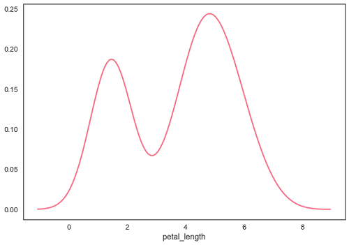
Seaborn - Kernel Density Estimates
Kernel Density Estimation (KDE) is a way to estimate the probability density function of a continuous random variable. It is used for non-parametric analysis.
Setting the hist flag to False in distplot will yield the kernel density estimation plot.
Example
import pandas as pd
import seaborn as sb
from matplotlib import pyplot as plt
df = sb.load_dataset('iris')
sb.distplot(df['petal_length'],hist=False)
plt.show()
Output
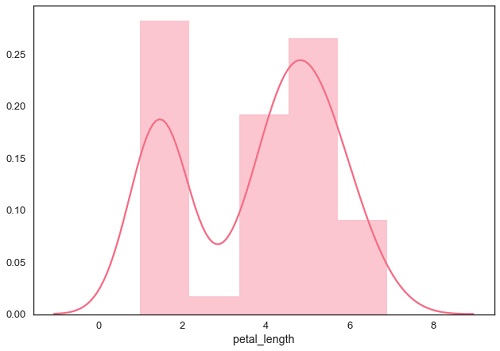
Fitting Parametric Distribution
distplot() is used to visualize the parametric distribution of a dataset.
Example
import pandas as pd
import seaborn as sb
from matplotlib import pyplot as plt
df = sb.load_dataset('iris')
sb.distplot(df['petal_length'])
plt.show()
Output
Plotting Bivariate Distribution
Bivariate Distribution is used to determine the relation between two variables. This mainly deals with relationship between two variables and how one variable is behaving with respect to the other.
The best way to analyze Bivariate Distribution in seaborn is by using the jointplot() function.
Jointplot creates a multi-panel figure that projects the bivariate relationship between two variables and also the univariate distribution of each variable on separate axes.
Scatter Plot
Scatter plot is the most convenient way to visualize the distribution where each observation is represented in two-dimensional plot via x and y axis.
Example
import pandas as pd
import seaborn as sb
from matplotlib import pyplot as plt
df = sb.load_dataset('iris')
sb.jointplot(x = 'petal_length',y = 'petal_width',data = df)
plt.show()
Output
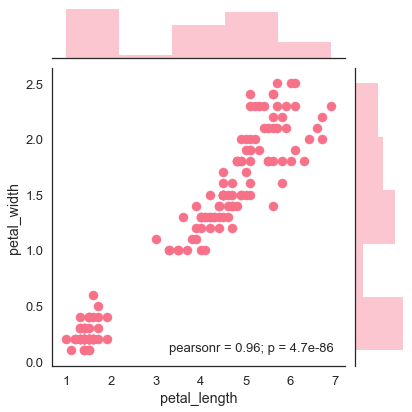
The above figure shows the relationship between the petal_length and petal_width in the Iris data. A trend in the plot says that positive correlation exists between the variables under study.
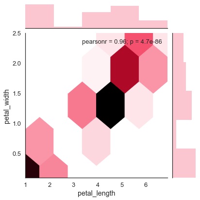
Hexbin Plot
Hexagonal binning is used in bivariate data analysis when the data is sparse in density i.e., when the data is very scattered and difficult to analyze through scatterplots.
An addition parameter called kind and value hex plots the hexbin plot.
Example
import pandas as pd
import seaborn as sb
from matplotlib import pyplot as plt
df = sb.load_dataset('iris')
sb.jointplot(x = 'petal_length',y = 'petal_width',data = df,kind = 'hex')
plt.show()
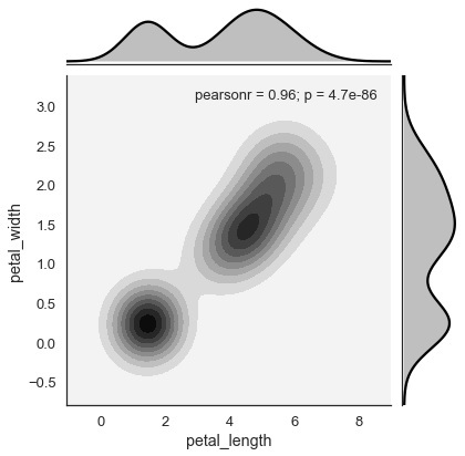
Kernel Density Estimation
Kernel density estimation is a non-parametric way to estimate the distribution of a variable. In seaborn, we can plot a kde using jointplot().
Pass value kde to the parameter kind to plot kernel plot.
Example
import pandas as pd
import seaborn as sb
from matplotlib import pyplot as plt
df = sb.load_dataset('iris')
sb.jointplot(x = 'petal_length',y = 'petal_width',data = df,kind = 'hex')
plt.show()
Output
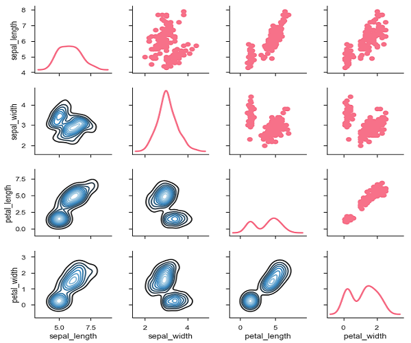
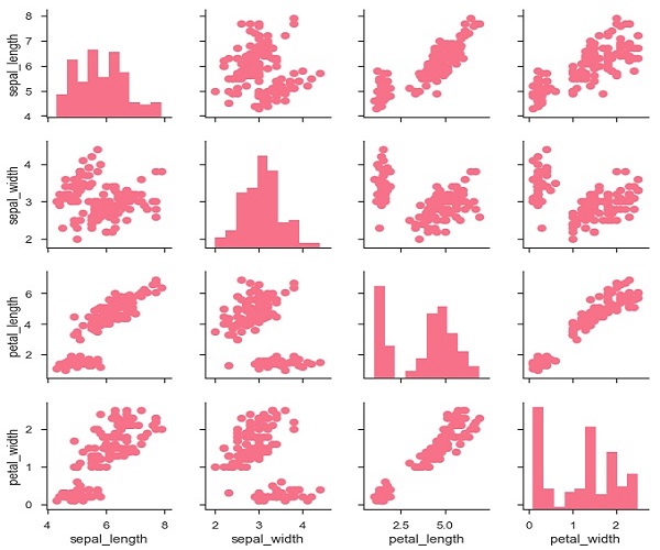
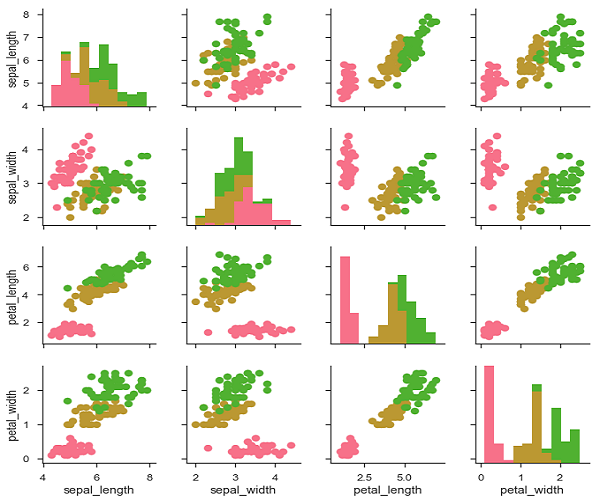
Seaborn - Visualizing Pairwise Relationship
Datasets under real-time study contain many variables. In such cases, the relation between each and every variable should be analyzed. Plotting Bivariate Distribution for (n,2) combinations will be a very complex and time taking process.
To plot multiple pairwise bivariate distributions in a dataset, you can use the pairplot() function. This shows the relationship for (n,2) combination of variable in a DataFrame as a matrix of plots and the diagonal plots are the univariate plots.
Axes
In this section, we will learn what are Axes, their usage, parameters, and so on.
Usage
seaborn.pairplot(data,)
Parameters
Following table lists down the parameters for Axes −
| Sr.No. | Parameter & Description |
|---|---|
| 1 | data Dataframe |
| 2 | hue Variable in data to map plot aspects to different colors. |
| 3 | palette Set of colors for mapping the hue variable |
| 4 | kind Kind of plot for the non-identity relationships. {scatter, reg} |
| 5 | diag_kind Kind of plot for the diagonal subplots. {hist, kde} |
Except data, all other parameters are optional. There are few other parameters which pairplot can accept. The above mentioned are often used params.
Example
import pandas as pd
import seaborn as sb
from matplotlib import pyplot as plt
df = sb.load_dataset('iris')
sb.set_style("ticks")
sb.pairplot(df,hue = 'species',diag_kind = "kde",kind = "scatter",palette = "husl")
plt.show()
Output
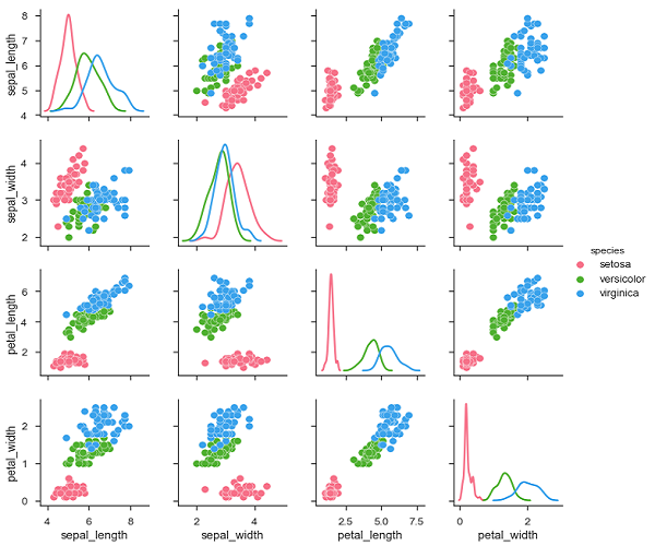
We can observe the variations in each plot. The plots are in matrix format where the row name represents x axis and column name represents the y axis.
The diagonal plots are kernel density plots where the other plots are scatter plots as mentioned.
Seaborn - Plotting Categorical Data
In our previous chapters we learnt about scatter plots, hexbin plots and kde plots which are used to analyze the continuous variables under study. These plots are not suitable when the variable under study is categorical.
When one or both the variables under study are categorical, we use plots like striplot(), swarmplot(), etc,. Seaborn provides interface to do so.
Categorical Scatter Plots
In this section, we will learn about categorical scatter plots.
stripplot()
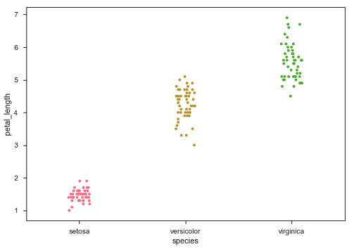
stripplot() is used when one of the variable under study is categorical. It represents the data in sorted order along any one of the axis.
Example
import pandas as pd
import seaborn as sb
from matplotlib import pyplot as plt
df = sb.load_dataset('iris')
sb.stripplot(x = "species", y = "petal_length", data = df)
plt.show()
Output
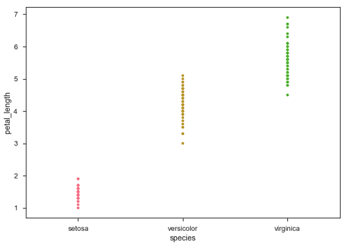
In the above plot, we can clearly see the difference of petal_length in each species. But, the major problem with the above scatter plot is that the points on the scatter plot are overlapped. We use the Jitter parameter to handle this kind of scenario.
Jitter adds some random noise to the data. This parameter will adjust the positions along the categorical axis.
Example
import pandas as pd
import seaborn as sb
from matplotlib import pyplot as plt
df = sb.load_dataset('iris')
sb.stripplot(x = "species", y = "petal_length", data = df, jitter = Ture)
plt.show()
Output
Now, the distribution of points can be seen easily.
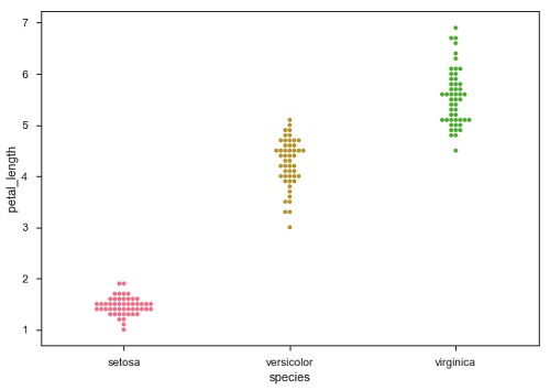
Swarmplot()
Another option which can be used as an alternate to Jitter is function swarmplot(). This function positions each point of scatter plot on the categorical axis and thereby avoids overlapping points −
Example
import pandas as pd
import seaborn as sb
from matplotlib import pyplot as plt
df = sb.load_dataset('iris')
sb.swarmplot(x = "species", y = "petal_length", data = df)
plt.show()
Output
Seaborn - Distribution of Observations
In categorical scatter plots which we dealt in the previous chapter, the approach becomes limited in the information it can provide about the distribution of values within each category. Now, going further, let us see what can facilitate us with performing comparison with in categories.
Box Plots
Boxplot is a convenient way to visualize the distribution of data through their quartiles.
Box plots usually have vertical lines extending from the boxes which are termed as whiskers. These whiskers indicate variability outside the upper and lower quartiles, hence Box Plots are also termed as box-and-whisker plot and box-and-whisker diagram. Any Outliers in the data are plotted as individual points.
Example
import pandas as pd
import seaborn as sb
from matplotlib import pyplot as plt
df = sb.load_dataset('iris')
sb.swarmplot(x = "species", y = "petal_length", data = df)
plt.show()
Output
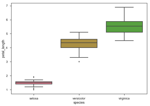
The dots on the plot indicates the outlier.
Violin Plots
Violin Plots are a combination of the box plot with the kernel density estimates. So, these plots are easier to analyze and understand the distribution of the data.
Let us use tips dataset called to learn more into violin plots. This dataset contains the information related to the tips given by the customers in a restaurant.
Example
import pandas as pd
import seaborn as sb
from matplotlib import pyplot as plt
df = sb.load_dataset('tips')
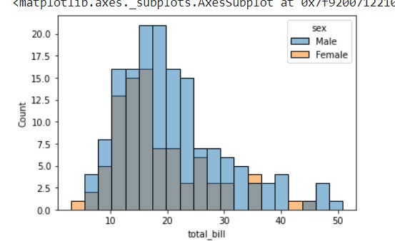
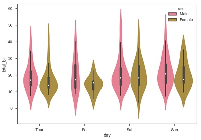
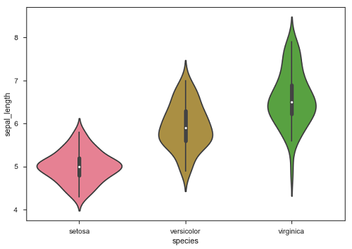
sb.violinplot(x = "day", y = "total_bill", data=df)
plt.show()
Output
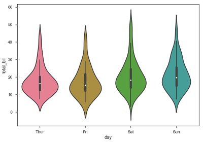
The quartile and whisker values from the boxplot are shown inside the violin. As the violin plot uses KDE, the wider portion of violin indicates the higher density and narrow region represents relatively lower density. The Inter-Quartile range in boxplot and higher density portion in kde fall in the same region of each category of violin plot.
The above plot shows the distribution of total_bill on four days of the week. But, in addition to that, if we want to see how the distribution behaves with respect to sex, lets explore it in below example.
Example
import pandas as pd
import seaborn as sb
from matplotlib import pyplot as plt
df = sb.load_dataset('tips')
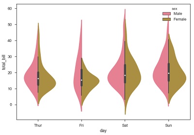
sb.violinplot(x = "day", y = "total_bill",hue = 'sex', data = df)
plt.show()
Output
Now we can clearly see the spending behavior between male and female. We can easily say that, men make more bill than women by looking at the plot.
And, if the hue variable has only two classes, we can beautify the plot by splitting each violin into two instead of two violins on a given day. Either parts of the violin refer to each class in the hue variable.
Example
import pandas as pd
import seaborn as sb
from matplotlib import pyplot as plt
df = sb.load_dataset('tips')
sb.violinplot(x = "day", y="total_bill",hue = 'sex', data = df)
plt.show()
Output
Seaborn - Statistical Estimation
In most of the situations, we deal with estimations of the whole distribution of the data. But when it comes to central tendency estimation, we need a specific way to summarize the distribution. Mean and median are the very often used techniques to estimate the central tendency of the distribution.
In all the plots that we learnt in the above section, we made the visualization of the whole distribution. Now, let us discuss regarding the plots with which we can estimate the central tendency of the distribution.
Bar Plot
The barplot() shows the relation between a categorical variable and a continuous variable. The data is represented in rectangular bars where the length the bar represents the proportion of the data in that category.
Bar plot represents the estimate of central tendency. Let us use the titanic dataset to learn bar plots.
Example
import pandas as pd
import seaborn as sb
from matplotlib import pyplot as plt
df = sb.load_dataset('titanic')
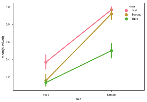
sb.barplot(x = "sex", y = "survived", hue = "class", data = df)
plt.show()
Output
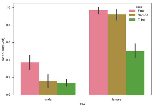
In the above example, we can see that the average number of survivals of male and female in each class. From the plot we can understand that more number of females survived than males. In both males and females more number of survivals are from first class.
A special case in barplot is to show the no of observations in each category rather than computing a statistic for a second variable. For this, we use countplot().
Example
import pandas as pd
import seaborn as sb
from matplotlib import pyplot as plt
df = sb.load_dataset('titanic')
sb.countplot(x = " class ", data = df, palette = "Blues");
plt.show()
Output
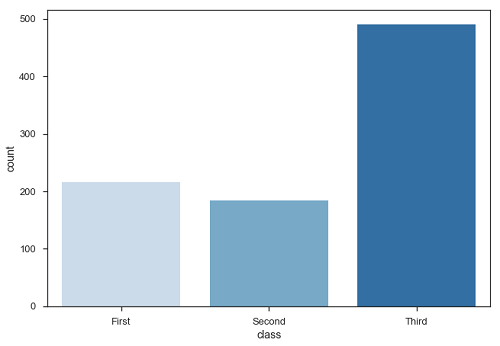
Plot says that, the number of passengers in the third class are higher than first and second class.
Point Plots
Point plots serve same as bar plots but in a different style. Rather than the full bar, the value of the estimate is represented by the point at a certain height on the other axis.
Example
import pandas as pd
import seaborn as sb
from matplotlib import pyplot as plt
df = sb.load_dataset('titanic')
sb.pointplot(x = "sex", y = "survived", hue = "class", data = df)
plt.show()
Output
Seaborn - Plotting Wide Form Data
It is always preferable to use long-from or tidy datasets. But at times when we are left with no option rather than to use a wide-form dataset, same functions can also be applied to wide-form data in a variety of formats, including Pandas Data Frames or two-dimensional NumPy arrays. These objects should be passed directly to the data parameter the x and y variables must be specified as strings
Example
import pandas as pd
import seaborn as sb
from matplotlib import pyplot as plt
df = sb.load_dataset('iris')
sb.boxplot(data = df, orient = "h")
plt.show()
Output
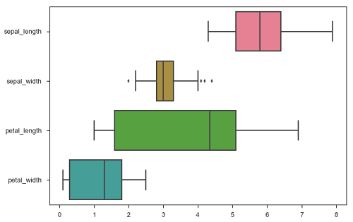
Additionally, these functions accept vectors of Pandas or NumPy objects rather than variables in a DataFrame.
Example
import pandas as pd
import seaborn as sb
from matplotlib import pyplot as plt
df = sb.load_dataset('iris')
sb.boxplot(data = df, orient = "h")
plt.show()
Output
The major advantage of using Seaborn for many developers in Python world is because it can take pandas DataFrame object as parameter.
Seaborn - Multi Panel Categorical Plots
Categorical data can we visualized using two plots, you can either use the functions pointplot(), or the higher-level function factorplot().
Factorplot
Factorplot draws a categorical plot on a FacetGrid. Using kind parameter we can choose the plot like boxplot, violinplot, barplot and stripplot. FacetGrid uses pointplot by default.
Example
import pandas as pd
import seaborn as sb
from matplotlib import pyplot as plt
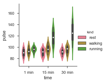
df = sb.load_dataset('exercise')
sb.factorplot(x = "time", y = pulse", hue = "kind",data = df);
plt.show()
Output
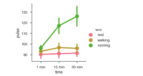
We can use different plot to visualize the same data using the kind parameter.
Example
import pandas as pd
import seaborn as sb
from matplotlib import pyplot as plt
df = sb.load_dataset('exercise')
sb.factorplot(x = "time", y = "pulse", hue = "kind", kind = 'violin',data = df);
plt.show()
Output
In factorplot, the data is plotted on a facet grid.
What is Facet Grid?
Facet grid forms a matrix of panels defined by row and column by dividing the variables. Due of panels, a single plot looks like multiple plots. It is very helpful to analyze all combinations in two discrete variables.
Let us visualize the above the definition with an example
Example
import pandas as pd
import seaborn as sb
from matplotlib import pyplot as plt
df = sb.load_dataset('exercise')
sb.factorplot(x = "time", y = "pulse", hue = "kind", kind = 'violin', col = "diet", data = df);
plt.show()
Output
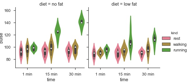
The advantage of using Facet is, we can input another variable into the plot. The above plot is divided into two plots based on a third variable called diet using the col parameter.
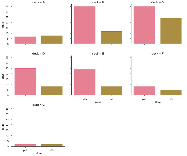
We can make many column facets and align them with the rows of the grid −
Example
import pandas as pd
import seaborn as sb
from matplotlib import pyplot as plt
df = sb.load_dataset('titanic')
sb.factorplot("alive", col = "deck", col_wrap = 3,data = df[df.deck.notnull()],kind = "count")
plt.show()
output
Seaborn - Linear Relationships
Most of the times, we use datasets that contain multiple quantitative variables, and the goal of an analysis is often to relate those variables to each other. This can be done through the regression lines.
While building the regression models, we often check for multicollinearity, where we had to see the correlation between all the combinations of continuous variables and will take necessary action to remove multicollinearity if exists. In such cases, the following techniques helps.
Functions to Draw Linear Regression Models
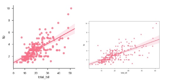
There are two main functions in Seaborn to visualize a linear relationship determined through regression. These functions are regplot() and lmplot().
regplot vs lmplot
| regplot | lmplot |
|---|---|
| accepts the x and y variables in a variety of formats including simple numpy arrays, pandas Series objects, or as references to variables in a pandas DataFrame | has data as a required parameter and the x and y variables must be specified as strings. This data format is called long-form data |
Let us now draw the plots.
Example
Plotting the regplot and then lmplot with the same data in this example
import pandas as pd
import seaborn as sb
from matplotlib import pyplot as plt
df = sb.load_dataset('tips')
sb.regplot(x = "total_bill", y = "tip", data = df)
sb.lmplot(x = "total_bill", y = "tip", data = df)
plt.show()
Output
You can see the difference in the size between two plots.
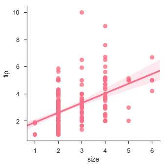
We can also fit a linear regression when one of the variables takes discrete values
Example
import pandas as pd
import seaborn as sb
from matplotlib import pyplot as plt
df = sb.load_dataset('tips')
sb.lmplot(x = "size", y = "tip", data = df)
plt.show()
Output
Fitting Different Kinds of Models
The simple linear regression model used above is very simple to fit, but in most of the cases, the data is non-linear and the above methods cannot generalize the regression line.
Let us use Anscombes dataset with the regression plots −
Example
import pandas as pd
import seaborn as sb
from matplotlib import pyplot as plt
df = sb.load_dataset('anscombe')
sb.lmplot(x="x", y="y", data=df.query("dataset == 'I'"))
plt.show()
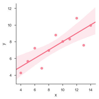
In this case, the data is good fit for linear regression model with less variance.
Let us see another example where the data takes high deviation which shows the line of best fit is not good.
Example
import pandas as pd
import seaborn as sb
from matplotlib import pyplot as plt
df = sb.load_dataset('anscombe')
sb.lmplot(x = "x", y = "y", data = df.query("dataset == 'II'"))
plt.show()
Output
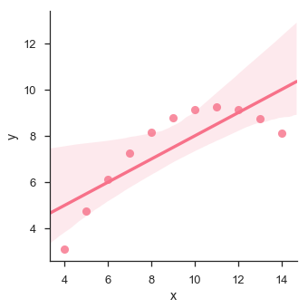
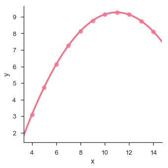
The plot shows the high deviation of data points from the regression line. Such non-linear, higher order can be visualized using the lmplot() and regplot().These can fit a polynomial regression model to explore simple kinds of nonlinear trends in the dataset −
Example
import pandas as pd
import seaborn as sb
from matplotlib import pyplot as plt
df = sb.load_dataset('anscombe')
sb.lmplot(x = "x", y = "y", data = df.query("dataset == 'II'"),order = 2)
plt.show()
Output
Seaborn - Facet Grid
A useful approach to explore medium-dimensional data, is by drawing multiple instances of the same plot on different subsets of your dataset.
This technique is commonly called as lattice, or trellis plotting, and it is related to the idea of small multiples.
To use these features, your data has to be in a Pandas DataFrame.
Plotting Small Multiples of Data Subsets
In the previous chapter, we have seen the FacetGrid example where FacetGrid class helps in visualizing distribution of one variable as well as the relationship between multiple variables separately within subsets of your dataset using multiple panels.
A FacetGrid can be drawn with up to three dimensions − row, col, and hue. The first two have obvious correspondence with the resulting array of axes; think of the hue variable as a third dimension along a depth axis, where different levels are plotted with different colors.
FacetGrid object takes a dataframe as input and the names of the variables that will form the row, column, or hue dimensions of the grid.
The variables should be categorical and the data at each level of the variable will be used for a facet along that axis.
Example
import pandas as pd
import seaborn as sb
from matplotlib import pyplot as plt
df = sb.load_dataset('tips')
g = sb.FacetGrid(df, col = "time")
plt.show()
Output
In the above example, we have just initialized the facetgrid object which doesnt draw anything on them.
The main approach for visualizing data on this grid is with the FacetGrid.map() method. Let us look at the distribution of tips in each of these subsets, using a histogram.
Example
import pandas as pd
import seaborn as sb
from matplotlib import pyplot as plt
df = sb.load_dataset('tips')
g = sb.FacetGrid(df, col = "time")
g.map(plt.hist, "tip")
plt.show()
Output
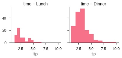
The number of plots is more than one because of the parameter col. We discussed about col parameter in our previous chapters.
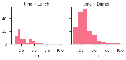
To make a relational plot, pass the multiple variable names.
Example
import pandas as pd
import seaborn as sb
from matplotlib import pyplot as plt
df = sb.load_dataset('tips')
g = sb.FacetGrid(df, col = "sex", hue = "smoker")
g.map(plt.scatter, "total_bill", "tip")
plt.show()
Output
Seaborn - Pair Grid
PairGrid allows us to draw a grid of subplots using the same plot type to visualize data.
Unlike FacetGrid, it uses different pair of variable for each subplot. It forms a matrix of sub-plots. It is also sometimes called as scatterplot matrix.
The usage of pairgrid is similar to facetgrid. First initialise the grid and then pass the plotting function.
Example
import pandas as pd
import seaborn as sb
from matplotlib import pyplot as plt
df = sb.load_dataset('iris')
g = sb.PairGrid(df)
g.map(plt.scatter);
plt.show()
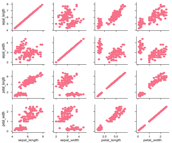
It is also possible to plot a different function on the diagonal to show the univariate distribution of the variable in each column.
Example
import pandas as pd
import seaborn as sb
from matplotlib import pyplot as plt
df = sb.load_dataset('iris')
g = sb.PairGrid(df)
g.map_diag(plt.hist)
g.map_offdiag(plt.scatter);
plt.show()
Output
We can customize the color of these plots using another categorical variable. For example, the iris dataset has four measurements for each of three different species of iris flowers so you can see how they differ.
Example
import pandas as pd
import seaborn as sb
from matplotlib import pyplot as plt
df = sb.load_dataset('iris')
g = sb.PairGrid(df)
g.map_diag(plt.hist)
g.map_offdiag(plt.scatter);
plt.show()
Output
We can use a different function in the upper and lower triangles to see different aspects of the relationship.
Example
import pandas as pd
import seaborn as sb
from matplotlib import pyplot as plt
df = sb.load_dataset('iris')
g = sb.PairGrid(df)
g.map_upper(plt.scatter)
g.map_lower(sb.kdeplot, cmap = "Blues_d")
g.map_diag(sb.kdeplot, lw = 3, legend = False);
plt.show()
Output