- Seaborn - Home
- Seaborn - Introduction
- Seaborn - Environment Setup
- Importing Datasets and Libraries
- Seaborn - Figure Aesthetic
- Seaborn- Color Palette
- Seaborn - Histogram
- Seaborn - Kernel Density Estimates
- Seaborn - Visualizing Pairwise Relationship
- Seaborn - Plotting Categorical Data
- Distribution of Observations
- Seaborn - Statistical Estimation
- Seaborn - Plotting Wide Form Data
- Seaborn - Multi Panel Categorical Plots
- Seaborn - Linear Relationships
- Seaborn - Facet Grid
- Seaborn - Pair Grid
- Seaborn Function Reference
- Seaborn - Function Reference
- Relational Plots
- Distribution Plots
- Categorial plots
- Regression plots
- Matrix Plots
- Multi plot grids
- Themeing
- Color Palettes
- Palette widgets
- Utility Functions
- Seaborn Useful Resources
- Seaborn - Quick Guide
- Seaborn - cheatsheet
- Seaborn - Useful Resources
- Seaborn - Discussion
Seaborn - Distribution of Observations
In categorical scatter plots which we dealt in the previous chapter, the approach becomes limited in the information it can provide about the distribution of values within each category. Now, going further, let us see what can facilitate us with performing comparison with in categories.
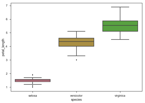
Example - Box Plots
Boxplot is a convenient way to visualize the distribution of data through their quartiles.
Box plots usually have vertical lines extending from the boxes which are termed as whiskers. These whiskers indicate variability outside the upper and lower quartiles, hence Box Plots are also termed as box-and-whisker plot and box-and-whisker diagram. Any Outliers in the data are plotted as individual points.
main.py
import pandas as pd
import seaborn as sb
from matplotlib import pyplot as plt
df = sb.load_dataset('iris')
sb.swarmplot(x = "species", y = "petal_length", data = df)
plt.show()
Output
The dots on the plot indicates the outlier.
Example - Violin Plots
Violin Plots are a combination of the box plot with the kernel density estimates. So, these plots are easier to analyze and understand the distribution of the data.
Let us use tips dataset called to learn more into violin plots. This dataset contains the information related to the tips given by the customers in a restaurant.
main.py
import pandas as pd
import seaborn as sb
from matplotlib import pyplot as plt
df = sb.load_dataset('tips')
sb.violinplot(x = "day", y = "total_bill", data=df)
plt.show()
Output
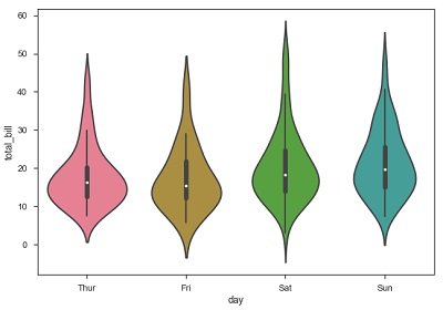
The quartile and whisker values from the boxplot are shown inside the violin. As the violin plot uses KDE, the wider portion of violin indicates the higher density and narrow region represents relatively lower density. The Inter-Quartile range in boxplot and higher density portion in kde fall in the same region of each category of violin plot.
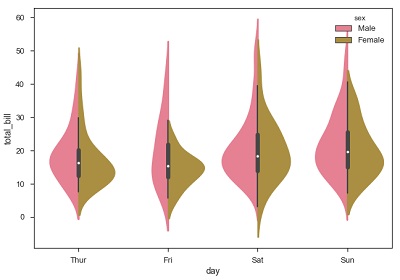
Example - Using Hue
The above plot shows the distribution of total_bill on four days of the week. But, in addition to that, if we want to see how the distribution behaves with respect to sex, lets explore it in below example.
main.py
import pandas as pd
import seaborn as sb
from matplotlib import pyplot as plt
df = sb.load_dataset('tips')
sb.violinplot(x = "day", y = "total_bill",hue = 'sex', data = df)
plt.show()
Output
Now we can clearly see the spending behavior between male and female. We can easily say that, men make more bill than women by looking at the plot.
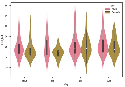
Example - Beautifying the plot
And, if the hue variable has only two classes, we can beautify the plot by splitting each violin into two instead of two violins on a given day. Either parts of the violin refer to each class in the hue variable.
main.py
import pandas as pd
import seaborn as sb
from matplotlib import pyplot as plt
df = sb.load_dataset('tips')
sb.violinplot(x = "day", y="total_bill",hue = 'sex', data = df)
plt.show()
Output