- Seaborn - Home
- Seaborn - Introduction
- Seaborn - Environment Setup
- Importing Datasets and Libraries
- Seaborn - Figure Aesthetic
- Seaborn- Color Palette
- Seaborn - Histogram
- Seaborn - Kernel Density Estimates
- Seaborn - Visualizing Pairwise Relationship
- Seaborn - Plotting Categorical Data
- Distribution of Observations
- Seaborn - Statistical Estimation
- Seaborn - Plotting Wide Form Data
- Seaborn - Multi Panel Categorical Plots
- Seaborn - Linear Relationships
- Seaborn - Facet Grid
- Seaborn - Pair Grid
- Seaborn Function Reference
- Seaborn - Function Reference
- Relational Plots
- Distribution Plots
- Categorial plots
- Regression plots
- Matrix Plots
- Multi plot grids
- Themeing
- Color Palettes
- Palette widgets
- Utility Functions
- Seaborn Useful Resources
- Seaborn - Quick Guide
- Seaborn - cheatsheet
- Seaborn - Useful Resources
- Seaborn - Discussion
Seaborn - Facet Grid
A useful approach to explore medium-dimensional data, is by drawing multiple instances of the same plot on different subsets of your dataset.
This technique is commonly called as lattice, or trellis plotting, and it is related to the idea of small multiples.
To use these features, your data has to be in a Pandas DataFrame.
Plotting Small Multiples of Data Subsets
In the previous chapter, we have seen the FacetGrid example where FacetGrid class helps in visualizing distribution of one variable as well as the relationship between multiple variables separately within subsets of your dataset using multiple panels.
A FacetGrid can be drawn with up to three dimensions − row, col, and hue. The first two have obvious correspondence with the resulting array of axes; think of the hue variable as a third dimension along a depth axis, where different levels are plotted with different colors.
FacetGrid object takes a dataframe as input and the names of the variables that will form the row, column, or hue dimensions of the grid.
The variables should be categorical and the data at each level of the variable will be used for a facet along that axis.
Example
import pandas as pd
import seaborn as sb
from matplotlib import pyplot as plt
df = sb.load_dataset('tips')
g = sb.FacetGrid(df, col = "time")
plt.show()
Output
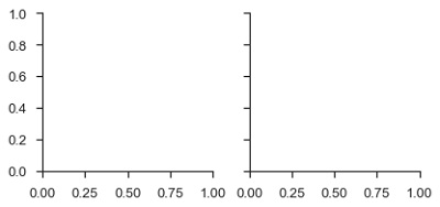
In the above example, we have just initialized the facetgrid object which doesnt draw anything on them.
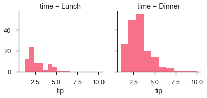
The main approach for visualizing data on this grid is with the FacetGrid.map() method. Let us look at the distribution of tips in each of these subsets, using a histogram.
Example
import pandas as pd
import seaborn as sb
from matplotlib import pyplot as plt
df = sb.load_dataset('tips')
g = sb.FacetGrid(df, col = "time")
g.map(plt.hist, "tip")
plt.show()
Output
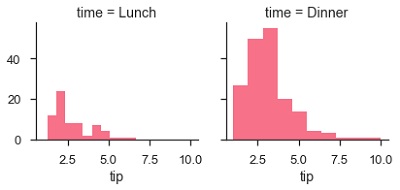
The number of plots is more than one because of the parameter col. We discussed about col parameter in our previous chapters.
To make a relational plot, pass the multiple variable names.
Example
import pandas as pd
import seaborn as sb
from matplotlib import pyplot as plt
df = sb.load_dataset('tips')
g = sb.FacetGrid(df, col = "sex", hue = "smoker")
g.map(plt.scatter, "total_bill", "tip")
plt.show()
Output