- Seaborn - Home
- Seaborn - Introduction
- Seaborn - Environment Setup
- Importing Datasets and Libraries
- Seaborn - Figure Aesthetic
- Seaborn- Color Palette
- Seaborn - Histogram
- Seaborn - Kernel Density Estimates
- Seaborn - Visualizing Pairwise Relationship
- Seaborn - Plotting Categorical Data
- Distribution of Observations
- Seaborn - Statistical Estimation
- Seaborn - Plotting Wide Form Data
- Seaborn - Multi Panel Categorical Plots
- Seaborn - Linear Relationships
- Seaborn - Facet Grid
- Seaborn - Pair Grid
- Seaborn Function Reference
- Seaborn - Function Reference
- Relational Plots
- Distribution Plots
- Categorial plots
- Regression plots
- Matrix Plots
- Multi plot grids
- Themeing
- Color Palettes
- Palette widgets
- Utility Functions
- Seaborn Useful Resources
- Seaborn - Quick Guide
- Seaborn - cheatsheet
- Seaborn - Useful Resources
- Seaborn - Discussion
Seaborn - Color Palette
Color plays an important role than any other aspect in the visualizations. When used effectively, color adds more value to the plot. A palette means a flat surface on which a painter arranges and mixes paints.
Building Color Palette
Seaborn provides a function called color_palette(), which can be used to give colors to plots and adding more aesthetic value to it.
Usage
seaborn.color_palette(palette = None, n_colors = None, desat = None)
Parameter
The following table lists down the parameters for building color palette −
| Sr.No. | Palatte & Description |
|---|---|
| 1 | n_colors Number of colors in the palette. If None, the default will depend on how palette is specified. By default the value of n_colors is 6 colors. |
| 2 | desat Proportion to desaturate each color. |
Return
Return refers to the list of RGB tuples. Following are the readily available Seaborn palettes −
Deep
Muted
Bright
Pastel
Dark
Colorblind
Besides these, one can also generate new palette
It is hard to decide which palette should be used for a given data set without knowing the characteristics of data. Being aware of it, we will classify the different ways for using color_palette() types −
qualitative
sequential
diverging
We have another function seaborn.palplot() which deals with color palettes. This function plots the color palette as horizontal array. We will know more regarding seaborn.palplot() in the coming examples.
Example - Qualitative Color Palettes
Qualitative or categorical palettes are best suitable to plot the categorical data.
main.py
from matplotlib import pyplot as plt
import seaborn as sb
current_palette = sb.color_palette()
sb.palplot(current_palette)
plt.show()
Output
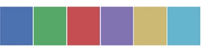
We havent passed any parameters in color_palette(); by default, we are seeing 6 colors. You can see the desired number of colors by passing a value to the n_colors parameter. Here, the palplot() is used to plot the array of colors horizontally.
Example - Sequential Color Palettes
Sequential plots are suitable to express the distribution of data ranging from relative lower values to higher values within a range.
Appending an additional character s to the color passed to the color parameter will plot the Sequential plot.
main.py
from matplotlib import pyplot as plt
import seaborn as sb
current_palette = sb.color_palette()
sb.palplot(sb.color_palette("Greens"))
plt.show()
Output
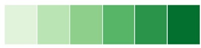
Note −We need to append s to the parameter like Greens in the above example.
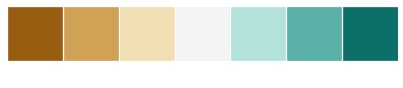
Example - Diverging Color Palette
Diverging palettes use two different colors. Each color represents variation in the value ranging from a common point in either direction.
Assume plotting the data ranging from -1 to 1. The values from -1 to 0 takes one color and 0 to +1 takes another color.
By default, the values are centered from zero. You can control it with parameter center by passing a value.
main.py
from matplotlib import pyplot as plt
import seaborn as sb
current_palette = sb.color_palette()
sb.palplot(sb.color_palette("BrBG", 7))
plt.show()
Output
Example - Setting the Default Color Palette
The functions color_palette() has a companion called set_palette() The relationship between them is similar to the pairs covered in the aesthetics chapter. The arguments are same for both set_palette() and color_palette(), but the default Matplotlib parameters are changed so that the palette is used for all plots.
main.py
import numpy as np
from matplotlib import pyplot as plt
def sinplot(flip = 1):
   x = np.linspace(0, 14, 100)
   for i in range(1, 5):
      plt.plot(x, np.sin(x + i * .5) * (7 - i) * flip)

import seaborn as sb
sb.set_style("white")
sb.set_palette("husl")
sinplot()
plt.show()
Output

Plotting Univariate Distribution
Distribution of data is the foremost thing that we need to understand while analysing the data. Here, we will see how seaborn helps us in understanding the univariate distribution of the data.
Function distplot() provides the most convenient way to take a quick look at univariate distribution. This function will plot a histogram that fits the kernel density estimation of the data.
Usage
seaborn.distplot()
Parameters
The following table lists down the parameters and their description −
| Sr.No. | Parameter & Description |
|---|---|
| 1 | data Series, 1d array or a list |
| 2 | bins Specification of hist bins |
| 3 | hist bool |
| 4 | kde bool |
These are basic and important parameters to look into.
