- Seaborn - Home
- Seaborn - Introduction
- Seaborn - Environment Setup
- Importing Datasets and Libraries
- Seaborn - Figure Aesthetic
- Seaborn- Color Palette
- Seaborn - Histogram
- Seaborn - Kernel Density Estimates
- Seaborn - Visualizing Pairwise Relationship
- Seaborn - Plotting Categorical Data
- Distribution of Observations
- Seaborn - Statistical Estimation
- Seaborn - Plotting Wide Form Data
- Seaborn - Multi Panel Categorical Plots
- Seaborn - Linear Relationships
- Seaborn - Facet Grid
- Seaborn - Pair Grid
- Seaborn Function Reference
- Seaborn - Function Reference
- Relational Plots
- Distribution Plots
- Categorial plots
- Regression plots
- Matrix Plots
- Multi plot grids
- Themeing
- Color Palettes
- Palette widgets
- Utility Functions
- Seaborn Useful Resources
- Seaborn - Quick Guide
- Seaborn - cheatsheet
- Seaborn - Useful Resources
- Seaborn - Discussion
Seaborn - regplot() method
seaborn.regplot() method is used to plot data and draw a linear regression model fit. There are several options for estimating the regression model, all of which are mutually exclusive.
As we might already know, Regrression Analysis is a technique used to evaluate the relationship between independent factors and dependent attributes. Hence, this model is used to create a regression plot.
The regplot() and lmplot() functions are relatively close, but the regplot() method is an axes level function while the other is not. Matplotlib axes containing the plot are returned as a result of this method.
Syntax
Following is the syntax of seaborn.regplot() method −
seaborn.regplot(*, x=None, y=None, data=None, x_estimator=None, x_bins=None, x_ci='ci', scatter=True, fit_reg=True, ci=95, n_boot=1000, units=None, seed=None, order=1, logistic=False, lowess=False, robust=False, logx=False, x_partial=None, y_partial=None, truncate=True, dropna=True, x_jitter=None, y_jitter=None, label=None, color=None, marker='o', scatter_kws=None, line_kws=None, ax=None)
Parameters
Some of the parameters of the regplot() method are discussed below.
| S.No | Parameter and Description |
|---|---|
| 1 | x,y These parameters take names of variables as input that plot the long form data. |
| 2 | data This is the dataframe that is used to plot graphs. |
| 3 | x_estimator This is a callable that accepts values and maps vectors to scalars. It is an optional parameter. Each distinct value of x is applied to this function, and the estimated value is plotted as a result. When x is a discrete variable, this is helpful. This estimate will be bootstrapped and a confidence interval will be drawn if x_ci is provided. |
| 4 | x_bins This optional parameter accepts int or vector as input. The x variable is binned into discrete bins and then the central tendency and confidence interval are estimated. |
| 5 | {x,y}_jitter This optional parameter accepts floating point values. Add uniform random noise of this size to either the x or y variables. |
| 6 | color Used to specify a single color, and this color is applied to all plot elements. |
| 7 | marker This is the marker that is used to plot the data points in the graph. |
| 8 | x_ci Takes values from ci, sd, int in [0, 100] or None. It is an optional parameter. The size of the confidence interval used when plotting a central tendency for discrete values of x is determined by the value passed to this parameter. |
| 9 | logx Takes boolean vaules and if True, plots the scatterplot and regression model in the input space while also estimating a linear regression of the type y log(x). For this to work, x must be positive. |
Loading the seaborn library
Let us load the seaborn library and the dataset before moving on to developing the plots. To load or import the seaborn library the following line of code can be used.
Import seaborn as sns
Loading the dataset
In this article, we will make use of the Titanic dataset inbuilt in the seaborn library. the following command is used to load the dataset.
titanic=sns.load_dataset("titanic")
The below mentioned command is used to view the first 5 rows in the dataset. This enables us to understand what variables can be used to plot a graph.
titanic.head()
The below is the output for the above piece of code.
index,survived,pclass,sex,age,sibsp,parch,fare,embarked,class,who,adult_male,deck,embark_town,alive,alone
0,0,3,male,22.0,1,0,7.25,S,Third,man,true,NaN,Southampton,no,false
1,1,1,female,38.0,1,0,71.2833,C,First,woman,false,C,Cherbourg,yes,false
2,1,3,female,26.0,0,0,7.925,S,Third,woman,false,NaN,Southampton,yes,true
Now that we have loaded the dataset, we will explore as few examples.
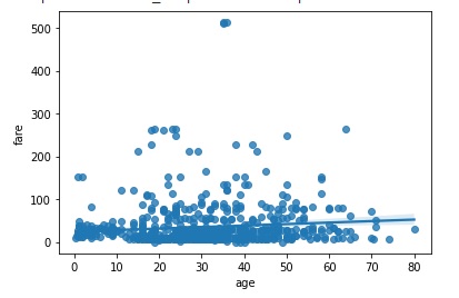
Example 1
In this example, we will plot a simple regression plot by taking the in-built dataset titanic and working with it. The columns fare and age of the titanic dataset are passed to the x and y arguments respectively. Here, both the columns are numeric in type. Also, the color parameter is used to set the color of the data points being plotted on the plot. In the below code, g is passed which means the plot obtained will have datapoints in green color.
import seaborn as sns
import matplotlib.pyplot as plt
titanic=sns.load_dataset("titanic")
titanic.head()
sns.regplot(x="fare", y="age",color="g", data=titanic)
plt.show()
Output
the plot obtained is below −
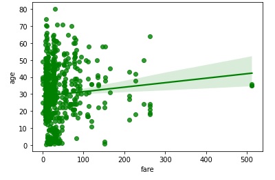
Example 2
in this example, the marker parameter is made use of. This is the marker that is used to plot the data points in the graph. In the below example, the marker passed in * so the plot obtained will have observations marked with *.
import seaborn as sns
import matplotlib.pyplot as plt
titanic=sns.load_dataset("titanic")
titanic.head()
sns.regplot(y="fare", x="age",color="g", marker="*",data=titanic)
plt.show()
Output
the plot obtained is below −
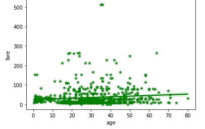
Example 3
In this example, we will understand the working of the y_jitter parameter. This optional parameter accepts floating point values and it adds uniform random noise of this size to either the x or y variables to the plot. it can be used in your code as shown below.
import seaborn as sns
import matplotlib.pyplot as plt
titanic=sns.load_dataset("titanic")
titanic.head()
sns.regplot(y="fare", x="age", y_jitter=.9,data=titanic)
plt.show()
Output
the output plot obtained is attached below −
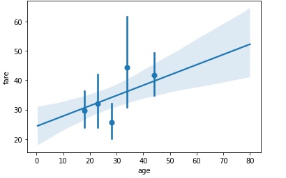
Example 4
Now, we will understand how the bins parameter behaves. This optional parameter accepts int or vector as input. The x variable is binned into discrete bins and then the central tendency and confidence interval are estimated. In the below example, integer 5 is passed to x_bins and the output is observed.
import seaborn as sns
import matplotlib.pyplot as plt
titanic=sns.load_dataset("titanic")
titanic.head()
sns.regplot(y="fare", x="age",x_bins=5,data=titanic)
plt.show()
Output
the graph produced is below.