- Seaborn - Home
- Seaborn - Introduction
- Seaborn - Environment Setup
- Importing Datasets and Libraries
- Seaborn - Figure Aesthetic
- Seaborn- Color Palette
- Seaborn - Histogram
- Seaborn - Kernel Density Estimates
- Seaborn - Visualizing Pairwise Relationship
- Seaborn - Plotting Categorical Data
- Distribution of Observations
- Seaborn - Statistical Estimation
- Seaborn - Plotting Wide Form Data
- Seaborn - Multi Panel Categorical Plots
- Seaborn - Linear Relationships
- Seaborn - Facet Grid
- Seaborn - Pair Grid
- Seaborn Function Reference
- Seaborn - Function Reference
- Relational Plots
- Distribution Plots
- Categorial plots
- Regression plots
- Matrix Plots
- Multi plot grids
- Themeing
- Color Palettes
- Palette widgets
- Utility Functions
- Seaborn Useful Resources
- Seaborn - Quick Guide
- Seaborn - cheatsheet
- Seaborn - Useful Resources
- Seaborn - Discussion
Seaborn - pointplot() method
Seaborn.pointplot() method helps to draw point estimates and confidence intervals using scatter plots. Using the locations of the scatter plot points, a point plot represents an estimate of the central tendency for a numerical variable and uses error bars to show the degree of uncertainty in the estimate.
For comparisons between various levels of one or more categorical variables, point plots may be more helpful than bar plots. They excel in demonstrating interactions, or how the connection between levels of one category variable alters as levels of a second categorical variable are added. It is simpler for the eyes to detect interactions by differences in slope rather than by comparing the heights of various groupings of points or bars thanks to the lines that connect each point from the same hue level.
Syntax
Following is the syntax of the seaborn.pointplot() method −
seaborn.pointplot(*, x=None, y=None, hue=None, data=None, order=None, hue_order=None, estimator=<function mean at 0x7ff320f315e0>, ci=95, n_boot=1000, units=None, seed=None, markers='o', linestyles='-', dodge=False, join=True, scale=1, orient=None, color=None, palette=None, errwidth=None, capsize=None, ax=None, **kwargs)
Parameters
Some of the parameters of the pointplot() method are discussed below.
| S.No | Name and Description |
|---|---|
| 1 | x,y These parameters take names of variables as input that plot the long form data. |
| 2 | data This is the dataframe that is used to plot graphs. |
| 3 | hue Names of variables in the dataframe that are needed for plotting the graph. |
| 4 | linewidth This parameter takes floating values and determines the width of the gray lines that frame the elements in the plot. |
| 5 | dodge This parameter takes a boolean value. if we use hue nesting, passing true to this parameter will separate the strips for different hue levels. If False is passed, the points for each level will be plotted on top of each other. |
| 6 | orient It takes values h or v and the orientation of the graph is determined based on this. |
| 7 | color matplotlib color is taken as input and this determines the color of all the elements. |
| 8 | palette This parameter specifies the colors for different hue mappings. |
| 9 | join Takes boolean values and if True, lines between point estimates will be drawn at the same hue level. |
Let us load the Seaborn library and the dataset before moving on to developing the plots.
Loading the seaborn library
To load or import the seaborn library the following line of code can be used.
Import seaborn as sns
Loading the dataset
In this article, we will make use of the Titanic dataset inbuilt in the seaborn library. the following command is used to load the dataset.
titanic=sns.load_dataset("titanic")
The below mentioned command is used to view the first 5 rows in the dataset. This enables us to understand what variables can be used to plot a graph.
titanic.head()
The below is the output for the above piece of code.
index,survived,pclass,sex,age,sibsp,parch,fare,embarked,class,who,adult_male,deck,embark_town,alive,alone
0,0,3,male,22.0,1,0,7.25,S,Third,man,true,NaN,Southampton,no,false
1,1,1,female,38.0,1,0,71.2833,C,First,woman,false,C,Cherbourg,yes,false
2,1,3,female,26.0,0,0,7.925,S,Third,woman,false,NaN,Southampton,yes,true
Now that we have loaded the dataset, we will explore a few examples.
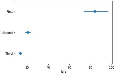
Example 1
To plot a simple pointplot() by passing x and y arguments we will obtain the following plot. The titanic dataset is used in this article and the columns class and fare are passed to the x and y variables of the method.
import seaborn as sns
import matplotlib.pyplot as plt
titanic=sns.load_dataset("titanic")
titanic.head()
sns.pointplot(x="class", y="fare", data=titanic)
plt.show()
Output
the plot obtained is seen below.
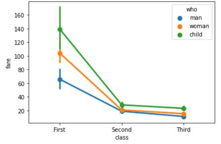
Example 2
Hue argument takes the name of the categorical variable in the data frame. We will see how the point plot graph varies when the hue argument is also passed to the method. The below line of code can be used to do so. By passing different data frames containing different dataset to the data argument in the point plot, you can plot your own graph.
import seaborn as sns
import matplotlib.pyplot as plt
titanic=sns.load_dataset("titanic")
titanic.head()
sns.pointplot(x="class", y="fare",hue="who" ,data=titanic)
plt.show()
Output
The output obtained is as follows −
Example 3
Dodge argument takes a Boolean value. if we use hue nesting, passing true to this parameter will separate the strips for different hue levels. If False is passed, the points for each level will be plotted on top of each other. In this example, we will understand how this parameter works.
import seaborn as sns
import matplotlib.pyplot as plt
titanic=sns.load_dataset("titanic")
titanic.head()
sns.pointplot(x="class", y="fare",hue="who",dodge=True ,data=titanic)
plt.show()
Output
The output obtained is as follows −
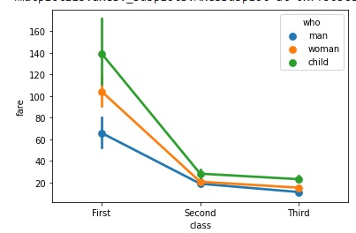
The plot obtained can be seen above.
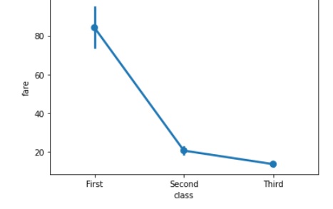
Example 4
In this example, we will understand how to draw a straight line plot using the pointplot() method. The join parameter takes boolean values and if True, lines between point estimates will be drawn at the same hue level.
import seaborn as sns
import matplotlib.pyplot as plt
titanic=sns.load_dataset("titanic")
titanic.head()
sns.pointplot(y="class", x="fare" ,join=False,data=titanic)
plt.show()
Output
the above line of code generates the plot shown below −