- Seaborn - Home
- Seaborn - Introduction
- Seaborn - Environment Setup
- Importing Datasets and Libraries
- Seaborn - Figure Aesthetic
- Seaborn- Color Palette
- Seaborn - Histogram
- Seaborn - Kernel Density Estimates
- Seaborn - Visualizing Pairwise Relationship
- Seaborn - Plotting Categorical Data
- Distribution of Observations
- Seaborn - Statistical Estimation
- Seaborn - Plotting Wide Form Data
- Seaborn - Multi Panel Categorical Plots
- Seaborn - Linear Relationships
- Seaborn - Facet Grid
- Seaborn - Pair Grid
- Seaborn Function Reference
- Seaborn - Function Reference
- Relational Plots
- Distribution Plots
- Categorial plots
- Regression plots
- Matrix Plots
- Multi plot grids
- Themeing
- Color Palettes
- Palette widgets
- Utility Functions
- Seaborn Useful Resources
- Seaborn - Quick Guide
- Seaborn - cheatsheet
- Seaborn - Useful Resources
- Seaborn - Discussion
Seaborn - lineplot() method
The Seaborn.lineplot() method helps to draw a line plot with the possibility of several semantic groupings. That is variables can be grouped and a graphical representation of these variables can be drawn.
Seaborn Lineplot is a data visualization tool that depicts the relationship between a set of continuous and categorical data points. These points are categorized based on semantic values. For instance, consider two points x and y, and their relationship can be depicted visually using various parameters of this method: like hue, size and style.
However, this style of plot is hard to interpret and is often ineffective. In this case, using redundant semantics is helpful.
Syntax
Following is the syntax of seaborn.lineplot() method −
seaborn.lineplot(*, x=None, y=None, hue=None, size=None, style=None, data=None, palette=None, hue_order=None, hue_norm=None, sizes=None, size_order=None, size_norm=None, dashes=True, markers=None, style_order=None, units=None, estimator='mean', ci=95, n_boot=1000, seed=None, sort=True, err_style='band', err_kws=None, legend='auto', ax=None, **kwargs)
Parameters
Some of the parameters of the seaborn.lineplot() method, are shown below.
| S.No | Parameter and Description |
|---|---|
| 1 | x,y Variables that are represented on the x, and y-axis. |
| 2 | Hue This will produce elements with different colors. It is a grouping variable. |
| 3 | Size This will produce elements of different sizes. It is also a grouping variable. |
| 4 | Style This will produce elements with different styles. |
| 5 | Data This parameter takes the input data structure. That is either a mapping or a sequence. |
| 7 | Hue_order This parameter takes input that will produce lines with different colors. |
| 8 | Kind Corresponds to the kind of plot to be drawn. Can be a line or scatter. The Scatter plot is the default setting. |
| 9 | Palette This parameter is used to set the color tone of the mapping. It can be bright, pastel, dark, etc. |
| 10 | Height, width These are scalar quantities that determine the height and width of the plot. |
| 11 | Sort() sorts the data according to the x,y variables. |
| 12 | Seed() used to generate random numbers for reproducible bootstrapping. |
| 13 | Hue_norm() Used to set normalization range in data units. A pair of data values are provided. |
Return Value
This method returns the matplotlib axes with plotted points.
Loading the dataset
let us load the dataset before moving on to developing the plots. In this article, we will make use of the FMRI dataset inbuilt into the seaborn library. the following command is used to load the dataset.
fmri=sns.load_dataset("fmri")
The below-mentioned command is used to view the first 5 rows in the dataset. This enables us to understand what variables can be used to plot a graph.
fmri.head()
Following is the output for the above piece of code.
index,subject,timepoint,event,region,signal
0,s13,18,stim,parietal,-0.017551581538
1,s5,14,stim,parietal,-0.0808829319505
2,s12,18,stim,parietal,-0.0810330187333
3,s11,18,stim,parietal,-0.0461343901751999
4,s10,18,stim,parietal,-0.0379702032642
Example 1
(In the entire article, the seaborn library has been imported as sns.)
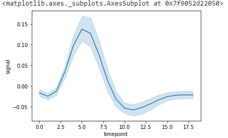
This example is used to understand how to draw a line plot using two variables of wide form. Here, wide form refers to entire data rather than to a particular constraint. More about this is seen in example 4.
To draw a wide-form line plot of two variables in the dataset, the following command is used.
import seaborn as sns
import matplotlib.pyplot as plt
fmri=sns.load_dataset("fmri")
fmri.head()
sns.lineplot(data=fmri, x="timepoint", y="signal")
plt.show()
Output
The above command will give the following plot.
Example 2
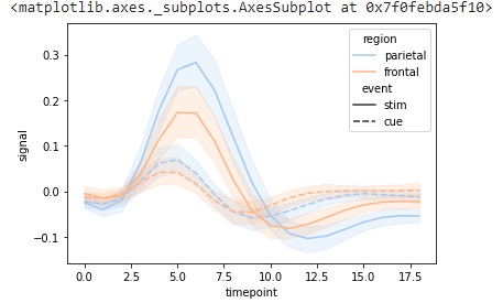
To draw a wide-form line plot with 4 variables the following command is used. In this particular dataset, we will use the time point, signal, region, and event variables to draw a line plot using 4 parameters; x, y, hue and style.
import seaborn as sns
import matplotlib.pyplot as plt
fmri=sns.load_dataset("fmri")
fmri.head()
sns.lineplot(data=fmri, x="timepoint", y="signal", hue="region", style="event")
plt.show()
Output
The above command will give the following plot.
Example 3
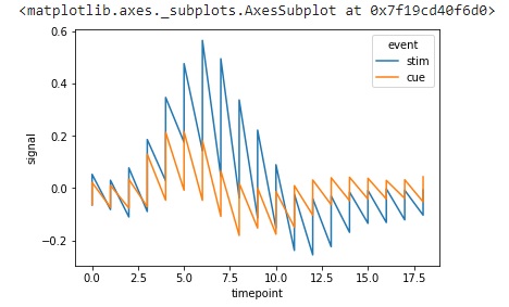
In this example, we will plot the graph by using the sort parameter. This sort parameter takes Boolean values and when it is true, the data will be sorted according to the x and y variables. If it is false, lines will connect the points in the order in which they appear in the dataset.
import seaborn as sns
import matplotlib.pyplot as plt
fmri=sns.load_dataset("fmri")
fmri.head()
sns.lineplot(data=fmri.query("region == 'parietal'"),x="timepoint",
y="signal", hue="event", estimator=None, sort=True)
plt.show()
Output
The graph obtained by using this piece of code is seen below.
Example 4
We can also use line plots to highlight the confidence intervals of the data using either bands or bars.
This example will show how to highlight the confidence intervals in a given dataset. Before moving on to this plot, let us understand why lineplot() is used so popularly.
One of the major advantages of line plot is that it allows data to be plotted in wide form and specified form.
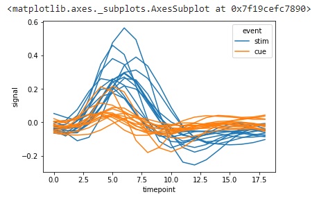
That is, say for the FMRI dataset, there are two types of regions, parietal and frontal. We can plot the graph only for parietal or only for frontal data. The below example explains how to do this.
To plot data belonging to only one type of input, we must use the query function to group the data. In the below example, data with the region column as parietal is being grouped and then a line plot is being plotted.
import seaborn as sns
import matplotlib.pyplot as plt
fmri=sns.load_dataset("fmri")
fmri.head()
sns.lineplot(data=fmri.query("region == 'parietal'"),x="timepoint",
y="signal", hue="event", units="subject",estimator=None)
plt.show()
Output
The estimator parameter takes a callable method, pandas method name or none. If passed none, it will consider all the values in the dataset for the plot.