- Seaborn - Home
- Seaborn - Introduction
- Seaborn - Environment Setup
- Importing Datasets and Libraries
- Seaborn - Figure Aesthetic
- Seaborn- Color Palette
- Seaborn - Histogram
- Seaborn - Kernel Density Estimates
- Seaborn - Visualizing Pairwise Relationship
- Seaborn - Plotting Categorical Data
- Distribution of Observations
- Seaborn - Statistical Estimation
- Seaborn - Plotting Wide Form Data
- Seaborn - Multi Panel Categorical Plots
- Seaborn - Linear Relationships
- Seaborn - Facet Grid
- Seaborn - Pair Grid
- Seaborn Function Reference
- Seaborn - Function Reference
- Relational Plots
- Distribution Plots
- Categorial plots
- Regression plots
- Matrix Plots
- Multi plot grids
- Themeing
- Color Palettes
- Palette widgets
- Utility Functions
- Seaborn Useful Resources
- Seaborn - Quick Guide
- Seaborn - cheatsheet
- Seaborn - Useful Resources
- Seaborn - Discussion
Seaborn.jointplot() method
The Seaborn.jointplot() method is used to subplot grid for plotting pairwise relationships in a dataset. This function offers the JointGrid class a handy interface with a number of pre-made plot types. If you require greater flexibility, you should use JointGrid directly as this wrapper is designed to be relatively lightweight.
As the name suggests, the Joint Plot is comprised of three individual plots a bivariate graph that shows the difference of the dependent variables behavior with independent variables behavior, another plot placed above the bivariate graph to observe the distribution of independent variables, another plot positioned on the right margin vertically that displays the distribution of the dependent variable.
Syntax
Following is the syntax of the seaborn.jointplot() method −
seaborn.jointplot(*, x=None, y=None, data=None, kind='scatter', color=None, height=6, ratio=5, space=0.2, dropna=False, xlim=None, ylim=None, marginal_ticks=False, joint_kws=None, marginal_kws=None, hue=None, palette=None, hue_order=None, hue_norm=None, **kwargs)
Parameters
Some of the parameters of the seaborn.jointplot() method are as follows.
| S.No | Name and Description |
|---|---|
| 1 | Data Takes dataframe where each column is a variable and each row is an observation. |
| 2 | hue variables that specify portions of the data that will be displayed on certain grid facets. To regulate the order of levels for this variable, refer to the var order parameters. |
| 3 | Kind Takes avlues from{scatter, kde, hist, reg}and the kind of plot to make is determined. |
| 4 | ratio Takes numeric values and determines the Ratio of joint axes height to marginal axes height. |
| 5 | Height Takes a scalar value and determines the height of the facet. |
| 6 | Color Takes matplotlib color as input and determines single color specification for when hue mapping is not used. |
| 7 | Marginal_ticks Takes Boolean value and If If False, suppress ticks on the count/density axis of the marginal plots. |
| 8 | hue_order Takes lists as input and Order for the levels of the faceting variables is determined by this order. |
Return Value
This method returns the JointGrid object managing multiple subplots that correspond to joint and marginal axes for plotting a bivariate relationship or distribution.
Loading the seaborn library
let us load the seaborn library and the dataset before moving on to the developing the plots. To load or import the seaborn library the following line of code can be used.
Import seaborn as sns
Loading the dataset
In this article, we will make use of the Tips dataset inbuilt in the seaborn library. the following command is used to load the dataset.
tips=sns.load_dataset("tips")
The below mentioned command is used to view the first 5 rows in the dataset. This enables us to understand what variables can be used to plot a graph.
tips.head()
the below is the output for the above piece of code.
index,total_bill,tip,sex,smoker,day,time,size
0,16.99,1.01,Female,No,Sun,Dinner,2
1,10.34,1.66,Male,No,Sun,Dinner,3
2,21.01,3.5,Male,No,Sun,Dinner,3
3,23.68,3.31,Male,No,Sun,Dinner,2
4,24.59,3.61,Female,No,Sun,Dinner,4
Now that we have loaded the data, we will move on to plotting the data.
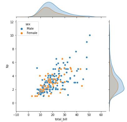
Example 1
In this example, we will use the tips dataset and plot a jointplot by passing data from this dataset. To the x,y,hue columns we will pass the total_bill, tip and sex columns of the dataset respectively. The plot thus obtained is as follows.
import seaborn as sns
import matplotlib.pyplot as plt
tips=sns.load_dataset("tips")
tips.head()
sns.jointplot(data=tips, x="total_bill", y="tip",hue="sex")
plt.show()
Output
The output of the plot obtained is as follows −
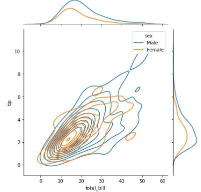
Example 2
in this example, we will pass the kind parameter and produce a jointplot that is a kernel density estimate in nature.
import seaborn as sns
import matplotlib.pyplot as plt
tips=sns.load_dataset("tips")
tips.head()
sns.jointplot(data=tips, x="total_bill", y="tip",hue="sex",kind="kde")
plt.show()
Output
the plot obtained is below,
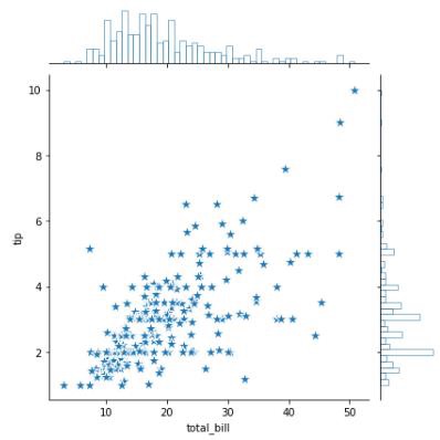
Example 3
In this example, we will use the marginal_kws parameter that is an additional keyword argument which determined the kind of plot shown on the margins of the facet. In the bellow example, we are passing bins which means a histogram of the specified number of bins will be drawn on the margins and the plot drawn is not filled since the fill parameter is passed as false.
import seaborn as sns
import matplotlib.pyplot as plt
tips=sns.load_dataset("tips")
tips.head()
sns.jointplot(
data=tips, x="total_bill", y="tip",
marker="*", s=150, marginal_kws=dict(bins=50, fill=False),
)
plt.show()
Output
The output obtained is as follows −
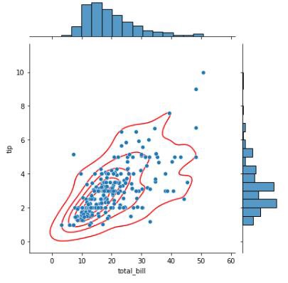
Example 4
In this example, we will draw a joint plot and then use the plot_joint method to add a different kind of plot over the existing joint plot. Below, we plotted a scatter plot for the tips dataset and then a kernel density estimate(KDE) plot is drawn in red color over the scatter plot as can be seen in the figure. This can be achieved using the plot_joint() method.
The color of the KDE plot is initialized to red and the levels of KDE to be presented to be initialized as 6 in this example.
import seaborn as sns
import matplotlib.pyplot as plt
tips=sns.load_dataset("tips")
tips.head()
g = sns.jointplot(data=tips, x="total_bill", y="tip")
g.plot_joint(sns.kdeplot, color="r", zorder=0, levels=6)
plt.show()
Output
the plot obtained is as follows,