- Seaborn - Home
- Seaborn - Introduction
- Seaborn - Environment Setup
- Importing Datasets and Libraries
- Seaborn - Figure Aesthetic
- Seaborn- Color Palette
- Seaborn - Histogram
- Seaborn - Kernel Density Estimates
- Seaborn - Visualizing Pairwise Relationship
- Seaborn - Plotting Categorical Data
- Distribution of Observations
- Seaborn - Statistical Estimation
- Seaborn - Plotting Wide Form Data
- Seaborn - Multi Panel Categorical Plots
- Seaborn - Linear Relationships
- Seaborn - Facet Grid
- Seaborn - Pair Grid
- Seaborn Function Reference
- Seaborn - Function Reference
- Relational Plots
- Distribution Plots
- Categorial plots
- Regression plots
- Matrix Plots
- Multi plot grids
- Themeing
- Color Palettes
- Palette widgets
- Utility Functions
- Seaborn Useful Resources
- Seaborn - Quick Guide
- Seaborn - cheatsheet
- Seaborn - Useful Resources
- Seaborn - Discussion
Seaborn.JointGrid class
The Seaborn.JointGrid class is used as a Grid for drawing a bivariate plot with marginal univariate plots.
Usually, many plots can already be drawn using a figure-level interface called jointplot(); however, we can use this class if we need the data visualization to be more flexible. This class, at the base, sets up a grid and stores the data internally for making the plotting easier
Following is the syntax of the seaborn.JointGrid
class seaborn.JointGrid(**kwargs)
__init__(self, *, x=None, y=None, data=None, height=6, ratio=5, space=0.2, dropna=False, xlim=None, ylim=None, size=None, marginal_ticks=False, hue=None, palette=None, hue_order=None, hue_norm=None)
Parameters of seaborn.JointGrid
Some of the parameters for this class are shown below.
| S.No | Parameter and Description |
|---|---|
| 1 | Data Takes dataframe where each column is a variable and each row is an observation. |
| 2 | hue variables that specify portions of the data that will be displayed on certain grid facets. To regulate the order of levels for this variable, refer to the var order parameters. |
| 3 | Kind Takes avlues from{scatter, kde, hist, reg}and the kind of plot to make is determined. |
| 4 | ratio Takes numeric values and determines the Ratio of joint axes height to marginal axes height. |
| 5 | Height Takes a scalar value and determines the height of the facet. |
| 6 | Color Takes matplotlib color as input and determines single color specification for when hue mapping is not used. |
| 7 | Marginal_ticks Takes Boolean value and If If False, suppress ticks on the count/density axis of the marginal plots. |
| 8 | hue_order Takes lists as input and Order for the levels of the faceting variables is determined by this order. |
Let us load the seaborn library and the dataset before moving on to the developing the plots.
Loading the seaborn library
To load or import the seaborn library the following line of code can be used.
Import seaborn as sns
Loading the dataset
In this article, we will make use of the Tips dataset inbuilt in the seaborn library. the following command is used to load the dataset.
tips=sns.load_dataset("tips")
The below mentioned command is used to view the first 5 rows in the dataset. This enables us to understand what variables can be used to plot a graph.
tips.head()
The below is the output for the above piece of code −
index,total_bill,tip,sex,smoker,day,time,size
0,16.99,1.01,Female,No,Sun,Dinner,2
1,10.34,1.66,Male,No,Sun,Dinner,3
2,21.01,3.5,Male,No,Sun,Dinner,3
3,23.68,3.31,Male,No,Sun,Dinner,2
4,24.59,3.61,Female,No,Sun,Dinner,4
Now that we have loaded the data, we will move on to plotting the data.
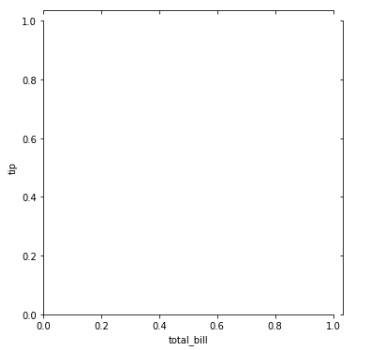
Example 1
In the below example, we will draw a simple JointGrid by passing it the tips dataset and x,y columns. This will generate a JointGrid empty facet.
import seaborn as sns
import matplotlib.pyplot as plt
tips=sns.load_dataset("tips")
tips.head()
sns.JointGrid(data=tips, x="total_bill", y="tip")
plt.show()
Output
the output plot produced is as follows,
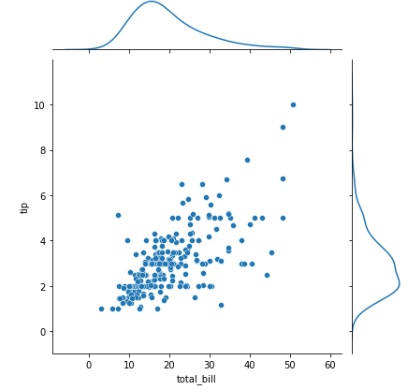
Example 2
We will plot a scatterplot over the joint grid facet in this example. A scatter plot is drawn inside the facet and a kernel density estimate plot is drawn on the marginal of the facet.
import seaborn as sns
import matplotlib.pyplot as plt
tips=sns.load_dataset("tips")
tips.head()
g = sns.JointGrid(data=tips, x="total_bill", y="tip")
g.plot(sns.scatterplot, sns.kdeplot)
plt.show()
Output
the output plot is as shown,
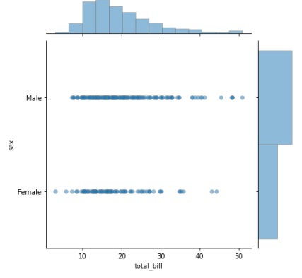
Example 3
Similar to the above example, the plot() function is used to draw a scatterplot inside the joint grid facet and a histogram is drawn on the marginal of the facet. Along with these, a few other parameters are passed to the function such as edge color, line width and alpha.
Here, edge color is a special parameter hat takes the values, matplotlib color or grey. it is an optional argument. The hue of the lines around each spot are determined by this parameter. The color scheme used for the body of the points determines the brightness if you pass "grey."
Linewidth is a parameter that takes floating value and determines the width of lines that divide each cell. Next, the alpha parameter is passed. We can utilize the alpha argument in the plot function to modify the transparency of plots. Its value is by default set to 1. This option has a value between 0 and 1, and as the value approaches 0, the plot becomes more translucent and invisible.
import seaborn as sns
import matplotlib.pyplot as plt
tips=sns.load_dataset("tips")
tips.head()
g = sns.JointGrid(data=tips, x="total_bill", y="sex")
g.plot(sns.scatterplot, sns.histplot, alpha=.5, edgecolor=".5", linewidth=.5)
plt.show()
Output
now, the plot obtained is as follows,
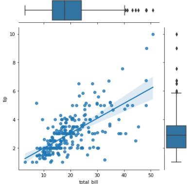
Example 4
A categorical plot can also be drawn on the marginal of the JointGrid facet. In this example we will how a box plot can be drawn.
import seaborn as sns
import matplotlib.pyplot as plt
tips=sns.load_dataset("tips")
tips.head()
g = sns.JointGrid(data=tips, x="total_bill", y="tip")
g.plot(sns.regplot, sns.boxplot)
plt.show()
Output
The output obtained is as follows −