- Seaborn - Home
- Seaborn - Introduction
- Seaborn - Environment Setup
- Importing Datasets and Libraries
- Seaborn - Figure Aesthetic
- Seaborn- Color Palette
- Seaborn - Histogram
- Seaborn - Kernel Density Estimates
- Seaborn - Visualizing Pairwise Relationship
- Seaborn - Plotting Categorical Data
- Distribution of Observations
- Seaborn - Statistical Estimation
- Seaborn - Plotting Wide Form Data
- Seaborn - Multi Panel Categorical Plots
- Seaborn - Linear Relationships
- Seaborn - Facet Grid
- Seaborn - Pair Grid
- Seaborn Function Reference
- Seaborn - Function Reference
- Relational Plots
- Distribution Plots
- Categorial plots
- Regression plots
- Matrix Plots
- Multi plot grids
- Themeing
- Color Palettes
- Palette widgets
- Utility Functions
- Seaborn Useful Resources
- Seaborn - Quick Guide
- Seaborn - cheatsheet
- Seaborn - Useful Resources
- Seaborn - Discussion
Seaborn - implot() method
Seaborn.lmplot() method is used to plot data and draw regression model fits across grids where multiple plots can be plotted.
This function combines FacetGrid and regplot(). The purpose of this interface is to make fitting regression models across conditional subsets of a dataset simple and convenient.
A typical approach when considering how to assign variables to various facets is that hue makes sense for the most significant comparison, followed by col and row.
Syntax
Following is the syntax of seaborn.lmplot() method −
seaborn.lmplot(*, x=None, y=None, data=None, hue=None, col=None, row=None, palette=None, col_wrap=None, height=5, aspect=1, markers='o', sharex=None, sharey=None, hue_order=None, col_order=None, row_order=None, legend=True, legend_out=None, x_estimator=None, x_bins=None, x_ci='ci', scatter=True, fit_reg=True, ci=95, n_boot=1000, units=None, seed=None, order=1, logistic=False, lowess=False, robust=False, logx=False, x_partial=None, y_partial=None, truncate=True, x_jitter=None, y_jitter=None, scatter_kws=None, line_kws=None, facet_kws=None, size=None)
Parameters
Some of the parameters of the seaborn.lmplot() method are as follows −
| S.No | Parameter and Description |
|---|---|
| 1 | x,y These parameters take names of variables as input that plot the long form data. |
| 2 | data This is the dataframe that is used to plot graphs. |
| 3 | x_estimator This is a callable that accepts values and maps vectors to scalars. It is an optional parameter. Each distinct value of x is applied to this function, and the estimated value is plotted as a result. When x is a discrete variable, this is helpful. This estimate will be bootstrapped and a confidence interval will be drawn if x_ci is provided. |
| 4 | x_bins This optional parameter accepts int or vector as input. The x variable is binned into discrete bins and then the central tendency and confidence interval are estimated. |
| 5 | {x,y}_jitter This optional parameter accepts floating point values. Add uniform random noise of this size to either the x or y variables. |
| 6 | color Used to specify a single color, and this color is applied to all plot elements. |
| 7 | marker This is the marker that is used to plot the data points in the graph. |
| 8 | x_ci Takes values from ci, sd, int in [0, 100] or None. It is an optional parameter. The size of the confidence interval used when plotting a central tendency for discrete values of x is determined by the value passed to this parameter. |
| 9 | logx Takes boolean vaules and if True, plots the scatterplot and regression model in the input space while also estimating a linear regression of the type y log(x). For this to work, x must be positive. |
| 10 | hue,row,col These parameters take strings as input and these variables define the subsets of data which will be drawn on separate facets of the grid. |
Let us load the seaborn library and the dataset before moving on to developing the plots.
Loading the seaborn library
To load or import the seaborn library the following line of code can be used.
Import seaborn as sns
Loading the dataset
In this article, we will make use of the Titanic dataset inbuilt in the seaborn library. the following command is used to load the dataset.
titanic=sns.load_dataset("titanic")
The below mentioned command is used to view the first 5 rows in the dataset. This enables us to understand what variables can be used to plot a graph.
titanic.head()
The below is the output for the above piece of code.
index,survived,pclass,sex,age,sibsp,parch,fare,embarked,class,who,adult_male,deck,embark_town,alive,alone
0,0,3,male,22.0,1,0,7.25,S,Third,man,true,NaN,Southampton,no,false
1,1,1,female,38.0,1,0,71.2833,C,First,woman,false,C,Cherbourg,yes,false
2,1,3,female,26.0,0,0,7.925,S,Third,woman,false,NaN,Southampton,yes,true
Now that we have loaded the dataset, we will explore as few examples.
Example 1
We are using the titanic dataset in this article. We will pass the fare, age and class columns to the x,y, and hue parameters respectively. The below line of code can be used to do so.
import seaborn as sns
import matplotlib.pyplot as plt
titanic=sns.load_dataset("titanic")
titanic.head()
sns.lmplot(x="fare", y="age", hue="class",data=titanic)
plt.show()
Output
The output generated is seen below −
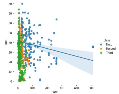
As explained in the regression plots introduction chapter, the lmplot() method plots a graph in scenarios where multiple plots are possible, ie: when hue semantic mapping is applied to the datasets, the regression lines are drawn.
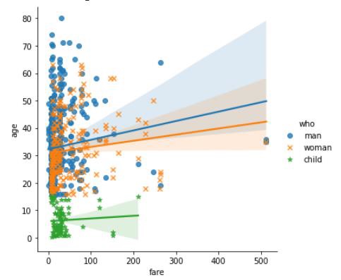
Example 2
In this example, we will see the usage of the markers parameter of the lmplot() method. This method takes a list of strings or a string as input and the observations plotted in the final graph are according the strings passed to this parameter.
import seaborn as sns
import matplotlib.pyplot as plt
titanic=sns.load_dataset("titanic")
titanic.head()
sns.lmplot(x="fare", y="age", hue="who",data=titanic,markers=["o", "x","*"])
plt.show()
(For different kind of markers this URL can refereed to.
#https://matplotlib.org/3.1.0/api/markers_api.html for different kinds of markers.)
Output
The plot for the above line of code is as follows −
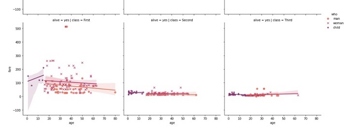
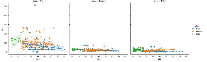
Example 3
In this example, we will understand how the plot will change when the col values are passed to the lmplot() method along with x,y and hue parameters. Since we are using the titanic dataset, we are passing the age, fare, who and class columns to the x,y,hue and col parameters respectively. The below line of code can be used to do so.
import seaborn as sns
import matplotlib.pyplot as plt
titanic=sns.load_dataset("titanic")
titanic.head()
sns.lmplot(y="fare", x="age", hue="who",col="class",data=titanic)
plt.show()
Output
the output plot produced is attached below −
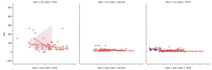
Example 4
Now, we will see the usage of a few other parameters in the seaborn.lmplot() method. The palette parameter takes the values palette name, list, or dict. These colors are used for the different levels of the hue variable.
These values should be something that can be interpreted by color_palette(), or a dictionary mapping hue levels to matplotlib colors. In the following example, flare is passed to the palette and the output plot obtained can be observed below.
import seaborn as sns
import matplotlib.pyplot as plt
titanic=sns.load_dataset("titanic")
titanic.head()
sns.lmplot(y="fare", x="age", hue="who",col="class",row="alive",data=titanic,markers=["o", "x","*"],palette="flare")
plt.show()
Output
the plot obtained is as follows −