- Seaborn - Home
- Seaborn - Introduction
- Seaborn - Environment Setup
- Importing Datasets and Libraries
- Seaborn - Figure Aesthetic
- Seaborn- Color Palette
- Seaborn - Histogram
- Seaborn - Kernel Density Estimates
- Seaborn - Visualizing Pairwise Relationship
- Seaborn - Plotting Categorical Data
- Distribution of Observations
- Seaborn - Statistical Estimation
- Seaborn - Plotting Wide Form Data
- Seaborn - Multi Panel Categorical Plots
- Seaborn - Linear Relationships
- Seaborn - Facet Grid
- Seaborn - Pair Grid
- Seaborn Function Reference
- Seaborn - Function Reference
- Relational Plots
- Distribution Plots
- Categorial plots
- Regression plots
- Matrix Plots
- Multi plot grids
- Themeing
- Color Palettes
- Palette widgets
- Utility Functions
- Seaborn Useful Resources
- Seaborn - Quick Guide
- Seaborn - cheatsheet
- Seaborn - Useful Resources
- Seaborn - Discussion
Seaborn - displot() method
The seaborn.displot() method is a function that provides access to several approached for visualizing univariate and bivariate distribution of data. This function like other functions in the Seaborn library allows the plotting of subsets of data defined by semantic mapping across multiple subplots.
The distribution and range of a collection of numeric values are represented against a dimension in a distribution plot.
Syntax
Following is the syntax of the Seaborn.displot() method
seaborn.displot(data=None, *, x=None, y=None, hue=None, row=None, col=None, weights=None, kind='hist', rug=False, rug_kws=None, log_scale=None, legend=True, palette=None, hue_order=None, hue_norm=None, color=None, col_wrap=None, row_order=None, col_order=None, height=5, aspect=1, facet_kws=None, **kwargs)
Parameters
Some of the parameters of the displot() method are discussed below.
| S.No | Parameter and Description |
|---|---|
| 1 | x,y Variables that are represented on the x,y axis. |
| 2 | Hue This will produce elements with different colors. It is a grouping variable. |
| 3 | Legend Boolean values, if false it suppressed the legend from being shown in the plot. |
| 4 | Row,col These parameters define the subsets are to be plotted. |
| 5 | Data This parameter takes the input data structure. That is either a mapping or a sequence. |
| 6 | rug Boolean value that if true, shows marginal ticks. |
| 7 | Kind Corresponds to the kind of plot to be drawn. Can be hist,kde or ecdf. |
| 8 | Palette This parameter is used to set the color tone of the mapping. It can be bright, pastel, dark etc. |
| 9 | Color Used to specify a single color, when hue mapping is not specified. |
| 10 | Aspect Depending on this value, the size of the plot is determined. |
| 11 | Log_scale Sets axes scales to log and the values plotted are in log scale. |
The default plot provided by this plot is an histogram. let us load the seaborn library and the dataset before moving on to the developing the plots.
Loading the seaborn library
To load or import the seaborn library the following line of code can be used.
Import seaborn as sns
Loading the dataset
in this article, we will make use of the Tips dataset inbuilt in the seaborn library. the following command is used to load the dataset.
tips=sns.load_dataset("tips")
The below mentioned command is used to view the first 5 rows in the dataset. This enables us to understand what variables can be used to plot a graph.
tips.head()
the below is the output for the above piece of code.
index,total_bill,tip,sex,smoker,day,time,size
0,16.99,1.01,Female,No,Sun,Dinner,2
1,10.34,1.66,Male,No,Sun,Dinner,3
2,21.01,3.5,Male,No,Sun,Dinner,3
3,23.68,3.31,Male,No,Sun,Dinner,2
4,24.59,3.61,Female,No,Sun,Dinner,4
Now that we have loaded the data, we will move on to plotting the data.
Example 1
In this example, we will plot a simple distribution plot using the seabron.displot() method for univariate distribution. The default plot kind is a histogram for this method.
import seaborn as sns
import matplotlib.pyplot as plt
tips=sns.load_dataset("tips")
tips.head()
sns.displot(data=tips, x="total_bill")
plt.show()
Output
The above line of code will generate the following output −
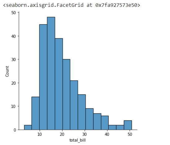
As we can see, the total bill column is plotted as a histogram against the count on y axis.
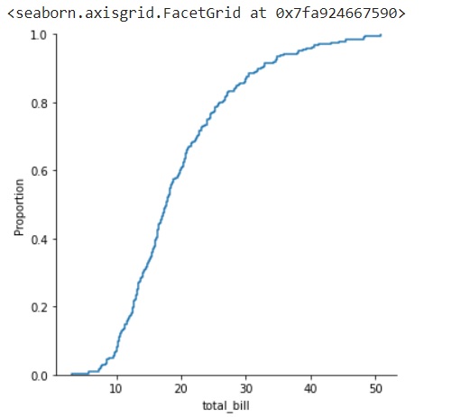
Example 2
In this example, we will see use the kind parameter and pass different arguments to it.
The kind parameter takes one of the following three values: kde, ecdf and hist.
The below piece of code, outputs a graph that is the empirical cumulative distribution graph.
import seaborn as sns
import matplotlib.pyplot as plt
tips=sns.load_dataset("tips")
tips.head()
sns.displot(data=tips, x="total_bill",kind="ecdf")
plt.show()
Output
The above line of code will generate the following output −
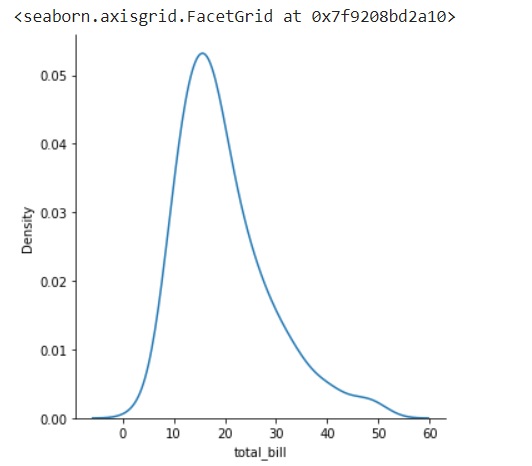
Example 3
import seaborn as sns
import matplotlib.pyplot as plt
tips=sns.load_dataset("tips")
tips.head()
sns.displot(data=tips, x="total_bill",kind="kde")
plt.show()
Output
The above line of code will generate the following output −
Example 4
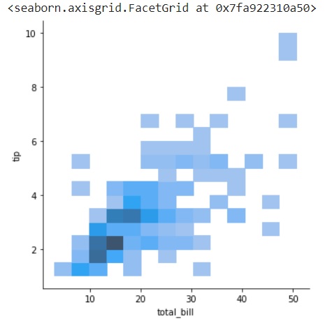
In this example, we will plot bivariate distribution plots. This can be done by passing data to the x and y parameters of the method.
sns.displot(data=tips, x="total_bill",y="tip")
import seaborn as sns
import matplotlib.pyplot as plt
tips=sns.load_dataset("tips")
tips.head()
sns.displot(data=tips, x="total_bill",y="tip")
plt.show()
Output
The above line of code will generate the following output −
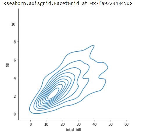
Example 5
Plotting a bivariate plot and passing a value to the kind parameter.
sns.displot(data=tips, x="total_bill",y="tip",kind="kde")
import seaborn as sns
import matplotlib.pyplot as plt
tips=sns.load_dataset("tips")
tips.head()
sns.displot(data=tips, x="total_bill",y="tip",kind="kde")
plt.show()
Output
The above line of code will generate the following output −
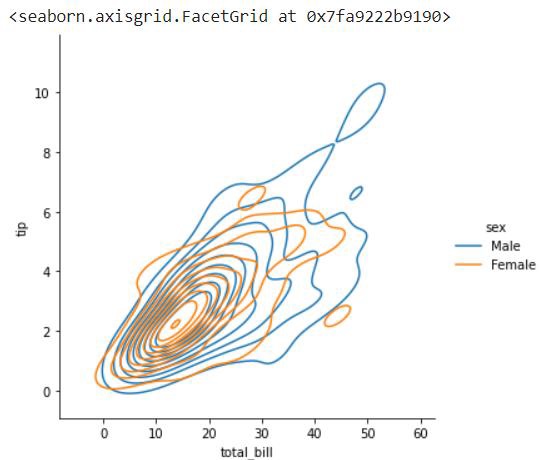
Example 6
We will plot a bivariate distribution and also pass different parameters to the method and see the variation in graphs.
Firstly, we will pass the x, y and hue parameters and plot a kde plot.
import seaborn as sns
import matplotlib.pyplot as plt
tips=sns.load_dataset("tips")
tips.head()
sns.displot(data=tips, x="total_bill",y="tip",hue="sex",kind="kde")
plt.show()
Output
the above code snippet will produce the following graph.
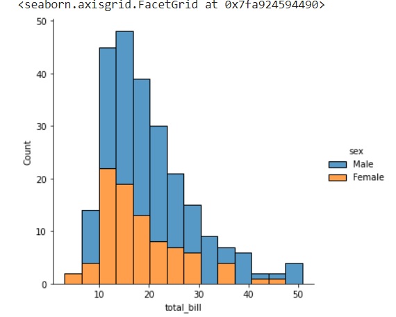
Example 7
In this example, we will see the use of multiple keyword argument in a univariate graph. Here, multiple is an additional keyword argument that allows customization of the graph.
Multiple essentially takes value as stack and then it stacks data in the plot. This can be seen in the following graph.
sns.displot(data=tips, x="total_bill",hue="sex",multiple="stack")
import seaborn as sns
import matplotlib.pyplot as plt
tips=sns.load_dataset("tips")
tips.head()
sns.displot(data=tips, x="total_bill",hue="sex",multiple="stack")
plt.show()
Output
the output of the above code snippet is as follows