- Seaborn - Home
- Seaborn - Introduction
- Seaborn - Environment Setup
- Importing Datasets and Libraries
- Seaborn - Figure Aesthetic
- Seaborn- Color Palette
- Seaborn - Histogram
- Seaborn - Kernel Density Estimates
- Seaborn - Visualizing Pairwise Relationship
- Seaborn - Plotting Categorical Data
- Distribution of Observations
- Seaborn - Statistical Estimation
- Seaborn - Plotting Wide Form Data
- Seaborn - Multi Panel Categorical Plots
- Seaborn - Linear Relationships
- Seaborn - Facet Grid
- Seaborn - Pair Grid
- Seaborn Function Reference
- Seaborn - Function Reference
- Relational Plots
- Distribution Plots
- Categorial plots
- Regression plots
- Matrix Plots
- Multi plot grids
- Themeing
- Color Palettes
- Palette widgets
- Utility Functions
- Seaborn Useful Resources
- Seaborn - Quick Guide
- Seaborn - cheatsheet
- Seaborn - Useful Resources
- Seaborn - Discussion
Seaborn - countplot() method
The Seaborn.countplot() method is used to display the count of categorical observations in each bin in the dataset. A count plot resembles a histogram over a categorical variable as opposed to a quantitative one. You can compare counts across nested variables because the fundamental API and settings are the same as those for barplot().
The countplot() method takes input data in many forms, such as wide-form data, long-from data, arrays or a list of vectors.
Syntax
Following is the syntax of seaborn.countplot() method −
seaborn.countplot(*, x=None, y=None, hue=None, data=None, order=None, hue_order=None, orient=None, color=None, palette=None, saturation=0.75, dodge=True, ax=None, **kwargs)
Parameters
Some of the parameters of the seaborn.countplot() method are as follows −
| S.No | Name and Description |
|---|---|
| 1 | x,y These parameters take names of variables as input that plot the long form data. |
| 2 | data This is the dataframe that is used to plot graphs. |
| 3 | hue Names of variables in the dataframe that are needed for plotting the graph. |
| 4 | linewidth This parameter takes floating values and determines the width of the gray lines that frame the elements in the plot. |
| 5 | dodge This parameter takes a Boolean value. if we use hue nesting, passing true to this parameter will separate the strips for different hue levels. If False is passed, the points for each level will be plotted on top of each other. |
| 6 | orient It takes values h or v and the orientation of the graph is determined based on this. |
| 7 | color matplotlib color is taken as input and this determines the color of all the elements. |
| 8 | palette This parameter specifies the colors for different hue mappings. |
| 9 | saturation Takes a floating value and the proportion of the original saturation to draw colors is determined by this value. |
let us load the seaborn library and the dataset before moving on to the developing the plots.
Loading the seaborn library
To load or import the seaborn library the following line of code can be used.
Import seaborn as sns
Loading the dataset
In this article, we will make use of the Tips dataset inbuilt in the seaborn library. the following command is used to load the dataset.
tips=sns.load_dataset("tips")
The below mentioned command is used to view the first 5 rows in the dataset. This enables us to understand what variables can be used to plot a graph.
tips.head()
The below is the output for the above piece of code.
index,total_bill,tip,sex,smoker,day,time,size
0,16.99,1.01,Female,No,Sun,Dinner,2
1,10.34,1.66,Male,No,Sun,Dinner,3
2,21.01,3.5,Male,No,Sun,Dinner,3
3,23.68,3.31,Male,No,Sun,Dinner,2
4,24.59,3.61,Female,No,Sun,Dinner,4
Now that we have loaded the data, we will move on to plotting the data.
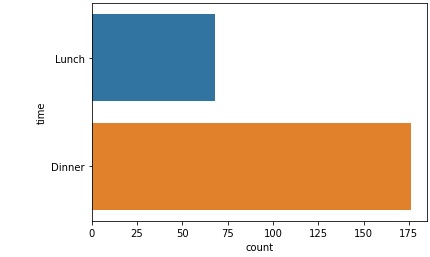
Example 1
To plot a simple count plot, we only have to pass the dataset and a variable to either x or y parameters of the method. In this case, we will pass only the y parameter first and then pass the x parameter.
The below line of code can be used when you want to pass only the y parameter.
import seaborn as sns
import matplotlib.pyplot as plt
tips=sns.load_dataset("tips")
tips.head()
sns.countplot(y="time", data=tips)
plt.show()
Output
The output for the above line of code can be seen below −
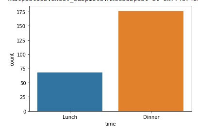
Example 2
The below line of code can be used when you want to pass only the x parameter.
import seaborn as sns
import matplotlib.pyplot as plt
tips=sns.load_dataset("tips")
tips.head()
sns.countplot(x="time", data=tips)
plt.show()
Output
The output produced is as follows −
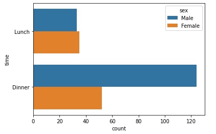
Example 3
In this example, we will pass the hue parameter along with either x or y parameter and observe the difference in the graph produced. We are using the tips dataset in this article and since, hue requires a categorical variable, the variable sex is being passed to it, the y parameter also requires a categorical variable since countplot is a categorical plot that plots the graph if any one of the xy parameters is categorical. The below code can be used to plot the desired graph.
import seaborn as sns
import matplotlib.pyplot as plt
tips=sns.load_dataset("tips")
tips.head()
sns.countplot(y="time", hue="sex",data=tips)
plt.show()
Output
The output obtained is as follows −
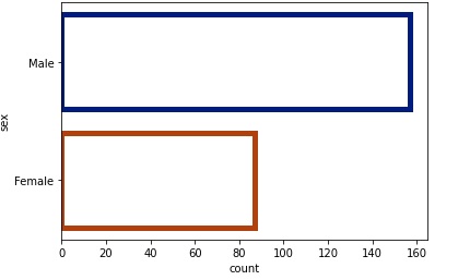
Example 4
Now, we will see the usage of the edgecolor, facecolor and linewidth parameters. Usually, all these parameters are combined to obtain a graph of desired color and look.
edge color is a special parameter hat takes the values, matplotlib color or grey. it is an optional argument. The hue of the lines around each spot are determined by this parameter. The color scheme used for the body of the points determines the brightness if you pass "grey."
Facecolor parameter determines the background color of the elements in the plot. The linewidth parameter takes floating values and determines the width of the gray lines that frame the elements in the plot.
import seaborn as sns
import matplotlib.pyplot as plt
tips=sns.load_dataset("tips")
tips.head()
sns.countplot(y="sex",edgecolor=sns.color_palette("dark", 3),facecolor=(0,0,0,0),linewidth=5,data=tips)
plt.show()
Output
The output obtained is as follows −
since facecolor is initialized to zeros, the background is empty in the plot.