- Seaborn - Home
- Seaborn - Introduction
- Seaborn - Environment Setup
- Importing Datasets and Libraries
- Seaborn - Figure Aesthetic
- Seaborn- Color Palette
- Seaborn - Histogram
- Seaborn - Kernel Density Estimates
- Seaborn - Visualizing Pairwise Relationship
- Seaborn - Plotting Categorical Data
- Distribution of Observations
- Seaborn - Statistical Estimation
- Seaborn - Plotting Wide Form Data
- Seaborn - Multi Panel Categorical Plots
- Seaborn - Linear Relationships
- Seaborn - Facet Grid
- Seaborn - Pair Grid
- Seaborn Function Reference
- Seaborn - Function Reference
- Relational Plots
- Distribution Plots
- Categorial plots
- Regression plots
- Matrix Plots
- Multi plot grids
- Themeing
- Color Palettes
- Palette widgets
- Utility Functions
- Seaborn Useful Resources
- Seaborn - Quick Guide
- Seaborn - cheatsheet
- Seaborn - Useful Resources
- Seaborn - Discussion
Seaborn - barplot() method
Seaborn.barplot() method is used to show point estimates and confidence intervals as rectangular bars. With the height of each rectangle representing an estimate of central tendency for a numerical variable, a bar plot also shows the degree of uncertainty surrounding that estimate via error bars.
When 0 is a meaningful value for the quantitative variable and you want to make comparisons against it, bar plots which include 0 in the quantitative axis range are an excellent option. A point plot will enable you to concentrate on disparities between levels of one or more categorical variables in datasets where 0 is not a meaningful value.
Syntax
Following is the syntax of seaborn.barplot() method −
seaborn.barplot(*, x=None, y=None, hue=None, data=None, order=None, hue_order=None, estimator=<function mean at 0x7ff320f315e0>, ci=95, n_boot=1000, units=None, seed=None, orient=None, color=None, palette=None, saturation=0.75, errcolor='.26', errwidth=None, capsize=None, dodge=True, ax=None, **kwargs
Parameters
Some of the parameters of the seaborn.barplot() method are as follows −
| S.No | Name and Description |
|---|---|
| 1 | x,y These parameters take names of variables as input that plot the long form data. |
| 2 | data This is the dataframe that is used to plot graphs. |
| 3 | hue Names of variables in the dataframe that are needed for plotting the graph. |
| 4 | linewidth This parameter takes floating values and determines the width of the gray lines that frame the elements in the plot. |
| 5 | dodge This parameter takes a boolean value. if we use hue nesting, passing true to this parameter will separate the strips for different hue levels. If False is passed, the points for each level will be plotted on top of each other. |
| 6 | orient It takes values h or v and the orientation of the graph is determined based on this. |
| 7 | color matplotlib color is taken as input and this determines the color of all the elements. |
| 8 | palette This parameter specifies the colors for different hue mappings. |
| 9 | capsize Takes floating point values as input and determines the width of caps on error bars. |
Loading the seaborn library
Let us load the Seaborn library and the dataset before moving on to developing the plots. To load or import the seaborn library the following line of code can be used.
Import seaborn as sns
Loading the dataset
In this article, we will make use of the Titanic dataset inbuilt in the seaborn library. the following command is used to load the dataset.
titanic=sns.load_dataset("titanic")
The below mentioned command is used to view the first 5 rows in the dataset. This enables us to understand what variables can be used to plot a graph.
titanic.head()
The below is the output for the above piece of code.
index,survived,pclass,sex,age,sibsp,parch,fare,embarked,class,who,adult_male,deck,embark_town,alive,alone
0,0,3,male,22.0,1,0,7.25,S,Third,man,true,NaN,Southampton,no,false
1,1,1,female,38.0,1,0,71.2833,C,First,woman,false,C,Cherbourg,yes,false
2,1,3,female,26.0,0,0,7.925,S,Third,woman,false,NaN,Southampton,yes,true
Now that we have loaded the dataset, we will explore as few examples.
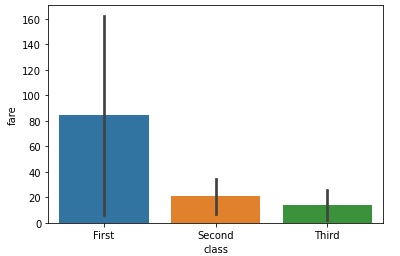
Example 1
To plot a basic barplot, passing the arguments x,y and the dataset to the data argument should suffice. Here, we are using the titanic dataset and the columns class and fare are passed to x,y respectively. Since barplot is also a categorical plot, it will need one categorical variable to plot a graph. The following line of code can be referred to for plotting a simple barplot().
import seaborn as sns
import matplotlib.pyplot as plt
titanic=sns.load_dataset("titanic")
titanic.head()
sns.barplot(x="class", y="fare", data=titanic)
plt.show()
Output
The output obtained is as follows −
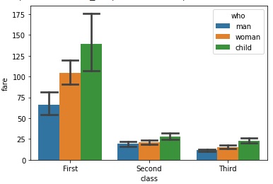
Example 2
capsize parameter is a very useful parameter in the barplot() method. It takes floating point values and determines the width of the cap on error bars. In this example, we will pass the capsize parameter to the method and observe the changes in the graph produced. The hue parameter is also passed in the below example since the graph will be a lot clearer.
import seaborn as sns
import matplotlib.pyplot as plt
titanic=sns.load_dataset("titanic")
titanic.head()
sns.barplot(x="class", y="fare",hue="who",capsize=0.2,data=titanic)
plt.show()
Output
The output obtained is as follows −
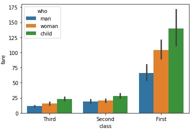
Example 3
In this example, we will understand the working of the order parameter. This parameter takes values as a list of strings. These list of strings are the order in which the categorical levels are plotted. Since the order for the class variable in the dataset is First, Second and Third, the order passed in the below line of code is the reverse to the current order.
import seaborn as sns
import matplotlib.pyplot as plt
titanic=sns.load_dataset("titanic")
titanic.head()
sns.barplot(x="class",y="fare",hue="who", data=titanic,order=["Third", "Second","First"])
plt.show()
Output
The output obtained by using the above line of code is as follows −
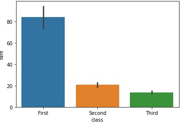
Example 4
Central tendency is a parameter that has a lot of uses and is an optional parameter that takes the values, float, or none. It is an optional parameter. To be drawn around estimated values are confidence intervals of varying sizes. If "sd," value is passed, bootstrapping is performed and the plots contain the observed standard deviation instead. If None, error bars won't be displayed and no bootstrapping will be done.
import seaborn as sns
import matplotlib.pyplot as plt
titanic=sns.load_dataset("titanic")
titanic.head()
sns.barplot(x="class", y="fare", ci="sd",data=titanic)
plt.show()
Output
The output obtained is as follows −