- MATLAB - Home
- MATLAB - Overview
- MATLAB - Features
- MATLAB - Environment Setup
- MATLAB - Editors
- MATLAB - Online
- MATLAB - Workspace
- MATLAB - Syntax
- MATLAB - Variables
- MATLAB - Commands
- MATLAB - Data Types
- MATLAB - Operators
- MATLAB - Dates and Time
- MATLAB - Numbers
- MATLAB - Random Numbers
- MATLAB - Strings and Characters
- MATLAB - Text Formatting
- MATLAB - Timetables
- MATLAB - M-Files
- MATLAB - Colon Notation
- MATLAB - Data Import
- MATLAB - Data Output
- MATLAB - Normalize Data
- MATLAB - Predefined Variables
- MATLAB - Decision Making
- MATLAB - Decisions
- MATLAB - If End Statement
- MATLAB - If Else Statement
- MATLAB - If…Elseif Else Statement
- MATLAB - Nest If Statememt
- MATLAB - Switch Statement
- MATLAB - Nested Switch
- MATLAB - Loops
- MATLAB - Loops
- MATLAB - For Loop
- MATLAB - While Loop
- MATLAB - Nested Loops
- MATLAB - Break Statement
- MATLAB - Continue Statement
- MATLAB - End Statement
- MATLAB - Arrays
- MATLAB - Arrays
- MATLAB - Vectors
- MATLAB - Transpose Operator
- MATLAB - Array Indexing
- MATLAB - Multi-Dimensional Array
- MATLAB - Compatible Arrays
- MATLAB - Categorical Arrays
- MATLAB - Cell Arrays
- MATLAB - Matrix
- MATLAB - Sparse Matrix
- MATLAB - Tables
- MATLAB - Structures
- MATLAB - Array Multiplication
- MATLAB - Array Division
- MATLAB - Array Functions
- MATLAB - Functions
- MATLAB - Functions
- MATLAB - Function Arguments
- MATLAB - Anonymous Functions
- MATLAB - Nested Functions
- MATLAB - Return Statement
- MATLAB - Void Function
- MATLAB - Local Functions
- MATLAB - Global Variables
- MATLAB - Function Handles
- MATLAB - Filter Function
- MATLAB - Factorial
- MATLAB - Private Functions
- MATLAB - Sub-functions
- MATLAB - Recursive Functions
- MATLAB - Function Precedence Order
- MATLAB - Map Function
- MATLAB - Mean Function
- MATLAB - End Function
- MATLAB - Error Handling
- MATLAB - Error Handling
- MATLAB - Try...Catch statement
- MATLAB - Debugging
- MATLAB - Plotting
- MATLAB - Plotting
- MATLAB - Plot Arrays
- MATLAB - Plot Vectors
- MATLAB - Bar Graph
- MATLAB - Histograms
- MATLAB - Graphics
- MATLAB - 2D Line Plot
- MATLAB - 3D Plots
- MATLAB - Formatting a Plot
- MATLAB - Logarithmic Axes Plots
- MATLAB - Plotting Error Bars
- MATLAB - Plot a 3D Contour
- MATLAB - Polar Plots
- MATLAB - Scatter Plots
- MATLAB - Plot Expression or Function
- MATLAB - Draw Rectangle
- MATLAB - Plot Spectrogram
- MATLAB - Plot Mesh Surface
- MATLAB - Plot Sine Wave
- MATLAB - Interpolation
- MATLAB - Interpolation
- MATLAB - Linear Interpolation
- MATLAB - 2D Array Interpolation
- MATLAB - 3D Array Interpolation
- MATLAB - Polynomials
- MATLAB - Polynomials
- MATLAB - Polynomial Addition
- MATLAB - Polynomial Multiplication
- MATLAB - Polynomial Division
- MATLAB - Derivatives of Polynomials
- MATLAB - Transformation
- MATLAB - Transforms
- MATLAB - Laplace Transform
- MATLAB - Laplacian Filter
- MATLAB - Laplacian of Gaussian Filter
- MATLAB - Inverse Fourier transform
- MATLAB - Fourier Transform
- MATLAB - Fast Fourier Transform
- MATLAB - 2-D Inverse Cosine Transform
- MATLAB - Add Legend to Axes
- MATLAB - Object Oriented
- MATLAB - Object Oriented Programming
- MATLAB - Classes and Object
- MATLAB - Functions Overloading
- MATLAB - Operator Overloading
- MATLAB - User-Defined Classes
- MATLAB - Copy Objects
- MATLAB - Algebra
- MATLAB - Linear Algebra
- MATLAB - Gauss Elimination
- MATLAB - Gauss-Jordan Elimination
- MATLAB - Reduced Row Echelon Form
- MATLAB - Eigenvalues and Eigenvectors
- MATLAB - Integration
- MATLAB - Integration
- MATLAB - Double Integral
- MATLAB - Trapezoidal Rule
- MATLAB - Simpson's Rule
- MATLAB - Miscellenous
- MATLAB - Calculus
- MATLAB - Differential
- MATLAB - Inverse of Matrix
- MATLAB - GNU Octave
- MATLAB - Simulink
MATLAB - Scatter Plots
Scatter plots are a type of data visualization that displays individual data points as dots.They are useful for showing the relationship between two continuous variables, such as height and weight, or for highlighting clusters or patterns in the data.
Each dot on the plot represents a single data point, with its position on the x-axis corresponding to one variable and its position on the y-axis corresponding to the other variable.Scatter plots are particularly useful for identifying trends, patterns, and outliers in the data.In MATLAB, you can create scatter plots using the scatter function.
Syntax
scatter(x,y)
scatter(x,y,sz)
scatter(x,y,sz,c)
scatter(___,"filled")
scatter(___,mkr)
scatter(tbl,xvar,yvar)
scatter(tbl,xvar,yvar,"filled")
The detailed explanation of the syntax is as follows −
scatter(x,y) − The scatter(x, y) function generates a scatter plot with circular markers positioned according to the values in the vectors x and y.For a single set of coordinates, ensure that x and y are vectors of the same length.To plot multiple sets of coordinates on a single set of axes, input either x or y as a matrix.
scatter(x,y,sz) − Function defines the sizes of the circles in the scatter plot. To make all circles the same size, set sz as a single value. For different circle sizes, use a vector or matrix for sz.
scatter(x,y,sz,c) − Sets the colors of the circles in the scatter plot. You can choose a single color for all circles or have varying colors. For instance, to plot all circles in red, set c as "red".
scatter(___,"filled") − Here the "filled" option with the scatter function fills in the circles. This option can be used with any of the input argument combinations we have described earlier in the above syntaxes.
scatter(___,mkr) − Syntax allows you to specify the marker type for the scatter plot.
scatter(tbl,xvar,yvar) − Function plots the variables xvar and yvar from the table tbl. To plot a single data set, select one variable for xvar and one variable for yvar. For multiple data sets, choose multiple variables for xvar, yvar, or both. If both arguments contain multiple variables, they must be of the same length.
scatter(tbl,xvar,yvar,"filled") − Will plot the specified variables from the table with filled circles.
Examples of Plotting Scatter Plots
Let us see examples for plotting scatter plots based on the syntax we discussed above.
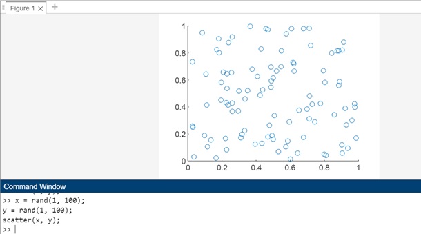
Example 1: Using scatter(x,y)
The code for above syntax is as follows −
x = rand(1, 100);
y = rand(1, 100);
scatter(x, y);
In this example, x and y are vectors of random values, each containing 100 elements. The scatter(x, y) function creates a scatter plot with these values, where each point is represented by a circular marker.
When you execute the same in matlab command window the output is −
Example 2: Using scatter(x,y,sz)
The code we have for above syntax is as follows −
x = rand(1, 100);
y = rand(1, 100);
sz = 50 * rand(1, 100);
scatter(x, y, sz);
In this example, sz is a vector containing 100 random values that represent the sizes of the circles in the scatter plot. By specifying sz as the third argument in the scatter function, each circle will be plotted with a size corresponding to the value at the corresponding index in the sz vector. This allows you to create a scatter plot where the size of each circle is determined by a separate set of values.
When you execute the same in matlab command window the output is −

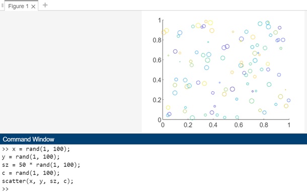
Example 3: Using scatter(x,y,sz,c)
The code for above syntax is as follows −
x = rand(1, 100);
y = rand(1, 100);
sz = 50 * rand(1, 100);
c = rand(1, 100);
scatter(x, y, sz, c);
In this example, c is a vector containing 100 random values that represent the colors of the circles in the scatter plot. By specifying c as the fourth argument in the scatter function, each circle will be plotted with a color corresponding to the value at the corresponding index in the c vector.
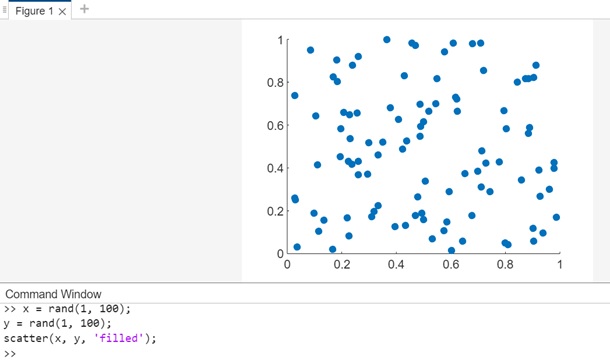
Example 4: Using scatter(___,"filled")
The code for above syntax is −
x = rand(1, 100);
y = rand(1, 100);
scatter(x, y, 'filled');
In this example, the "filled" option is used with the scatter function to fill in the circles in the scatter plot. This option can be used with any of the input argument combinations described earlier, allowing you to customize the appearance of the plot while filling in the circles.
When you execute the code in matlab command window the output is −
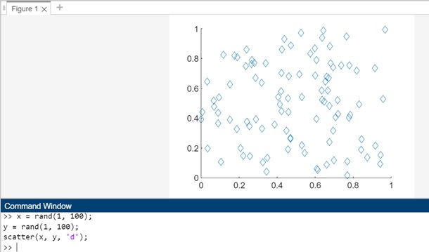
Example 5: Using scatter(___,mkr)
The code for above syntax is −
x = rand(1, 100);
y = rand(1, 100);
scatter(x, y, 'd');
In this example, the 'd' argument is used as the marker type for the scatter function, which specifies that diamond markers should be used for each data point in the scatter plot. You can replace 'd' with other marker types such as 'o' for circles, 's' for squares, '+' for plus signs, etc., to customize the appearance of the markers in the plot.
When you execute the code in matlab command window the output is −
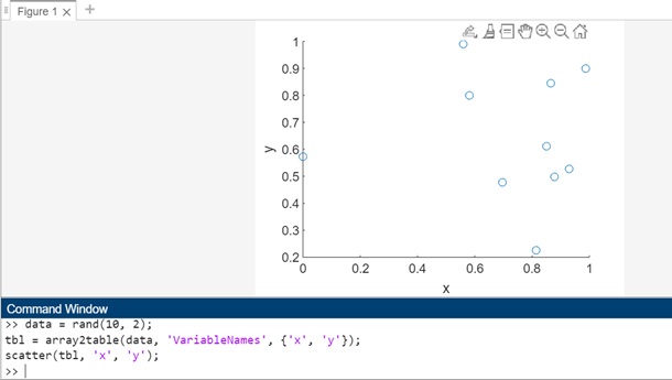
Example 6: Using scatter(tbl,xvar,yvar)
The code for above syntax is −
data = rand(10, 2);
tbl = array2table(data, 'VariableNames', {'x', 'y'});
scatter(tbl, 'x', 'y');
In this example, tbl is a table containing two variables, x and y. The line tbl = array2table(data, 'VariableNames', {'x', 'y'}); converts the data array into a table tbl with two variables named 'x' and 'y'.The scatter(tbl, 'x', 'y') function is used to create a scatter plot of these variables.
When you execute the code in matlab command window the output is −
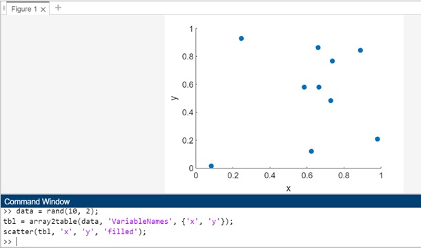
Example 7: Using scatter(tbl,xvar,yvar,"filled")
The code for above syntax is −
data = rand(10, 2);
tbl = array2table(data, 'VariableNames', {'x', 'y'});
scatter(tbl, 'x', 'y', 'filled');
In this example, tbl is a table containing two variables, x and y. The scatter(tbl, 'x', 'y', 'filled') function is used to create a scatter plot of these variables with filled circles. The 'filled' argument specifies that the markers in the scatter plot should be filled.
When you execute the same in matlab command window the output is −
Scatter Plots by Group
Scatter plots by group refer to scatter plots where data points are grouped or colored based on a categorical variable. This type of plot is useful for visualizing relationships between two continuous variables while also showing how the data is divided into different groups. Each group is represented by a different color or marker style in the scatter plot, making it easier to compare the groups and identify any patterns or trends.
In MATLAB, scatter plots by group can be created using the gscatter() function. This function allows you to plot multiple groups of data points in a scatter plot, with each group represented by a different color or marker style.
Syntax
gscatter(x,y,g)
gscatter(x,y,g,clr,sym,siz)
gscatter(x,y,g,clr,sym,siz,doleg)
gscatter(x,y,g,clr,sym,siz,doleg,xnam,ynam)
The detailed explanation of the syntax is as follows −
gscatter(x,y,g) − Function produces a scatter plot where the data points represented by x and y are grouped based on the values in g. Both x and y should be vectors of the same length.
gscatter(x,y,g,clr,sym,siz) − Function allows you to customize the marker color (clr), symbol (sym), and size (siz) for each group in the scatter plot.
gscatter(x,y,g,clr,sym,siz,doleg) − Function determines whether a legend is shown on the graph. By default, gscatter creates a legend.
gscatter(x,y,g,clr,sym,siz,doleg,xnam,ynam) − Function lets you specify labels for the x-axis (xnam) and y-axis (ynam). If you don't provide xnam and ynam, and the x and y inputs are variables with names, gscatter will use those variable names for the axis labels.
Let us see an example of each of the syntax that we discussed above.
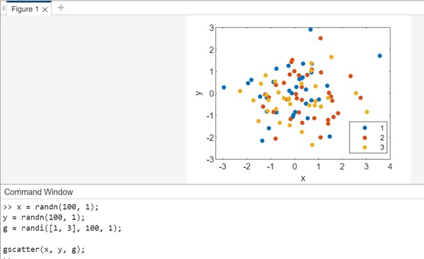
Example 1: Using gscatter(x,y,g)
The code for above syntax is as follows −
x = randn(100, 1);
y = randn(100, 1);
g = randi([1, 3], 100, 1);

gscatter(x, y, g);
In this example, gscatter is used to create a scatter plot of x vs y, where the data points are grouped based on the values in g. Each group is represented by a different color, and a legend is added to the plot to indicate which color corresponds to each group.
When you execute the same in matlab command window the output is −
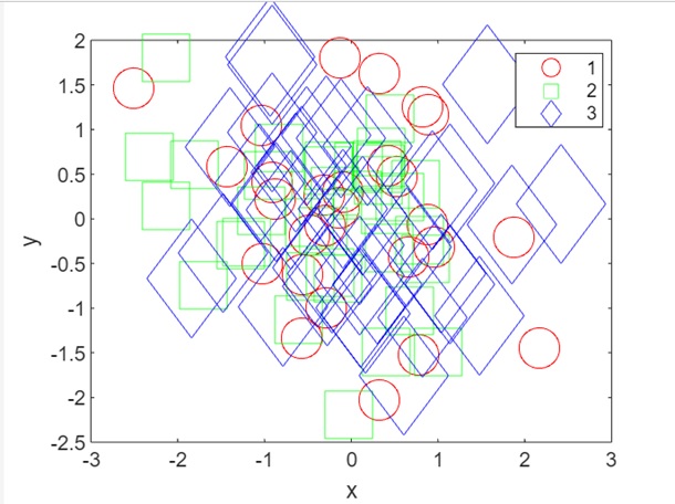
Example 2: Using gscatter(x,y,g,clr,sym,siz)
The code for above syntax is −
x = randn(100, 1);
y = randn(100, 1);
g = randi([1, 3], 100, 1);
clr = ['r', 'g', 'b'];
sym = ['o', 's', 'd'];
siz = [20, 30, 40];
gscatter(x, y, g, clr, sym, siz);
In this example, gscatter is used to create a scatter plot of x vs y, where the data points are grouped based on the values in g. The clr, sym, and siz vectors define custom marker properties (color, symbol, and size) for each group. The scatter plot will display each group with the specified color, marker symbol, and marker size.
When you execute the code the output is −
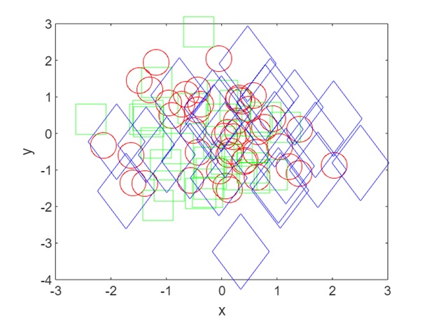
Example 3: Using gscatter(x,y,g,clr,sym,siz,doleg)
The code for above syntax is −
x = randn(100, 1);
y = randn(100, 1);
g = randi([1, 3], 100, 1);
clr = ['r', 'g', 'b'];
sym = ['o', 's', 'd'];
siz = [20, 30, 40];
gscatter(x, y, g, clr, sym, siz, 'off');
In this example, gscatter is used to create a scatter plot of x vs y, where the data points are grouped based on the values in g. The clr, sym, and siz vectors define custom marker properties (color, symbol, and size) for each group. The 'off' argument for doleg specifies that no legend should be displayed on the plot.
When you execute the same in matlab command window the output is −
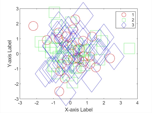
Example 4: Using gscatter(x,y,g,clr,sym,siz,doleg,xnam,ynam)
The code for above syntax is −
x = randn(100, 1);
y = randn(100, 1);
g = randi([1, 3], 100, 1);
clr = ['r', 'g', 'b'];
sym = ['o', 's', 'd'];
siz = [20, 30, 40];
xnam = 'X-axis Label';
ynam = 'Y-axis Label';
gscatter(x, y, g, clr, sym, siz, 'on', xnam, ynam);
In this example, gscatter is used to create a scatter plot of x vs y, where the data points are grouped based on the values in g. The clr, sym, and siz vectors define custom marker properties (color, symbol, and size) for each group. The 'on' argument for doleg specifies that a legend should be displayed on the plot. The xnam and ynam arguments specify custom labels for the x-axis and y-axis, respectively. If you don't provide xnam and ynam, and the x and y inputs are variables with names, gscatter will use those variable names for the axis labels.
When you execute the code in matlab command window the output is −