
Article Categories
- All Categories
-
 Data Structure
-
 Networking
-
 RDBMS
RDBMS
-
 Operating System
-
 Java
Java
-
 MS Excel
-
 iOS
iOS
-
 HTML
HTML
-
 CSS
CSS
-
 Android
-
 Python
-
 C Programming
-
 C++
C++
-
 C#
C#
-
 MongoDB
-
 MySQL
MySQL
-
 Javascript
-
 PHP
PHP
-
 Economics & Finance
Selected Reading
Plot scatter points on polar axis in Matplotlib
To plot scatter points on polar axis in Matplotlib, we can create a polar coordinate system where points are positioned using angles (theta) and radial distances (r). This is useful for visualizing circular or angular data patterns.
Basic Polar Scatter Plot
Let's start with a simple example that demonstrates the key components ?
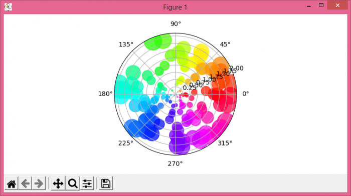
import numpy as np
import matplotlib.pyplot as plt

# Set figure size
plt.rcParams["figure.figsize"] = [7.50, 3.50]
plt.rcParams["figure.autolayout"] = True

# Generate sample data
N = 150
r = 2 * np.random.rand(N)
theta = 2 * np.pi * np.random.rand(N)
area = 200 * r**2
colors = theta

# Create polar plot
fig = plt.figure()
ax = fig.add_subplot(projection='polar')
c = ax.scatter(theta, r, c=colors, s=area, cmap='hsv', alpha=0.75)

plt.show()
How It Works
The polar scatter plot requires these key steps:
- Theta values − angles in radians (0 to 2?)
- R values − radial distances from the center
- Projection='polar' − creates the polar coordinate system
- Color mapping − uses theta values to create a color gradient
- Size mapping − point sizes based on radial distance
Customizing Polar Scatter Plots
Here's an example with more customization options ?
import numpy as np
import matplotlib.pyplot as plt

# Generate structured data
angles = np.linspace(0, 2*np.pi, 50)
radius = np.random.uniform(0.5, 3, 50)
sizes = np.random.uniform(50, 300, 50)
colors = radius

# Create customized polar scatter plot
fig, ax = plt.subplots(figsize=(8, 8), subplot_kw=dict(projection='polar'))

scatter = ax.scatter(angles, radius, c=colors, s=sizes,
                    cmap='viridis', alpha=0.7, edgecolors='black', linewidth=0.5)

# Customize the plot
ax.set_title('Customized Polar Scatter Plot', pad=20)
ax.set_ylim(0, 3.5)
ax.grid(True)

# Add colorbar
plt.colorbar(scatter, ax=ax, shrink=0.8, pad=0.1)

plt.show()
Parameters
| Parameter | Description | Example |
|---|---|---|
theta |
Angular coordinates (radians) | np.linspace(0, 2*np.pi, 100) |
r |
Radial coordinates | np.random.rand(100) |
c |
Color values |
theta or r
|
s |
Point sizes | 200 * r**2 |
cmap |
Colormap |
'hsv', 'viridis'
|
Output
Conclusion
Polar scatter plots are perfect for displaying data with angular relationships. Use projection='polar' to create the coordinate system, and map colors and sizes to data values for enhanced visualization.

Updated on: 2026-03-25T22:59:17+05:30
1K+ Views

Advertisements