- Plotly - Home
- Plotly - Introduction
- Plotly - Environment Setup
- Plotly - Online & Offline Plotting
- Plotting Inline with Jupyter Notebook
- Plotly - Package Structure
- Plotly - Exporting to Static Images
- Plotly - Legends
- Plotly - Format Axis & Ticks
- Plotly - Subplots & Inset Plots
- Plotly - Bar Chart & Pie Chart
- Plotly - Scatter Plot, Scattergl Plot & Bubble Charts
- Plotly - Dot Plots & Table
- Plotly - Histogram
- Plotly - Box Plot Violin Plot & Contour Plot
- Plotly - Distplots, Density Plot & Error Bar Plot
- Plotly - Heatmap
- Plotly - Polar Chart & Radar Chart
- Plotly - OHLC Chart Waterfall Chart & Funnel Chart
- Plotly - 3D Scatter & Surface Plot
- Plotly - Adding Buttons/Dropdown
- Plotly - Slider Control
- Plotly - FigureWidget Class
- Plotly with Pandas and Cufflinks
- Plotly with Matplotlib and Chart Studio
- Plotly Useful Resources
- Plotly - Quick Guide
- Plotly - Cheatsheet
- Plotly - Useful Resources
- Plotly - Discussion
Plotly - Polar Chart and Radar Chart
In this chapter, we will learn how Polar Chart and Radar Chart can be made with the help Plotly.
First of all, let us study about polar chart.
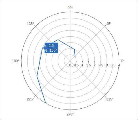
Polar Chart
Polar Chart is a common variation of circular graphs. It is useful when relationships between data points can be visualized most easily in terms of radiuses and angles.
In Polar Charts, a series is represented by a closed curve that connect points in the polar coordinate system. Each data point is determined by the distance from the pole (the radial coordinate) and the angle from the fixed direction (the angular coordinate).
A polar chart represents data along radial and angular axes. The radial and angular coordinates are given with the r and theta arguments for go.Scatterpolar() function. The theta data can be categorical, but, numerical data are possible too and is the most commonly used.
Following code produces a basic polar chart. In addition to r and theta arguments, we set mode to lines (it can be set to markers well in which case only the data points will be displayed).
import numpy as np
r1 = [0,6,12,18,24,30,36,42,48,54,60]
t1 = [1,0.995,0.978,0.951,0.914,0.866,0.809,0.743,0.669,0.588,0.5]
trace = go.Scatterpolar(
   r = [0.5,1,2,2.5,3,4],
   theta = [35,70,120,155,205,240],
   mode = 'lines',
)
data = [trace]
fig = go.Figure(data = data)
iplot(fig)
The output is given below −
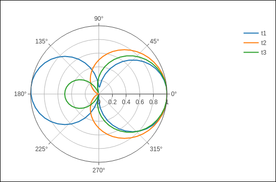
In the following example data from a comma-separated values (CSV) file is used to generate polar chart. First few rows of polar.csv are as follows −
y,x1,x2,x3,x4,x5,
0,1,1,1,1,1,
6,0.995,0.997,0.996,0.998,0.997,
12,0.978,0.989,0.984,0.993,0.986,
18,0.951,0.976,0.963,0.985,0.969,
24,0.914,0.957,0.935,0.974,0.946,
30,0.866,0.933,0.9,0.96,0.916,
36,0.809,0.905,0.857,0.943,0.88,
42,0.743,0.872,0.807,0.923,0.838,
48,0.669,0.835,0.752,0.901,0.792,
54,0.588,0.794,0.691,0.876,0.74,
60,0.5,0.75,0.625,0.85,0.685,
Enter the following script in notebooks input cell to generate polar chart as below −
import pandas as pd
df = pd.read_csv("polar.csv")
t1 = go.Scatterpolar(
   r = df['x1'], theta = df['y'], mode = 'lines', name = 't1'
)
t2 = go.Scatterpolar(
   r = df['x2'], theta = df['y'], mode = 'lines', name = 't2'
)
t3 = go.Scatterpolar(
   r = df['x3'], theta = df['y'], mode = 'lines', name = 't3'
)
data = [t1,t2,t3]
fig = go.Figure(data = data)
iplot(fig)
Given below is the output of the above mentioned code −
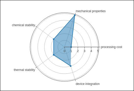
Radar chart
A Radar Chart (also known as a spider plot or star plot) displays multivariate data in the form of a two-dimensional chart of quantitative variables represented on axes originating from the center. The relative position and angle of the axes is typically uninformative.
For a Radar Chart, use a polar chart with categorical angular variables in go.Scatterpolar() function in the general case.
Following code renders a basic radar chart with Scatterpolar() function −
radar = go.Scatterpolar(
   r = [1, 5, 2, 2, 3],
   theta = [
      'processing cost',
      'mechanical properties',
      'chemical stability',
      'thermal stability',
      'device integration'
   ],
   fill = 'toself'
)
data = [radar]
fig = go.Figure(data = data)
iplot(fig)
The below mentioned output is a result of the above given code −