- Plotly - Home
- Plotly - Introduction
- Plotly - Environment Setup
- Plotly - Online & Offline Plotting
- Plotting Inline with Jupyter Notebook
- Plotly - Package Structure
- Plotly - Exporting to Static Images
- Plotly - Legends
- Plotly - Format Axis & Ticks
- Plotly - Subplots & Inset Plots
- Plotly - Bar Chart & Pie Chart
- Plotly - Scatter Plot, Scattergl Plot & Bubble Charts
- Plotly - Dot Plots & Table
- Plotly - Histogram
- Plotly - Box Plot Violin Plot & Contour Plot
- Plotly - Distplots, Density Plot & Error Bar Plot
- Plotly - Heatmap
- Plotly - Polar Chart & Radar Chart
- Plotly - OHLC Chart Waterfall Chart & Funnel Chart
- Plotly - 3D Scatter & Surface Plot
- Plotly - Adding Buttons/Dropdown
- Plotly - Slider Control
- Plotly - FigureWidget Class
- Plotly with Pandas and Cufflinks
- Plotly with Matplotlib and Chart Studio
- Plotly Useful Resources
- Plotly - Quick Guide
- Plotly - Cheatsheet
- Plotly - Useful Resources
- Plotly - Discussion
Plotly - Distplots Density Plot and Error Bar Plot
In this chapter, we will understand about distplots, density plot and error bar plot in detail. Let us begin by learning about distplots.
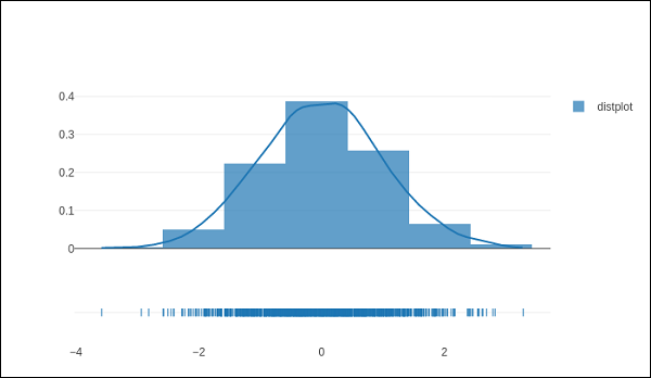
Distplots
The distplot figure factory displays a combination of statistical representations of numerical data, such as histogram, kernel density estimation or normal curve, and rug plot.
The distplot can be composed of all or any combination of the following 3 components −
- histogram
- curve: (a) kernel density estimation or (b) normal curve, and
- rug plot
The figure_factory module has create_distplot() function which needs a mandatory parameter called hist_data.
Following code creates a basic distplot consisting of a histogram, a kde plot and a rug plot.
x = np.random.randn(1000)
hist_data = [x]
group_labels = ['distplot']
fig = ff.create_distplot(hist_data, group_labels)
iplot(fig)
The output of the code mentioned above is as follows −
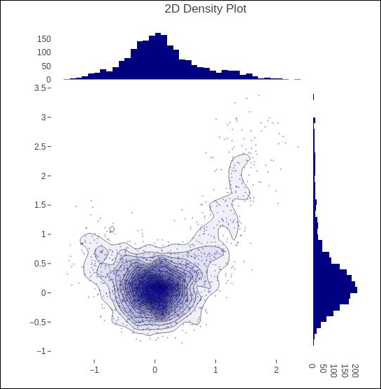
Density Plot
A density plot is a smoothed, continuous version of a histogram estimated from the data. The most common form of estimation is known as kernel density estimation (KDE). In this method, a continuous curve (the kernel) is drawn at every individual data point and all of these curves are then added together to make a single smooth density estimation.
The create_2d_density() function in module plotly.figure_factory._2d_density returns a figure object for a 2D density plot.
Following code is used to produce 2D Density plot over histogram data.
t = np.linspace(-1, 1.2, 2000)
x = (t**3) + (0.3 * np.random.randn(2000))
y = (t**6) + (0.3 * np.random.randn(2000))
fig = ff.create_2d_density( x, y)
iplot(fig)
Below mentioned is the output of the above given code.
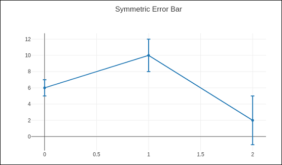
Error Bar Plot
Error bars are graphical representations of the error or uncertainty in data, and they assist correct interpretation. For scientific purposes, reporting of errors is crucial in understanding the given data.
Error bars are useful to problem solvers because error bars show the confidence or precision in a set of measurements or calculated values.
Mostly error bars represent range and standard deviation of a dataset. They can help visualize how the data is spread around the mean value. Error bars can be generated on variety of plots such as bar plot, line plot, scatter plot etc.
The go.Scatter() function has error_x and error_y properties that control how error bars are generated.
visible (boolean) − Determines whether or not this set of error bars is visible.
Type property has possible values "percent" | "constant" | "sqrt" | "data. It sets the rule used to generate the error bars. If "percent", the bar lengths correspond to a percentage of underlying data. Set this percentage in `value`. If "sqrt", the bar lengths correspond to the square of the underlying data. If "data", the bar lengths are set with data set `array`.
symmetric property can be true or false. Accordingly, the error bars will have the same length in both direction or not (top/bottom for vertical bars, left/right for horizontal bars.
array − sets the data corresponding the length of each error bar. Values are plotted relative to the underlying data.
arrayminus − Sets the data corresponding the length of each error bar in the bottom (left) direction for vertical (horizontal) bars Values are plotted relative to the underlying data.
Following code displays symmetric error bars on a scatter plot −
trace = go.Scatter(
   x = [0, 1, 2], y = [6, 10, 2],
   error_y = dict(
   type = 'data', # value of error bar given in data coordinates
   array = [1, 2, 3], visible = True)
)
data = [trace]
layout = go.Layout(title = 'Symmetric Error Bar')
fig = go.Figure(data = data, layout = layout)
iplot(fig)
Given below is the output of the above stated code.
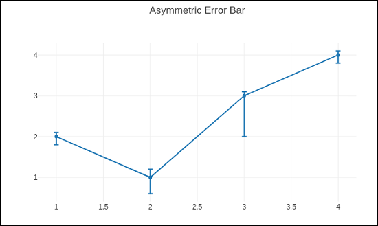
Asymmetric error plot is rendered by following script −
trace = go.Scatter(
   x = [1, 2, 3, 4],
   y =[ 2, 1, 3, 4],
   error_y = dict(
      type = 'data',
      symmetric = False,
      array = [0.1, 0.2, 0.1, 0.1],
      arrayminus = [0.2, 0.4, 1, 0.2]
   )
)
data = [trace]
layout = go.Layout(title = 'Asymmetric Error Bar')
fig = go.Figure(data = data, layout = layout)
iplot(fig)
The output of the same is as given below −