- KNIME - Home
- KNIME - Introduction
- KNIME - Installation
- KNIME - First Run
- KNIME - Workbench
- KNIME - Running Your First Workflow
- KNIME - Exploring Workflow
- KNIME - Building Your Own Model
- KNIME - Testing the Model
- KNIME - Summary and Future Work
- KNIME Useful Resources
- KNIME - Quick Guide
- KNIME - Useful Resources
- KNIME - Discussion
KNIME - Quick Guide
KNIME - Introduction
Developing Machine Learning models is always considered very challenging due to its cryptic nature. Generally, to develop machine learning applications, you must be a good developer with an expertise in command-driven development. The introduction of KNIME has brought the development of Machine Learning models in the purview of a common man.
KNIME provides a graphical interface (a user friendly GUI) for the entire development. In KNIME, you simply have to define the workflow between the various predefined nodes provided in its repository. KNIME provides several predefined components called nodes for various tasks such as reading data, applying various ML algorithms, and visualizing data in various formats. Thus, for working with KNIME, no programming knowledge is required. Isnt this exciting?
The upcoming chapters of this tutorial will teach you how to master the data analytics using several well-tested ML algorithms.
KNIME - Installation
KNIME Analytics Platform is available for Windows, Linux and MacOS. In this chapter, let us look into the steps for installing the platform on the Mac. If you use Windows or Linux, just follow the installation instructions given on the KNIME download page. The binary installation for all three platforms is available at KNIMEs page.
Mac Installation
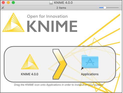
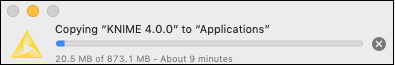
Download the binary installation from the KNIME official site. Double click on the downloaded dmg file to start the installation. When the installation completes, just drag the KNIME icon to the Applications folder as seen here −
KNIME - First Run
Double-click the KNIME icon to start the KNIME Analytics Platform. Initially, you will be asked to setup a workspace folder for saving your work. Your screen will look like the following −
You may set the selected folder as default and the next time you launch KNIME, it will not
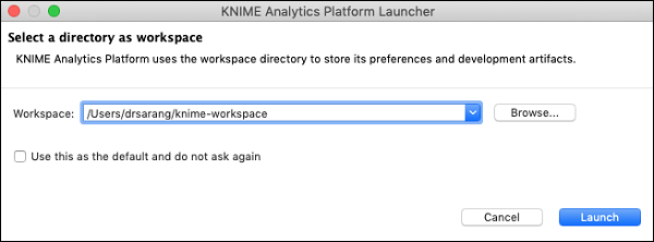
show up this dialog again.
After a while, the KNIME platform will start on your desktop. This is the workbench where you would carry your analytics work. Let us now look at the various portions of the workbench.
KNIME - Workbench
When KNIME starts, you will see the following screen −
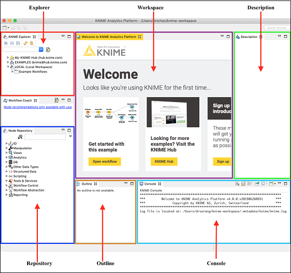
As has been marked in the screenshot, the workbench consists of several views. The views which are of immediate use to us are marked in the screenshot and listed below −
Workspace
Outline
Nodes Repository
KNIME Explorer
Console
Description
As we move ahead in this chapter, let us learn these views each in detail.
Workspace View
The most important view for us is the Workspace view. This is where you would create your machine learning model. The workspace view is highlighted in the screenshot below −
The screenshot shows an opened workspace. You will soon learn how to open an existing workspace.
Each workspace contains one or more nodes. You will learn the significance of these nodes later in the tutorial. The nodes are connected using arrows. Generally, the program flow is defined from left to right, though this is not required. You may freely move each node anywhere in the workspace. The connecting lines between the two would move appropriately to maintain the connection between the nodes. You may add/remove connections between nodes at any time. For each node a small description may be optionally added.
Outline View
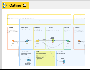
The workspace view may not be able to show you the entire workflow at a time. That is the reason, the outline view is provided.
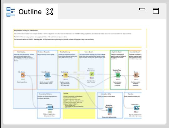
The outline view shows a miniature view of the entire workspace. There is a zoom window inside this view that you can slide to see the different portions of the workflow in the Workspace view.
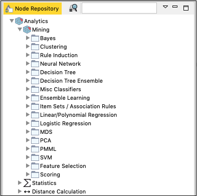
Node Repository
This is the next important view in the workbench. The Node repository lists the various nodes available for your analytics. The entire repository is nicely categorized based on the node functions. You will find categories such as −
IO
Views
Analytics
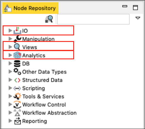
Under each category you would find several options. Just expand each category view to see what you have there. Under the IO category, you will find nodes to read your data in various file formats, such as ARFF, CSV, PMML, XLS, etc.
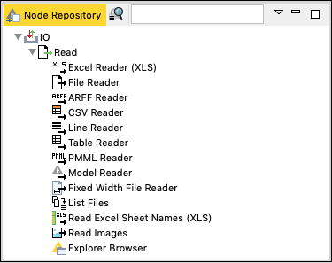
Depending on your input source data format, you will select the appropriate node for reading your dataset.
By this time, probably you have understood the purpose of a node. A node defines a certain kind of functionality that you can visually include in your workflow.
The Analytics node defines the various machine learning algorithms, such as Bayes, Clustering, Decision Tree, Ensemble Learning, and so on.
The implementation of these various ML algorithms is provided in these nodes. To apply any algorithm in your analytics, simply pick up the desired node from the repository and add it to your workspace. Connect the output of the Data reader node to the input of this ML node and your workflow is created.
We suggest you to explore the various nodes available in the repository.
KNIME Explorer
The next important view in the workbench is the Explorer view as shown in the screenshot below −
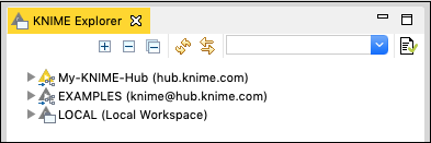
The first two categories list the workspaces defined on the KNIME server. The third option LOCAL is used for storing all the workspaces that you create on your local machine. Try expanding these tabs to see the various predefined workspaces. Especially, expand EXAMPLES tab.
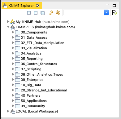
KNIME provides several examples to get you started with the platform. In the next chapter, you will be using one of these examples to get yourself acquainted with the platform.
Console View
As the name indicates, the Console view provides a view of the various console messages while executing your workflow.
The Console view is useful in diagnosing the workflow and examining the analytics results.
Description View
The last important view that is of immediate relevance to us is the Description view. This view provides a description of a selected item in the workspace. A typical view is shown in the screenshot below −
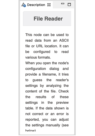
The above view shows the description of a File Reader node. When you select the File Reader node in your workspace, you will see its description in this view. Clicking on any other node shows the description of the selected node. Thus, this view becomes very useful in the initial stages of learning when you do not precisely know the purpose of the various nodes in the workspace and/or the nodes repository.
Toolbar
Besides the above described views, the workbench has other views such as toolbar. The toolbar contains various icons that facilitate a quick action. The icons are enabled/disabled depending on the context. You can see the action that each icon performs by hovering mouse on it. The following screen shows the action taken by Configure icon.

Enabling/Disabling Views
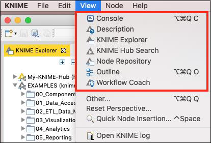
The various views that you have seen so far can be turned on/off easily. Clicking the Close icon in the view will close the view. To reinstate the view, go to the View menu option and select the desired view. The selected view will be added to the workbench.
Now, as you have been acquainted with the workbench, I will show you how to run a workflow and study the analytics performed by it.
KNIME - Running Your First Workflow
KNIME has provided several good workflows for ease of learning. In this chapter, we shall pick up one of the workflows provided in the installation to explain the various features and the power of analytics platform. We will use a simple classifier based on a Decision Tree for our study.
Loading Decision Tree Classifier
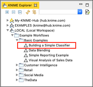
In the KNIME Explorer locate the following workflow −
LOCAL / Example Workflows / Basic Examples / Building a Simple Classifier
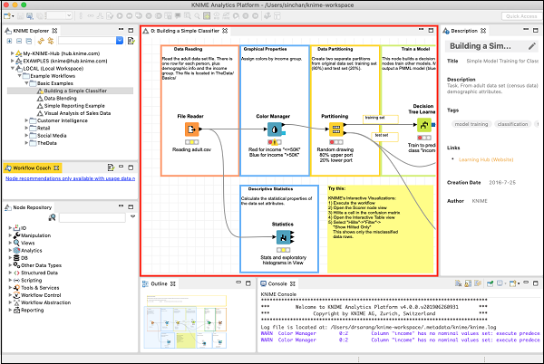
This is also shown in the screenshot below for your quick reference −
Double click on the selected item to open the workflow. Observe the Workspace view. You will see the workflow containing several nodes. The purpose of this workflow is to predict the income group from the democratic attributes of the adult data set taken from UCI Machine Learning Repository. The task of this ML model is to classify the people in a specific region as having income greater or lesser than 50K.
The Workspace view along with its outline is shown in the screenshot below −
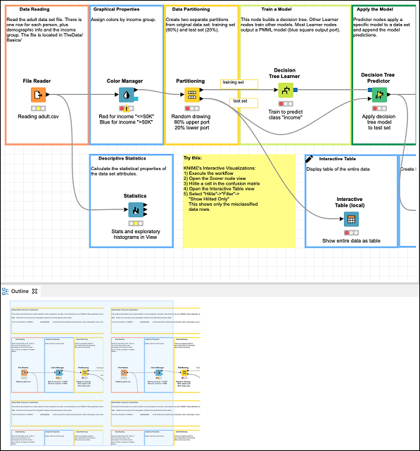
Notice the presence of several nodes picked up from the Nodes repository and connected in a workflow by arrows. The connection indicates that the output of one node is fed to the input of the next node. Before we learn the functionality of each of the nodes in the workflow, let us first execute the entire workflow.
Executing Workflow
Before we look into the execution of the workflow, it is important to understand the status report of each node. Examine any node in the workflow. At the bottom of each node you would find a status indicator containing three circles. The Decision Tree Learner node is shown in the screenshot below −
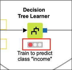
The status indicator is red indicating that this node has not been executed so far. During the execution, the center circle which is yellow in color would light up. On successful execution, the last circle turns green. There are more indicators to give you the status information in case of errors. You will learn them when an error occurs in the processing.
Note that currently the indicators on all nodes are red indicating that no node is executed so far. To run all nodes, click on the following menu item −
Node → Execute All
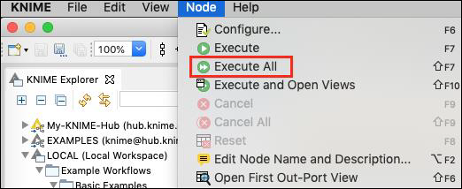
After a while, you will find that each node status indicator has now turned green indicating that there are no errors.
In the next chapter, we will explore the functionality of the various nodes in the workflow.
KNIME - Exploring Workflow
If you check out the nodes in the workflow, you can see that it contains the following −
File Reader,
Color Manager
Partitioning
Decision Tree Learner
Decision Tree Predictor
Score
Interactive Table
Scatter Plot
Statistics
These are easily seen in the Outline view as shown here −
Each node provides a specific functionality in the workflow. We will now look into how to configure these nodes to meet up the desired functionality. Please note that we will discuss only those nodes that are relevant to us in the current context of exploring the workflow.
File Reader
The File Reader node is depicted in the screenshot below −
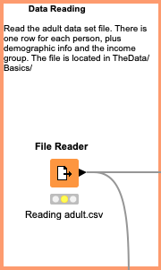
There is some description at the top of the window that is provided by the creator of the workflow. It tells that this node reads the adult data set. The name of the file is adult.csv as seen from the description underneath the node symbol. The File Reader has two outputs - one goes to Color Manager node and the other one goes to Statistics node.
If you right click the File Manager, a popup menu would show up as follows −
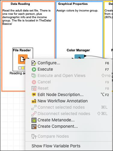
The Configure menu option allows for the node configuration. The Execute menu runs the node. Note that if the node has already been run and if it is in a green state, this menu is disabled. Also, note the presence of Edit Note Description menu option. This allows you to write the description for your node.
Now, select the Configure menu option, it shows the screen containing the data from the adult.csv file as seen in the screenshot here −
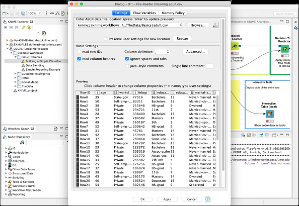
When you execute this node, the data will be loaded in the memory. The entire data loading program code is hidden from the user. You can now appreciate the usefulness of such nodes - no coding required.
Our next node is the Color Manager.
Color Manager
Select the Color Manager node and go into its configuration by right clicking on it. A colors settings dialog would appear. Select the income column from the dropdown list.
Your screen would look like the following −

Notice the presence of two constraints. If the income is less than 50K, the datapoint will acquire green color and if it is more it gets red color. You will see the data point mappings when we look at the scatter plot later in this chapter.
Partitioning
In machine learning, we usually split the entire available data in two parts. The larger part is used in training the model, while the smaller portion is used for testing. There are different strategies used for partitioning the data.
To define the desired partitioning, right click on the Partitioning node and select the Configure option. You would see the following screen −
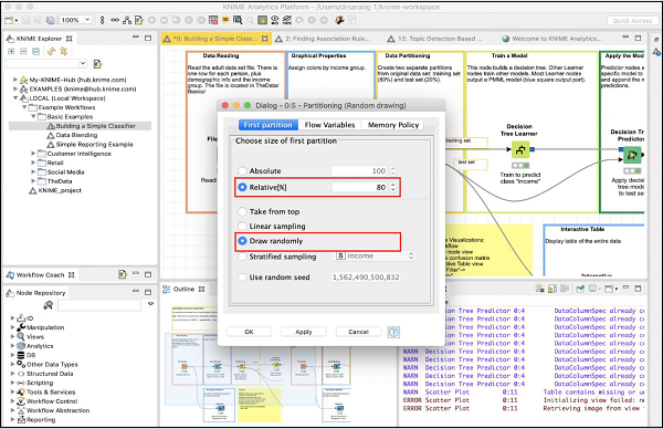
In the case, the system modeller has used the Relative (%) mode and the data is split in 80:20 ratio. While doing the split, the data points are picked up randomly. This ensures that your test data may not be biased. In case of Linear sampling, the remaining 20% data used for testing may not correctly represent the training data as it may be totally biased during its collection.
If you are sure that during data collection, the randomness is guaranteed, then you may select the linear sampling. Once your data is ready for training the model, feed it to the next node, which is the Decision Tree Learner.
Decision Tree Learner
The Decision Tree Learner node as the name suggests uses the training data and builds a model. Check out the configuration setting of this node, which is depicted in the screenshot below −
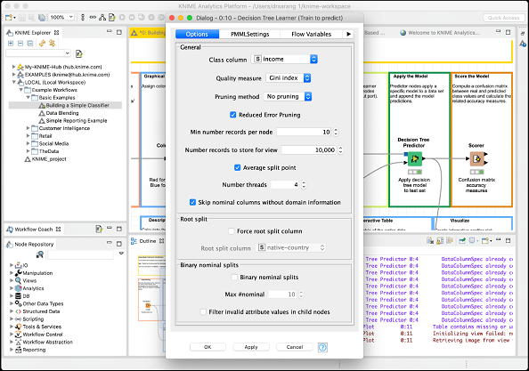
As you see the Class is income. Thus the tree would be built based on the income column and that is what we are trying to achieve in this model. We want a separation of people having income greater or lesser than 50K.
After this node runs successfully, your model would be ready for testing.
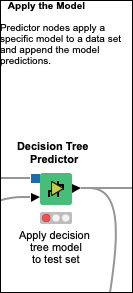
Decision Tree Predictor
The Decision Tree Predictor node applies the developed model to the test data set and appends the model predictions.
The output of the predictor is fed to two different nodes - Scorer and Scatter Plot. Next, we will examine the output of prediction.
Scorer
This node generates the confusion matrix. To view it, right click on the node. You will see the following popup menu −
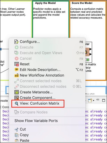
Click the View: Confusion Matrix menu option and the matrix will pop up in a separate window as shown in the screenshot here −
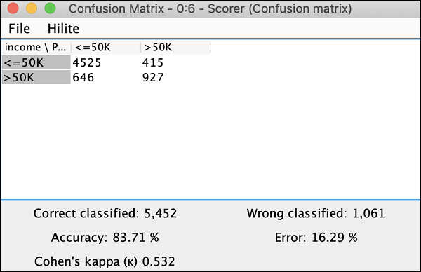
It indicates that the accuracy of our developed model is 83.71%. If you are not satisfied with this, you may play around with other parameters in model building, especially, you may like to revisit and cleanse your data.
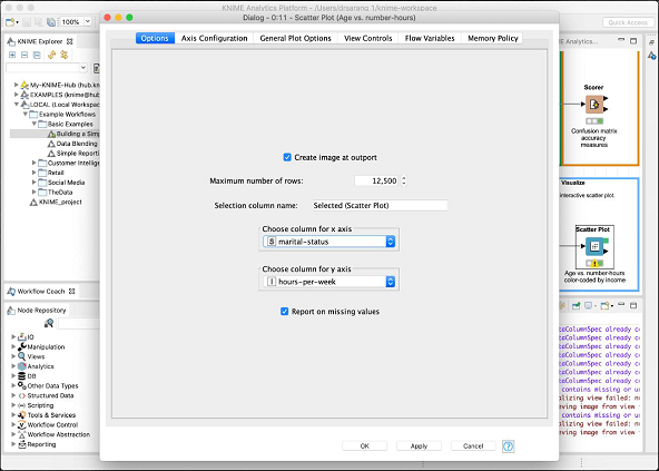
Scatter Plot
To see the scatter plot of the data distribution, right click on the Scatter Plot node and select the menu option Interactive View: Scatter Plot. You will see the following plot −
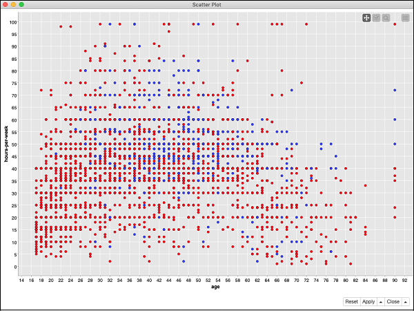
The plot gives the distribution of different income group people based on the threshold of 50K in two different colored dots - red and blue. These were the colors set in our Color Manager node. The distribution is relative to the age as plotted on the x-axis. You may select a different feature for x-axis by changing the configuration of the node.
The configuration dialog is shown here where we have selected the marital-status as a feature for x-axis.
This completes our discussion on the predefined model provided by KNIME. We suggest you to take up the other two nodes (Statistics and Interactive Table) in the model for your self-study.
Let us now move on to the most important part of the tutorial creating your own model.
KNIME - Building Your Own Model
In this chapter, you will build your own machine learning model to categorize the plants based on a few observed features. We will use the well-known iris dataset from UCI Machine Learning Repository for this purpose. The dataset contains three different classes of plants. We will train our model to classify an unknown plant into one of these three classes.
We will start with creating a new workflow in KNIME for creating our machine learning models.
Creating Workflow
To create a new workflow, select the following menu option in the KNIME workbench.
File → New
You will see the following screen −
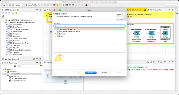
Select the New KNIME Workflow option and click on the Next button. On the next screen, you will be asked for the desired name for the workflow and the destination folder for saving it. Enter this information as desired and click Finish to create a new workspace.
A new workspace with the given name would be added to the Workspace view as seen here −
You will now add the various nodes in this workspace to create your model. Before, you add nodes, you have to download and prepare the iris dataset for our use.
Preparing Dataset
Download the iris dataset from the UCI Machine Learning Repository site Download Iris Dataset. The downloaded iris.data file is in CSV format. We will make some changes in it to add the column names.
Open the downloaded file in your favorite text editor and add the following line at the beginning.
sepal length, petal length, sepal width, petal width, class
When our File Reader node reads this file, it will automatically take the above fields as column names.
Now, you will start adding various nodes.
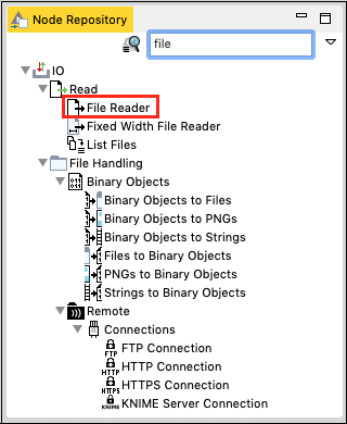
Adding File Reader
Go to the Node Repository view, type file in the search box to locate the File Reader node. This is seen in the screenshot below −
Select and double click the File Reader to add the node into the workspace. Alternatively, you may use drag-n-drop feature to add the node into the workspace. After the node is added, you will have to configure it. Right click on the node and select the Configure menu option. You have done this in the earlier lesson.
The settings screen looks like the following after the datafile is loaded.
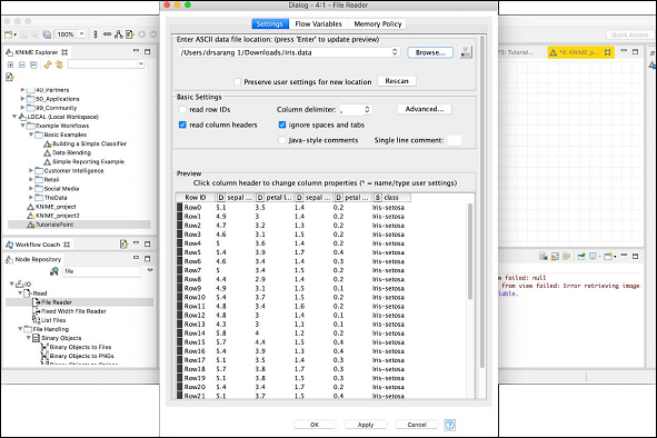
To load your dataset, click on the Browse button and select the location of your iris.data file. The node will load the contents of the file which are displayed in the lower portion of the configuration box. Once you are satisfied that the datafile is located properly and loaded, click on the OK button to close the configuration dialog.
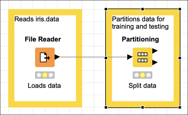
You will now add some annotation to this node. Right click on the node and select New Workflow Annotation menu option. An annotation box would appear on the screen as shown in the screenshot here:
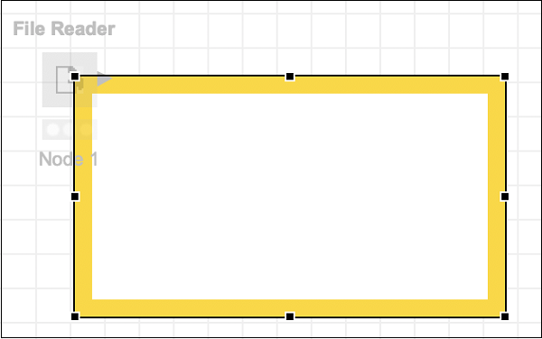
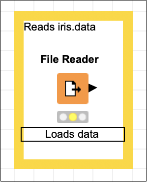
Click inside the box and add the following annotation −
Reads iris.data
Click anywhere outside the box to exit the edit mode. Resize and place the box around the node as desired. Finally, double click on the Node 1 text underneath the node to change this string to the following −
Loads data
At this point, your screen would look like the following −
We will now add a new node for partitioning our loaded dataset into training and testing.
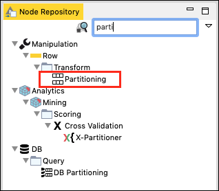
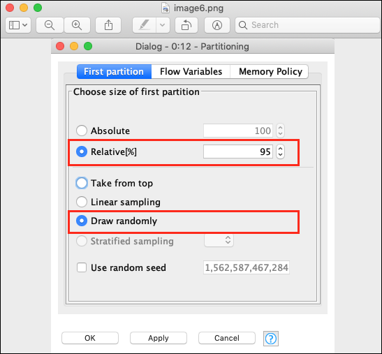
Adding Partitioning Node
In the Node Repository search window, type a few characters to locate the Partitioning node, as seen in the screenshot below −
Add the node to our workspace. Set its configuration as follows −
Relative (%) : 95
Draw Randomly
The following screenshot shows the configuration parameters.
Next, make the connection between the two nodes. To do so, click on the output of the File Reader node, keep the mouse button clicked, a rubber band line would appear, drag it to the input of Partitioning node, release the mouse button. A connection is now established between the two nodes.
Add the annotation, change the description, position the node and annotation view as desired. Your screen should look like the following at this stage −
Next, we will add the k-Means node.
Adding k-Means Node
Select the k-Means node from the repository and add it to the workspace. If you want to refresh your knowledge on k-Means algorithm, just look up its description in the description view of the workbench. This is shown in the screenshot below −
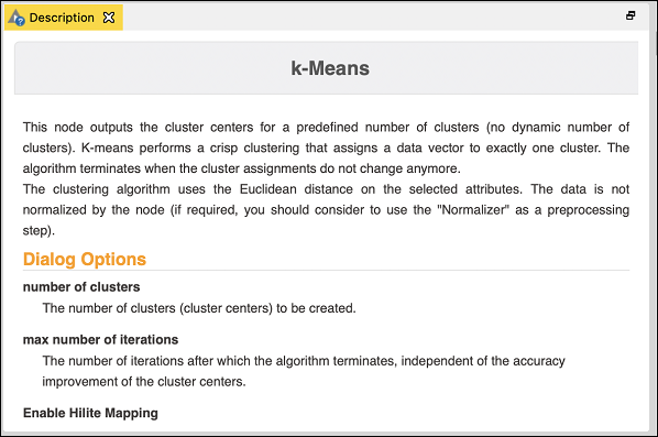
Incidentally, you may look up the description of different algorithms in the description window before taking a final decision on which one to use.
Open the configuration dialog for the node. We will use the defaults for all fields as shown here −
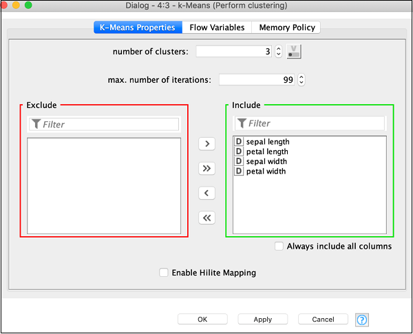
Click OK to accept the defaults and to close the dialog.
Set the annotation and description to the following −
Annotation: Classify clusters
Description:Perform clustering
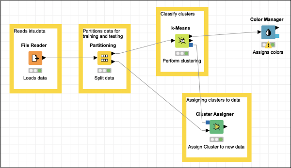
Connect the top output of the Partitioning node to the input of k-Means node. Reposition your items and your screen should look like the following −
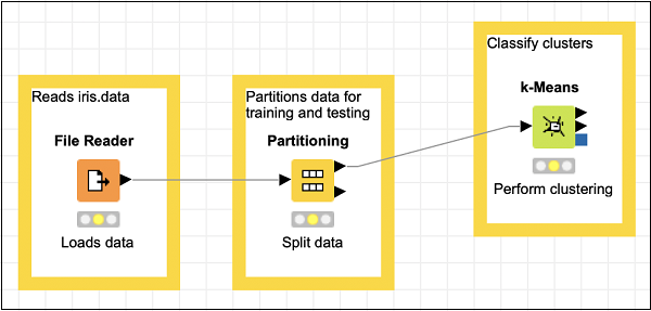
Next, we will add a Cluster Assigner node.
Adding Cluster Assigner
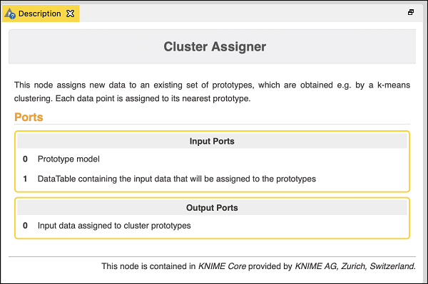
The Cluster Assigner assigns new data to an existing set of prototypes. It takes two inputs - the prototype model and the datatable containing the input data. Look up the nodes description in the description window which is depicted in the screenshot below −
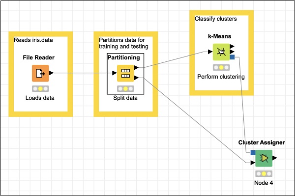
Thus, for this node you have to make two connections −
The PMML Cluster Model output of Partitioning node → Prototypes Input of Cluster Assigner
Second partition output of Partitioning node → Input data of Cluster Assigner
These two connections are shown in the screenshot below −
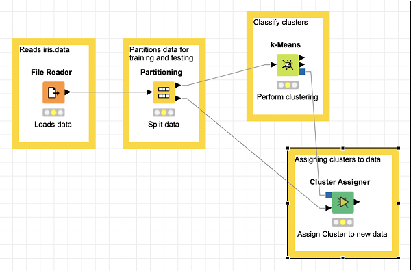
The Cluster Assigner does not need any special configuration. Just accept the defaults.
Now, add some annotation and description to this node. Rearrange your nodes. Your screen should look like the following −
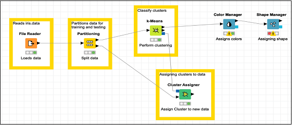
At this point, our clustering is completed. We need to visualize the output graphically. For this, we will add a scatter plot. We will set the colors and shapes for three classes differently in the scatter plot. Thus, we will filter the output of the k-Means node first through the Color Manager node and then through Shape Manager node.
Adding Color Manager
Locate the Color Manager node in the repository. Add it to the workspace. Leave the configuration to its defaults. Note that you must open the configuration dialog and hit OK to accept the defaults. Set the description text for the node.
Make a connection from the output of k-Means to the input of Color Manager. Your screen would look like the following at this stage −
Adding Shape Manager
Locate the Shape Manager in the repository and add it to the workspace. Leave its configuration to the defaults. Like the previous one, you must open the configuration dialog and hit OK to set defaults. Establish the connection from the output of Color Manager to the input of Shape Manager. Set the description for the node.
Your screen should look like the following −
Now, you will be adding the last node in our model and that is the scatter plot.
Adding Scatter Plot
Locate Scatter Plot node in the repository and add it to the workspace. Connect the output of Shape Manager to the input of Scatter Plot. Leave the configuration to defaults. Set the description.
Finally, add a group annotation to the recently added three nodes
Annotation: Visualization
Reposition the nodes as desired. Your screen should look like the following at this stage.
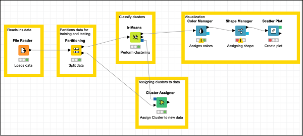
This completes the task of model building.
KNIME - Testing the Model
To test the model, execute the following menu options: Node → Execute All
If everything goes correct, the status signal at the bottom of each node would turn green. If not, you will need to look up the Console view for the errors, fix them up and re-run the workflow.
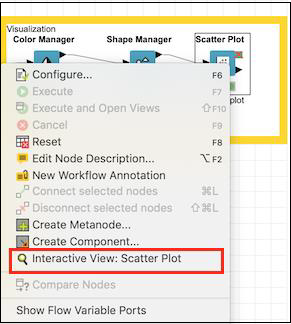
Now, you are ready to visualize the predicted output of the model. For this, right click the Scatter Plot node and select the following menu options: Interactive View: Scatter Plot
This is shown in the screenshot below −
You would see the scatter plot on the screen as shown here −
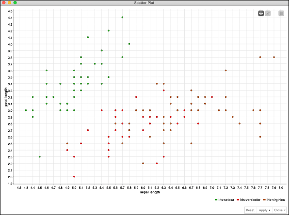
You can run through different visualizations by changing x- and y- axis. To do so, click on the settings menu at the top right corner of the scatter plot. A popup menu would appear as shown in the screenshot below −
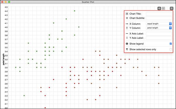
You can set the various parameters for the plot on this screen to visualize the data from several aspects.
This completes our task of model building.
KNIME - Summary and Future Work
KNIME provides a graphical tool for building Machine Learning models. In this tutorial, you learned how to download and install KNIME on your machine.
Summary
You learned the various views provided in the KNIME workbench. KNIME provides several predefined workflows for your learning. We used one such workflow to learn the capabilities of KNIME. KNIME provides several pre-programmed nodes for reading data in various formats, analyzing data using several ML algorithms, and finally visualizing data in many different ways. Towards the end of the tutorial, you created your own model starting from scratch. We used the well-known iris dataset to classify the plants using k-Means algorithm.
You are now ready to use these techniques for your own analytics.
Future Work
If you are a developer and would like to use the KNIME components in your programming applications, you will be glad to know that KNIME natively integrates with a wide range of programming languages such as Java, R, Python and many more.
