- KNIME - Home
- KNIME - Introduction
- KNIME - Installation
- KNIME - First Run
- KNIME - Workbench
- KNIME - Running Your First Workflow
- KNIME - Exploring Workflow
- KNIME - Building Your Own Model
- KNIME - Testing the Model
- KNIME - Summary and Future Work
- KNIME Useful Resources
- KNIME - Quick Guide
- KNIME - Useful Resources
- KNIME - Discussion
KNIME - Exploring Workflow
If you check out the nodes in the workflow, you can see that it contains the following −
File Reader,
Color Manager
Partitioning
Decision Tree Learner
Decision Tree Predictor
Score
Interactive Table
Scatter Plot
Statistics
These are easily seen in the Outline view as shown here −
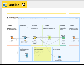
Each node provides a specific functionality in the workflow. We will now look into how to configure these nodes to meet up the desired functionality. Please note that we will discuss only those nodes that are relevant to us in the current context of exploring the workflow.
File Reader
The File Reader node is depicted in the screenshot below −
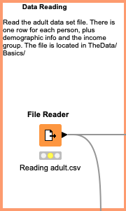
There is some description at the top of the window that is provided by the creator of the workflow. It tells that this node reads the adult data set. The name of the file is adult.csv as seen from the description underneath the node symbol. The File Reader has two outputs - one goes to Color Manager node and the other one goes to Statistics node.
If you right click the File Manager, a popup menu would show up as follows −
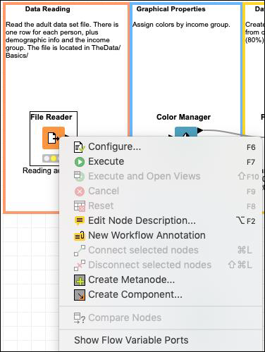
The Configure menu option allows for the node configuration. The Execute menu runs the node. Note that if the node has already been run and if it is in a green state, this menu is disabled. Also, note the presence of Edit Note Description menu option. This allows you to write the description for your node.
Now, select the Configure menu option, it shows the screen containing the data from the adult.csv file as seen in the screenshot here −
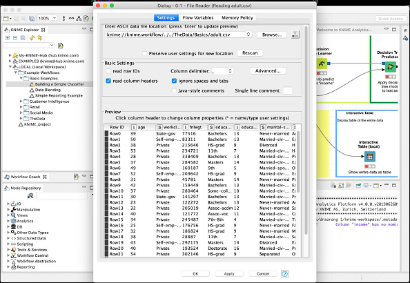
When you execute this node, the data will be loaded in the memory. The entire data loading program code is hidden from the user. You can now appreciate the usefulness of such nodes - no coding required.
Our next node is the Color Manager.
Color Manager
Select the Color Manager node and go into its configuration by right clicking on it. A colors settings dialog would appear. Select the income column from the dropdown list.
Your screen would look like the following −

Notice the presence of two constraints. If the income is less than 50K, the datapoint will acquire green color and if it is more it gets red color. You will see the data point mappings when we look at the scatter plot later in this chapter.
Partitioning
In machine learning, we usually split the entire available data in two parts. The larger part is used in training the model, while the smaller portion is used for testing. There are different strategies used for partitioning the data.
To define the desired partitioning, right click on the Partitioning node and select the Configure option. You would see the following screen −
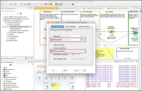
In the case, the system modeller has used the Relative (%) mode and the data is split in 80:20 ratio. While doing the split, the data points are picked up randomly. This ensures that your test data may not be biased. In case of Linear sampling, the remaining 20% data used for testing may not correctly represent the training data as it may be totally biased during its collection.
If you are sure that during data collection, the randomness is guaranteed, then you may select the linear sampling. Once your data is ready for training the model, feed it to the next node, which is the Decision Tree Learner.
Decision Tree Learner
The Decision Tree Learner node as the name suggests uses the training data and builds a model. Check out the configuration setting of this node, which is depicted in the screenshot below −
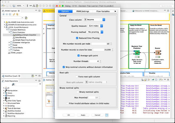
As you see the Class is income. Thus the tree would be built based on the income column and that is what we are trying to achieve in this model. We want a separation of people having income greater or lesser than 50K.
After this node runs successfully, your model would be ready for testing.
Decision Tree Predictor
The Decision Tree Predictor node applies the developed model to the test data set and appends the model predictions.
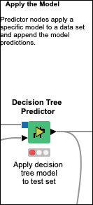
The output of the predictor is fed to two different nodes - Scorer and Scatter Plot. Next, we will examine the output of prediction.
Scorer
This node generates the confusion matrix. To view it, right click on the node. You will see the following popup menu −
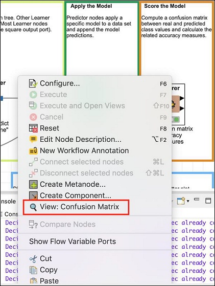
Click the View: Confusion Matrix menu option and the matrix will pop up in a separate window as shown in the screenshot here −
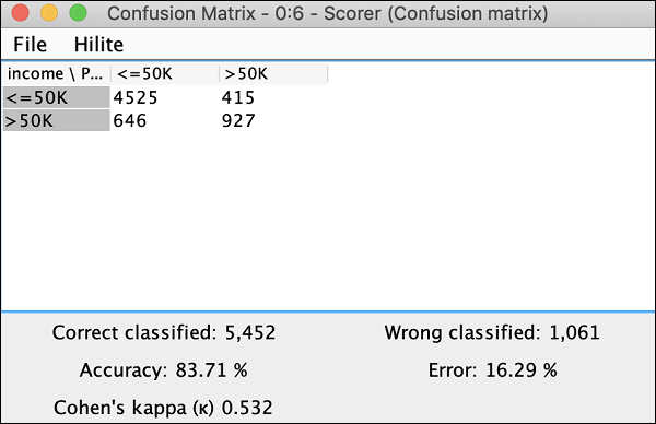
It indicates that the accuracy of our developed model is 83.71%. If you are not satisfied with this, you may play around with other parameters in model building, especially, you may like to revisit and cleanse your data.
Scatter Plot
To see the scatter plot of the data distribution, right click on the Scatter Plot node and select the menu option Interactive View: Scatter Plot. You will see the following plot −
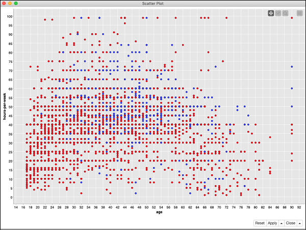
The plot gives the distribution of different income group people based on the threshold of 50K in two different colored dots - red and blue. These were the colors set in our Color Manager node. The distribution is relative to the age as plotted on the x-axis. You may select a different feature for x-axis by changing the configuration of the node.
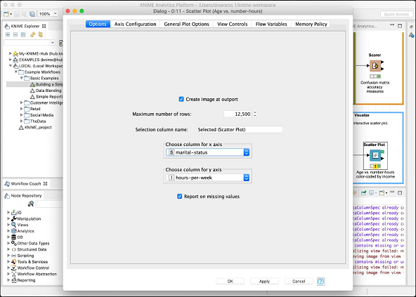
The configuration dialog is shown here where we have selected the marital-status as a feature for x-axis.
This completes our discussion on the predefined model provided by KNIME. We suggest you to take up the other two nodes (Statistics and Interactive Table) in the model for your self-study.
Let us now move on to the most important part of the tutorial creating your own model.
