- Plotly - Home
- Plotly - Introduction
- Plotly - Environment Setup
- Plotly - Online & Offline Plotting
- Plotting Inline with Jupyter Notebook
- Plotly - Package Structure
- Plotly - Exporting to Static Images
- Plotly - Legends
- Plotly - Format Axis & Ticks
- Plotly - Subplots & Inset Plots
- Plotly - Bar Chart & Pie Chart
- Plotly - Scatter Plot, Scattergl Plot & Bubble Charts
- Plotly - Dot Plots & Table
- Plotly - Histogram
- Plotly - Box Plot Violin Plot & Contour Plot
- Plotly - Distplots, Density Plot & Error Bar Plot
- Plotly - Heatmap
- Plotly - Polar Chart & Radar Chart
- Plotly - OHLC Chart Waterfall Chart & Funnel Chart
- Plotly - 3D Scatter & Surface Plot
- Plotly - Adding Buttons/Dropdown
- Plotly - Slider Control
- Plotly - FigureWidget Class
- Plotly with Pandas and Cufflinks
- Plotly with Matplotlib and Chart Studio
- Plotly Useful Resources
- Plotly - Quick Guide
- Plotly - Cheatsheet
- Plotly - Useful Resources
- Plotly - Discussion
Plotly - Environment Setup
This chapter focusses on how to do the environmental set up in Python with the help of Plotly.
Installation of Python package
It is always recommended to use Pythons virtual environment feature for installation of a new package. Following command creates a virtual environment in the specified folder.
python -m myenv
To activate the so created virtual environment run activate script in bin sub folder as shown below.
source bin/activate
Now we can install plotlys Python package as given below using pip utility.
pip install plotly
You may also want to install Jupyter notebook app which is a web based interface to Ipython interpreter.
pip install jupyter notebook
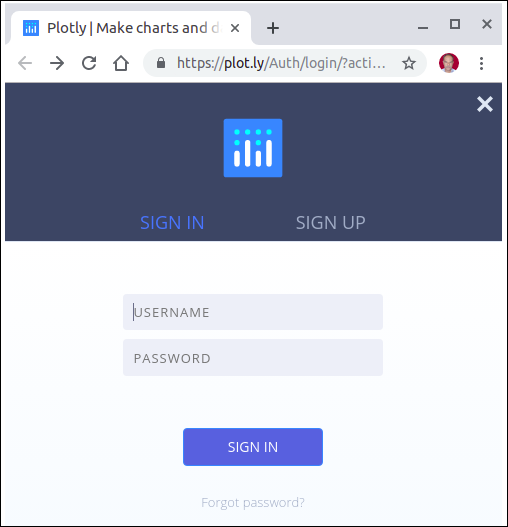
Firstly, you need to create an account on website which is available at https://plot.ly. You can sign up by using the link mentioned herewith https://plot.ly/api_signup and then log in successfully.
Next, obtain the API key from settings page of your dashboard.
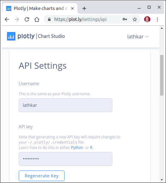
Use your username and API key to set up credentials on Python interpreter session.
import plotly
plotly.tools.set_credentials_file(username='test',
api_key='********************')
A special file named credentials is created in .plotly subfolder under your home directory. It looks similar to the following −
{
   "username": "test",
   "api_key": "********************",
   "proxy_username": "",
   "proxy_password": "",
   "stream_ids": []
}
In order to generate plots, we need to import the following module from plotly package −
import plotly.plotly as py
import plotly.graph_objs as go
plotly.plotly module contains the functions that will help us communicate with the Plotly servers. Functions in plotly.graph_objs module generates graph objects
