
Article Categories
- All Categories
-
 Data Structure
-
 Networking
-
 RDBMS
RDBMS
-
 Operating System
-
 Java
Java
-
 MS Excel
-
 iOS
iOS
-
 HTML
HTML
-
 CSS
CSS
-
 Android
-
 Python
-
 C Programming
-
 C++
C++
-
 C#
C#
-
 MongoDB
-
 MySQL
MySQL
-
 Javascript
-
 PHP
PHP
-
 Economics & Finance
Selected Reading
How to create barplot from data frame in R using rows as categories?
If we have small number of rows then we might want to create bar plot for rows instead of using columns as categories. This can be done by using barplot function but we need to convert the data frame to matrix and take the transpose of it. For example, if we have a data frame data_frame with 4 rows and 4 columns, then the barplot with rows as categories can be created as barplot(t(as.matrix(data_frame)),beside=TRUE)
Consider the below data frame −
Example
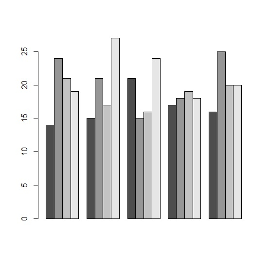
x1<-c(14,15,21,17,16)
x2<-c(24,21,15,18,25)
x3<-c(21,17,16,19,20)
x4<-c(19,27,24,18,20)
df<-data.frame(x1,x2,x3,x4)
df
Output
  x1 x2 x3 x4
1 14 24 21 19
2 15 21 17 27
3 21 15 16 24
4 17 18 19 18
5 16 25 20 20
Creating the barplot by treating rows as categories −
Example
barplot(t(as.matrix(df)),beside=TRUE)
Output
Let’s have a look at another example −
Example
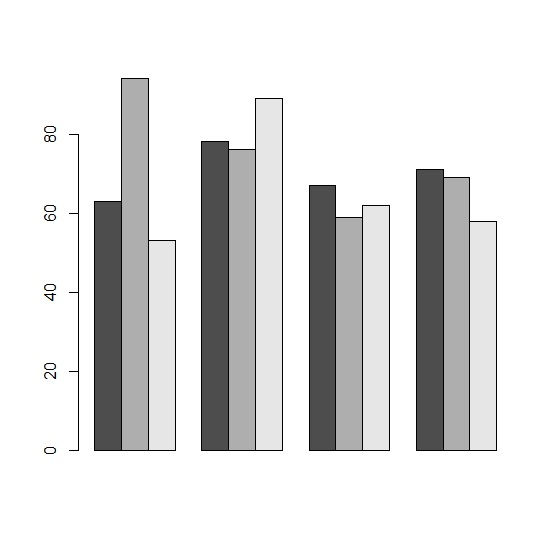
y1<-sample(51:99,4)
y2<-sample(51:99,4)
y3<-sample(51:99,4)
df_y<-data.frame(y1,y2,y3)
df_y
Output
  y1 y2 y3
1 80 67 72
2 66 56 60
3 70 69 80
4 73 87 61
Creating the barplot by treating rows as categories −
Example
barplot(t(as.matrix(df_y)),beside=TRUE)
Output

Updated on: 2026-03-11T22:50:52+05:30
7K+ Views

Advertisements