- Matplotlib - Home
- Matplotlib - Introduction
- Matplotlib - Vs Seaborn
- Matplotlib - Environment Setup
- Matplotlib - Anaconda distribution
- Matplotlib - Jupyter Notebook
- Matplotlib - Pyplot API
- Matplotlib - Simple Plot
- Matplotlib - Saving Figures
- Matplotlib - Markers
- Matplotlib - Figures
- Matplotlib - Styles
- Matplotlib - Legends
- Matplotlib - Colors
- Matplotlib - Colormaps
- Matplotlib - Colormap Normalization
- Matplotlib - Choosing Colormaps
- Matplotlib - Colorbars
- Matplotlib - Working With Text
- Matplotlib - Text properties
- Matplotlib - Subplot Titles
- Matplotlib - Images
- Matplotlib - Image Masking
- Matplotlib - Annotations
- Matplotlib - Arrows
- Matplotlib - Fonts
- Matplotlib - Font Indexing
- Matplotlib - Font Properties
- Matplotlib - Scales
- Matplotlib - LaTeX
- Matplotlib - LaTeX Text Formatting in Annotations
- Matplotlib - PostScript
- Matplotlib - Mathematical Expressions
- Matplotlib - Animations
- Matplotlib - Celluloid Library
- Matplotlib - Blitting
- Matplotlib - Toolkits
- Matplotlib - Artists
- Matplotlib - Styling with Cycler
- Matplotlib - Paths
- Matplotlib - Path Effects
- Matplotlib - Transforms
- Matplotlib - Ticks and Tick Labels
- Matplotlib - Radian Ticks
- Matplotlib - Dateticks
- Matplotlib - Tick Formatters
- Matplotlib - Tick Locators
- Matplotlib - Basic Units
- Matplotlib - Autoscaling
- Matplotlib - Reverse Axes
- Matplotlib - Logarithmic Axes
- Matplotlib - Symlog
- Matplotlib - Unit Handling
- Matplotlib - Ellipse with Units
- Matplotlib - Spines
- Matplotlib - Axis Ranges
- Matplotlib - Axis Scales
- Matplotlib - Axis Ticks
- Matplotlib - Formatting Axes
- Matplotlib - Axes Class
- Matplotlib - Twin Axes
- Matplotlib - Figure Class
- Matplotlib - Multiplots
- Matplotlib - Grids
- Matplotlib - Object-oriented Interface
- Matplotlib - PyLab module
- Matplotlib - Subplots() Function
- Matplotlib - Subplot2grid() Function
- Matplotlib - Anchored Artists
- Matplotlib - Manual Contour
- Matplotlib - Coords Report
- Matplotlib - AGG filter
- Matplotlib - Ribbon Box
- Matplotlib - Fill Spiral
- Matplotlib - Findobj Method
- Matplotlib - Hyperlinks
- Matplotlib - Image Thumbnail
- Matplotlib - Plotting with Keywords
- Matplotlib - Create Logo
- Matplotlib - Multipage PDF
- Matplotlib - Multiprocessing
- Matplotlib - Print Stdout
- Matplotlib - Compound Path
- Matplotlib - Sankey Class
- Matplotlib - MRI with EEG
- Matplotlib - Stylesheets
- Matplotlib - Background Colors
- Matplotlib - Basemap
Matplotlib Events
- Matplotlib - Event Handling
- Matplotlib - Close Event
- Matplotlib - Mouse Move
- Matplotlib - Click Events
- Matplotlib - Scroll Event
- Matplotlib - Keypress Event
- Matplotlib - Pick Event
- Matplotlib - Looking Glass
- Matplotlib - Path Editor
- Matplotlib - Poly Editor
- Matplotlib - Timers
- Matplotlib - Viewlims
- Matplotlib - Zoom Window
Matplotlib Widgets
- Matplotlib - Cursor Widget
- Matplotlib - Annotated Cursor
- Matplotlib - Button Widget
- Matplotlib - Check Buttons
- Matplotlib - Lasso Selector
- Matplotlib - Menu Widget
- Matplotlib - Mouse Cursor
- Matplotlib - Multicursor
- Matplotlib - Polygon Selector
- Matplotlib - Radio Buttons
- Matplotlib - RangeSlider
- Matplotlib - Rectangle Selector
- Matplotlib - Ellipse Selector
- Matplotlib - Slider Widget
- Matplotlib - Span Selector
- Matplotlib - Textbox
Matplotlib Plotting
- Matplotlib - Line Plots
- Matplotlib - Area Plots
- Matplotlib - Bar Graphs
- Matplotlib - Histogram
- Matplotlib - Pie Chart
- Matplotlib - Scatter Plot
- Matplotlib - Box Plot
- Matplotlib - Arrow Demo
- Matplotlib - Fancy Boxes
- Matplotlib - Zorder Demo
- Matplotlib - Hatch Demo
- Matplotlib - Mmh Donuts
- Matplotlib - Ellipse Demo
- Matplotlib - Bezier Curve
- Matplotlib - Bubble Plots
- Matplotlib - Stacked Plots
- Matplotlib - Table Charts
- Matplotlib - Polar Charts
- Matplotlib - Hexagonal bin Plots
- Matplotlib - Violin Plot
- Matplotlib - Event Plot
- Matplotlib - Heatmap
- Matplotlib - Stairs Plots
- Matplotlib - Errorbar
- Matplotlib - Hinton Diagram
- Matplotlib - Contour Plot
- Matplotlib - Wireframe Plots
- Matplotlib - Surface Plots
- Matplotlib - Triangulations
- Matplotlib - Stream plot
- Matplotlib - Ishikawa Diagram
- Matplotlib - 3D Plotting
- Matplotlib - 3D Lines
- Matplotlib - 3D Scatter Plots
- Matplotlib - 3D Contour Plot
- Matplotlib - 3D Bar Plots
- Matplotlib - 3D Wireframe Plot
- Matplotlib - 3D Surface Plot
- Matplotlib - 3D Vignettes
- Matplotlib - 3D Volumes
- Matplotlib - 3D Voxels
- Matplotlib - Time Plots and Signals
- Matplotlib - Filled Plots
- Matplotlib - Step Plots
- Matplotlib - XKCD Style
- Matplotlib - Quiver Plot
- Matplotlib - Stem Plots
- Matplotlib - Visualizing Vectors
- Matplotlib - Audio Visualization
- Matplotlib - Audio Processing
Matplotlib Useful Resources
- Matplotlib - Quick Guide
- Matplotlib - Cheatsheet
- Matplotlib - Useful Resources
- Matplotlib - Discussion
Matplotlib - Radio Button
Introduction
Matplotlib provides the RadioButtons widget in the matplotlib.widgets module for creating radio button groups in plots. Radio buttons are commonly used in graphical user interfaces to allow users to choose one option from a set of mutually exclusive options. In Matplotlib library RadioButtons offer a way to integrate this interactive element directly into a plot.
Now we will explore the key features, implementation detail and use cases of RadioButtons in Matplotlib library.
Key Features
The following are the key features of the Radiobuttons widget of the matplotlib library.
Mutually Exclusive Options − RadioButtons allow users to choose only one option from a set of mutually exclusive options. When one radio button is selected the others in the group are automatically deselected.
Integration with Callback Functions − The widget is often used in conjunction with callback functions. These functions are executed when a radio button is clicked by allowing developers to define custom actions based on the user's selection.
Customizable Appearance − RadioButtons provide customization options for appearance such as the label text, color and layout. This allows developers to align the appearance of radio buttons with the overall design of the plot.
Implementation of the Radiobuttons on a plot
Let's walk through a basic example to illustrate the implementation of RadioButtons in Matplotlib library. In this example we'll create a simple plot with two radio buttons and the plot will be updated based on the selected option.
The following is the explaination of the important functions and modules used in the below example.
plot_function − This is a simple function that generates random data around a sine wave. The line style of this function will be modified based on the selected radio button.
radio_callback − This function is called when a radio button is clicked. It sets the line style of the plotted function based on the selected option and redraws the plot.
RadioButtons(rax, ('solid', 'dashed', 'dashdot', 'dotted'), active=0) − This line creates the RadioButtons widget specifying the axes (rax), the labels for the line styles, and the initially selected line style (index 0).
radio_buttons.on_clicked(radio_callback) − This line connects the on_clicked event of the RadioButtons to the radio_callback function. The radio_callback function is called when a radio button is clicked.
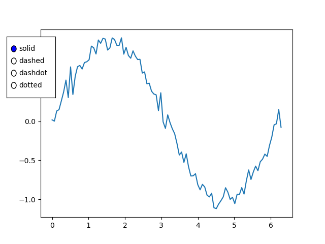
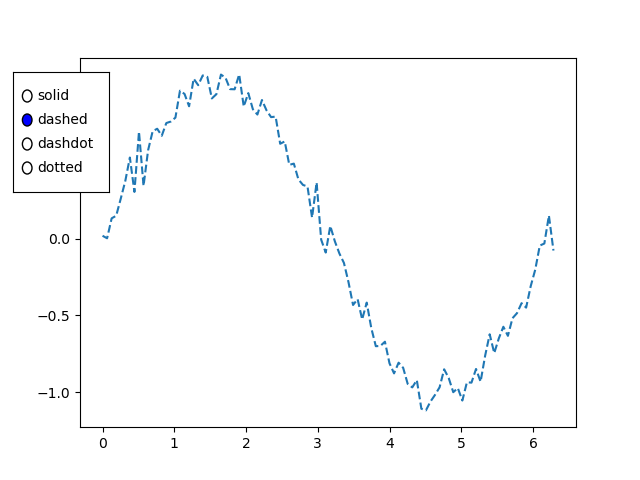
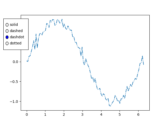
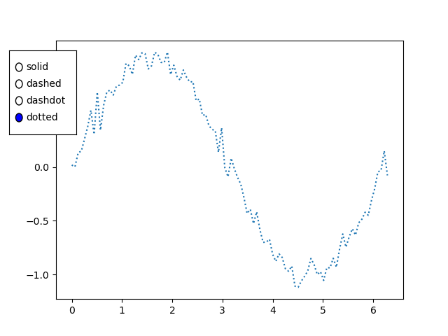
Example - Usage of Radio Buttons
import matplotlib.pyplot as plt
from matplotlib.widgets import RadioButtons
import numpy as np

# Function to be triggered by radio button selection
def radio_callback(label):
   ax.clear()  # Clear the axes for updating the plot
   ax.plot(x, plot_function(x, label), label=label, linestyle=label)
   ax.legend()
   plt.draw()  # Redraw the plot

# Function to generate random data around a sine wave
def plot_function(x, label):
   return np.sin(x) + np.random.normal(scale=0.1, size=x.shape)

# Create a figure and axes
fig, ax = plt.subplots()

# Generate x values
x = np.linspace(0, 2 * np.pi, 100)

# Create RadioButtons
radio_ax = plt.axes([0.05, 0.5, 0.15, 0.15])
radio_buttons = RadioButtons(radio_ax, ('solid', 'dashed', 'dashdot', 'dotted'), active=0)

# Connect the radio buttons to the callback function
radio_buttons.on_clicked(radio_callback)

# Initialize the plot with the initial line style
radio_callback('solid')

plt.show()
Output
When Solid radio button selected
When dashed radio button selected
When dashdot radio button selected
When dotted radio button selected
Use Cases
The below are the use cases of the radio buttons widget of the matplotli library.
Data Filtering − Radio buttons can be used to filter and display different subsets of data in a plot. Each option corresponds to a specific set of data and selecting an option updates the plot accordingly.
Parameter Selection − Radio buttons are useful for selecting different parameters or configurations in a visualization. For example we might use radio buttons to toggle between linear and logarithmic scales.
Interactive Control − Incorporating radio buttons adds interactive control to the plot by allowing users to dynamically change settings or switch between different views.
Scenario-based Visualization − In scenarios where the data can be presented in different ways such as different chart types or representations, radio buttons help users quickly switch between options.
Customization
Label and Color Customization:
We can customize the labels and colors of the radio buttons to match the design of our plot. This can be achieved by providing appropriate arguments when creating the RadioButtons widget.
Layout Customization:
Adjusting the layout of radio buttons as demonstrated in the example which allows us to control their position within the plot area.