
Article Categories
- All Categories
-
 Data Structure
-
 Networking
-
 RDBMS
RDBMS
-
 Operating System
-
 Java
Java
-
 MS Excel
-
 iOS
iOS
-
 HTML
HTML
-
 CSS
CSS
-
 Android
-
 Python
-
 C Programming
-
 C++
C++
-
 C#
C#
-
 MongoDB
-
 MySQL
MySQL
-
 Javascript
-
 PHP
PHP
-
 Economics & Finance
How to add group labels for bar charts in Matplotlib?
To make grouped labels for bar charts, we can take the following steps −
Create lists for labels, men_means and women_means with different data elements.
Return evenly spaced values within a given interval, using numpy.arrange() method.
Set the width variable, i.e., width=0.35.
Create fig and ax variables using subplots method, where default nrows and ncols are 1.
The bars are positioned at *x* with the given *align*\ment. Their dimensions are given by *height* and *width*. The vertical baseline is *bottom* (default 0), so create rect1 and rect2 using plt.bar() method.
Set the Y-Axis label using plt.ylabel() method.
Set a title for the axes using set_title() method.
Get or set the current tick locations and labels of the X-axis, using set_xticks() method.
Set X-axis tick labels of the grid, using set_xticklabels() method.
Place a legend on the figure, using legend() method.
Annotate created bars (rect1 and rect2) with some label using autolabel() method, that is userdefined method.
To show the figure, use the plt.show() method.
Example
import matplotlib.pyplot as plt
import numpy as np
plt.rcParams["figure.figsize"] = [7.00, 3.50]
plt.rcParams["figure.autolayout"] = True
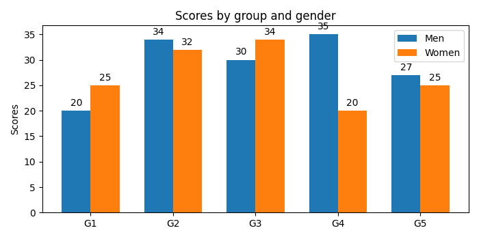
labels = ['G1', 'G2', 'G3', 'G4', 'G5']
men_means = [20, 34, 30, 35, 27]
women_means = [25, 32, 34, 20, 25]
x = np.arange(len(labels))
width = 0.35
fig, ax = plt.subplots()
rects1 = ax.bar(x - width / 2, men_means, width, label='Men')
rects2 = ax.bar(x + width / 2, women_means, width, label='Women')
ax.set_ylabel('Scores')
ax.set_title('Scores by group and gender')
ax.set_xticks(x)
ax.set_xticklabels(labels)
ax.legend()
def autolabel(rects):
for rect in rects:
height = rect.get_height()
ax.annotate('{}'.format(height),
xy=(rect.get_x() + rect.get_width() / 2, height),
xytext=(0, 3), # 3 points vertical offset
textcoords="offset points",
ha='center', va='bottom')
autolabel(rects1)
autolabel(rects2)
plt.show()
Output

1K+ Views
