
 Data Structure
 Networking
 RDBMS
RDBMS Operating System
 Java
Java MS Excel
 iOS
iOS HTML
HTML CSS
CSS Android
 Python
 C Programming
 C++
C++ C#
C# MongoDB
 MySQL
MySQL Javascript
 PHP
PHP
- Selected Reading
- UPSC IAS Exams Notes
- Developer's Best Practices
- Questions and Answers
- Effective Resume Writing
- HR Interview Questions
- Computer Glossary
- Who is Who
How Seaborn library used to display a kernel density estimation plot (joinplot) in Python?
Seaborn is a library that helps in visualizing data. It comes with customized themes and a high level interface.
Kernel Density Estimation, also known as KDE is a method in which the probability density function of a continuous random variable can be estimated. This method is used for the analysis of the non-parametric values. While using ‘jointplot’, if the argument ‘kind’ is set to ‘kde’, it plots the kernel density estimation plot.
Let us understand how the ‘jointplot’ function works to plot a kernel density estimation in python.
Example
import pandas as pd
import seaborn as sb
from matplotlib import pyplot as plt
my_df = sb.load_dataset('iris')
sb.jointplot(x = 'petal_length',y = 'petal_width',data = my_df,kind = 'kde')
plt.show()
Output
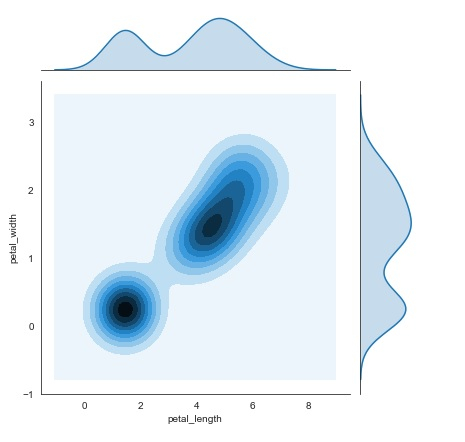
Explanation
The required packages are imported.
The input data is ‘iris_data’ which is loaded from the scikit learn library.
This data is stored in a dataframe.
The ‘load_dataset’ function is used to load the iris data.
This data is visualized using the ‘jointplot’ function.
Here, the ‘x’ and ‘y’ axis values are supplied as parameters.
Here, the ‘kind’ parameter is specified as ‘kde’ so that the plot understands to print kernel density estimation.
This kernel density estimation data is displayed on the console.

243 Views
