- Seaborn - Home
- Seaborn - Introduction
- Seaborn - Environment Setup
- Importing Datasets and Libraries
- Seaborn - Figure Aesthetic
- Seaborn- Color Palette
- Seaborn - Histogram
- Seaborn - Kernel Density Estimates
- Seaborn - Visualizing Pairwise Relationship
- Seaborn - Plotting Categorical Data
- Distribution of Observations
- Seaborn - Statistical Estimation
- Seaborn - Plotting Wide Form Data
- Seaborn - Multi Panel Categorical Plots
- Seaborn - Linear Relationships
- Seaborn - Facet Grid
- Seaborn - Pair Grid
- Seaborn Function Reference
- Seaborn - Function Reference
- Relational Plots
- Distribution Plots
- Categorial plots
- Regression plots
- Matrix Plots
- Multi plot grids
- Themeing
- Color Palettes
- Palette widgets
- Utility Functions
- Seaborn Useful Resources
- Seaborn - Quick Guide
- Seaborn - cheatsheet
- Seaborn - Useful Resources
- Seaborn - Discussion
Seaborn.clustermap() method
The Seaborn.clustermap() method is used to plot a dataset as a hierarchically clustered heat map.
A cluster map is an interactive map that is useful when too many data points are plotted way too close to each other that determining the variation and drawing the conclusion from the given data becomes difficult. Also known as bubble maps, it measures the performance, size and presence of clusters across various locations.
Syntax
Following is the syntax of the seaborn.clustermap() method −
Parameters
Some of the parameters of the seaborn.clustermap() method are discussed below.
| S.No | Name and Description |
|---|---|
| 1 | Data It takes a rectangular dataset as input. An ndarray that can be forced into a 2D dataset. If a Pandas DataFrame is provided, the columns and rows will be labelled using the index and column information. |
| 2 | Vmin, vmax This optional arguments takes floating point values as input and these values serve as colormap anchors; if not, the data and other keyword arguments will be used to infer them. |
| 3 | Cmap This optional parameter takes matplotlib colors or a list of colors as input. It performs the transformation of data values into a colour space. The default, if not specified, will depend on whether centre is set. |
| 4 | Metric Takes string value and determines the linkage method to use for calculating clusters. |
| 5 | Mask Takes bool array or DataFrame and is an optional parameter. If passed, data will not be shown in cells where mask is True. |
| 6 | Standard_scale This optional parameter takes integer values and One or zero rows or columns. The value passed determines whether or not to standardize that dimension, which entails dividing each row or column's maximum by its minimum value. |
| 7 | {row,col}_cluster Takes Boolean value and if True is passed clusters the {row,column}. |
| 8 | {row,col}_linkage Takes numpy.ndarray as input and the precomputed linakge matrix for rows or columns is obtained using this. |
| 9 | cbar Takes Boolean values and determines if a colorbar should be drawn or not. |
Return value
This method returns a ClusterGrid instance.
Loading the seaborn library
Let us load the seaborn library and the dataset before moving on to developing the plots. To load or import the seaborn library the following line of code can be used.
Import seaborn as sns
Loading the dataset
In this article, we will make use of the flights dataset inbuilt in the seaborn library. the following command is used to load the dataset.
flights=sns.load_dataset("flights")
The below mentioned command is used to view the first 5 rows in the dataset. This enables us to understand what variables can be used to plot a graph.
flights.head()
The below is the output for the above piece of code.
index,year,passengers
0,1949,112
1,1949,118
2,1949,132
3,1949,129
4,1949,121
Now that we have loaded the dataset, we will explore as few examples.
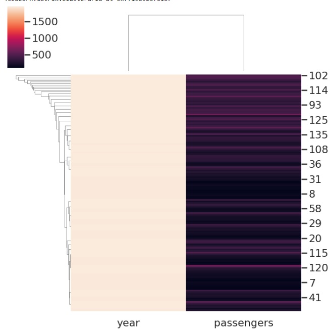
Example 1
We are using the flights dataset like mentioned above and since we are to draw a clustermap we will have to pop the categorical variable from the dataset. So in this case, the month column is popped/ removed and then the clustermap is produced. Then we are passing the flights data frame to the clustermap function along with the fig size and cmap parameters. The figsize parameter determines the size parameter of the plot and cmap determines the color of the plot.
import seaborn as sns
import matplotlib.pyplot as plt
flights=sns.load_dataset("flights")
flights.head()
data=flights.pop('month')
sns.clustermap(flights, cmap='vlag', figsize=(7, 7))
plt.show()
Output
Example 2
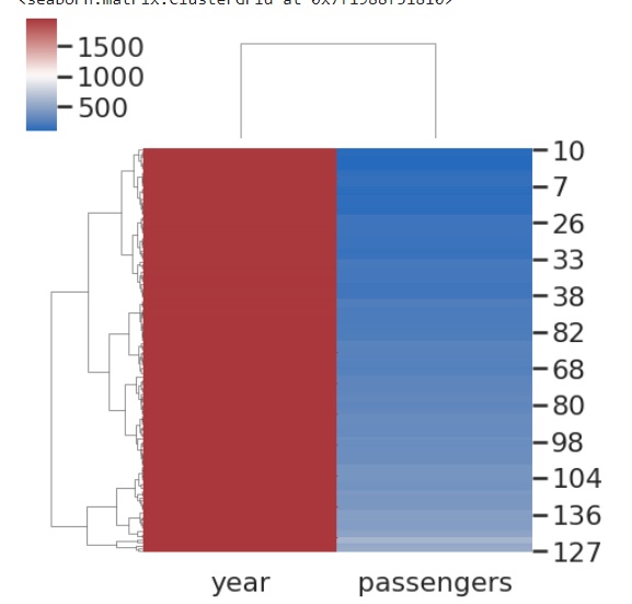
In this example, we will pass the vmin and vmax parameters along with the cmap and the data frame. Vmax and vmin are optional arguments takes floating point values as input and these values serve as colormap anchors; if not, the data and other keyword arguments will be used to infer them. We will notice the change in the plot when these are passed,
import seaborn as sns
import matplotlib.pyplot as plt
flights=sns.load_dataset("flights")
flights.head()
sns.clustermap(flights, cmap="mako", vmin=0, vmax=1000)
plt.show()
Output
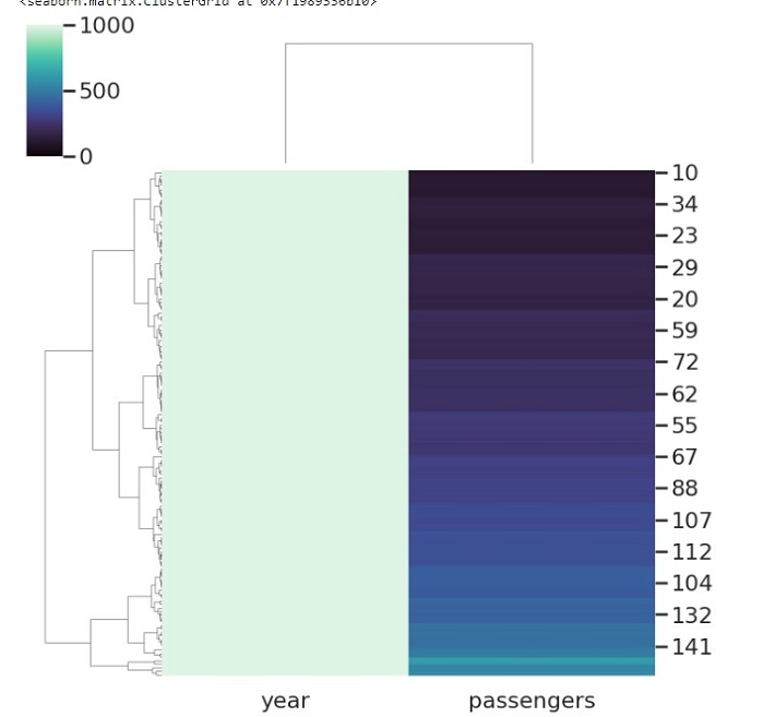
Example 3
Metric is a very useful parameter that is part of the clustermap() method in seaborn library. It takes string value and determines the linkage method to use for calculating clusters.
In the below code, we are passing the flights dataframe in the clustermap function along with the metric parameter. The metric parameter takes different values and we are passing correlation in this example.
import seaborn as sns
import matplotlib.pyplot as plt
flights=sns.load_dataset("flights")
flights.head()
sns.clustermap(flights, metric="correlation")
plt.show()
Output
Example 4
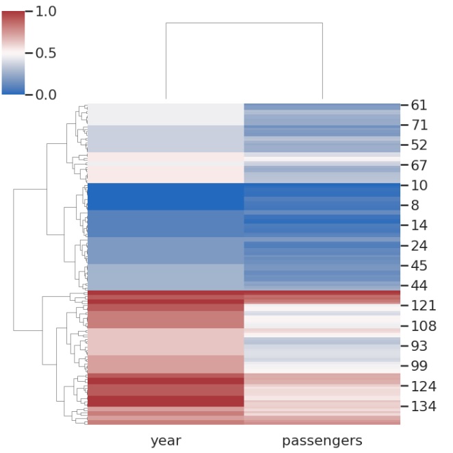
Standard_scale is another parameter that is popularly used and in the below example we are making use of this parameter and obtaining a cluster plot on the flights dataset.
The standard_scale is an optional parameter takes integer values and One or zero rows or columns. The value passed determines whether to standardize that dimension, which entails dividing each row or column's maximum by its minimum value.
import seaborn as sns
import matplotlib.pyplot as plt
flights=sns.load_dataset("flights")
flights.head()
sns.clustermap(flights, standard_scale=1,cmap="vlag")
plt.show()
Output
the plot obtained after running the above line of code is as follows,