- Flex - Home
- Flex - Overview
- Flex - Environment
- Flex - Applications
- Flex - Create Application
- Flex - Deploy Application
- Flex - Life Cycle Phases
- Flex - Style with CSS
- Flex - Style with Skin
- Flex - Data Binding
- Flex - Basic Controls
- Flex - Form Controls
- Flex - Complex Controls
- Flex - Layout Panels
- Flex - Visual Effects
- Flex - Event Handling
- Flex - Custom Controls
- Flex - RPC Services
- Flex - FlexUnit Integration
- Flex - Debug Application
- Flex - Internationalization
- Flex - Printing Support
Flex - Tree Control
Introduction
The Tree control displays hierarchical data arranged as an expandable tree.
Class Declaration
Following is the declaration for mx.controls.Tree class −
public class Tree
   extends List
      implements IIMESupport
Public Properties
| Sr.No | Property & Description |
|---|---|
| 1 | dataDescriptor : mx.controls.treeClasses:ITreeDataDescriptor Returns the current ITreeDataDescriptor. |
| 2 | dataProvider : Object [override] An object that contains the data to be displayed. |
| 3 | dragMoveEnabled : Boolean [override] Indicates that items can be moved instead of just copied from the Tree control as part of a drag-and-drop operation. |
| 4 | firstVisibleItem : Object The item that is currently displayed in the top row of the tree. |
| 5 | hasRoot : Boolean [read-only] Indicates that the current dataProvider has a root item; for example, a single top node in a hierarchical structure. |
| 6 | itemIcons : Object An object that specifies the icons for the items. |
| 7 | maxHorizontalScrollPosition : Number [override] The maximum value for the maxHorizontalScrollPosition property for the Tree control. |
| 8 | openItems : Object The items that have been opened or set opened. |
| 9 | showRoot : Boolean Sets the visibility of the root item. |
Public Methods
| Sr.No | Method & Description |
|---|---|
| 1 | Tree() Constructor. |
| 2 | expandChildrenOf(item:Object, open:Boolean):void Opens or closes all the tree items below the specified item. |
| 3 | expandItem(item:Object, open:Boolean, animate:Boolean = false, dispatchEvent:Boolean = false, cause:Event = null):void Opens or closes a branch item. |
| 4 | getParentItem(item:Object):* Returns the known parent of a child item. |
| 5 | isItemOpen(item:Object):Boolean Returns true if the specified item branch is open (is showing its children). |
| 6 | setItemIcon(item:Object, iconID:Class, iconID2:Class):void Sets the associated icon for the item. |
Protected Methods
| Sr.No | Method & Description |
|---|---|
| 1 | dragCompleteHandler(event:DragEvent):void [override] Handles DragEvent.DRAG_COMPLETE events. |
| 2 | dragDropHandler(event:DragEvent):void [override] Handles DragEvent.DRAG_DROP events. |
| 3 | initListData(item:Object, treeListData:mx.controls.treeClasses:TreeListData):void Initializes a TreeListData object that is used by the tree item renderer. |
| 4 | makeListData(data:Object, uid:String, rowNum:int):BaseListData [override] Creates a new TreeListData instance and populates the fields based on the input data provider item. |
Events
| Sr.No | Event & Description |
|---|---|
| 1 | itemClose Dispatched when a branch is closed or collapsed. |
| 2 | itemOpen Dispatched when a branch is opened or expanded. |
| 3 | itemOpening Dispatched when a branch open or close is initiated. |
Methods Inherited
This class inherits methods from the following classes −
- mx.controls.List
- mx.controls.listClasess.ListBase
- mx.core.ScrollControlBase
- mx.core.UIComponent
- mx.core.FlexSprite
- flash.display.Sprite
- flash.display.DisplayObjectContainer
- flash.display.InteractiveObject
- flash.display.DisplayObject
- flash.events.EventDispatcher
- Object
Flex Tree Control Example
Let us follow the following steps to check usage of Tree control in a Flex application by creating a test application −
| Step | Description |
|---|---|
| 1 | Create a project with a name HelloWorld under a package com.tutorialspoint.client as explained in the Flex - Create Application chapter. |
| 2 | Modify HelloWorld.mxml as explained below. Keep rest of the files unchanged. |
| 3 | Compile and run the application to make sure business logic is working as per the requirements. |
Following is the content of the modified mxml file src/com.tutorialspoint/HelloWorld.mxml.
<?xml version = "1.0" encoding = "utf-8"?>
<s:Application xmlns:fx = "http://ns.adobe.com/mxml/2009"
   xmlns:s = "library://ns.adobe.com/flex/spark"
   xmlns:mx = "library://ns.adobe.com/flex/mx
   width = "100%" height = "100%" minWidth = "500" minHeight = "500">

   <fx:Style source = "/com/tutorialspoint/client/Style.css" />
   <fx:Script>
      <![CDATA[
         [Bindable]
         public var selectedNode:XML;

         // Event handler for the Tree control change event.
         public function treeChanged(event:Event):void {
            selectedNode = Tree(event.target).selectedItem as XML;
         }
      ]]>
   </fx:Script>

   <fx:Declarations>
      <fx:XMLList id = "treeData">
         <node label = "E-Mail Box">
            <node label = "Inbox">
            <node label = "Client" />
               <node label = "Product" />
               <node label = "Personal" />
            </node>

            <node label = "Sent Items">
               <node label = "Professional" />
               <node label = "Personal" />
            </node>

            <node label = "Deleted Items" />
            <node label = "Spam" />
         </node>
      </fx:XMLList>
   </fx:Declarations>

   <s:BorderContainer width = "630" height = "480" id = "mainContainer"
      styleName = "container">
      <s:VGroup width = "100%" height = "100%" gap = "50"
         horizontalAlign = "center" verticalAlign = "middle">
         <s:Label id = "lblHeader" text = "Complex Controls Demonstration"
            fontSize = "40" color = "0x777777" styleName = "heading" />

         <s:Panel id = "treePanel" title = "Using Tree"
            width = "500" height = "300">
            <s:layout>
               <s:VerticalLayout  gap = "10" verticalAlign = "middle"
                  horizontalAlign = "center" />
            </s:layout>

            <mx:Tree id = "tree" width = "95%" height = "75%"
               labelField = "@label" showRoot = "false"
               dataProvider = "{treeData}" change = "treeChanged(event)" />
            <s:TextArea height = "20%" width = "95%"
               text = "Selected Item: {selectedNode.@label}" />
         </s:Panel>
      </s:VGroup>
   </s:BorderContainer>
</s:Application>
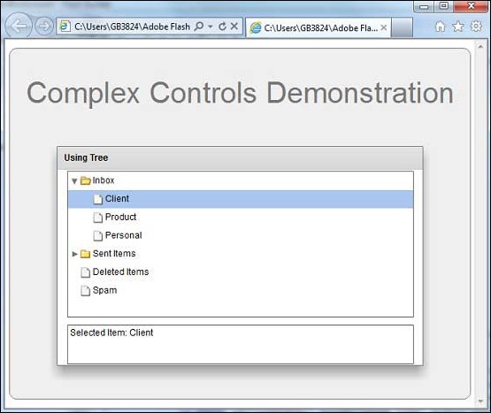
Once you are ready with all the changes done, let us compile and run the application in normal mode as we did in Flex - Create Application chapter. If everything is fine with your application, it will produce the following result: [ Try it online ]