- Flex - Home
- Flex - Overview
- Flex - Environment
- Flex - Applications
- Flex - Create Application
- Flex - Deploy Application
- Flex - Life Cycle Phases
- Flex - Style with CSS
- Flex - Style with Skin
- Flex - Data Binding
- Flex - Basic Controls
- Flex - Form Controls
- Flex - Complex Controls
- Flex - Layout Panels
- Flex - Visual Effects
- Flex - Event Handling
- Flex - Custom Controls
- Flex - RPC Services
- Flex - FlexUnit Integration
- Flex - Debug Application
- Flex - Internationalization
- Flex - Printing Support
Flex - Style with CSS
Flex supports the use of CSS syntax and styles to apply to its UI controls in the same way as CSS to HTML components.
Way # 1: Using External Style Sheet File
You can refer to a style sheet available in the class path of the application. For example consider Style.css file in com/tutorialspoint/client folder where HelloWorld.mxml file also lies.
/* CSS file */
@namespace s "library://ns.adobe.com/flex/spark";
@namespace mx "library://ns.adobe.com/flex/mx";
...
.container {
   cornerRadius :10;
   horizontalCenter :0;
   borderColor: #777777;
   verticalCenter:0;
   backgroundColor: #efefef;
}
Then css file can be referred by following code snippet
<fx:Style source = "/com/tutorialspoint/client/Style.css" />
Assign styles to UI component using styleName property
<s:BorderContainer width = "500" height = "500" id = "mainContainer"
   styleName = "container">
   ...
</s:BorderContainer>
Way # 2: Using Styles Within Ui Container Component
You can define styles within UI container component using <fx:Style> tag
Class Level Selector
<fx:Style>
   @namespace s "library://ns.adobe.com/flex/spark";
   @namespace mx "library://ns.adobe.com/flex/mx";

   /* class level selector  */
   .errorLabel {
      color: red;
   }
</fx:Style>
Assign styles to UI component using styleName property.
<s:Label id = "errorMsg" text = "This is an error message" styleName = "errorLabel" />
Id Level Selector
Style UI component using id selector.
<fx:Style>
   /* id level selector  */
   #msgLabel {
      color: gray;
   }
</fx:Style>

<s:Label id = "msgLabel" text = "This is a normal message" />
Type Level Selector
Style one type of UI Component in one GO.
<fx:Style>
   /* style applied on all buttons  */
   s|Button {
      fontSize: 15;
      color: #9933FF;
   }
</fx:Style>

<s:Button label = "Click Me!" id = "btnClickMe"
   click = "btnClickMe_clickHandler(event)" />
Flex Style with CSS Example
Let us follow the steps to check CSS styling of a Flex application by creating a test application −
| Step | Description |
|---|---|
| 1 | Create a project with a name HelloWorld under a packagecom.tutorialspoint.client as explained in the Flex - Create Application chapter. |
| 2 | Modify Style.css, HelloWorld.mxml as explained below. Keep rest of the files unchanged. |
| 3 | Compile and run the application to make sure business logic is working as per the requirements. |
Following is the content of the modified CSS file src/com.tutorialspoint/Style.css.
/* CSS file */
@namespace s "library://ns.adobe.com/flex/spark";
@namespace mx "library://ns.adobe.com/flex/mx";

.heading
{
   fontFamily: Arial, Helvetica, sans-serif;
   fontSize: 17px;
   color: #9b1204;
   textDecoration:none;
   fontWeight:normal;
}

.button {
   fontWeight: bold;
}

.container {
   cornerRadius :10;
   horizontalCenter :0;
   borderColor: #777777;
   verticalCenter:0;
   backgroundColor: #efefef;
}
Following is the content of the modified mxml file src/com.tutorialspoint/HelloWorld.mxml.
<?xml version = "1.0" encoding = "utf-8"?>
<s:Application xmlns:fx = "http://ns.adobe.com/mxml/2009"
   xmlns:s = "library://ns.adobe.com/flex/spark"
   xmlns:mx = "library://ns.adobe.com/flex/mx"
   width = "100%" height = "100%" minWidth = "500" minHeight = "500"
   initialize = "application_initializeHandler(event)">

   <!--Add reference to style sheet -->
   <fx:Style source = "/com/tutorialspoint/client/Style.css" />

   <!--Using styles within mxml file -->
   <fx:Style>
      @namespace s "library://ns.adobe.com/flex/spark";
      @namespace mx "library://ns.adobe.com/flex/mx";

      /* class level selector  */
      .errorLabel {
         color: red;
      }

      /* id level selector  */
      #msgLabel {
         color: gray;
      }

      /* style applied on all buttons  */
      s|Button {
         fontSize: 15;
         color: #9933FF;
      }
   </fx:Style>

   <fx:Script>
      <![CDATA[
         import mx.controls.Alert;
         import mx.events.FlexEvent;
         protected function btnClickMe_clickHandler(event:MouseEvent):void {
            Alert.show("Hello World!");
         }

         protected function application_initializeHandler(event:FlexEvent):void {
            lblHeader.text = "CSS Demonstrating Application";
         }
      ]]>
   </fx:Script>

   <s:BorderContainer width = "560" height = "500" id = "mainContainer"
      styleName = "container">
      <s:VGroup width = "100%" height = "100%" gap = "50"
         horizontalAlign = "center" verticalAlign = "middle">
         <s:Label width = "100%" id = "lblHeader" fontSize = "40"
            color = "0x777777" styleName = "heading" />
         <s:Button label = "Click Me!" id = "btnClickMe"
            click = "btnClickMe_clickHandler(event)"  />
         <s:Label id = "errorMsg"
            text = "This is an error message" styleName = "errorLabel" />
         <s:Label id = "msgLabel" text = "This is a normal message" />
      </s:VGroup>
   </s:BorderContainer>
</s:Application>
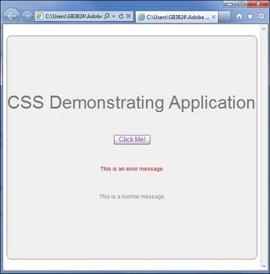
Once you are ready with all the changes done, let us compile and run the application in normal mode as we did in Flex - Create Application chapter. If everything is fine with your application, this will produce following result: [ Try it online ]