- Flex - Home
- Flex - Overview
- Flex - Environment
- Flex - Applications
- Flex - Create Application
- Flex - Deploy Application
- Flex - Life Cycle Phases
- Flex - Style with CSS
- Flex - Style with Skin
- Flex - Data Binding
- Flex - Basic Controls
- Flex - Form Controls
- Flex - Complex Controls
- Flex - Layout Panels
- Flex - Visual Effects
- Flex - Event Handling
- Flex - Custom Controls
- Flex - RPC Services
- Flex - FlexUnit Integration
- Flex - Debug Application
- Flex - Internationalization
- Flex - Printing Support
Flex - Custom Controls
Flex provides two ways to create custom components.
- Using ActionScript
- Using MXML
Using ActionScript
You can create a component by extending existing component. To create a component using Flash Builder, Click on File > New > ActionScript Class.
Enter the details as shown below −
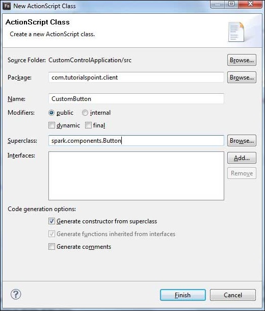
Flash Builder will create the following CustomButton.as file.
package com.tutorialspoint.client {
   import spark.components.Button;

   public class CustomButton extends Button {
      public function CustomButton() {
         super();
      }
   }
}
Using MXML
You can create a component by extending existing component. To create a component using Flash Builder, Click on File > New > MXML Component.
Enter the details as shown below.
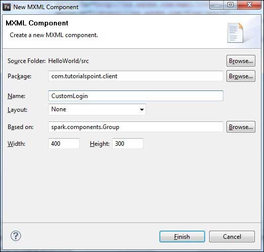
Flash Builder will create the following CustomLogin.mxml file.
<?xml version = "1.0" encoding = "utf-8"?>
<s:Group xmlns:fx = "http://ns.adobe.com/mxml/2009"
   xmlns:s = "library://ns.adobe.com/flex/spark"
   xmlns:mx = "library://ns.adobe.com/flex/mx"
   width = "400" height = "300">
</s:Group>
Let us follow the following steps to test custom controls in a Flex application −
| Step | Description |
|---|---|
| 1 | Create a project with a name HelloWorld under a package com.tutorialspoint.client as explained in the Flex - Create Application chapter. |
| 2 | Modify HelloWorld.mxml as explained below. Keep rest of the files unchanged. |
| 3 | Create CustomLogin.mxml and CustomButton.as component as explained above. Modify these files as explained below. Keep rest of the files unchanged. |
| 4 | Compile and run the application to make sure business logic is working as per the requirements. |
Following is the content of the modified mxml file src/com.tutorialspoint/client/CustomLogin.mxml.
<?xml version = "1.0" encoding = "utf-8"?>
<s:Group xmlns:fx = "http://ns.adobe.com/mxml/2009"
   xmlns:s = "library://ns.adobe.com/flex/spark"
   xmlns:mx = "library://ns.adobe.com/flex/mx" width = "400" height = "300">

   <s:Form>
      <s:FormItem label = "UserName:">
         <s:TextInput width = "200" />
      </s:FormItem>

      <s:FormItem label = "Password:">
         <s:TextInput width = "200" displayAsPassword = "true" />
      </s:FormItem>

      <s:FormItem>
         <s:Button label = "Login" />
      </s:FormItem>
   </s:Form>
</s:Group>
Following is the content of the modified mxml file src/com.tutorialspoint/client/CustomButton.as.
package com.tutorialspoint.client {
   import spark.components.Button;

   public class CustomButton extends Button {

      public function CustomButton() {
         super();
         this.setStyle("color","green");
         this.label = "Submit";
      }
   }
}
Following is the content of the modified mxml file src/com.tutorialspoint/client/HelloWorld.mxml.
<?xml version = "1.0" encoding = "utf-8"?>
<s:Application xmlns:fx = "http://ns.adobe.com/mxml/2009"
   xmlns:s = "library://ns.adobe.com/flex/spark"
   xmlns:mx = "library://ns.adobe.com/flex/mx"
   xmlns:client = "com.tutorialspoint.client.*"
   initialize = "application_initializeHandler(event)">

   <fx:Style source = "/com/tutorialspoint/client/Style.css" />
   <fx:Script>
      <![CDATA[
        import mx.events.FlexEvent;

        protected function application_initializeHandler(event:FlexEvent):void {
           //create a new custom button
           var customButton: CustomButton = new CustomButton();
           asPanel.addElement(customButton);
        }

      ]]>
   </fx:Script>

   <s:BorderContainer width = "630" height = "480" id = "mainContainer"
      styleName = "container">
      <s:VGroup width = "100%" height = "100%" gap = "10"
         horizontalAlign = "center" verticalAlign = "middle">
         <s:Label id = "lblHeader" text = "Custom Controls Demonstration"
            fontSize = "40" color = "0x777777" styleName = "heading" />

         <s:Panel title = "Using MXML Component" width = "400" height = "200">
            <client:CustomLogin>
            </client:CustomLogin>
         </s:Panel>

         <s:Panel  title = "Using AS Component" width = "400" height = "100">
            <s:VGroup id = "asPanel" width = "100%" height = "100%" gap = "10"
               horizontalAlign = "center" verticalAlign = "middle">
            </s:VGroup>
         </s:Panel>
      </s:VGroup>
   </s:BorderContainer>
</s:Application>
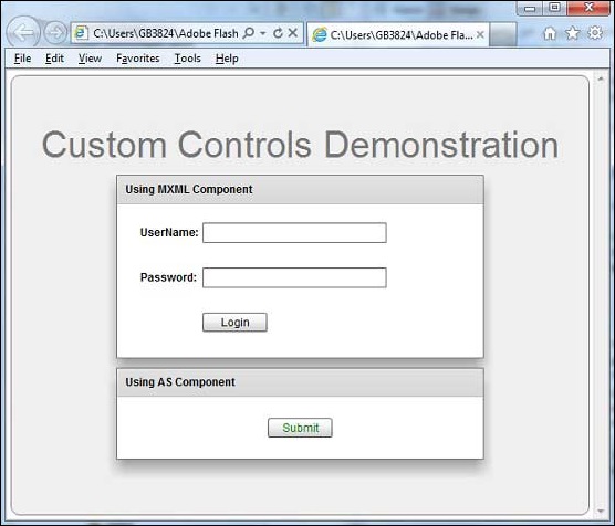
Once you are ready with all the changes done, let us compile and run the application in normal mode as we did in Flex - Create Application chapter. If everything is fine with your application, it will produce the following result: [ Try it online ]