- Flex - Home
- Flex - Overview
- Flex - Environment
- Flex - Applications
- Flex - Create Application
- Flex - Deploy Application
- Flex - Life Cycle Phases
- Flex - Style with CSS
- Flex - Style with Skin
- Flex - Data Binding
- Flex - Basic Controls
- Flex - Form Controls
- Flex - Complex Controls
- Flex - Layout Panels
- Flex - Visual Effects
- Flex - Event Handling
- Flex - Custom Controls
- Flex - RPC Services
- Flex - FlexUnit Integration
- Flex - Debug Application
- Flex - Internationalization
- Flex - Printing Support
Flex - Basic Controls
Every user interface considers the following three main aspects −
UI Elements − These are the core visual elements the user eventually sees and interacts with. Flex provides a huge list of widely used and common elements varying from basic to complex which we will cover in this tutorial.
Layouts − They define how UI elements should be organized on the screen and provide a final look and feel to the GUI (Graphical User Interface). This part will be covered in Layout chapter.
Behavior − These events occur when the user interacts with UI elements. This part will be covered in Event Handling chapter.
Flex UI Elements
The Flex UI library provides classes in a well-defined class hierarchy to create complex web-based user interfaces. All classes in this component hierarchy have been derived from the EventDispatcher base class as shown below −
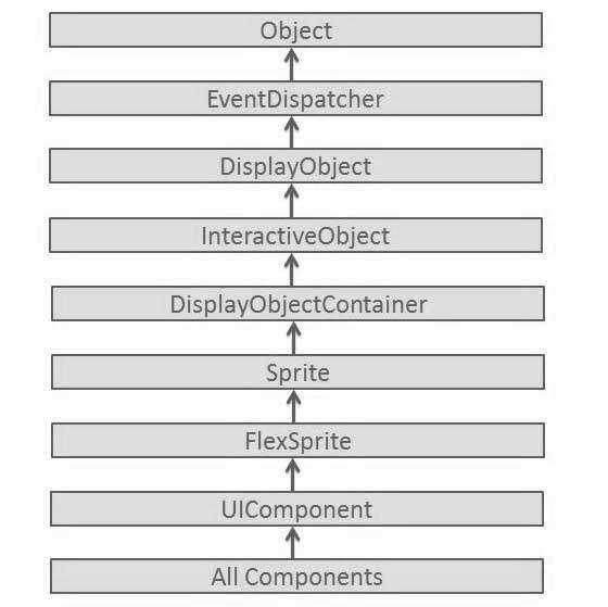
Every Basic UI control inherits properties from UI Component class which in turn inherits properties from EventDispatcher and other top level classes.
| Sr.No | Control & Description |
|---|---|
| 1 | Flex EventDispatcher Class
The EventDispatcher class is the base class for all classes that can dispatch events. The EventDispatcher class allows any object on the display list to be an event target and as such, to use the methods of the IEventDispatcher interface. |
| 2 | Flex UIComponent
The UIComponent class is the base class for all visual components, both interactive and non-interactive. |
Basic Controls
Following are the few important Basic Controls −
| Sr.No | Controls & Description |
|---|---|
| 1 | Label
Label is a low-level UIComponent that can render one or more lines of uniformly-formatted text. |
| 2 | Text
The Text control lets you display HTML content as well as normal text in your application. |
| 3 | Image
The Image control lets you import JPEG, PNG, GIF, and SWF files at runtime. |
| 4 | LinkButton
The LinkButton control is a borderless Button control whose contents are highlighted when a user moves the mouse over it. |
